Complete Pandas Tutorial: Analyzing Data with Python
Introduction
In this post, I’ll show you how to take your pandas and data analysis skills to the next level. This guide is packed with practical and valuable pandas tips. We’ll load a dataset and perform exploratory data analysis, scanning for missing values, plotting distributions, and checking for data correlation. Once we have a solid understanding of the data, I’ll demonstrate advanced techniques to clean up the dataframe. By the end, we’ll conduct some time series analysis and create a word cloud.
Install the dependencies
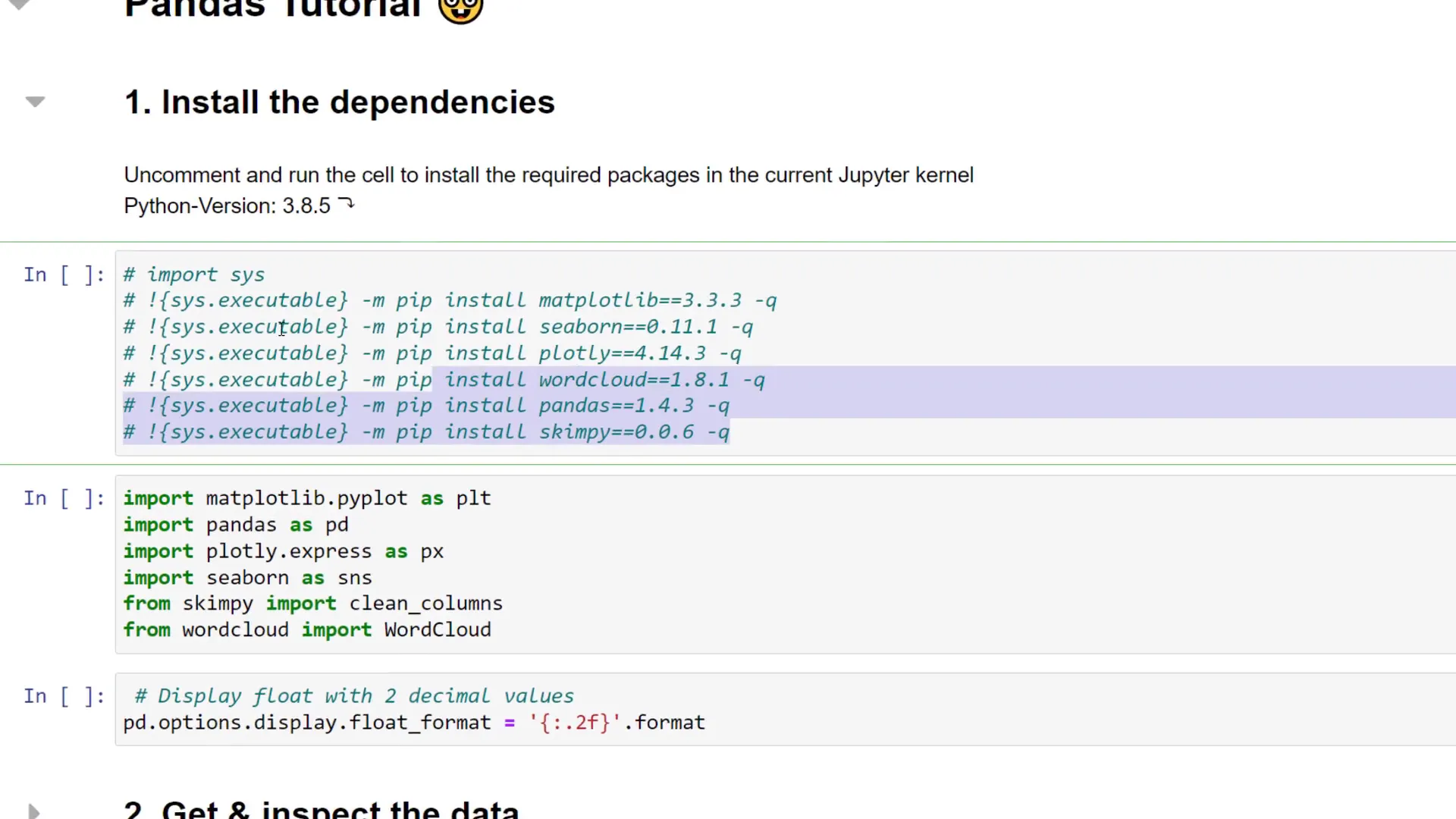
First things first, you need to install the required dependencies. You can grab the requirements.txt file from the GitHub repository or run a specific cell in Python to install all required packages in your current Jupyter kernel.
Get and inspect the data
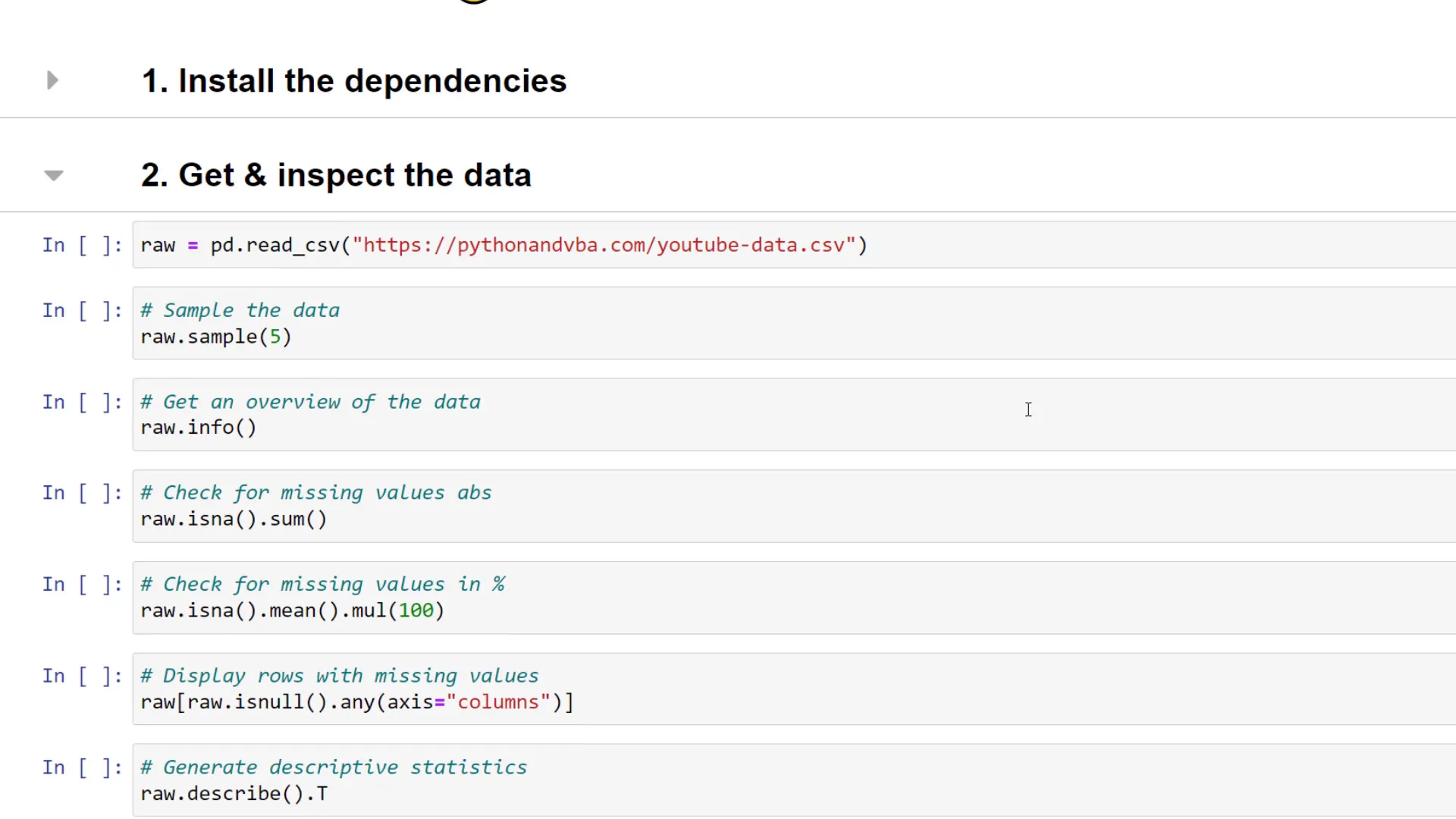
Next, let’s get the data and perform some exploratory data analysis. The data is stored in a CSV file hosted on my website. To convert the CSV file into a pandas dataframe, use pd.read_csv followed by the file location. Once we have the dataframe, we can look at five random rows. This includes YouTube video ID, title, publish time, comments, average percentage viewed, likes, views, impressions, and the click-through rate.
Check for missing values
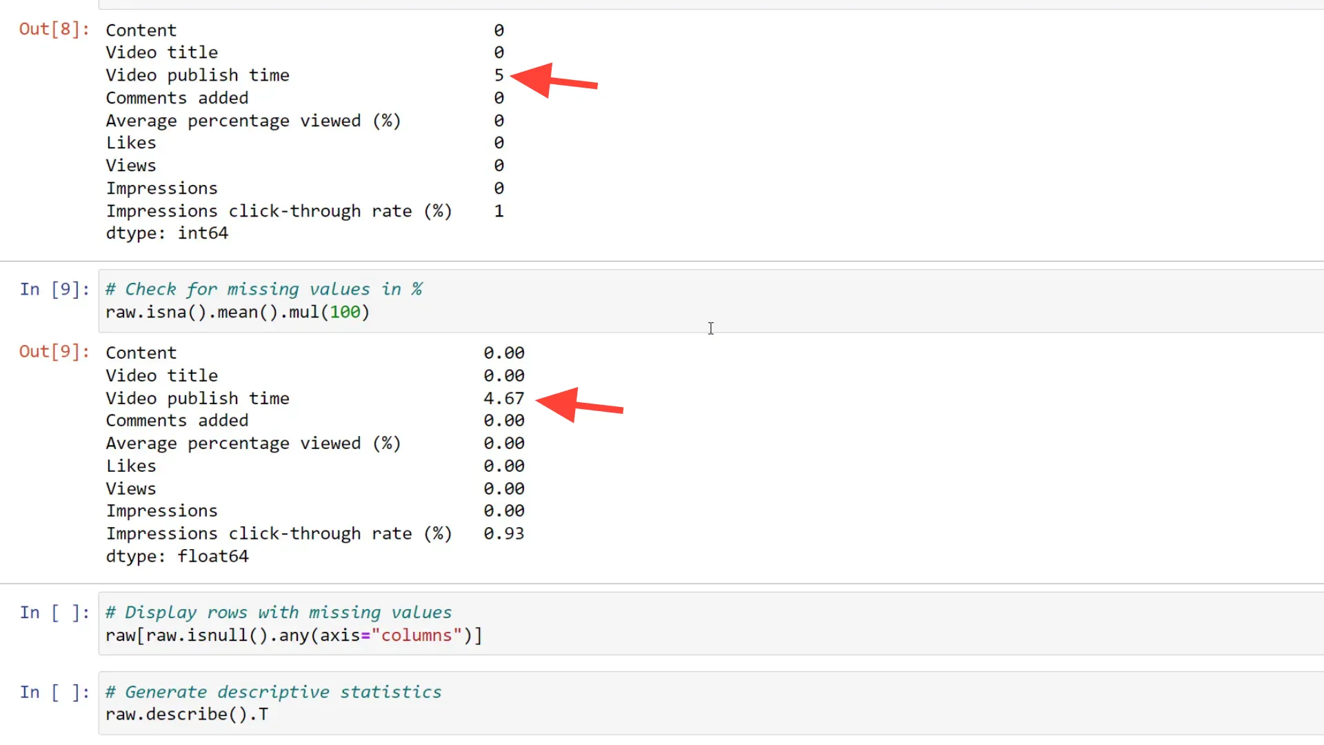
To get a quick overview of the data, I typically run the info method. From this overview, we can see the data types pandas assigned to each column. For example, the video publish time is stored as an object type, which we’ll need to convert to a DateTime object later. We also need to check for missing values. You can run isna on the dataframe and sum the boolean values to see the number of missing values by column. Sometimes, it’s hard to judge whether five missing entries are significant. To put it in perspective, we can calculate the percentage of missing values, revealing that the video publish time column has 4.7% missing values.
Check data distribution
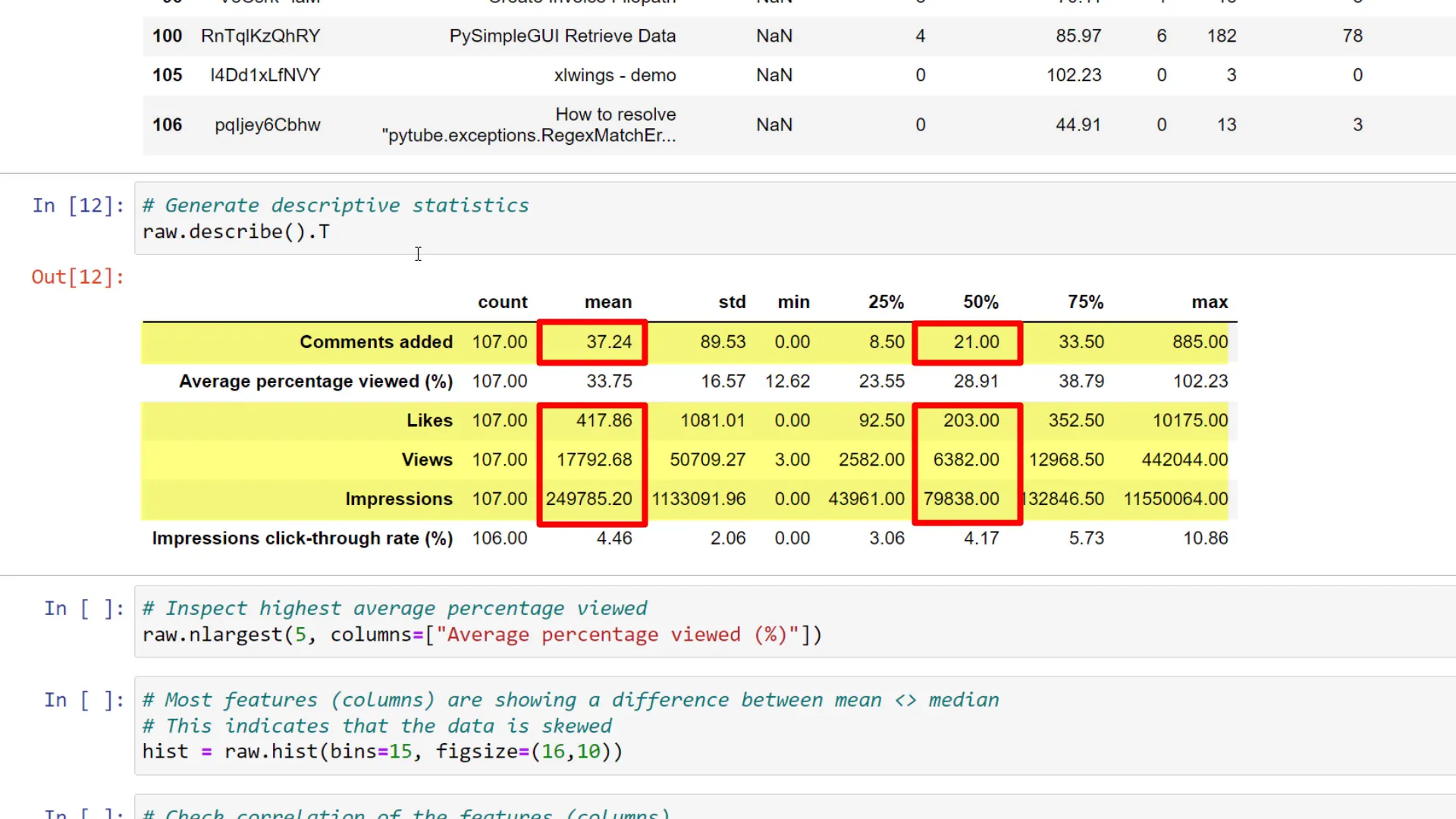
Now that we’ve scanned for missing values, let’s check the distribution of the data. We can use the describe method for a quick overview. I like to transpose the output for easier reading. Notably, the mean values for comments, likes, views, and impressions differ from the median, and the maximum value for the average percentage viewed is over 100%. We can identify which videos have the highest percentage viewed using nlargest.
Check for correlation
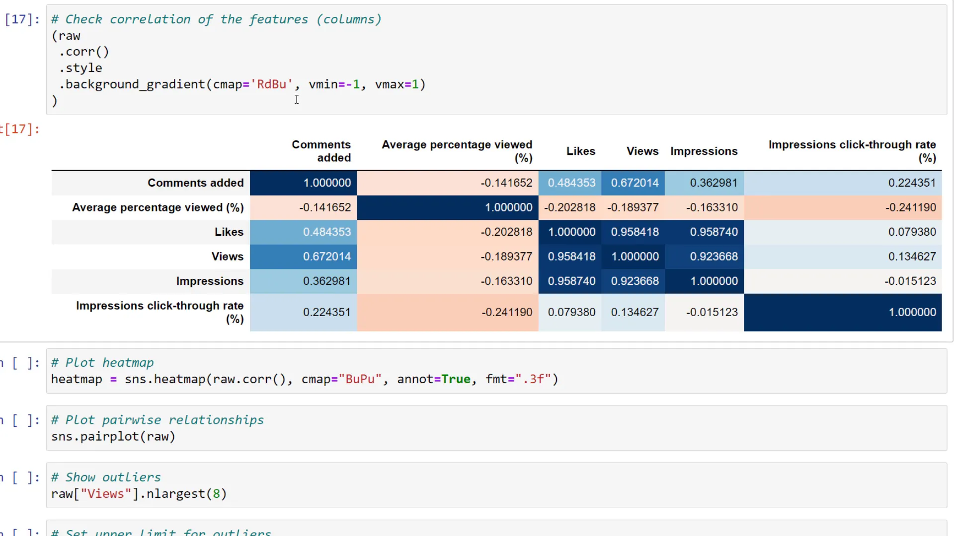
To validate our assumptions, we can compute the Pearson correlation of the dataframe. This gives an overview of how the columns correlate. Applying some styling to your dataframe can help visualize this as a heatmap. Numbers closer to 1 indicate a stronger positive correlation, while numbers closer to -1 indicate a negative correlation. We’ll also generate a heatmap using the seaborn library for better visualization.
Clean the data
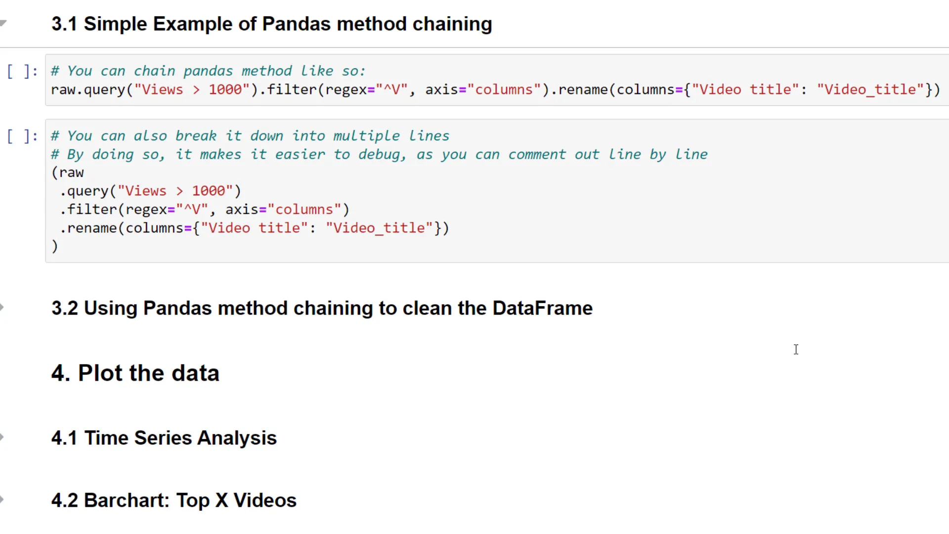
Now that we have a solid understanding of the data, let’s clean up the dataframe. I’ll take advantage of the ability to chain pandas methods for this process. For example, I can filter the dataframe by views, apply regular expressions on the column names, and rename headers in one line. I’ll walk you through the steps, starting with removing unwanted columns and handling missing values using dropna. Additionally, I’ll clean the column headers to avoid issues with selecting columns later.
Time Series Analysis
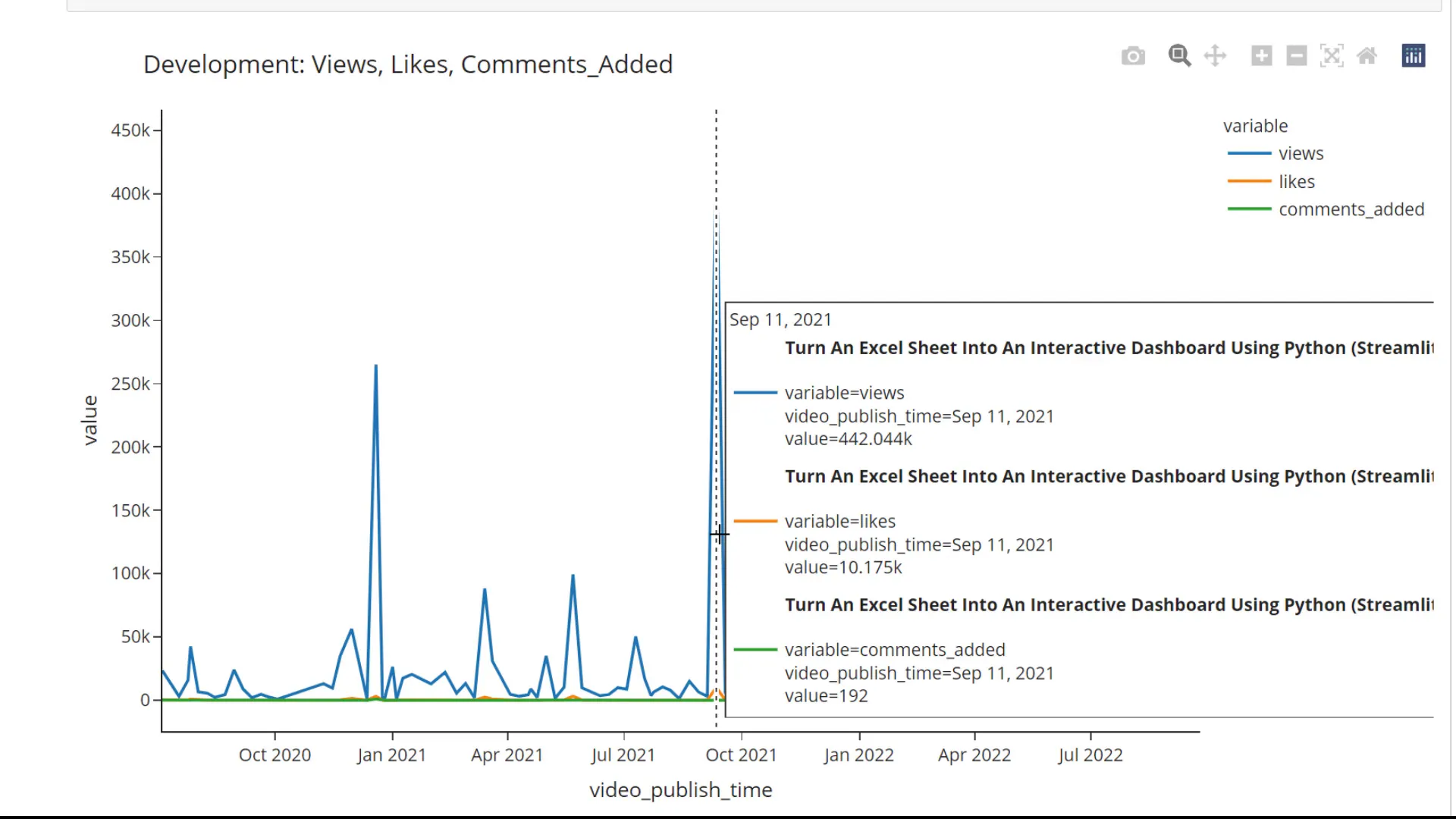
Let’s kick things off with some time series analysis. I’ll grab our clean dataframe and use the video publish time as the index. After sorting the index, we can analyze the views. We can use the plot method to create a line chart. For more advanced visualization, we could use the plotly express library, which allows for interactive charts where you can hover over data points for more details.
Visually analyse the data
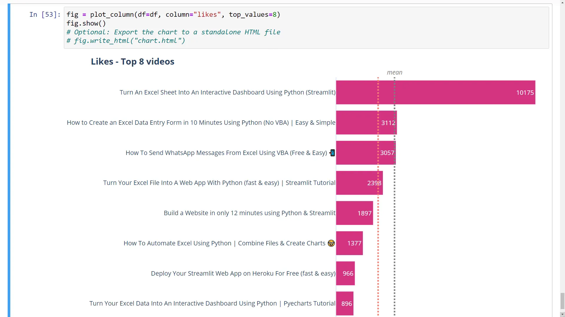
After defining the function to plot the data, I can print all numeric columns of our dataframe. This helps identify which columns can be used in the plot function. We can plot the top 5 videos with the most likes or change the number displayed. Additionally, we can visualize metrics like the likes-to-view ratio to identify trends without significant outliers.
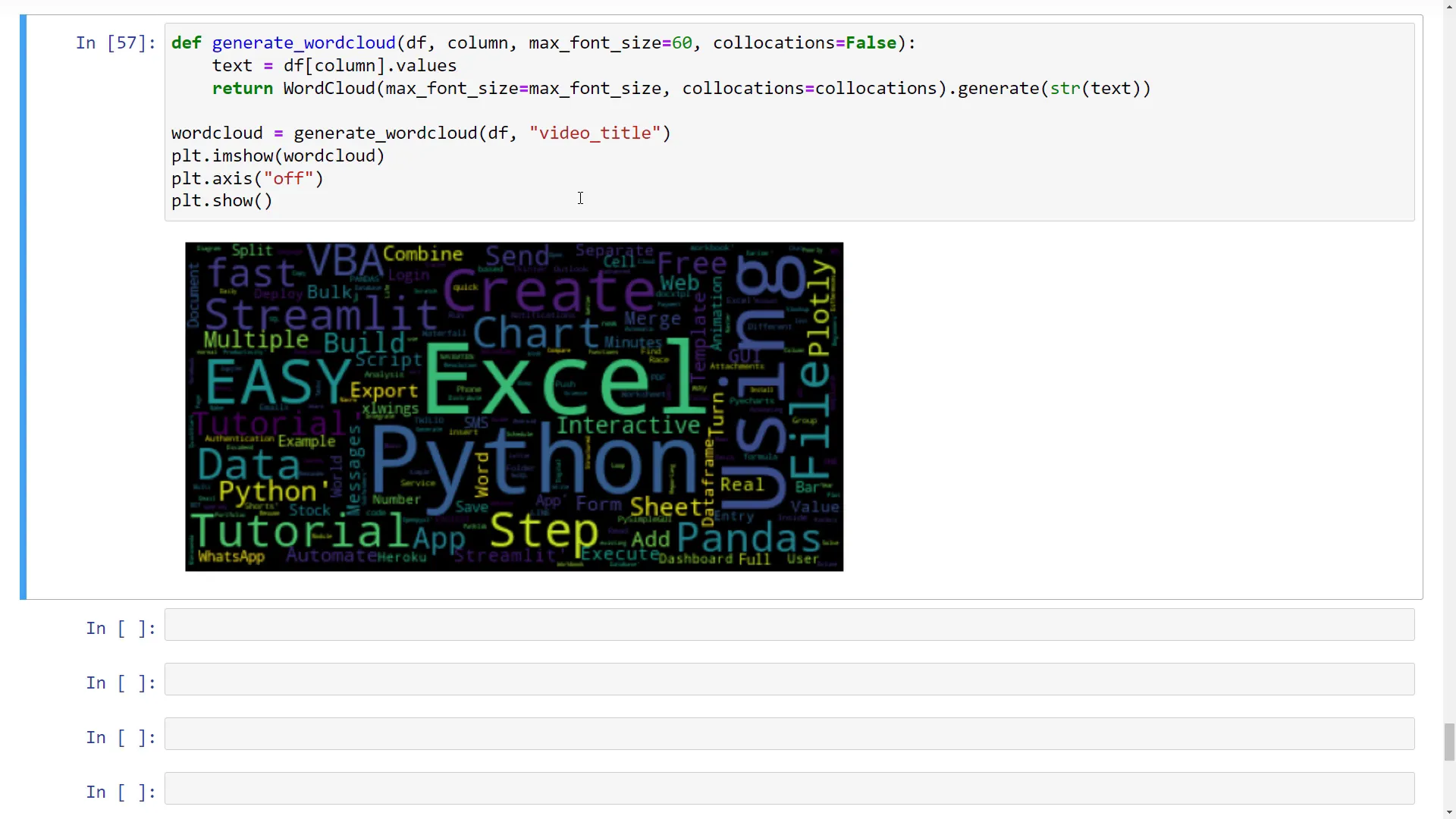
Create a word cloud
Lastly, let’s create a word cloud from all my video titles. The cloud will visually represent the most common topics in my videos, such as Excel, Python, Streamlit, Pandas, and VBA. If these topics interest you, consider subscribing for more content!
Outro
That’s a wrap! In this post, I covered how to analyze data using pandas, from installing dependencies to performing exploratory data analysis, cleaning the data, and visualizing it effectively. I hope you found these tips helpful in your journey to becoming a pandas pro!


