
Excel Template To Create Interactive Waterfall Charts | Combines VBA + Python
A free Excel template that produces interactive waterfall charts from a single click, with VBA handling the workbook side and Python doing the plotting. It copes with negative values, and the colours, labels and totals are all set from parameters in the sheet.
Walk-through of functionalities
The waterfall chart can handle negative values, displaying them effectively along the horizontal axis. You can specify various parameters in the Excel interface, including colors and labels. For instance, you can provide hexadecimal color codes for the bars, letting you customize the appearance significantly. If you would rather build the chart yourself than use the template, I walk through building the same waterfall chart in Plotly from an Excel range.
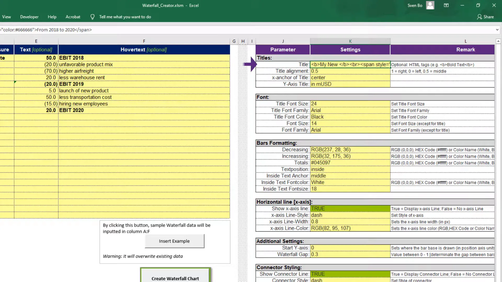
Additionally, you can choose where to place the text annotations, either inside the bars or outside, based on your preferences. There is also an option to adjust the line style, which is available in a dropdown menu. Options include solid lines and dotted lines, allowing for a tailored presentation of the data.
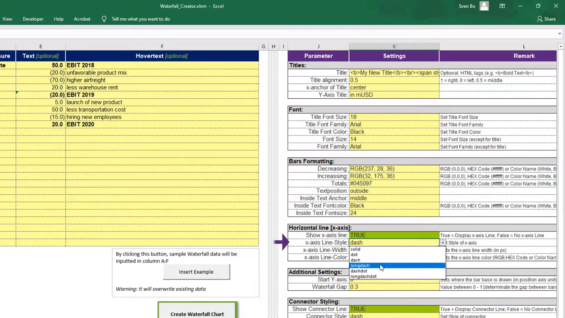
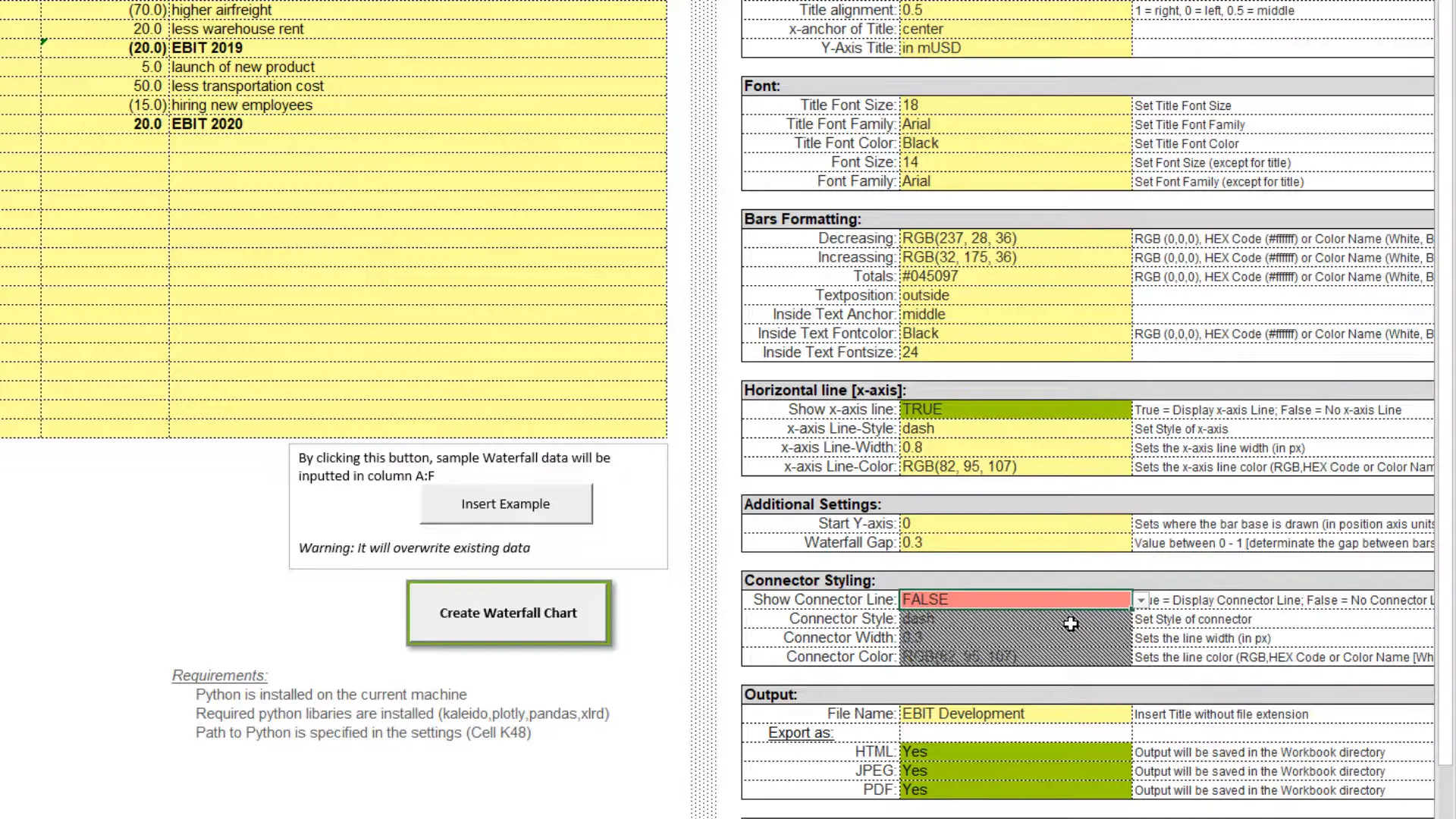
Another key feature is setting the starting point for the values, which can help highlight specific data points. You can also export the chart in various formats such as HTML, JPEG, and PDF, which is incredibly useful for sharing reports.
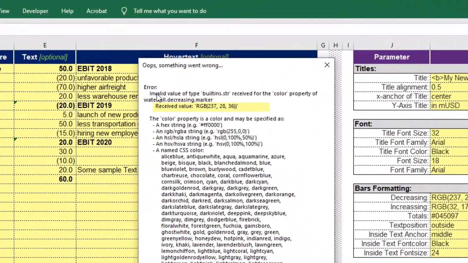
In case of unexpected input or settings, the tool is designed to alert you through a message box and will create an error log for troubleshooting. This ensures that you have guidance if something goes wrong.
Installation Guide
To set up this tool, you need to install Python and a few essential libraries. You can do this by using the pip command in the command prompt on Windows. Just open the command prompt and type the necessary commands to install the required libraries.
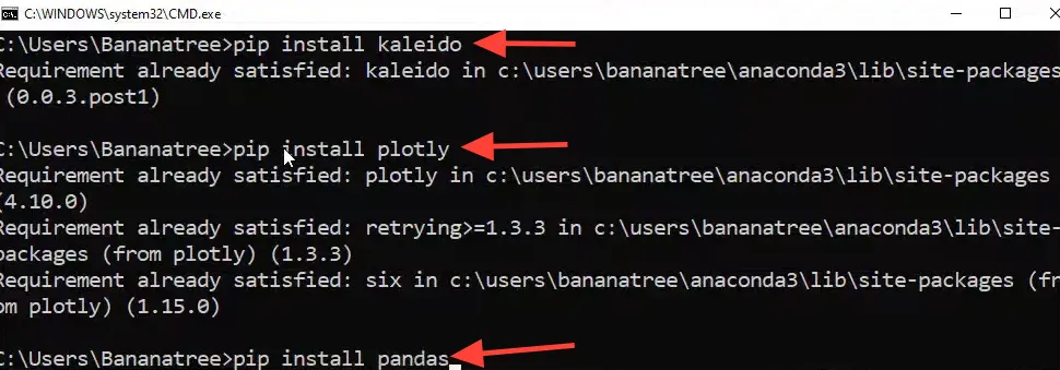
Once you have Python installed, you can run the script that generates the waterfall charts. The script is designed to be executed directly from Excel, streamlining the process even further.
Conclusion
In summary, this tool simplifies the process of creating interactive waterfall charts in Excel by leveraging the power of Python. You can customize the charts extensively and export them in multiple formats for easy sharing. This integration allows for a more flexible and visually appealing way to present your data.