A Tableau Alternative in Python for Data Analysis (in Streamlit & Jupyter) | PyGWalker Tutorial
Introduction
Today, I’m diving into a fantastic new Python library called PyGWalker. This tool allows you to transform your Pandas dataframes into a visually appealing Tableau-style User Interface for effective data analysis. Whether you’re working in a Jupyter Notebook or a Streamlit app, PyGWalker makes your data exploration intuitive and engaging.
Setup & Dataset
First things first, to get started with PyGWalker, you need to install it. Simply run the command below in your terminal:
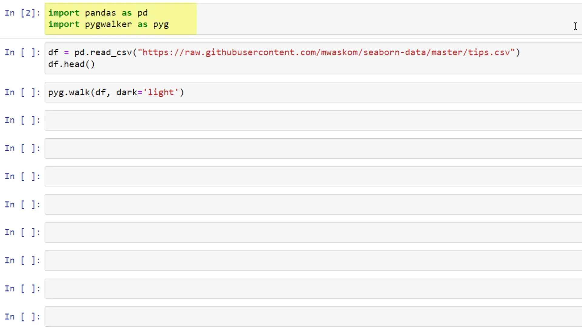
pip install pygwalkerOnce you’ve got it installed, you can import it alongside Pandas in your script. For our demo, I’ll be using the ‘tips’ dataset, which contains information like total bill amount, tips, gender, smoking status, date and time of the visit, and party size.
PyGWalker in Notebooks
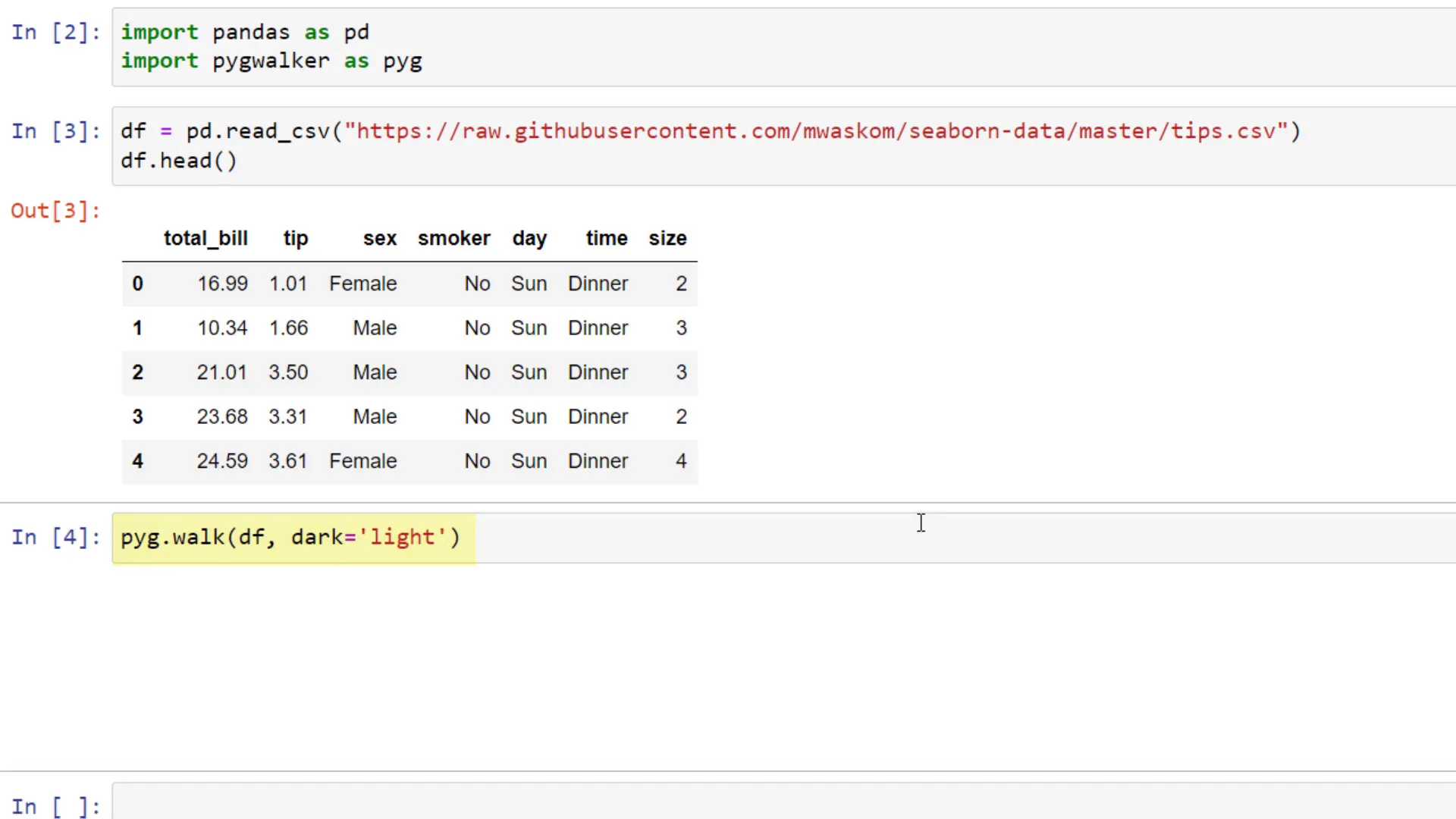
Now, let’s explore how to utilize PyGWalker in a Jupyter Notebook. After importing the necessary libraries, you can load the ‘tips’ dataset and call the pyg.walk function, passing in your dataframe. You can choose between a dark or light mode for the interface.
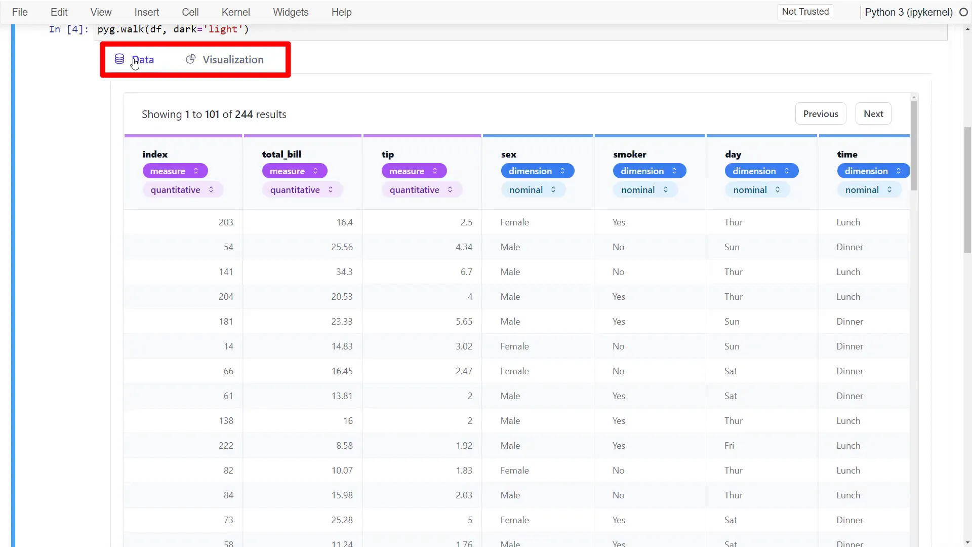
After executing this, you’ll see a canvas with two tabs: Data and Visualization. In the Data tab, you can inspect your dataframe and see how PyGWalker automatically labels numeric values as measures and the rest as dimensions.
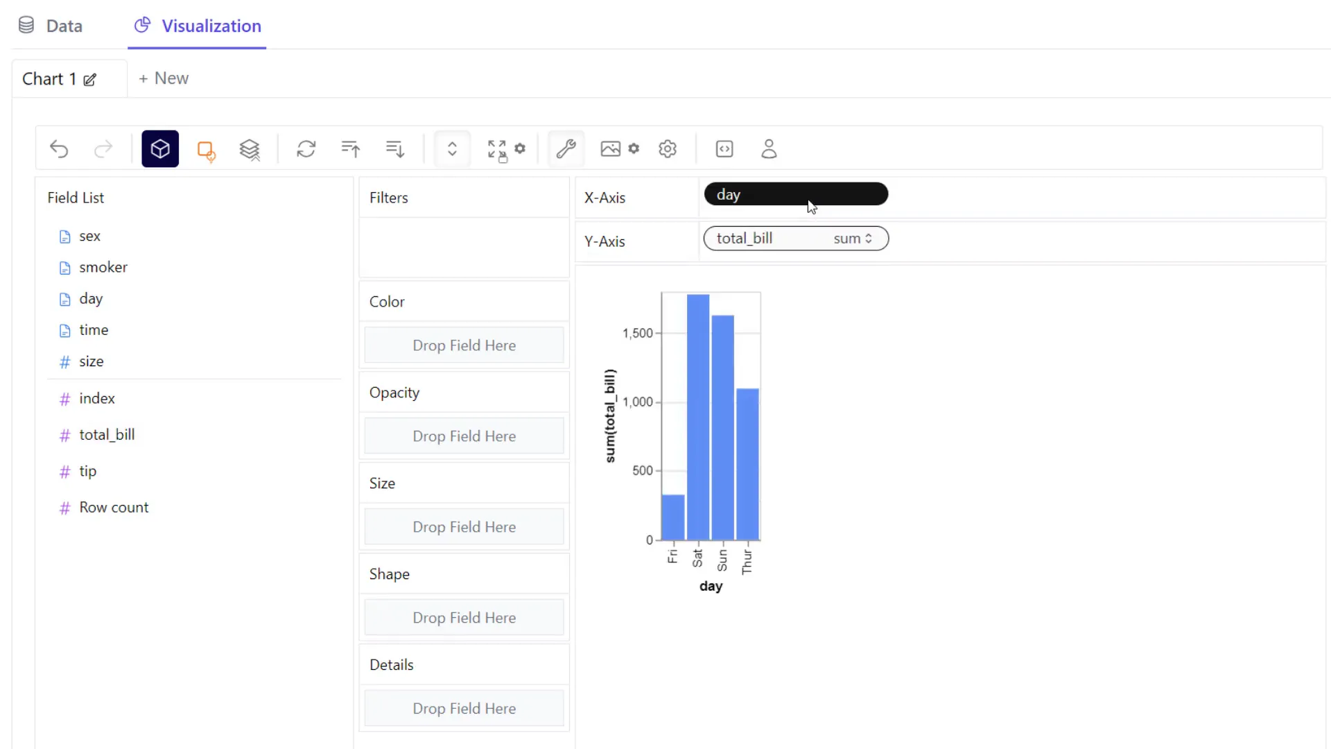
Switching to the Visualization tab, you can drag and drop fields into the x and y axes. For example, let’s plot the total bill amount by day. You can resize the chart by selecting the layout mode and adjusting accordingly.
By default, PyGWalker selects a chart type for you, but you can easily switch to other types, such as a line chart. The beauty of this tool lies in the ability to add additional fields intuitively. For instance, if you’re curious about tips, you can add that to the y-axis as well.
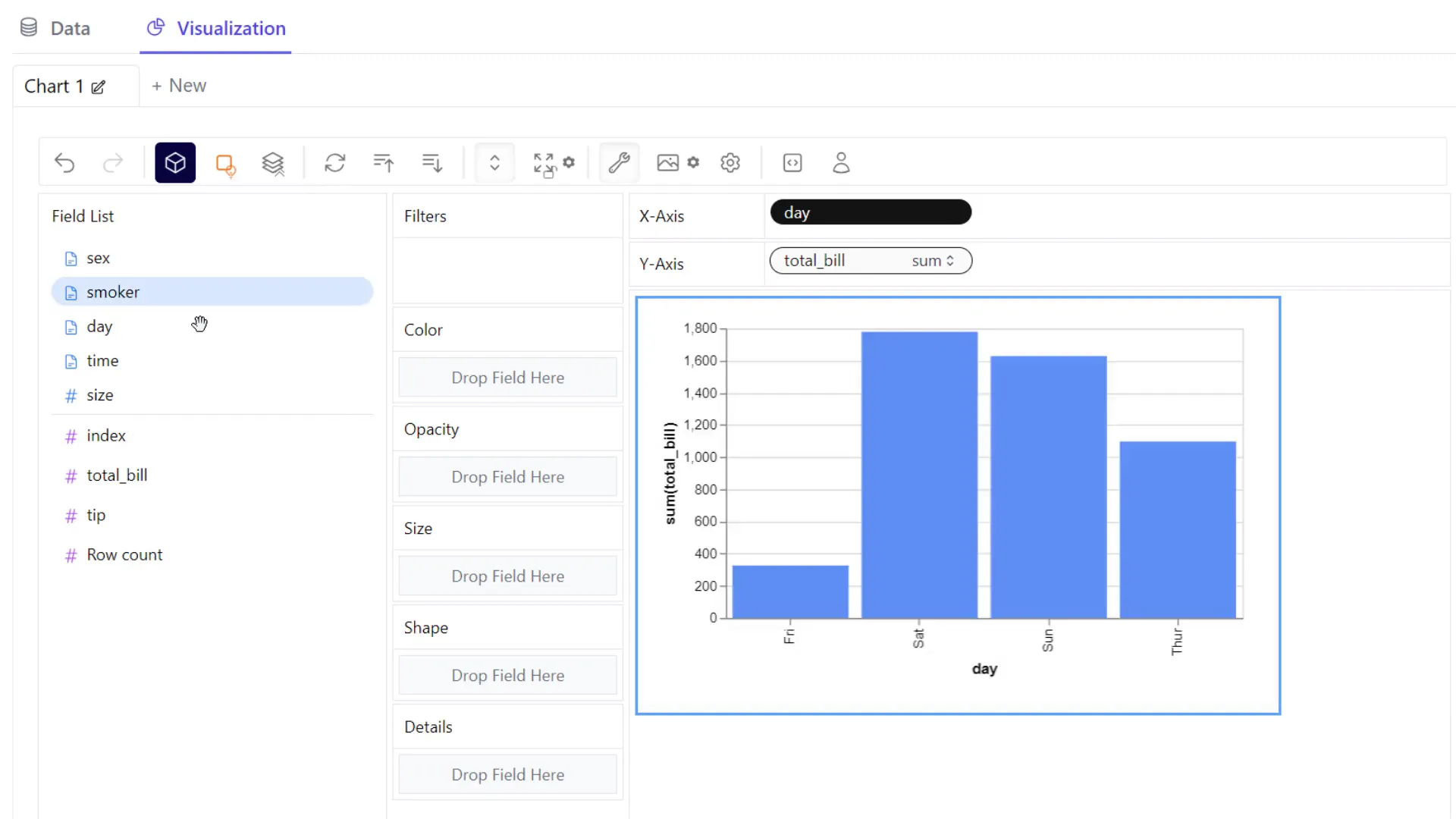
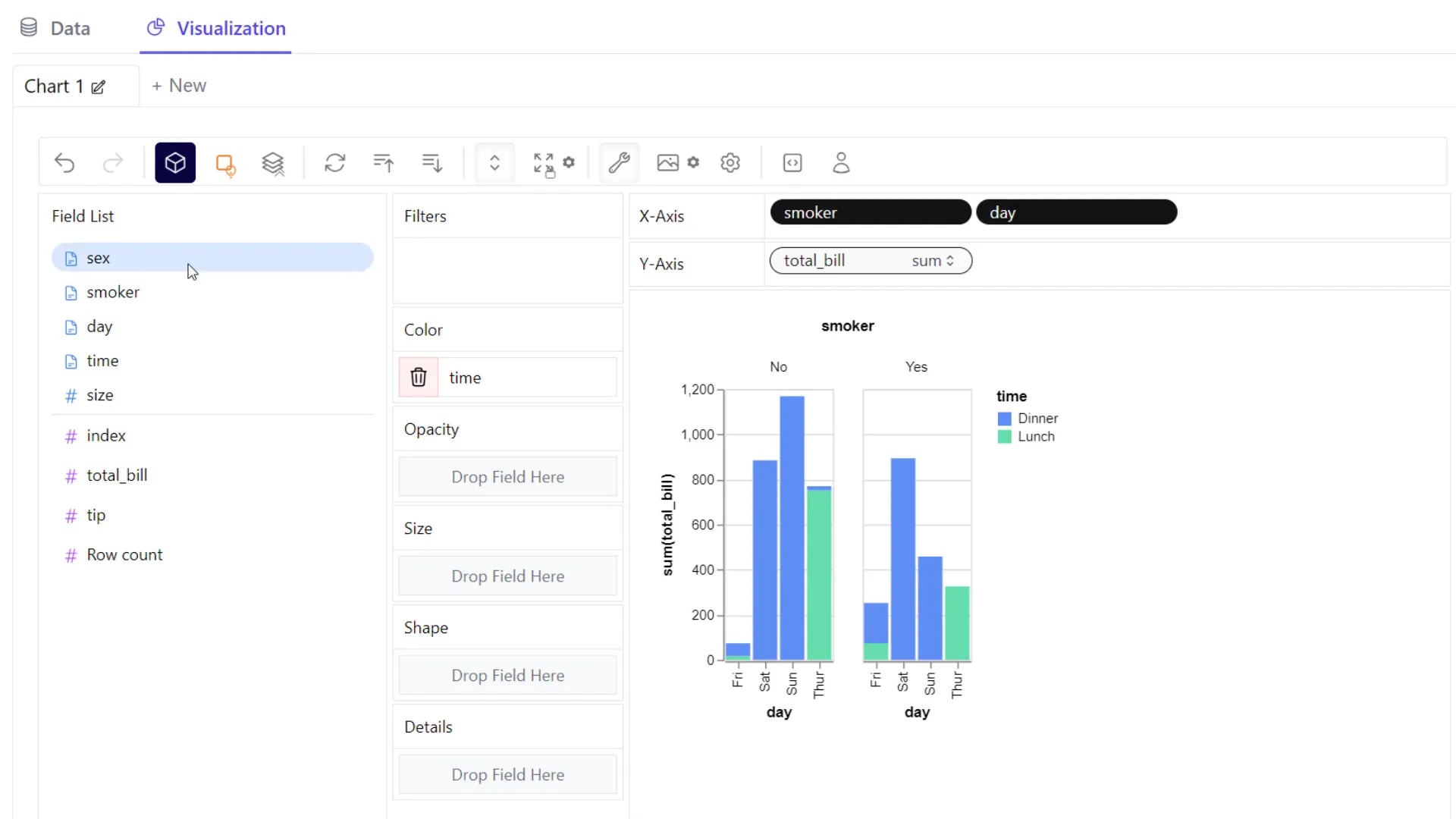
Furthermore, you can filter your data. If you want to analyze only male customers, simply drag the gender column to the filter field and select ‘male’. The visualization will update accordingly. To remove the filter later, just drag it out of the filter field.
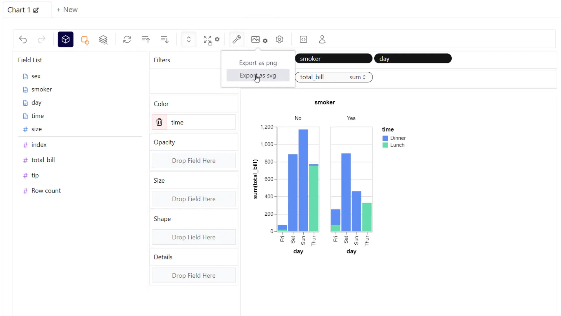
One of the cool features of PyGWalker is the ability to export your charts. For example, you can export to a scalable vector graphic (SVG) format for high-quality visuals.
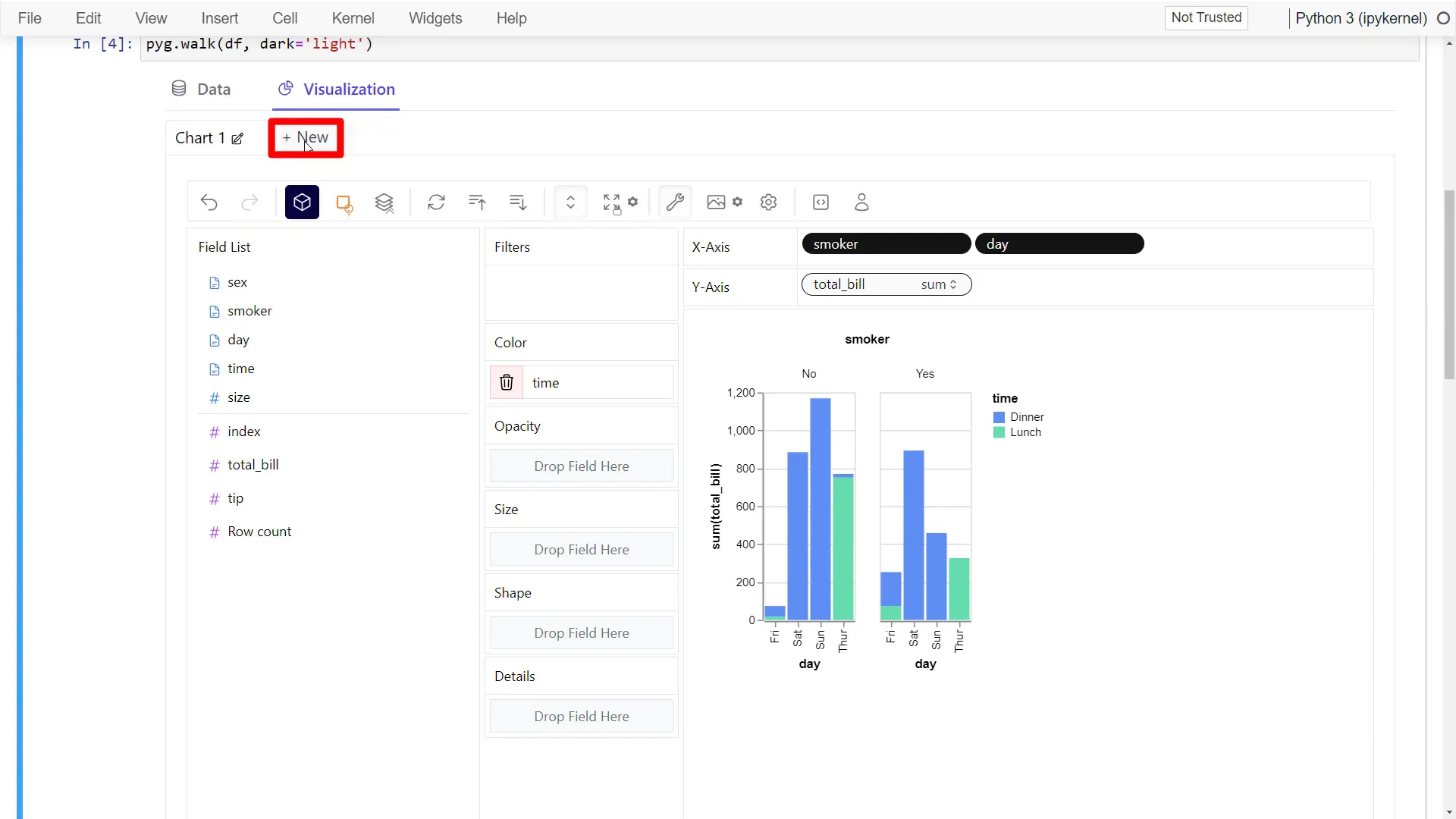
Additionally, you can create new charts by clicking on the options provided. Each new canvas allows for further exploration of your data.
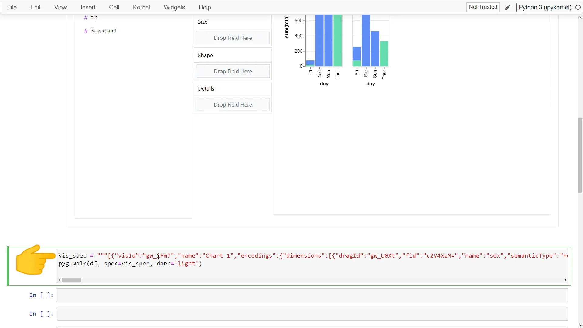
Another important feature is the ability to export your configuration. You can click on the “Export As” button to save your dashboard as code or a configuration file, which you can later use to recreate the same dashboard.
PyGWalker in Streamlit
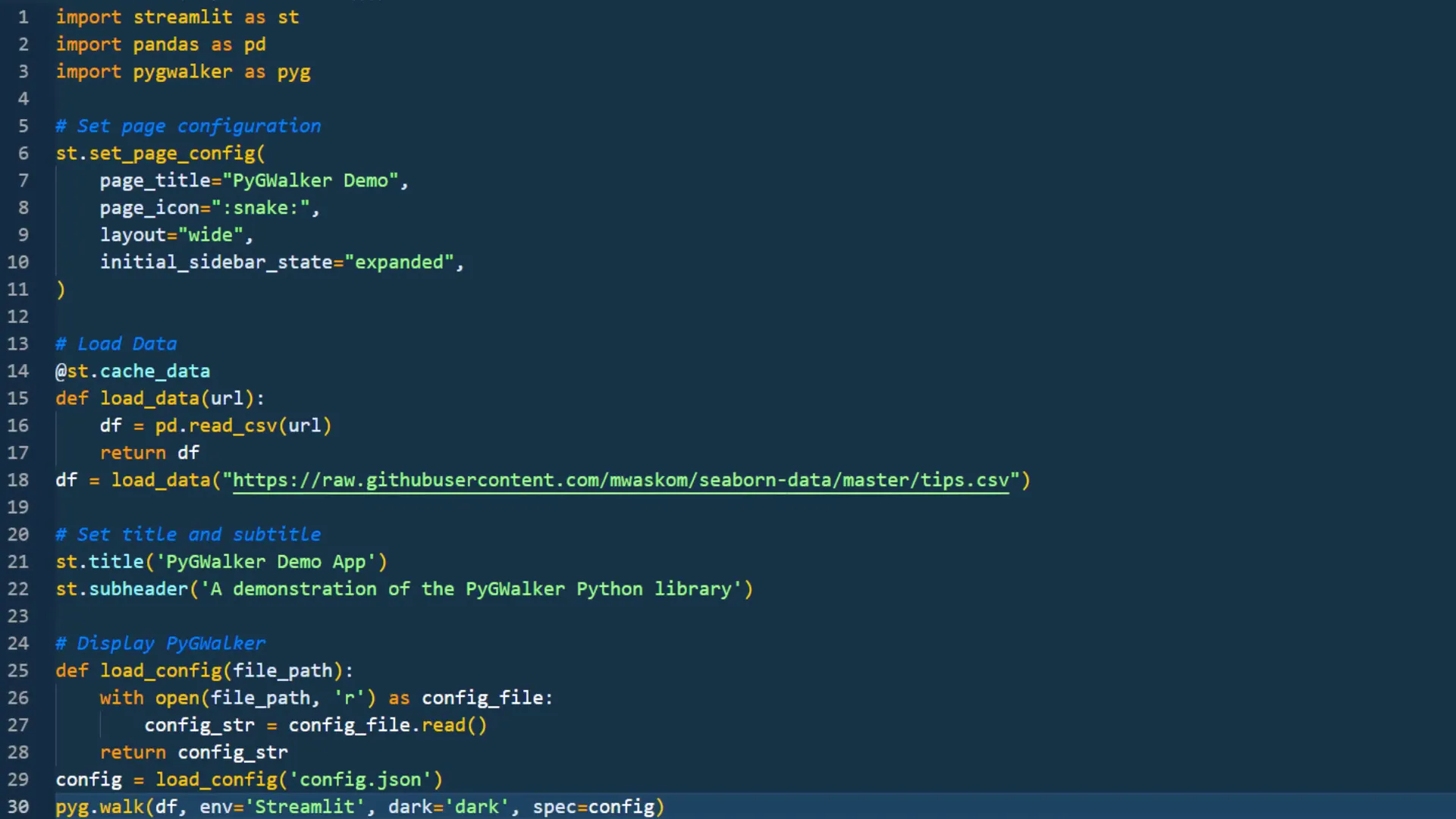
Now, let’s see how to implement PyGWalker in a Streamlit application. After importing Streamlit and setting some basic configurations, you can read the content from your config file and use pyg.walk again in your Streamlit app, specifying the environment as “Streamlit”.
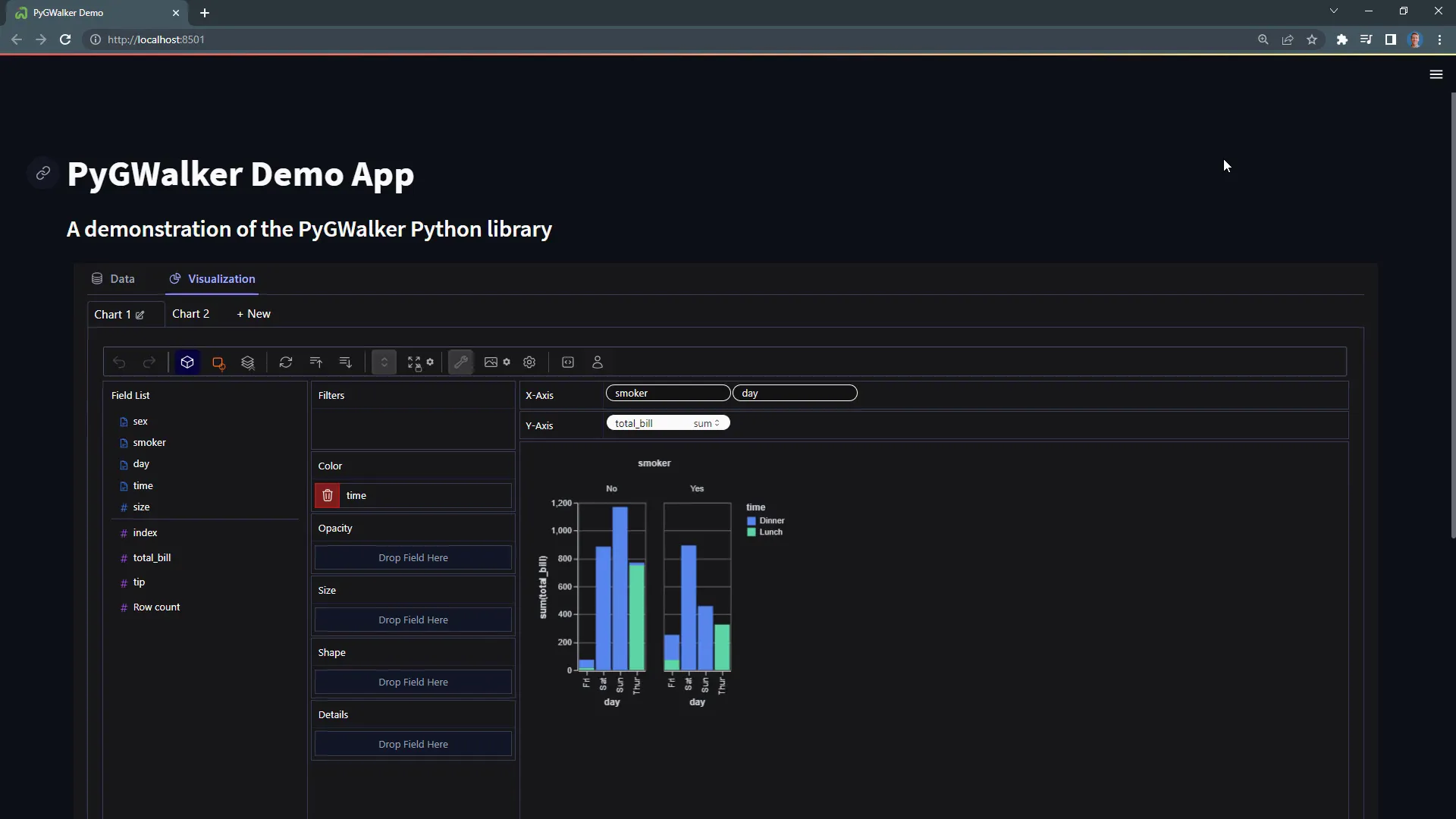
Once you run your Streamlit app with streamlit run app.py, you’ll have the PyGWalker canvas ready for interaction, just like in the Jupyter Notebook.
Outro
That’s a wrap for this tutorial! I encourage you to play around with PyGWalker to discover its many features. I’ll be uploading the Streamlit app and the Jupyter Notebook to my GitHub repository, so you can check the link in the description for access. Thanks for joining me today, and happy data exploring!


