
THIS Python Library Simplifies Working With Pandas

Sketch adds an AI helper to pandas: ask a DataFrame a question in plain English and it answers, or have it write the code for what you want. It sends a summary of your columns rather than the data itself, which matters for privacy.
Installation
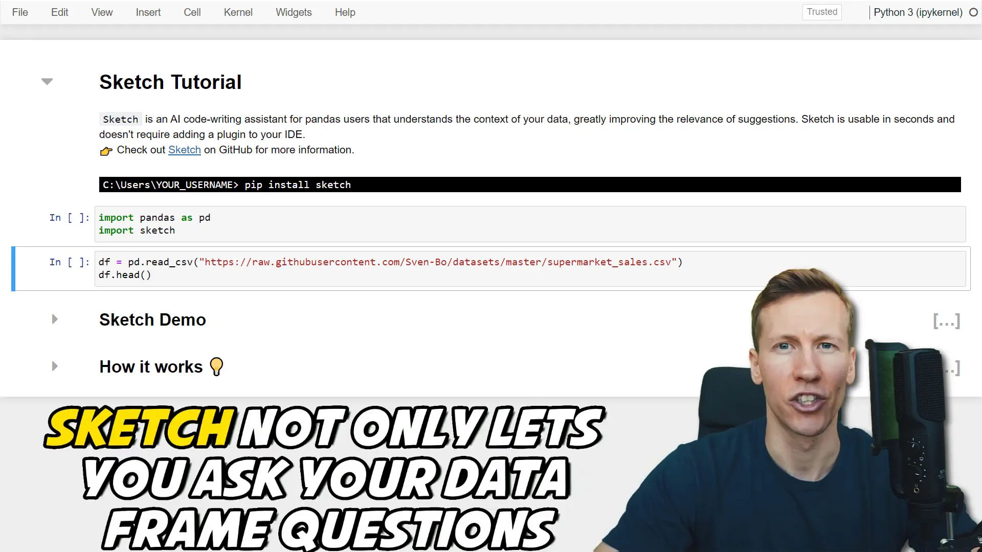
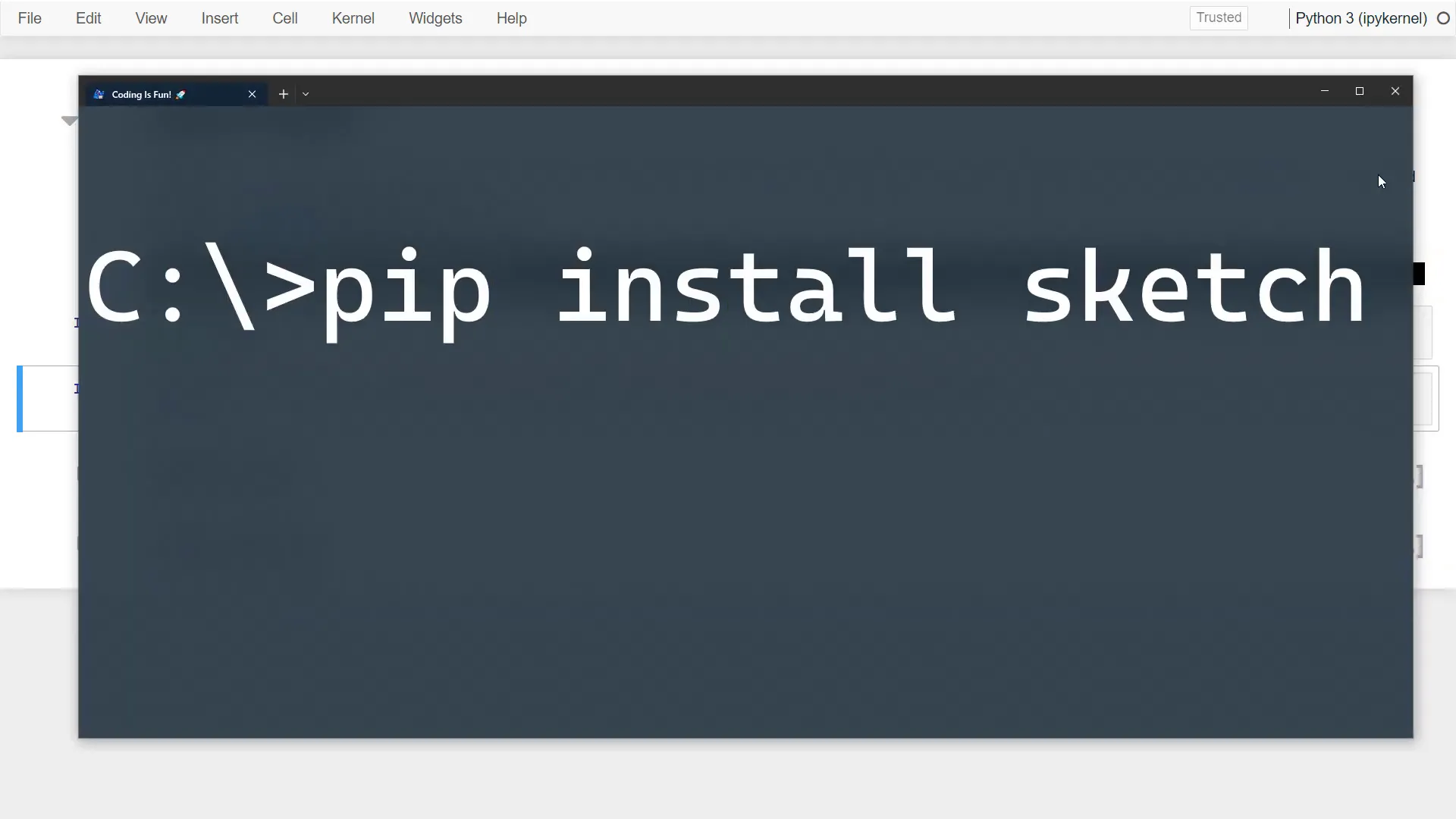
Installing Sketch is straightforward. Simply type pip install sketch in your command prompt or terminal. After installation, you can import it alongside Pandas to get started.
Using Sketch
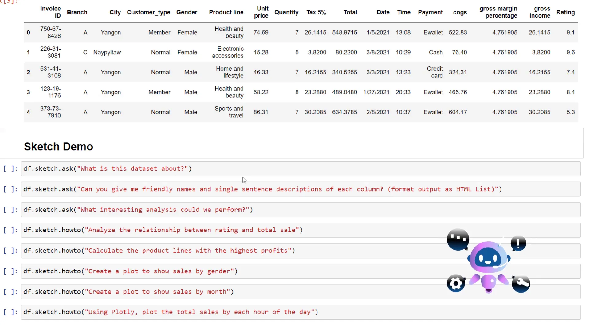
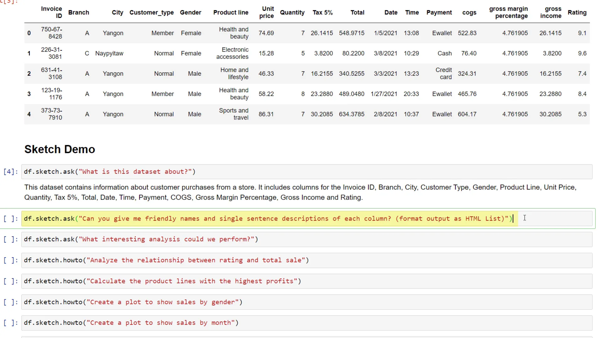
For demonstration purposes, I’ll load some sample data. Instead of explaining the dataset myself, I can leverage Sketch’s capabilities. By using sketch.ask, I can inquire about the dataset. For example, when I asked what the dataset is about, the AI informed me that it details customer purchases and enumerated the columns involved.
Next, I wanted a simple name and a short description for each column, formatted as an HTML list. Just like that, Sketch provided the desired output, which is particularly useful when dealing with column headers that may have abbreviations.
Next, I thought it would be interesting to ask the AI about potential analyses I could perform on the data. Sketch suggested various analyses, including calculations of sales amounts across different branches or products and monthly sales grouping. It even proposed exploring intriguing relationships within the data.
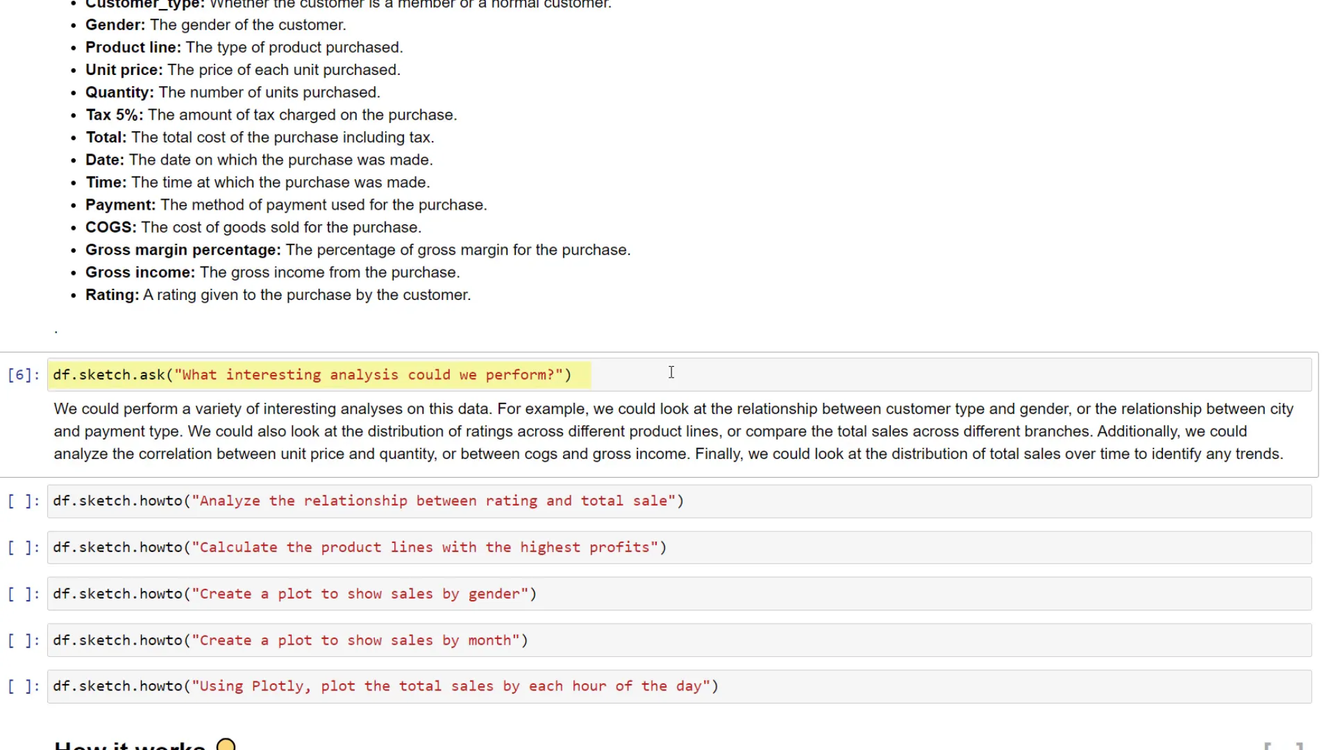
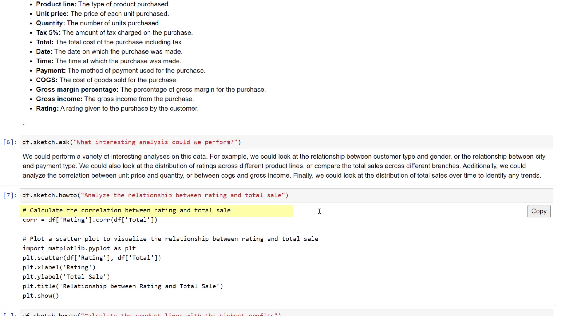
When I wanted to understand how ratings relate to total sales, Sketch provided a suggestion, even though the dataset didn’t explicitly contain a “total sales” column, just one labeled “total.” I copied the suggested code into a new cell, which generated a scatterplot with appropriate comments and labels. The result showed no clear correlation between ratings and total sales.
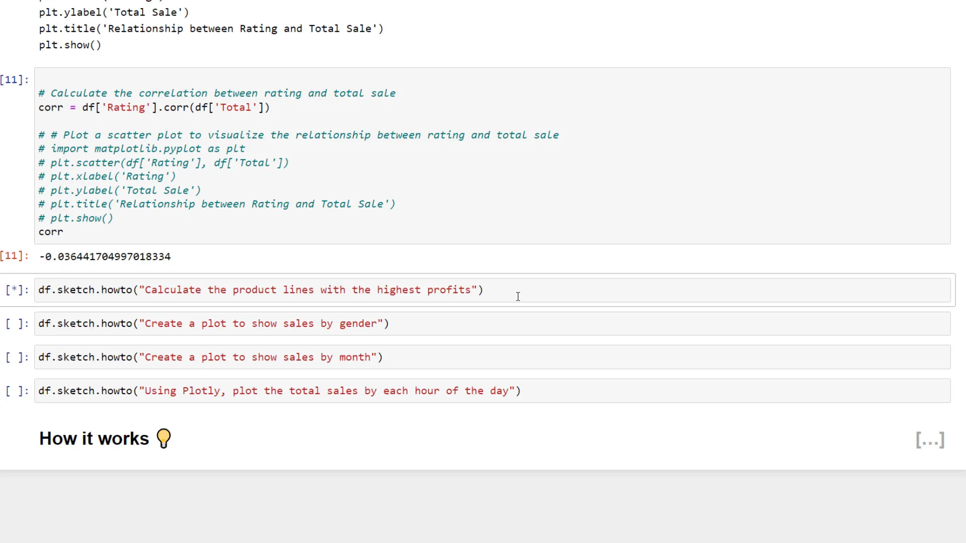
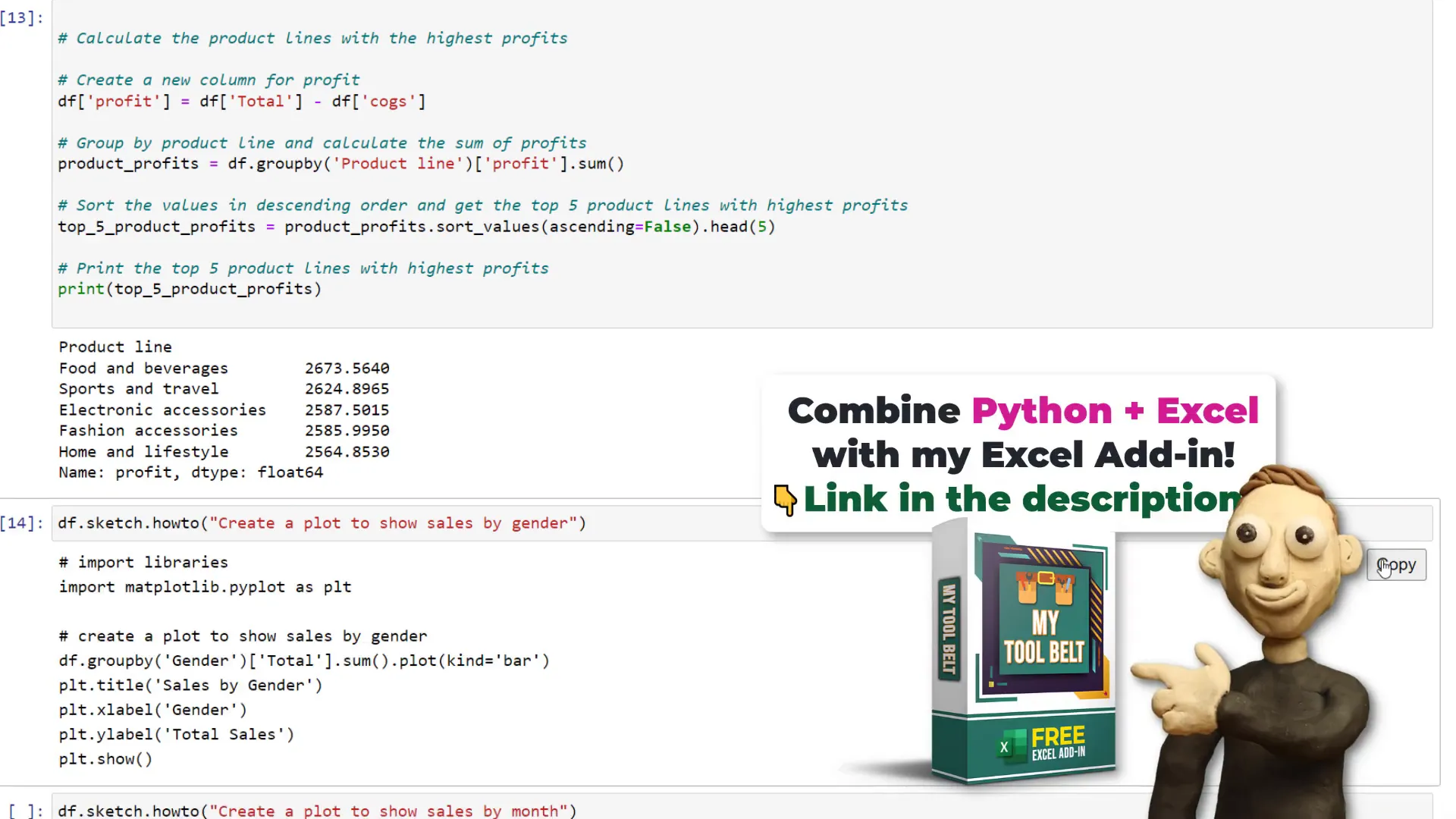
Next, I aimed to identify product lines with the highest profits. Since the dataset lacked a profit column, Sketch facilitated the creation of this column, allowing me to find the top five products with the highest profit amounts.
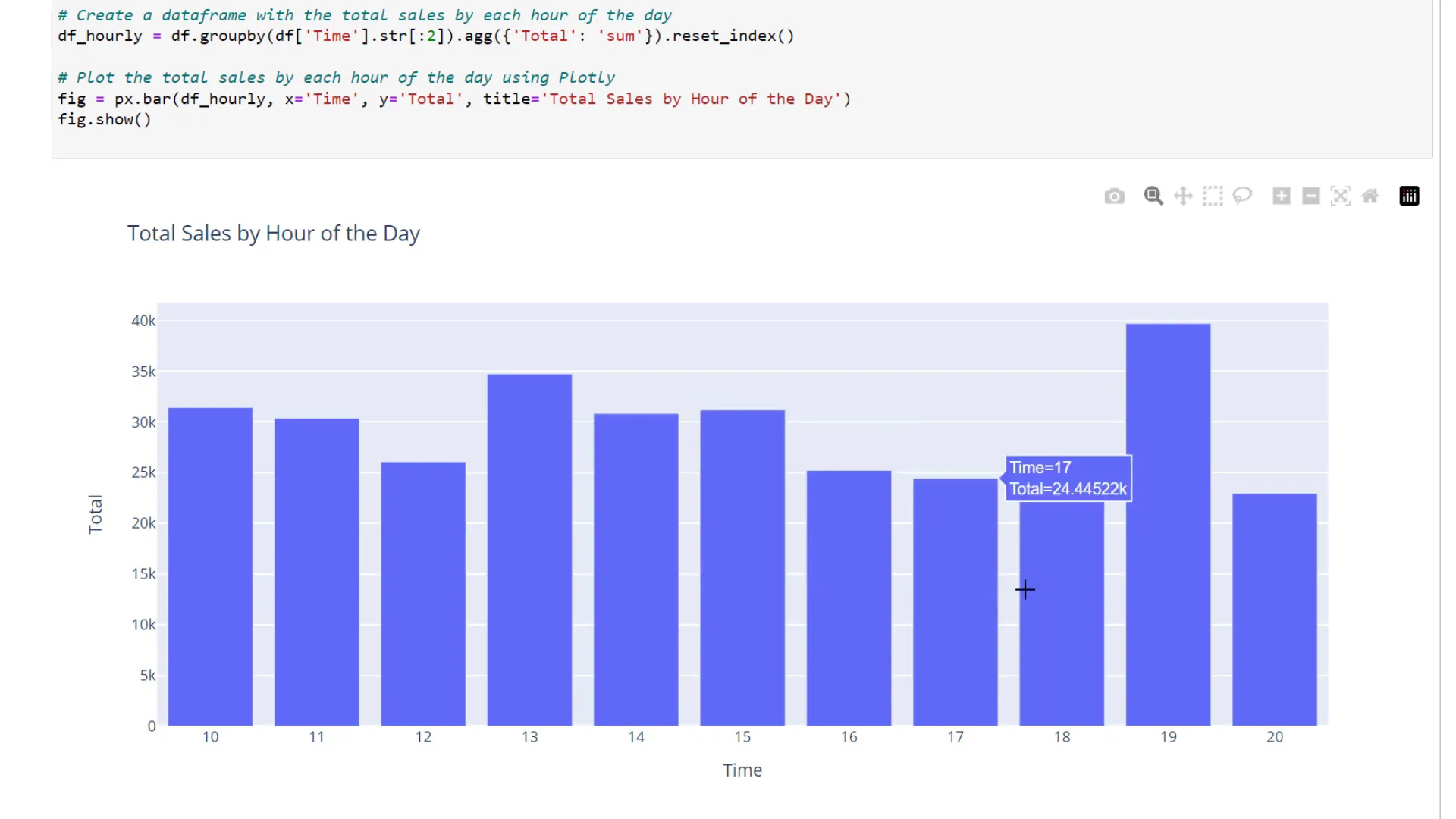
Sketch can also create plots. I asked it to plot total sales by gender, and once again received the Python code needed to execute this task. Additionally, I wanted to visualize sales by month, which required some data wrangling. Sketch provided the necessary steps, and I could specify using Plotly for the visualization. The resulting interactive Plotly chart displayed sales grouped by hour of the day.
How it works
So, how does Sketch function? According to the GitHub repository, Sketch summarizes the data and sends it to a large language model. It’s essential to consider this, especially when handling sensitive data. Unlike PandasAI, which randomizes the data before processing, Sketch does not apply similar measures, so caution is advised when using it with proprietary information.
Conclusion
In conclusion, Sketch is a promising library that simplifies working with Pandas by allowing users to ask questions and receive code snippets for various tasks. Although I didn’t cover all its functionalities, I encourage you to check out the GitHub repository for more details. I’ll also upload this notebook to my GitHub repo for those interested in experimenting with the data. Thanks for reading!