How To Create A Bar Race Animation Using Excel And Python
![How To Create A Bar Race Animation Using Excel And Python | Tutorial [EASY] 💻](https://pythonandvba.com/wp-content/cache/flying-press/6e829b44b13ce10708c4e5dd3b9dab66.jpg)
Introduction
In this post, I will guide you through the process of creating a bar race animation using Excel and Python. This type of visualization is gaining popularity due to its dynamic representation of data over time, making complex information more engaging and easier to understand.
Getting Started
To begin, you’ll need to set up your environment. This involves installing necessary libraries and preparing your data. The bar race animation can be created efficiently using a Python library called bar-chart-race.
Data Preparation
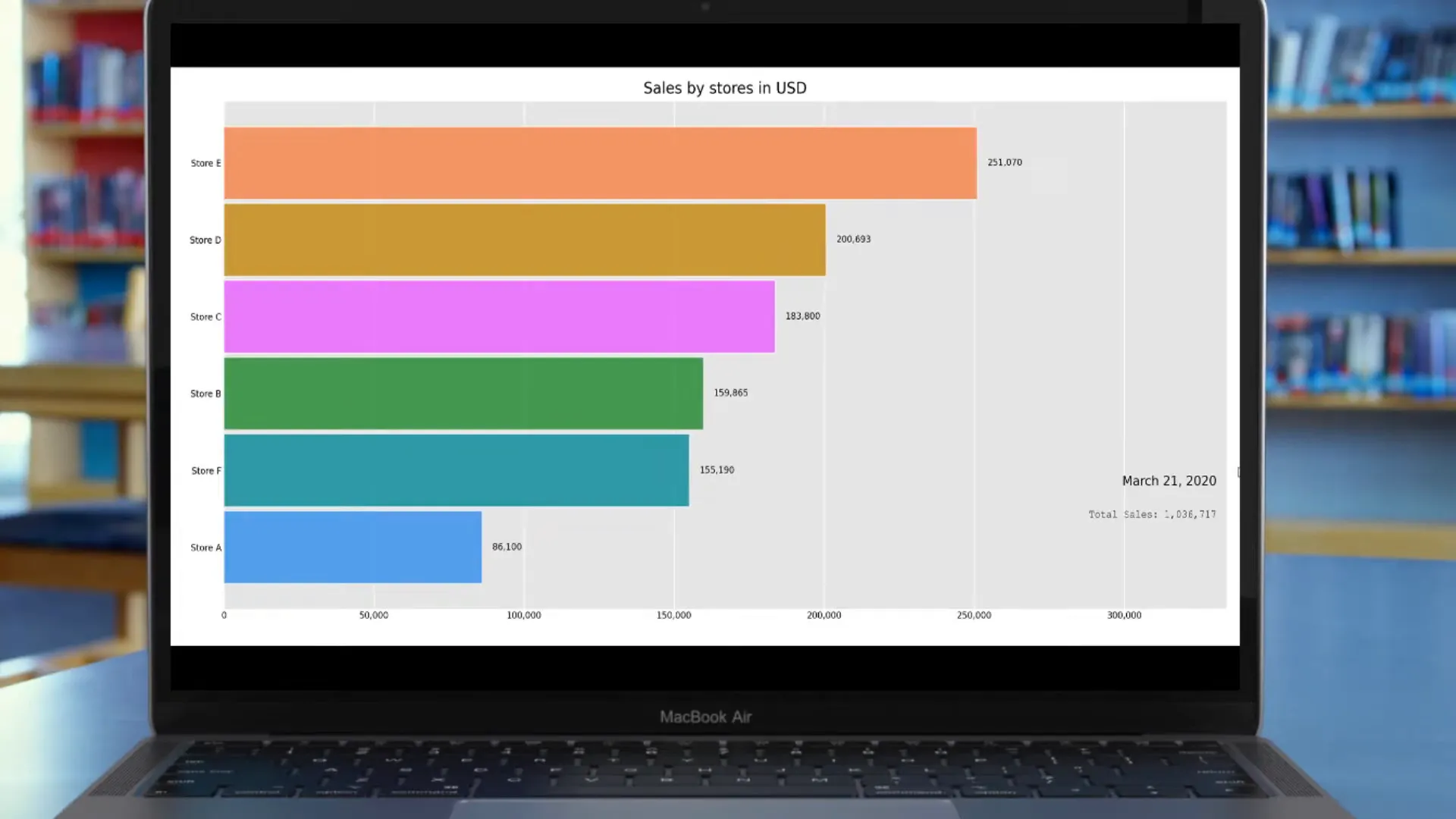
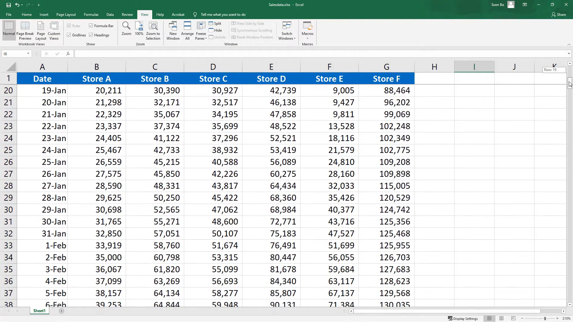
Before diving into coding, ensure your data is well-structured. Typically, your dataset should include a time component along with the values you want to visualize. This allows the animation to reflect changes over time effectively.
Setting Up the Environment
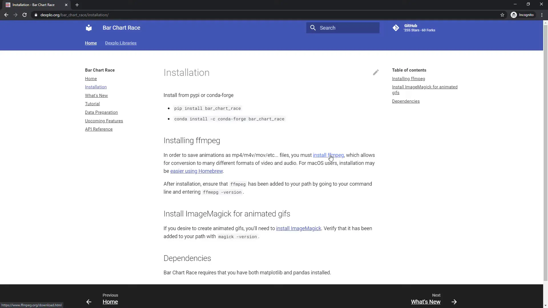
To run the animation smoothly, install the ffmpeg package. This is crucial for exporting your video once the animation is complete. You can find installation guidance on the official ffmpeg website or through various community forums.
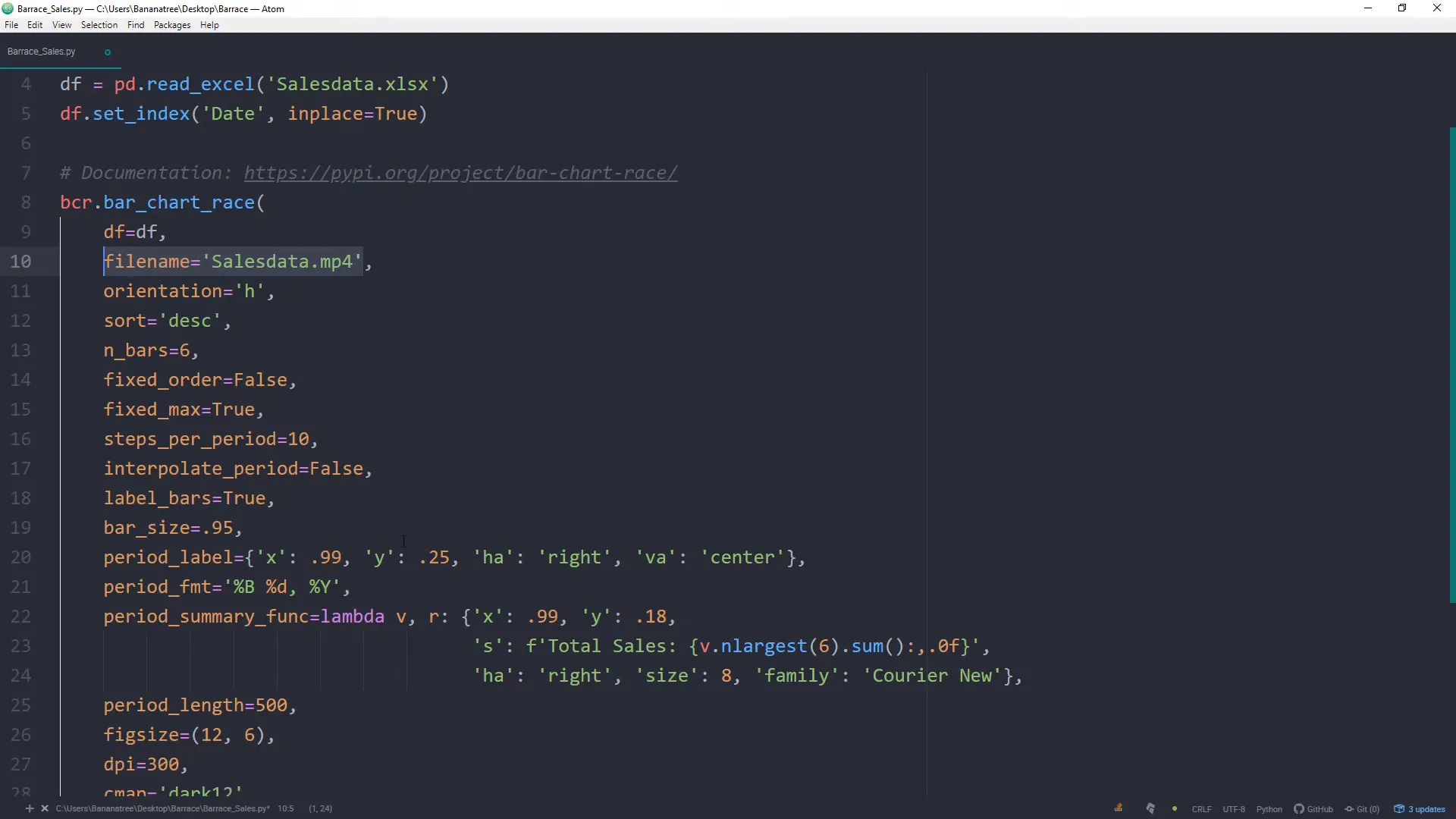
Creating the Animation Script
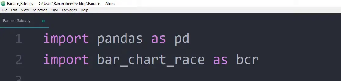
With your environment ready, you can begin writing your Python script. The script should include the necessary imports, data loading, and the logic to create the animated bar chart. The bar-chart-race library simplifies this process significantly.
Running the Script
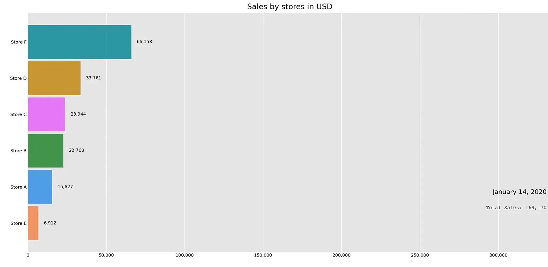
Once your script is set up, run it to generate the animation. The script will take your data and produce a video file that visually represents the changes over time. Make sure to check for any errors during execution and debug as necessary.
Exporting the Video
After the animation is created, export it to a video format. This step is essential for sharing your work with others. You can use ffmpeg for this purpose, ensuring the output video meets your desired specifications.
Conclusion
Creating a bar race animation using Excel and Python is a straightforward process that can yield visually appealing results. By following the steps outlined above, you can effectively showcase your data’s evolution and engage your audience with dynamic visualizations.