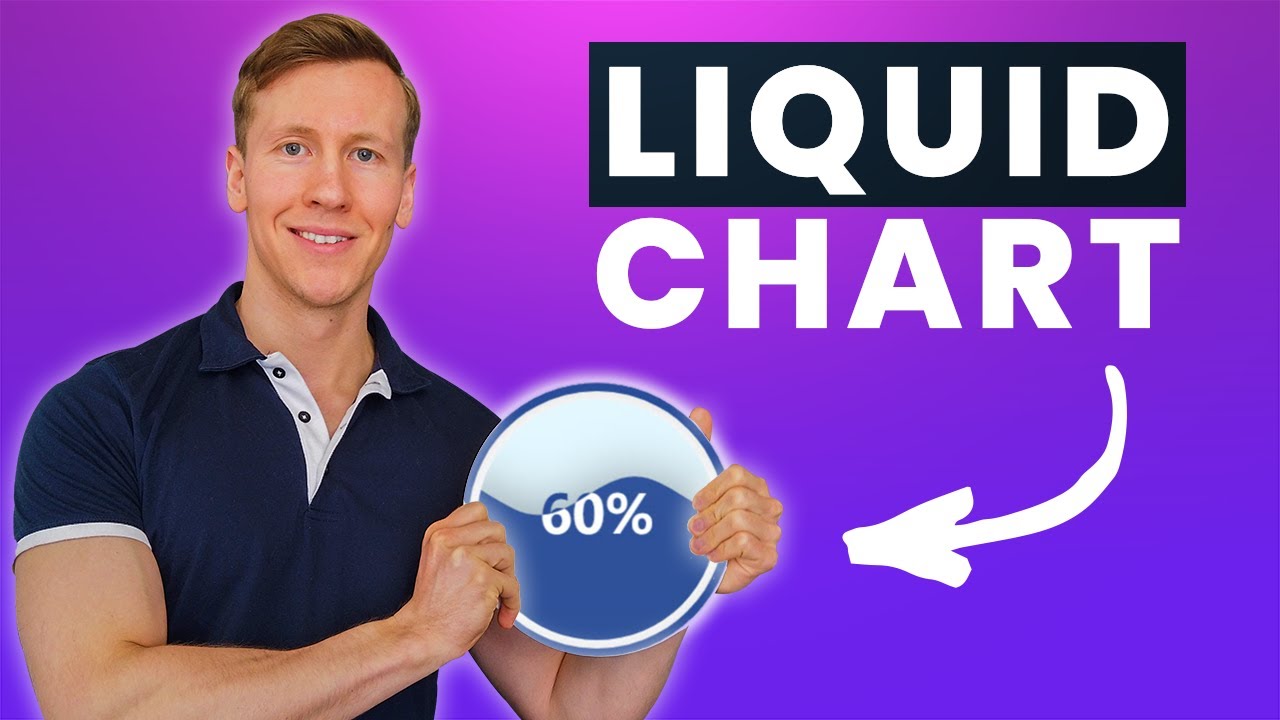
Create A Liquid (Water Polo) Chart From Excel Data in Python | ‘PyeCharts’ Tutorials
Introduction
This tutorial will guide you through the process of transforming values from an Excel worksheet into animated liquid charts using the Python library Pyecharts. Pyecharts renders these liquid charts in an HTML file, making it a great alternative if you’re looking to spice up your presentations or are tired of standard Excel charts.
Getting Started
Before diving in, ensure you have Python installed on your machine. If you haven’t installed Python yet, check out tutorials that guide you through the installation process.
First, you need to install the Pyecharts library. Open your command prompt or terminal and type:
pip install pyechartsNext, you’ll also need the Pandas library to retrieve values from Excel. If you haven’t installed Pandas yet, you can do so with the command:
pip install pandasCreating Your First Liquid Chart
Now that you have the necessary libraries installed, let’s create a simple liquid chart. Start by importing the required libraries:
from pyecharts.charts import Liquid
from pyecharts import options as opts
Next, initialize the liquid chart:
liquid_chart = Liquid()
liquid_chart.add("Customer Satisfaction", [0.95])
To set a title for your chart, you can use the following code:
liquid_chart.set_global_opts(title_opts=opts.TitleOpts(title="Customer Satisfaction"))Finally, render your chart to an HTML file:
liquid_chart.render("basic_example.html")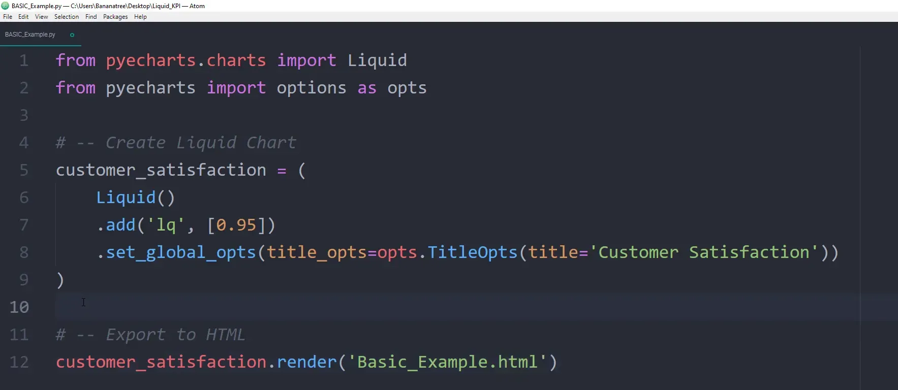
Adjusting Chart Position
After running your script, you may notice that the chart and title are not aligned. You can adjust the position using the center argument in the add method:
liquid_chart.add("Customer Satisfaction", [0.95], center=["15%", "35%"])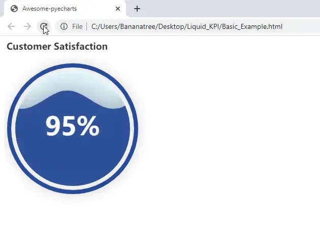
Fetching Data from Excel
Instead of hardcoding values, it’s better to fetch them directly from Excel. Create an Excel file containing your data, and use the Pandas library to read it:
import pandas as pd
df = pd.read_excel("data.xlsx", sheet_name="KPI")
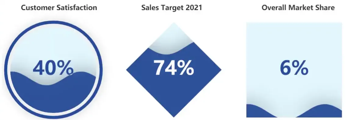
Creating Multiple Liquid Charts
You can create multiple liquid charts on the same page by importing the Grid class from Pyecharts:
from pyecharts.charts import GridNext, create additional charts for “Sales Target” and “Market Share,” ensuring the column names in your Excel file match exactly. Now, combine these charts using the Grid object. Finally, render the grid to an HTML file: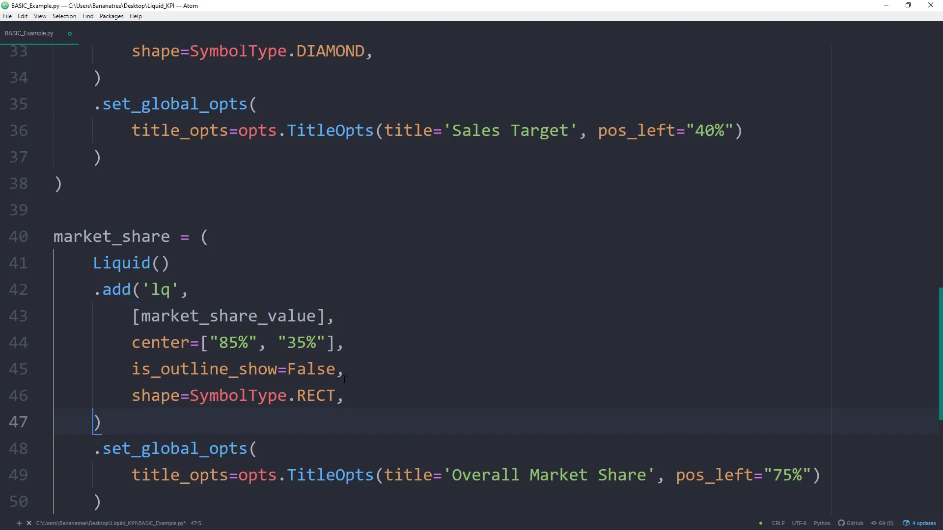
Final Touches
After rendering the dashboard, you may want to adjust title positions for each chart. You can do this by modifying the title options for each chart before rendering:
liquid_chart_sales.set_global_opts(title_opts=opts.TitleOpts(pos_left="40%"))
liquid_chart_market.set_global_opts(title_opts=opts.TitleOpts(pos_left="75%"))
You can also customize the chart shapes and styles. For example, set the outline to false and change the shape for the sales target:
liquid_chart_sales.add("Sales Target", [df["Sales Target"].iloc[0]], center=["50%", "35%"], is_outline_show=False, shape=SymbolType.DIAMOND)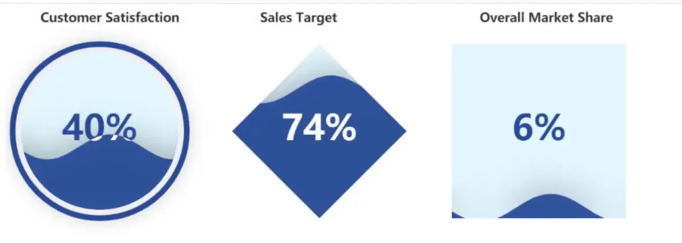
Conclusion
In this tutorial, you learned how to create animated liquid charts using the Pyecharts library, fetch data from Excel, and display multiple charts in a single dashboard. This approach not only enhances your presentations but also allows for dynamic data visualization.
Further Links
from pyecharts.charts import Liquid, Grid
from pyecharts import options as opts
from pyecharts.globals import SymbolType
import pandas as pd
# GitHub: https://github.com/pyecharts/pyecharts/blob/master/README.en.md
# Documentation: https://pyecharts.org/#/en-us/
# Gallery: https://gallery.pyecharts.org/#/Liquid/multiple_liquid
EXCEL_FILE = 'data.xlsx'
# -- Get values from Excel
kpi = pd.read_excel(EXCEL_FILE, sheet_name='KPI')
customer_satisfaction_value = kpi['Customer Satisfaction'].iloc[0]
sales_target_value = kpi["Sales Target"].iloc[0]
market_share_value = kpi["Market Share"].iloc[0]
# -- Create Liquid Chart
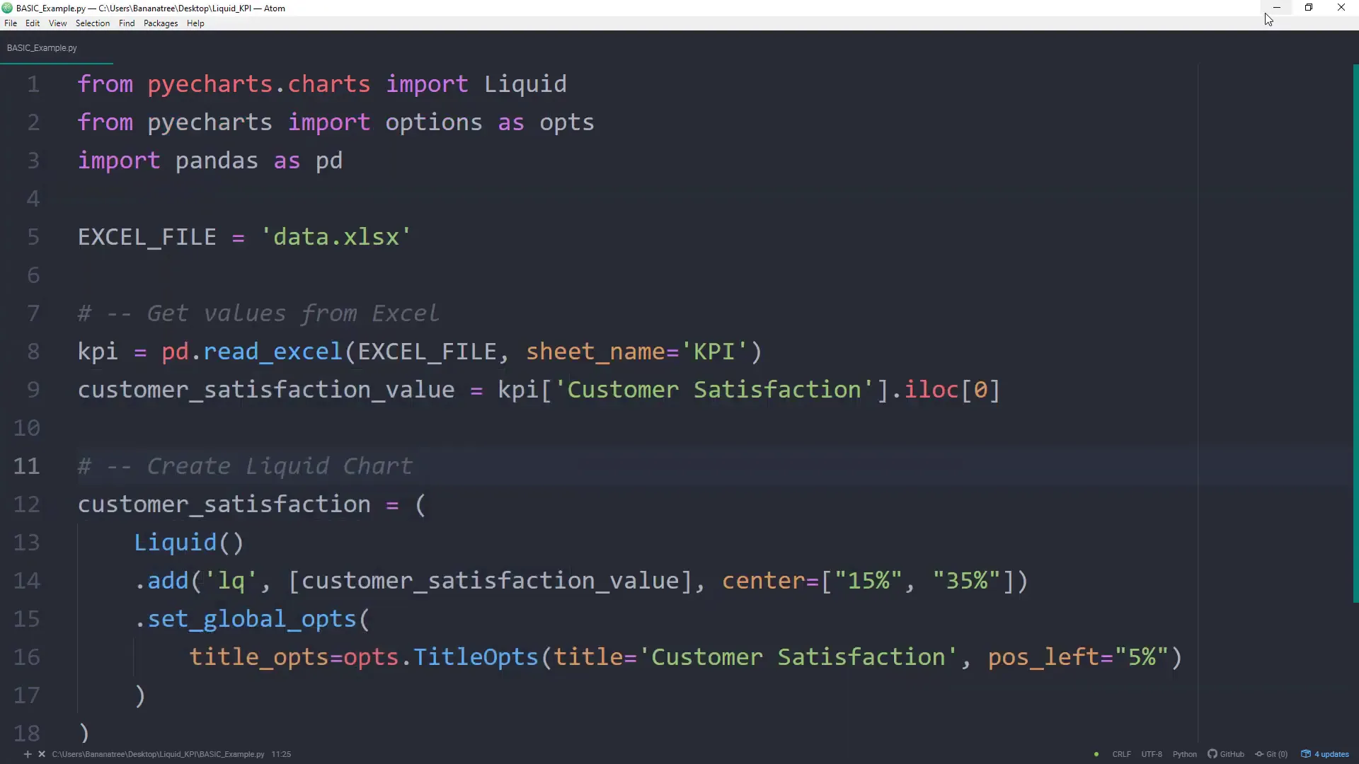
customer_satisfaction = (
Liquid()
.add('lq', [customer_satisfaction_value], center=["15%", "35%"])
.set_global_opts(
title_opts=opts.TitleOpts(title='Customer Satisfaction', pos_left="5%")
)
)
sales_target = (
Liquid()
.add('lq',
[sales_target_value],
center=["50%", "35%"],
is_outline_show=False,
shape=SymbolType.DIAMOND,
)
.set_global_opts(
title_opts=opts.TitleOpts(title='Sales Target 2021', pos_left="40%")
)
)
market_share = (
Liquid()
.add('lq',
[market_share_value],
center=["85%", "35%"],
is_outline_show=False,
shape=SymbolType.RECT,
)
.set_global_opts(
title_opts=opts.TitleOpts(title='Overall Market Share', pos_left="75%")
)
)
grid = (
Grid()
.add(customer_satisfaction, grid_opts=opts.GridOpts())
.add(sales_target, grid_opts=opts.GridOpts())
.add(market_share, grid_opts=opts.GridOpts())
)
# -- Export to HTML
grid.render('KPI_Dashboard.html')