FREE Python AI Tool That Creates Charts From Your Data 🤯
Introduction to Data Formulator
I recently came across a neat open source project by Microsoft (Data Formulator) and decided to try it out. In this post I will walk you through how to Create charts using AI on your own machine, explain why it might replace some of your lightweight BI workflows, and show step by step how to get started.
Why this matters
Imagine you have a spreadsheet with dozens of columns and you just want a quick chart or a new calculated column, like profit, without writing formulas or SQL. That is the exact pain point this tool solves. You can either drag and drop like in Power BI or type a plain English instruction and let the AI figure out which fields to use and how to calculate them. If you want to Create charts using AI without sending your data to the cloud, this package runs locally and supports multiple models.
Quick tour of the interface
The interface is familiar if you have used other BI tools. On startup you pick a data source, upload a file, paste data from the clipboard, or connect to a database. Below is a view of the initial screen where you choose your source and example datasets.
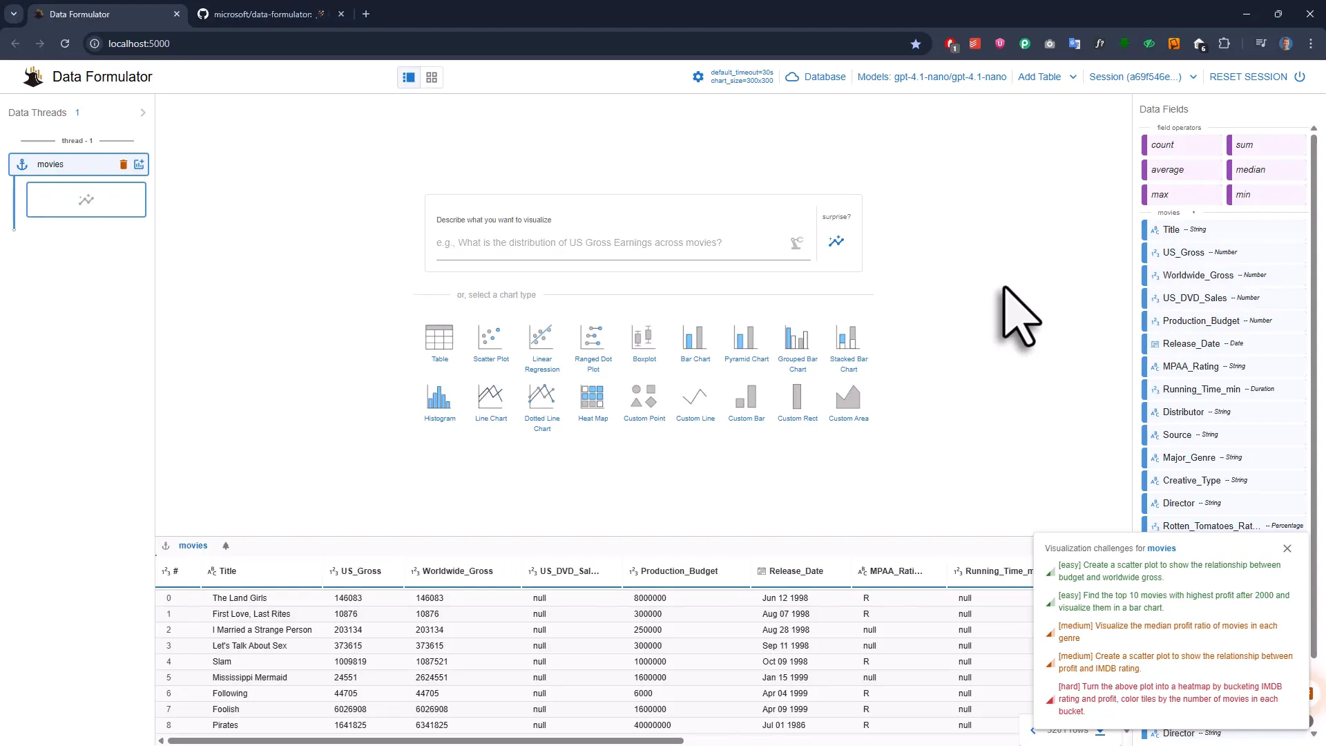
There are built in example datasets. I used the movies example for the demos. Once loaded, the table appears at the bottom, fields are listed on the right, and the center area is where you type a prompt or select a chart type.
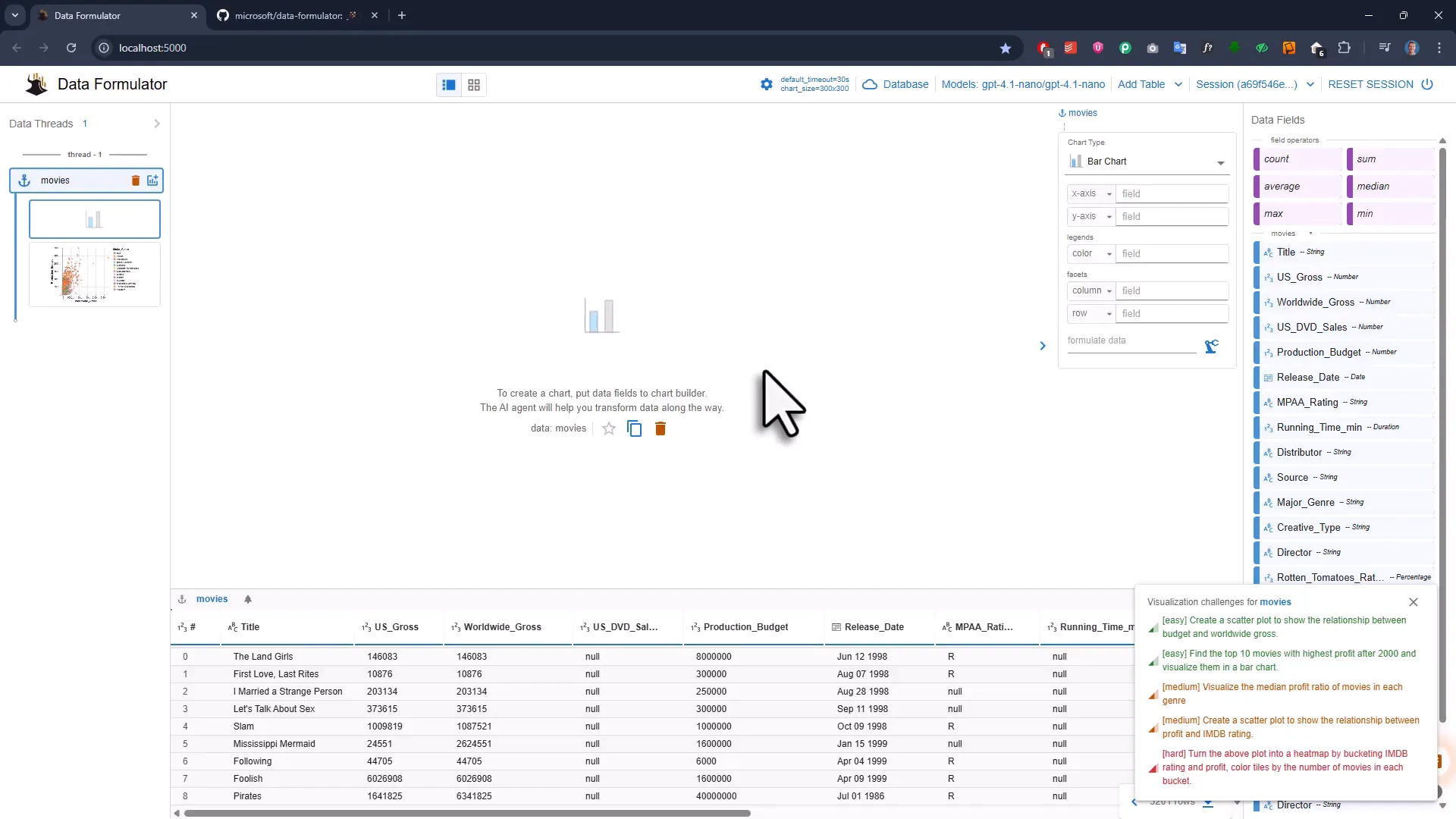
Make a scatter plot in seconds
Want a quick scatter plot showing production budget versus worldwide gross? Pick scatter, drag production budget to the x axis and worldwide gross to the y axis, and the plot appears instantly. Small touches like coloring by a categorical field are available too.
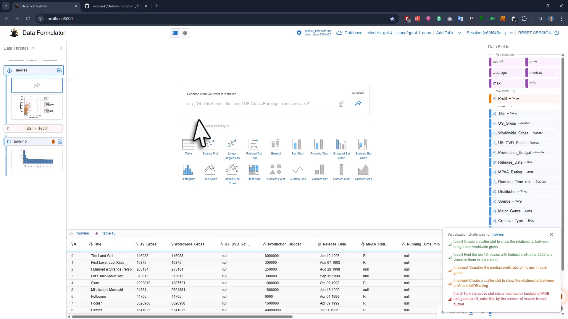
AI that creates columns on the fly
Here is where the workflow gets powerful. The dataset did not include a profit column, only turnover and production budget. Instead of creating a new column manually, I typed the word profit into the y axis and clicked the AI icon. The tool created a profit field, added it to the dataset, and produced the chart.
This is the exact reason you can confidently Create charts using AI. The AI will infer the calculation, generate the new field, and make it available for reuse in later charts.
Type what you want in plain English
If clicking and dragging is not your style, you can simply type a prompt such as “visualize the median profit of movies in each genre” and the tool generates the required calculated columns and chart for you. It is surprisingly fast and convenient when you just want insights and not to fight with formulas.
You can also export the chart as an image, inspect the underlying data source JSON, and open the dataset in an online editor for further tweaks.
Surprise insights and exploration
If you need inspiration, hit the surprise button and the AI will propose charts and relationships to explore, for example the link between production budget and box office success. It is a nice way to get a few angles without thinking too hard.
How to get started locally
Here is the short recipe to run it on your computer. The project is on GitHub with an MIT license so it is fine for commercial use. The basic steps are:
- Install the Python package with pip from the Data Formulator GitHub repo.
- Optionally create and activate a virtual environment.
- Run data formulator in your terminal to start a local server (default port 5000).
When you start a fresh session you will see a configuration screen to connect an AI provider. You can use open source models such as Olama or commercial ones like OpenAI by entering provider, model name and API key. You can swap models depending on the task.
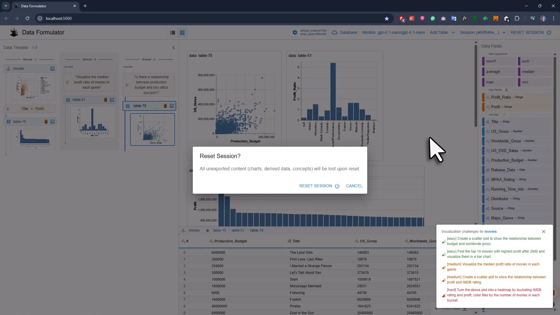
Organize your analysis
The left side of the app shows your data threads. Every new table, subset and chart is tracked so you can build a data story step by step. Subsets created by AI can be reused, renamed, exported, or imported back later. You can also connect to external databases like MySQL and Postgres through a data loader.
When to use this tool
- Rapid exploration and prototyping of data visualizations.
- Generating derived fields without manual calculations.
- Local workflows where you prefer not to upload data to external services.
- Teams who want a quick, MIT licensed option for lightweight BI tasks.
Wrap up
If you like the idea of being able to Create charts using AI quickly and locally, this tool is worth a look. It blends drag and drop familiarity with natural language convenience and gives you freedom to pick the AI model that fits your needs. Try it with a small dataset first and let the surprise button nudge you toward interesting questions. Think of it as a helpful data sidekick that does the heavy lifting while you focus on the story.