Create Gauge & Bullet Charts In 3 Seconds Using Excel and Python 🐍 | Free Excel Template
Introduction
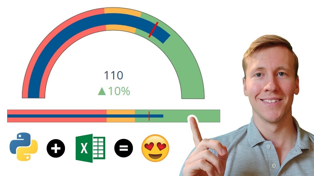
In this post, I’ll walk you through an exciting tool I’ve developed that allows you to easily generate bullet and gauge charts in Excel. This tool leverages Python to create stunning visualizations that can be saved in various formats, including HTML, images, or PDF. Let’s dive into the details of how this works!
Getting Started
Generating a chart is as simple as clicking a button. Once you do, the Python script executes and creates your desired chart type. Switching between a gauge and a bullet chart is equally straightforward; you just need to adjust the shape type in the settings.
Customization Options
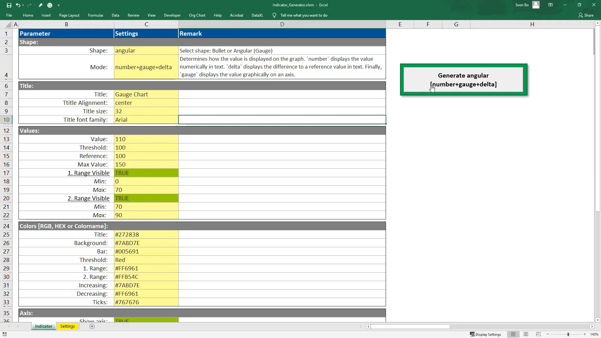
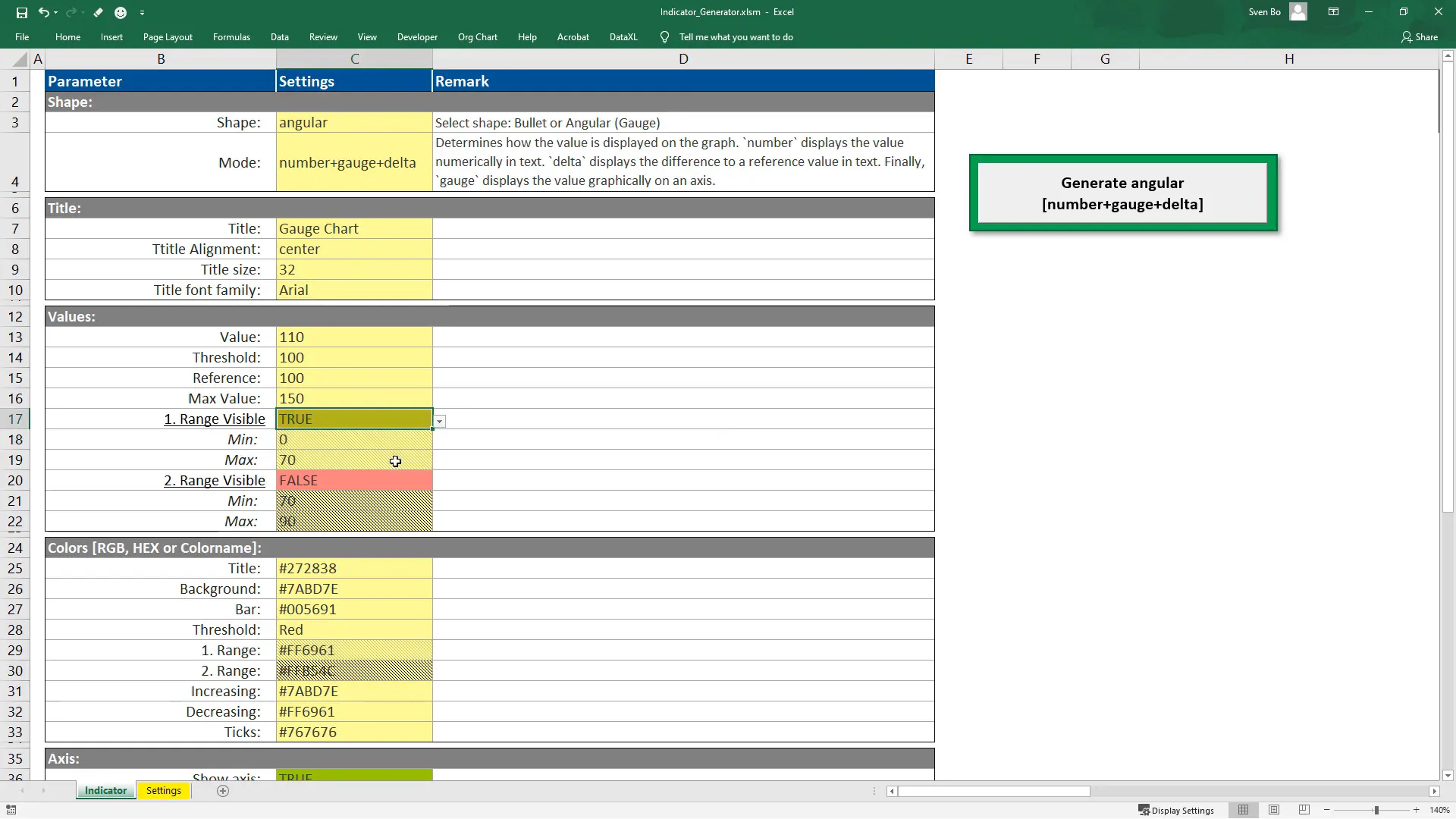
Customization is a key feature of this tool. For demonstration, I will focus on the gauge chart, but all settings apply to bullet charts as well. Here’s what you can customize:
Title Settings
You can set the title, adjust its alignment, size, and font family to match your preferences.
Value Ranges
The value section is crucial as it allows you to define various ranges. You can specify the inner bar’s value, the threshold, the maximum value, and a reference point for displaying data. If you prefer not to display any data, there’s an option to change the mode accordingly.
Color Customization
All colors can be adjusted using RGB codes, hexadecimal values, or by specifying color names like red, green, blue, etc. This flexibility ensures your charts can match the overall theme of your presentation or report.
Axis Settings
In the axis settings, you can customize tick marks and choose to hide the axis entirely if that suits your design better.
Additional Settings
There are also several additional settings, including font size, figure height, threshold width, and more. You can specify the output file name and choose the desired format from a dropdown menu.
Error Handling
The tool is designed to guide you. If you input an unexpected value, such as an incorrect hexadecimal code, a message box will alert you to the error, and an error log file will be created for your reference. This feature allows for a smoother user experience.
Using Python and Plotly
To utilize this tool, you need to have Python installed on your machine. Since you might be working with different Python environments, you’ll need to input the Python path in the designated cell. If you’re unsure how to find this path, simply type where python in your command prompt.
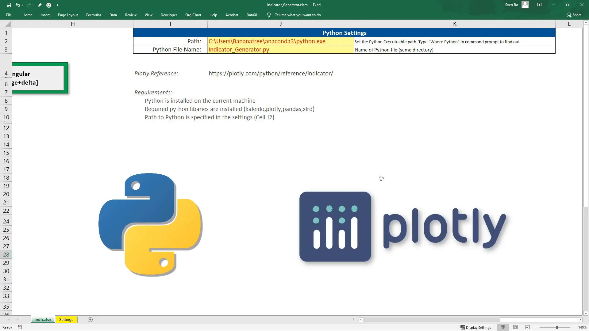
Make sure to install the required libraries, which are listed in a requirements.txt file. You can install them using pip, for example, pip install plotly.
Behind the Scenes
The Python file that generates the charts is executed via VBA. It stores the values of the settings in separate variables using the Pandas library, which are then passed to the Plotly chart as arguments. An exception handler at the bottom of the script ensures that any errors are logged appropriately.
Conclusion
This tool is a fantastic way to create visually appealing bullet and gauge charts quickly and efficiently. I encourage you to experiment with the settings to see what works best for your needs. If you encounter any issues or have questions, feel free to reach out in the comments section. I hope you find this tool as useful as I do!