How To Create A Treemap & Sunburst Chart In Python Using Plotly & Excel
![How To Create A Treemap & Sunburst Chart In Python Using Plotly & Excel | Tutorial [EASY] 💻](https://pythonandvba.com/wp-content/cache/flying-press/d87a86b6f40ce3ad8057aa4d93b7a5f5.jpg)
Introduction
In this tutorial, I will guide you through the process of creating a Treemap and Sunburst chart using the Plotly library in Python. The data for this project comes directly from an Excel file, allowing for dynamic updates as data changes.
Understanding the Charts
The Treemap visually represents countries based on their turnover, with container sizes indicating revenue. Additionally, the colors provide insight into profitability, where red indicates low margins and green signifies high margins. Users can click on containers or hover over them for more detailed information.
Setting Up Your Environment
Before diving into the code, ensure you have Python installed on your machine. If you haven’t installed it yet, there are numerous tutorials available online to assist you.
Next, you will need to install the required libraries:
- Open Command Prompt.
- Type the following commands to install the necessary libraries:
pip install plotly_expresspip install plotlypip install pandas
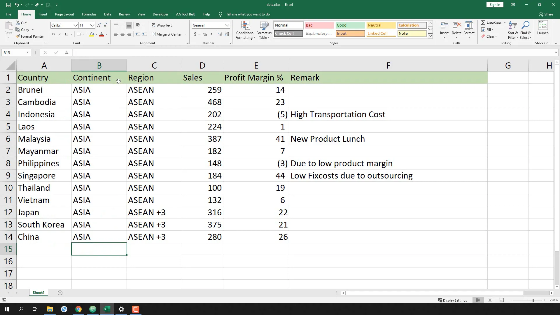
Preparing the Excel Data
Before writing the script, let’s take a quick look at the prepared Excel file. It contains an overview of sales and profit margins by country, region, and continent.
Creating the Python Script
I will create a new Python file named treemap.py. The first step is to import the libraries:
import plotly.express as px
import pandas as pd
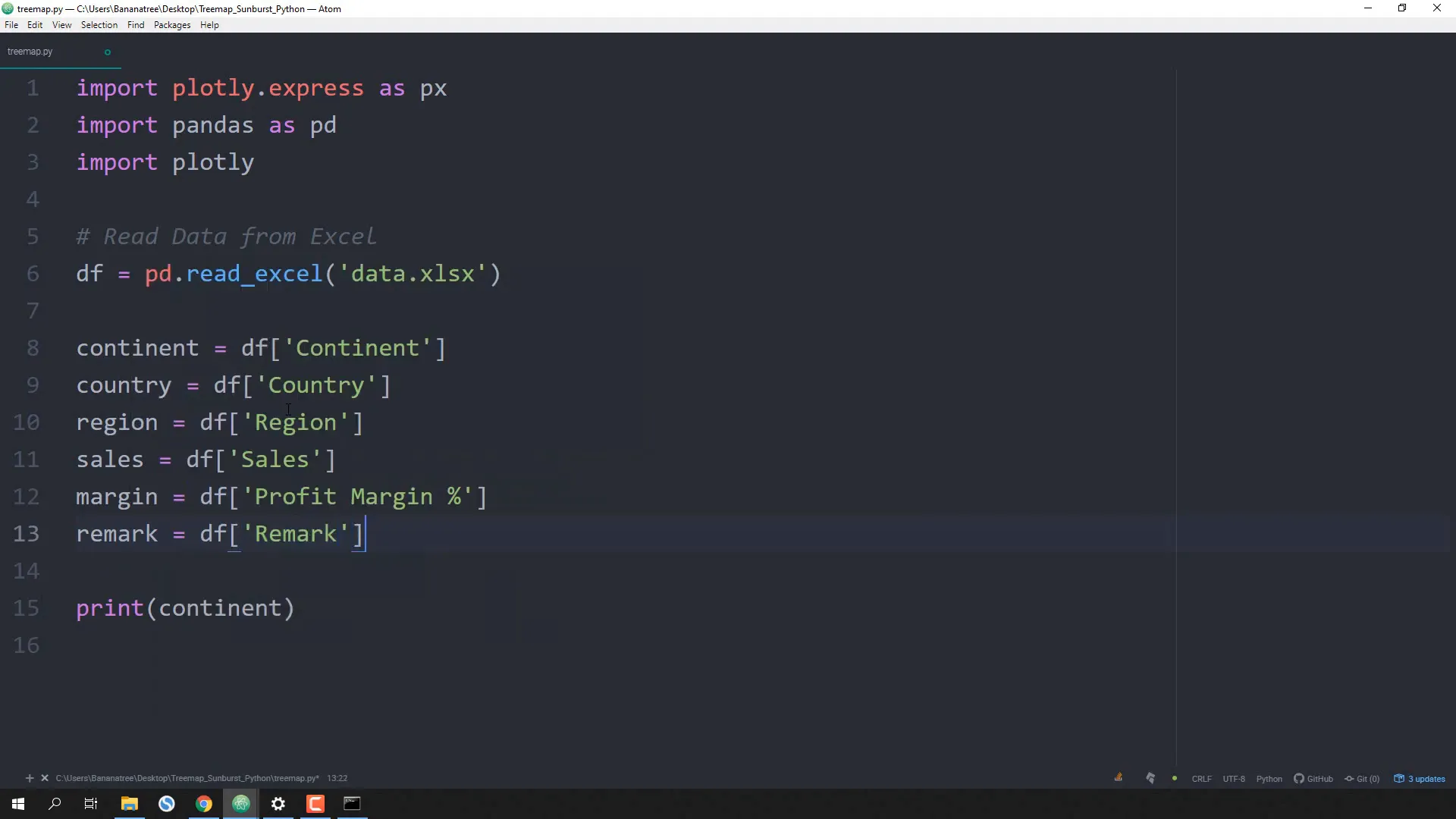
Next, I will read the data from the Excel file and store it in a DataFrame variable named df:
df = pd.read_excel('data.xlsx')
Extracting Data for the Chart
Now, I will extract values from each column into separate variables:
continent = df['continent']
country = df['country']
region = df['region']
sales = df['sales']
margin = df['margin']
remark = df['remark']
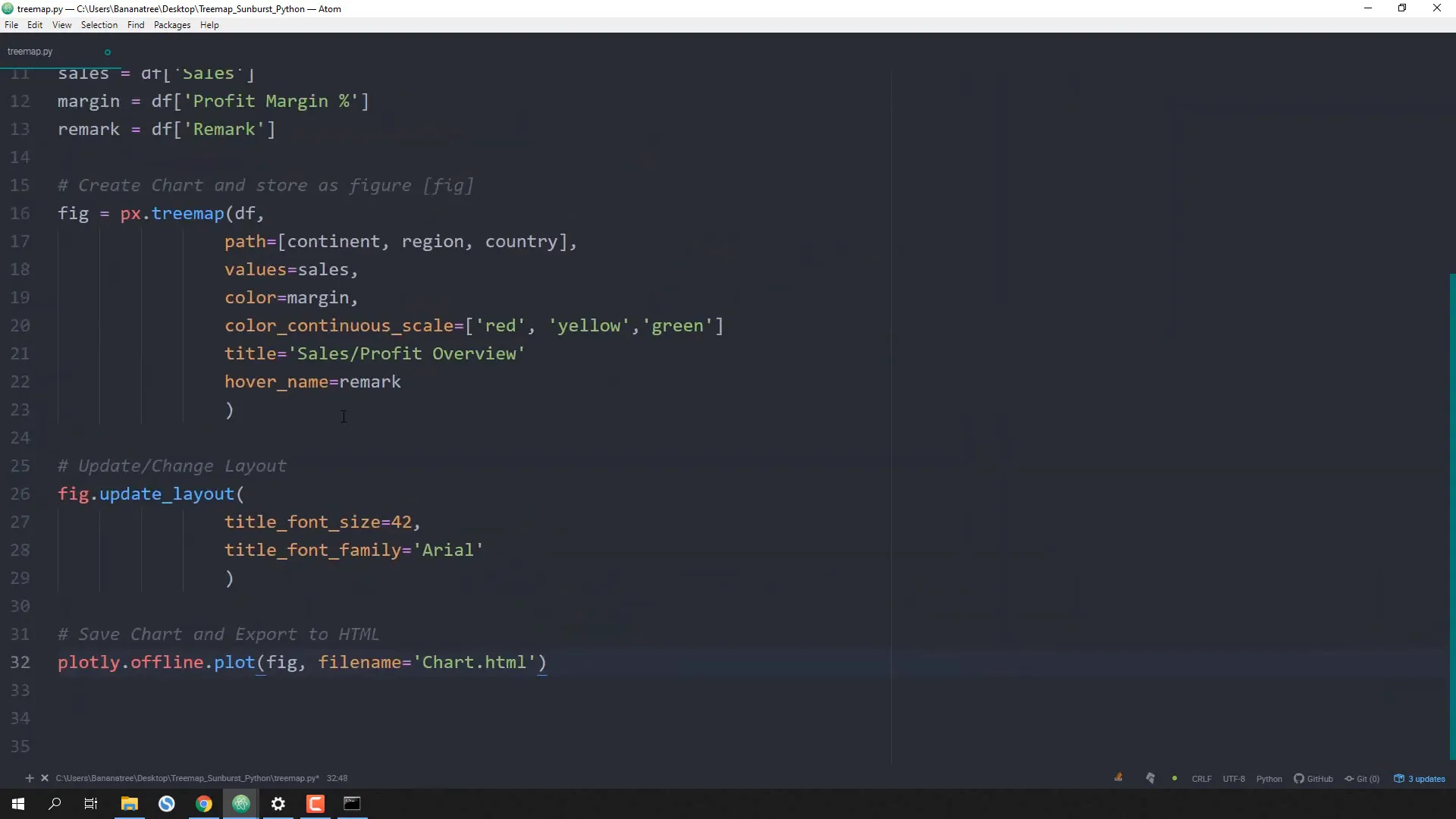
Creating the Treemap Chart
Next, I will create the Treemap chart by defining the hierarchy:
fig = px.treemap(df, path=['continent', 'region', 'country'], values='sales',
                 color='margin', color_continuous_scale=['red', 'yellow', 'green'],
                 title='Sales/Profit Overview', hover_name='remark')
Customizing the Layout
I’ll make some optional layout adjustments to enhance the chart’s appearance:
fig.update_layout(title_font_size=42, title_font_family='Arial')
Exporting the Chart
Finally, I will save the chart as an HTML file for easy sharing:
plotly.offline.plot(fig, filename='chart.html')
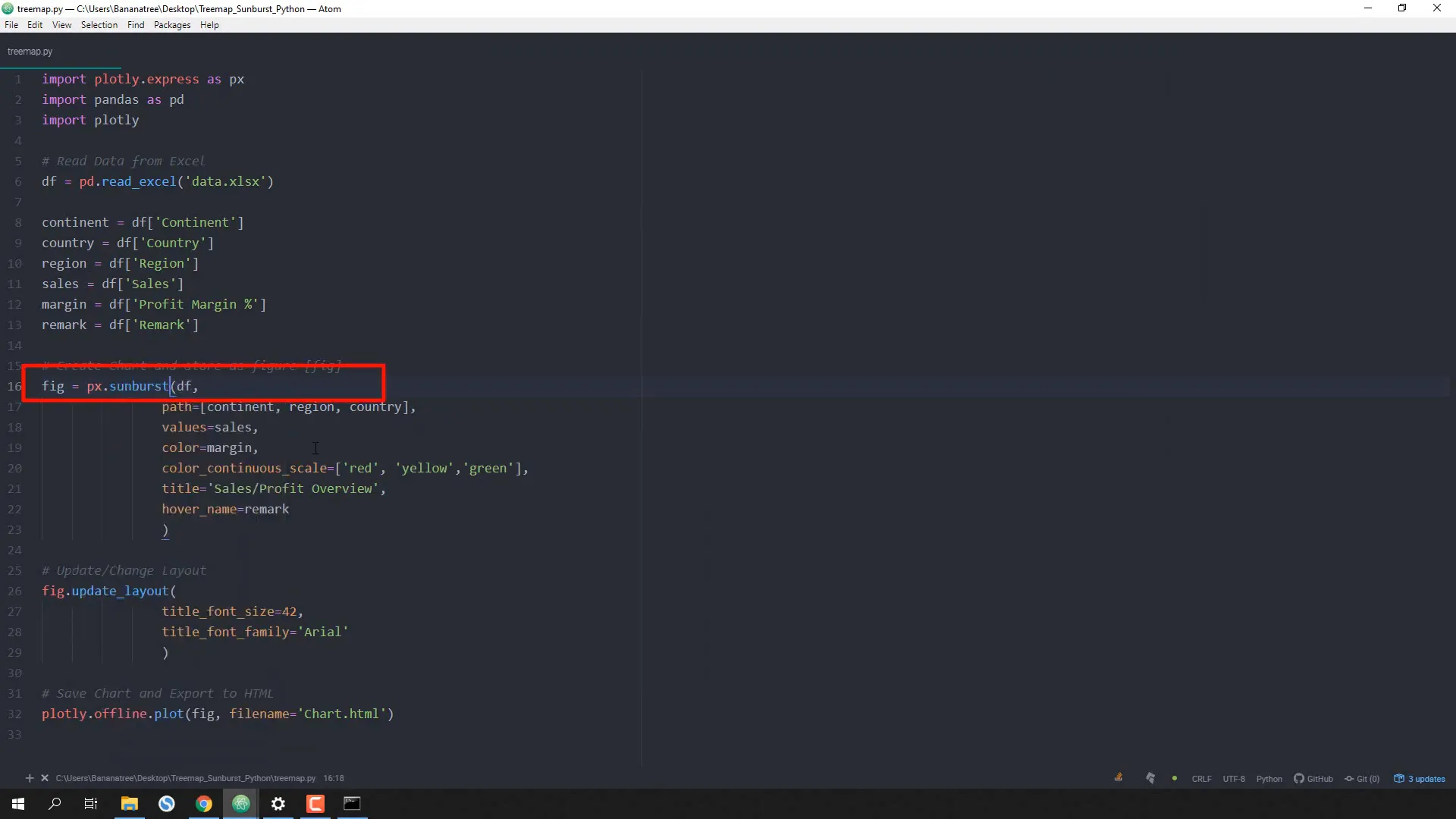
Switching to a Sunburst Chart
If you want to create a Sunburst chart instead, simply replace treemap with sunburst in the code. This allows for a hierarchical view of the data:
fig = px.sunburst(df, path=['continent', 'region', 'country'], values='sales',
                  color='margin', color_continuous_scale=['red', 'yellow', 'green'],
                  title='Sales/Profit Overview', hover_name='remark')
Dynamic Updates
The beauty of this setup is that any changes made to the Excel data, such as updating profit margins, can be reflected in the charts by simply running the script again.
Conclusion
In this tutorial, I demonstrated how to create interactive Treemap and Sunburst charts using Plotly in Python. You learned how to prepare your data, create the visualizations, customize them, and export them for sharing. This approach not only enhances data presentation but also allows for easy updates as data changes.