How To Create A Waterfall Chart In Python Using Plotly & Excel
![How To Create A Waterfall Chart In Python Using Plotly & Excel | Tutorial [EASY] 💻](https://pythonandvba.com/wp-content/cache/flying-press/7999e71792d2767452dd934d7cfa236b.jpg)
Introduction
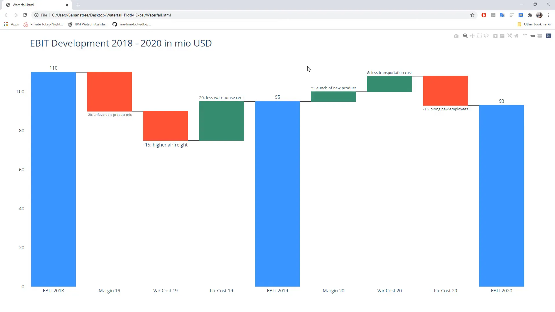
In this section, I will demonstrate how to create a waterfall chart using the Plotly library in Python. The data comes directly from an Excel file, showcasing changes in earnings before interest and taxes (EBIT) from 2018 to 2020. The chart displays explanations for the changes outside the boxes, and it’s fully interactive. Hovering over the chart reveals additional information, such as the absolute value of the changes.
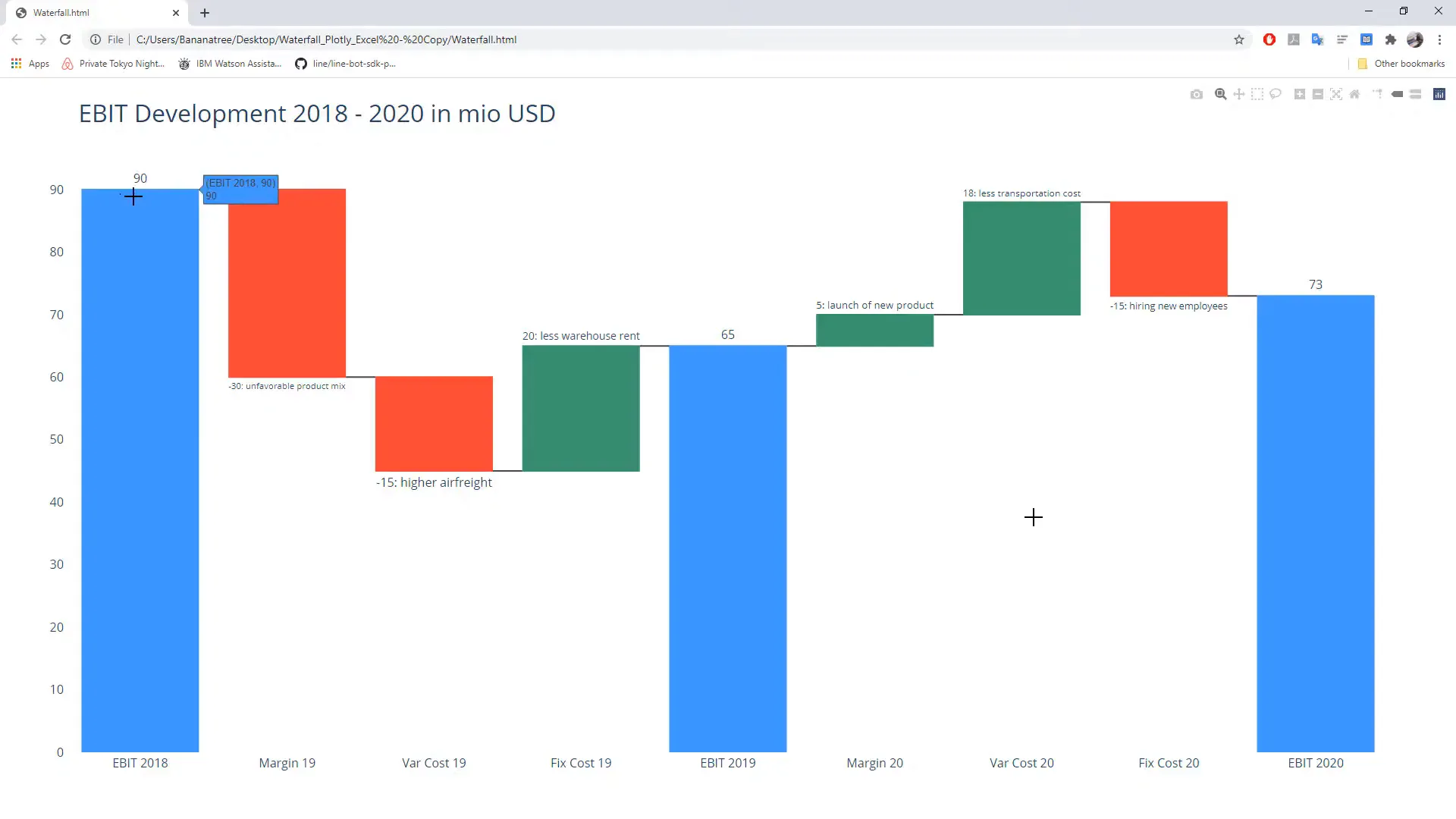
While you can create a waterfall chart in Excel, Python offers much more customization. You can change colors, connector lines, and even create stacked waterfall charts. The interactivity adds a nice touch to the chart, making it more engaging.
Getting Started
This tutorial is designed for absolute beginners in Python. Each step will be explained thoroughly, so even if you have never written a line of code before, you will be able to follow along and create your own interactive waterfall chart by the end.
The only requirement is that you have Python installed on your computer. If you haven’t installed Python yet, there are plenty of tutorials available to guide you through the installation process.
Let’s start by installing the required libraries. On Windows, press Windows + R, type cmd, and hit enter to open the command prompt. The names of the required libraries are stored in a requirements text file, which you can find in the description box.
First, install Plotly by typing:
pip install plotlyNext, install Pandas with the following command:
pip install pandas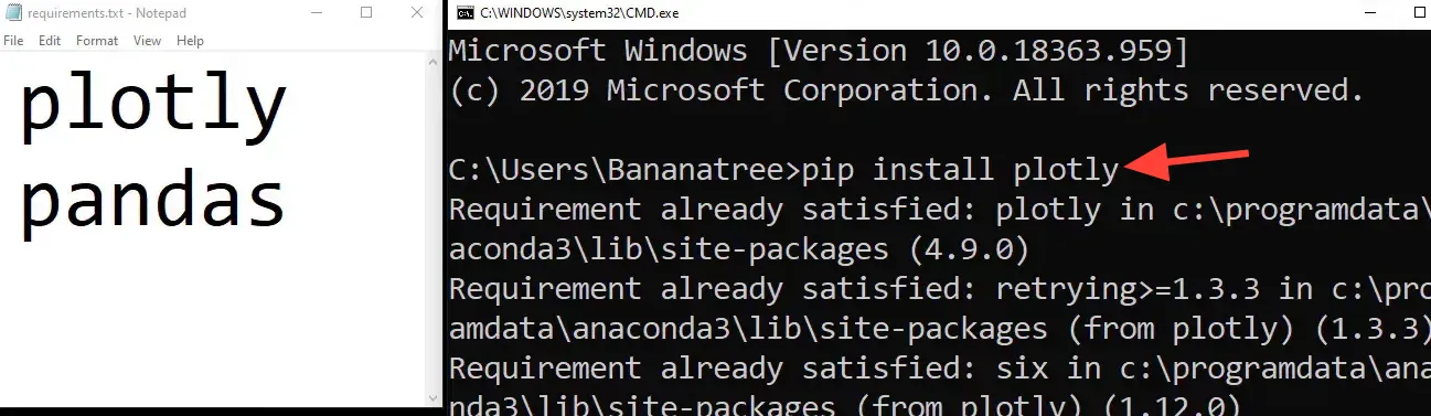
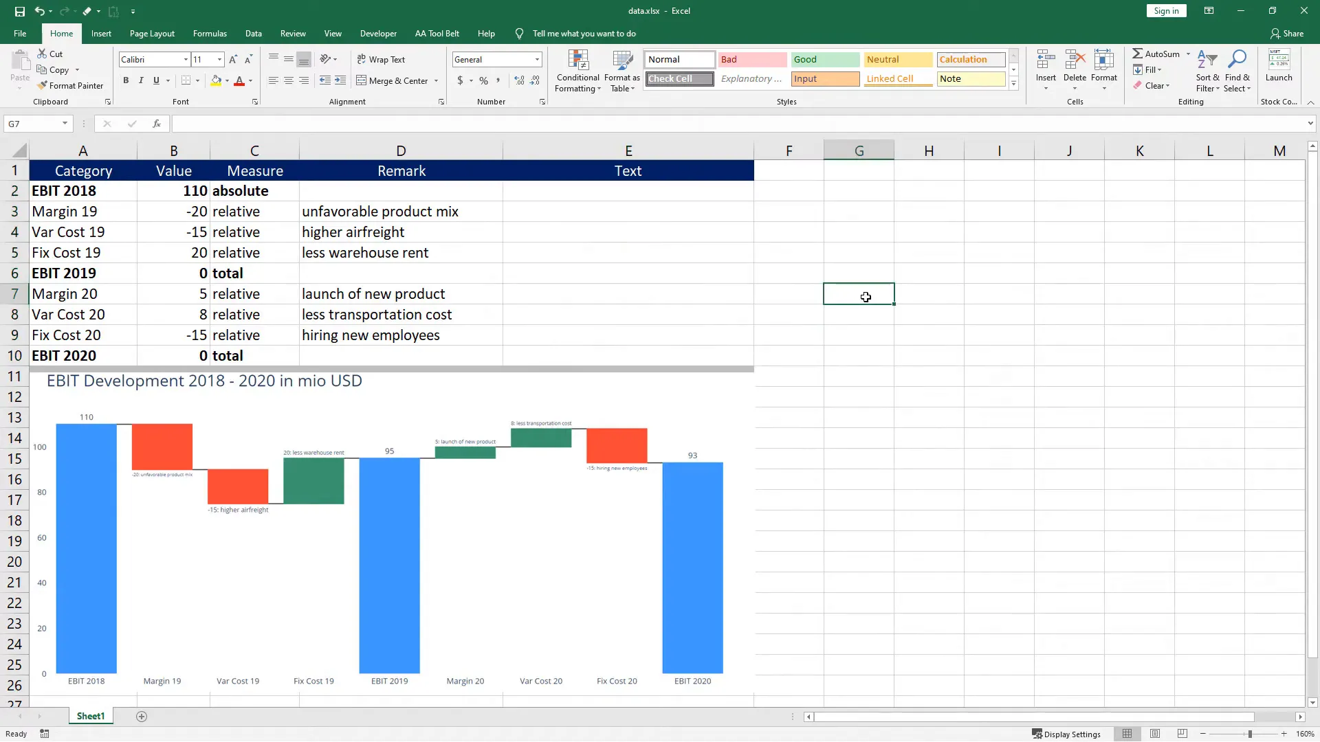
Now, let’s take a look at the Excel file prepared for this project. The first column contains the categories that will be displayed on the x-axis. The respective values are in the next column. When there is a total or subtotal, like EBIT for 2019, I will input a 0 in that cell.
In column C, we specify how Plotly should treat our values in the chart, indicating changes as relative and subtotals/totals as total. Column D contains remarks explaining the changes, which will not appear in the final chart but serve as a reference. In column E, I concatenate the values and remarks for labeling purposes. This step is optional, but it can be beneficial in a business scenario.
Now, let’s create a new Python file named waterfall.py. First, import the libraries:
import plotly.graph_objects as go
import plotly
import pandas as pd
Next, read the data from the Excel file and store it in a variable called df:
df = pd.read_excel('data.xlsx')Now, we will store the values of each column in separate variables:
x = df['category']
y = df['value']
measure = df['measure']
text = df['text']
With these variables set, we can now create the waterfall chart:
fig = go.Figure(go.Waterfall(
    measure=measure,
    x=x,
    y=y,
    text=text,
    textposition='outside'
))
Let’s update the layout of the chart:
fig.update_layout(
    title='EBIT Development 2018 to 2020 in Million USD',
    title_font=dict(size=32),
    font=dict(size=16),
    plot_bgcolor='rgba(0, 0, 0, 0)'
)
Finally, export the chart to an HTML file:
plotly.offline.plot(fig, filename='waterfall.html')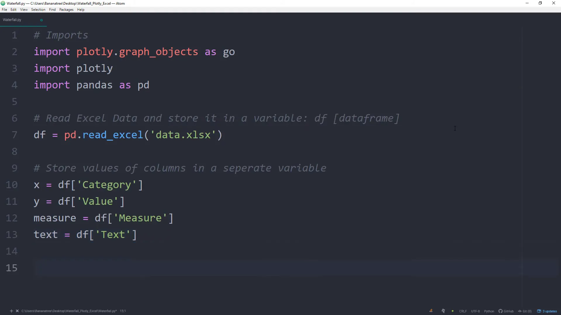
After saving the file, open the command prompt again and navigate to the folder where the script is located. Use the cd command to change directories:
cd path_to_your_folderThen, run the script using:
python waterfall.pyUpon successful execution, you should see your interactive waterfall chart displayed. The script also creates the HTML file in the same folder, allowing you to share it with colleagues who may not have Python installed.
If you want to take it a step further, consider writing a macro in VBA to execute the Python script at the click of a button. This way, you can make changes directly in Excel, save the file, and automatically update the waterfall chart without needing to run the script manually.
Outro
In this tutorial, I covered how to create an interactive waterfall chart using Plotly in Python. You learned about the necessary installations, how to structure your data in Excel, and how to generate and customize your chart. By following these steps, you should now be able to create your own waterfall charts for any data set.