How To Create An Interactive Population Pyramid in Python Using Plotly

Introduction
Creating interactive visualizations can significantly enhance data presentation, especially when dealing with demographic data. In this post, I’ll guide you through the process of building an interactive population pyramid using Python and the Plotly library. This visualization is not only informative but also engaging, allowing users to interact with the data.
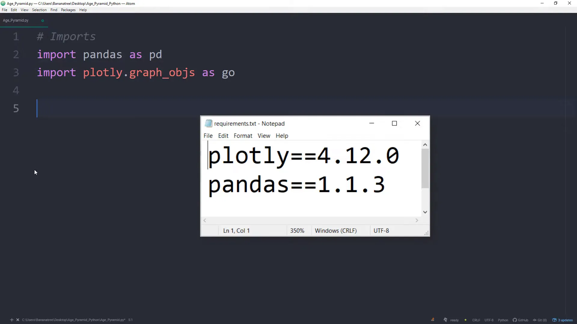
Getting Started
The first step involves setting up the environment and importing the necessary libraries. I’ll be using Pandas for data manipulation and Plotly for visualization. Ensure you have these libraries installed in your Python environment.
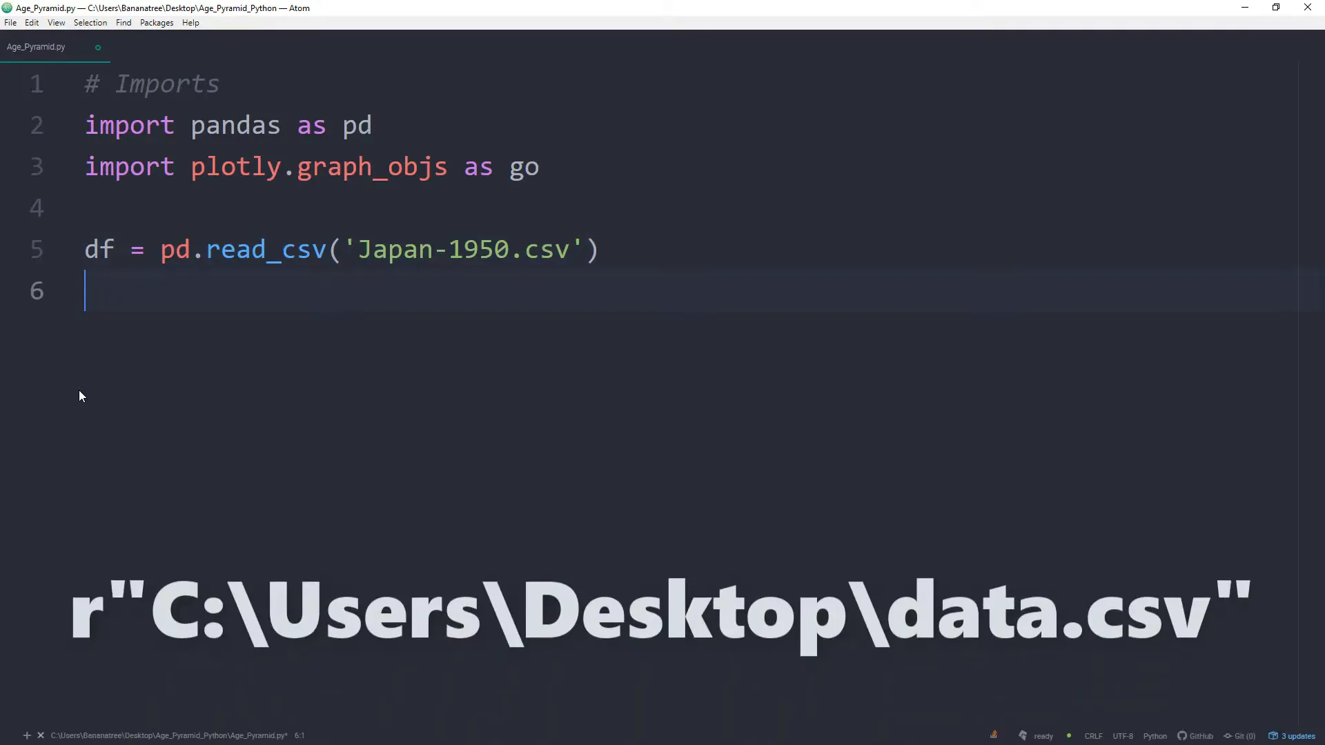
Loading the Data
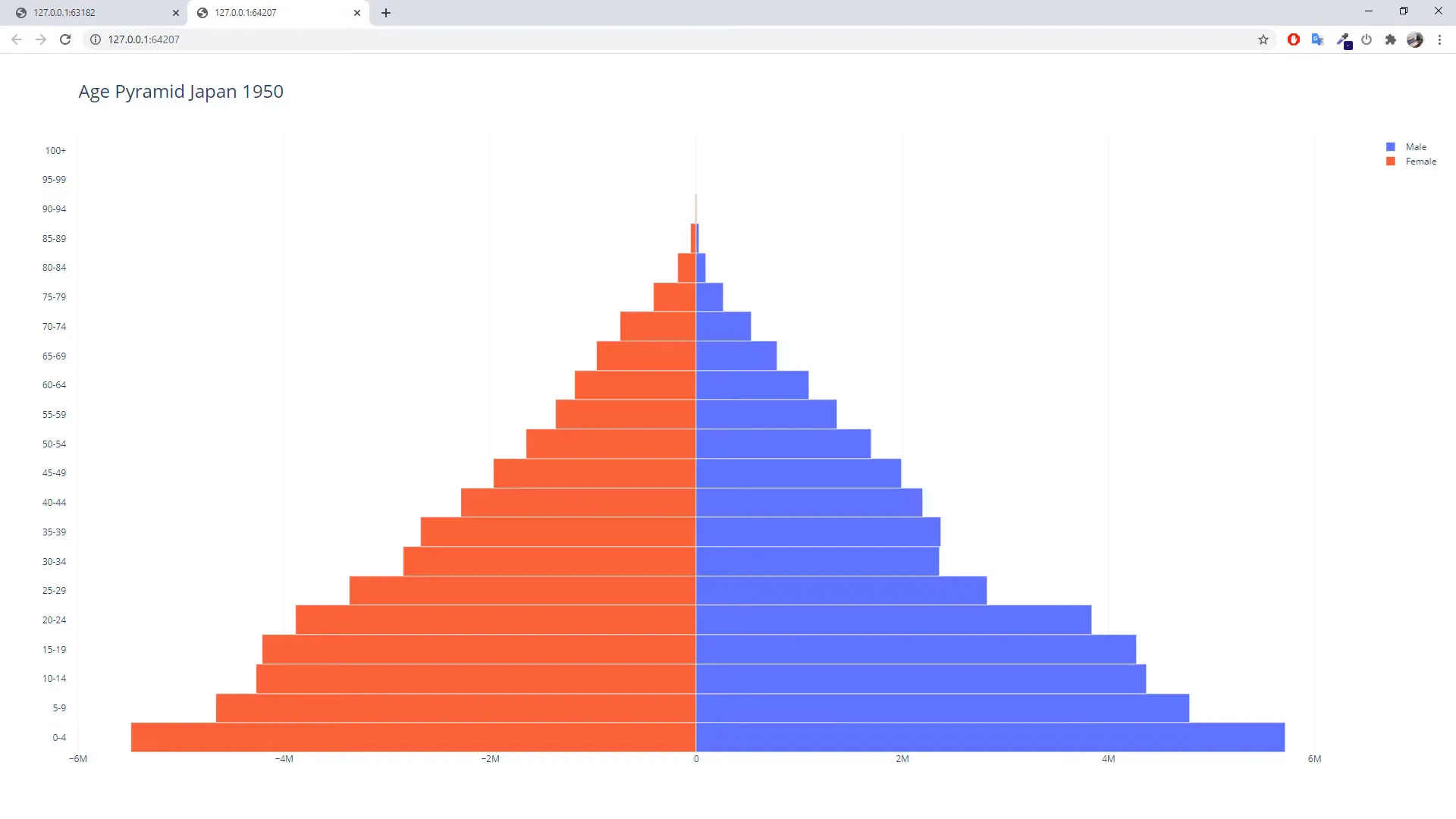
For this project, I’ll be using population data from Japan in 1950. The data can be obtained from various sources, such as the Population Pyramid website. Once you have the data, load it into a Pandas DataFrame.
Preparing the Data
After loading the data, it’s essential to shape it correctly for the pyramid visualization. This involves adjusting the male and female population figures so that they can be represented on opposite sides of the pyramid. Typically, male data is represented on the left and female data on the right, which requires flipping the female values to negative numbers.
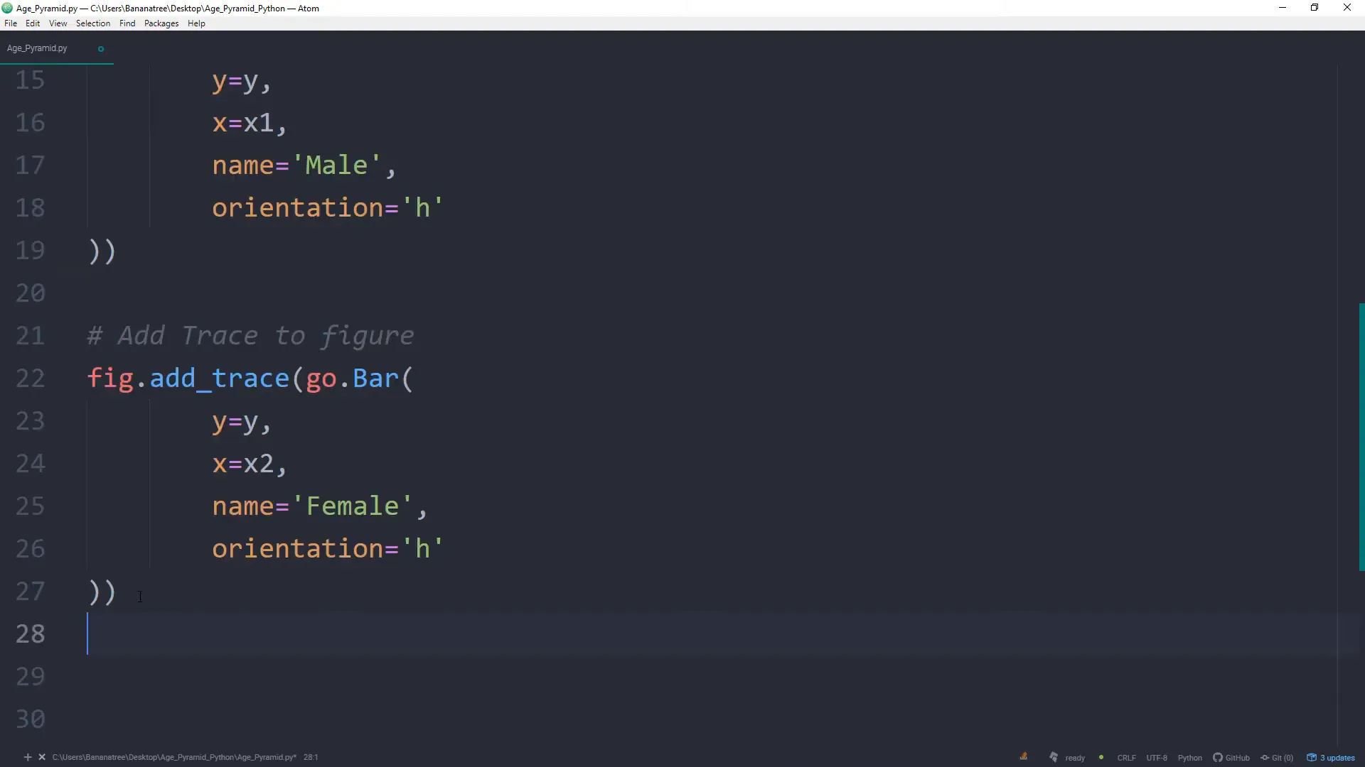
Creating the Population Pyramid
Once the data is prepared, I can now create the pyramid using Plotly. The initial step is to create a horizontal bar chart. I’ll be adding traces for both male and female populations. This is where the fun begins!
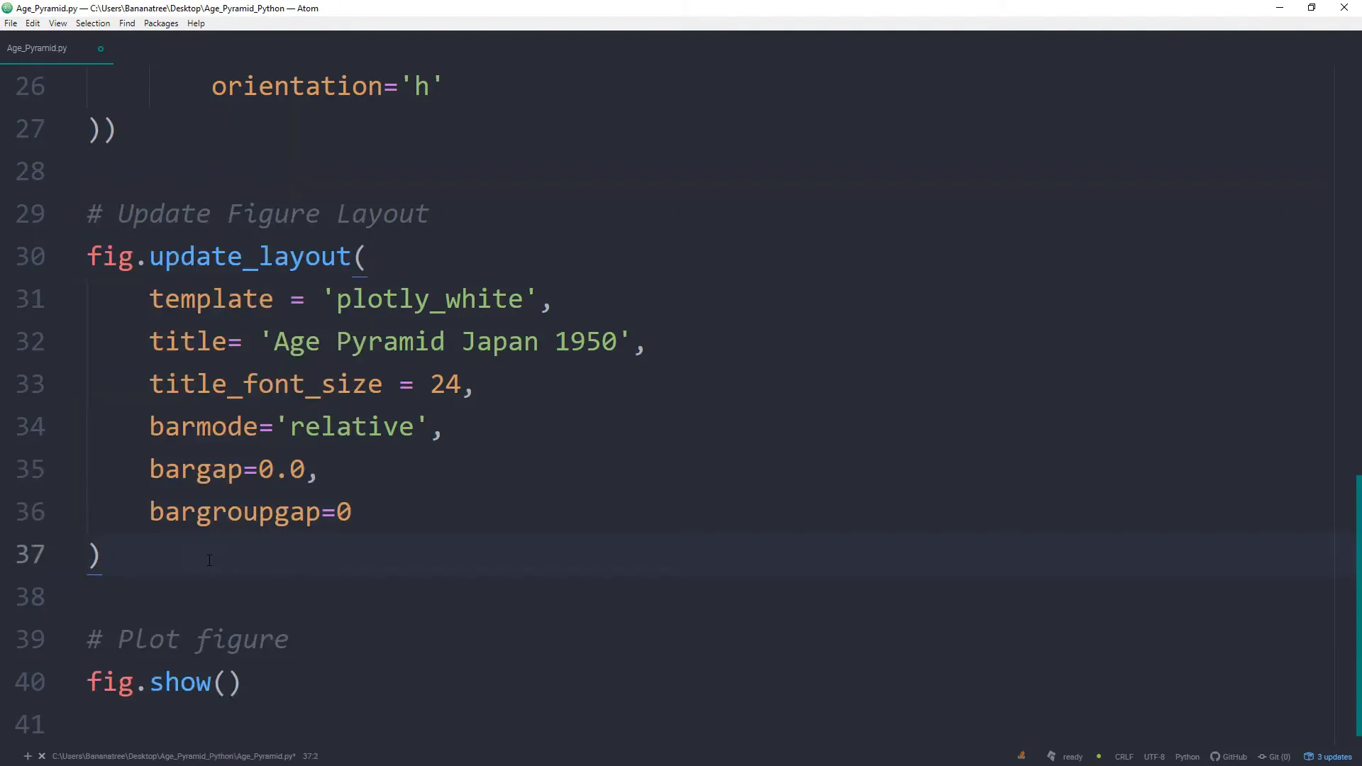
Updating the Layout
To make the visualization more appealing, I’ll customize the layout. This includes setting the title, adjusting the axis labels, and ensuring that the colors are distinct for each gender.
Handling Negative Values
While creating the pyramid, I encountered an issue with negative values showing up on the chart. This is easily fixable by ensuring the data is correctly formatted and adjusting the axis settings. It’s crucial to test the chart after making these adjustments to confirm that it displays as intended.
Final Touches
With the chart now displaying correctly, I can add final touches like interactive features, tooltips, and perhaps even festive elements if desired. This can make the visualization more engaging, especially during the holiday season.

Conclusion
In this blog post, I covered the entire process of creating an interactive population pyramid using Python and Plotly. From loading the data to preparing it, creating the visualization, and troubleshooting issues, each step is crucial for achieving an effective and informative chart. Interactive charts like these can significantly enhance the way demographic data is presented and understood.