How To Easily Insert Python Charts Into Excel
Introduction
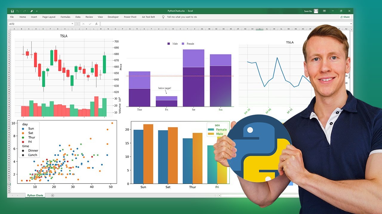
In this post, I’m diving into how to easily insert Python charts into Excel using the open-source library xlwings. This guide will walk you through the process step-by-step, so let’s get right into it!
Example Dataset
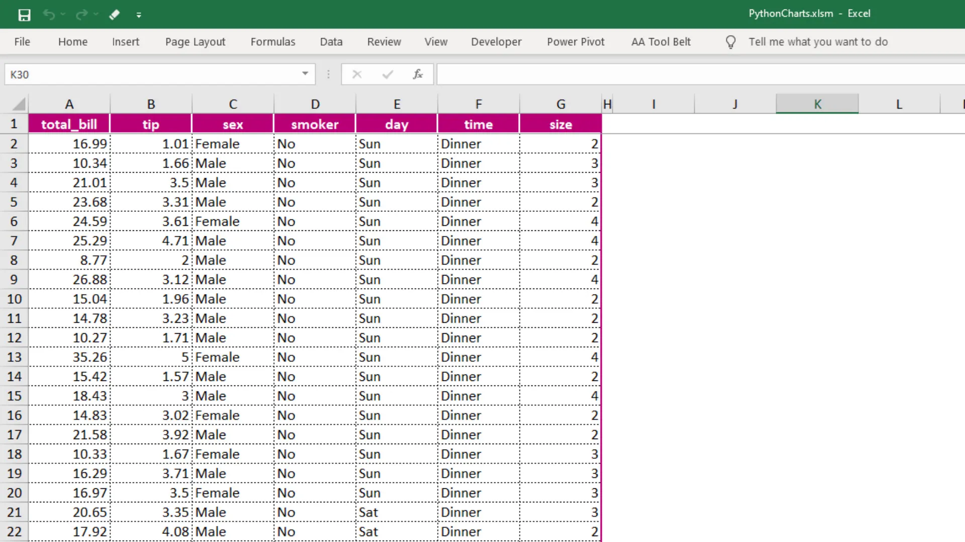
In my Excel file, I have an example dataset containing information about the total bill, tip size, additional customer information, and the day and time of the customer’s visit. Clicking a button will trigger a Python script to generate various charts using popular Python libraries like matplotlib, seaborn, pandas, and plotly.
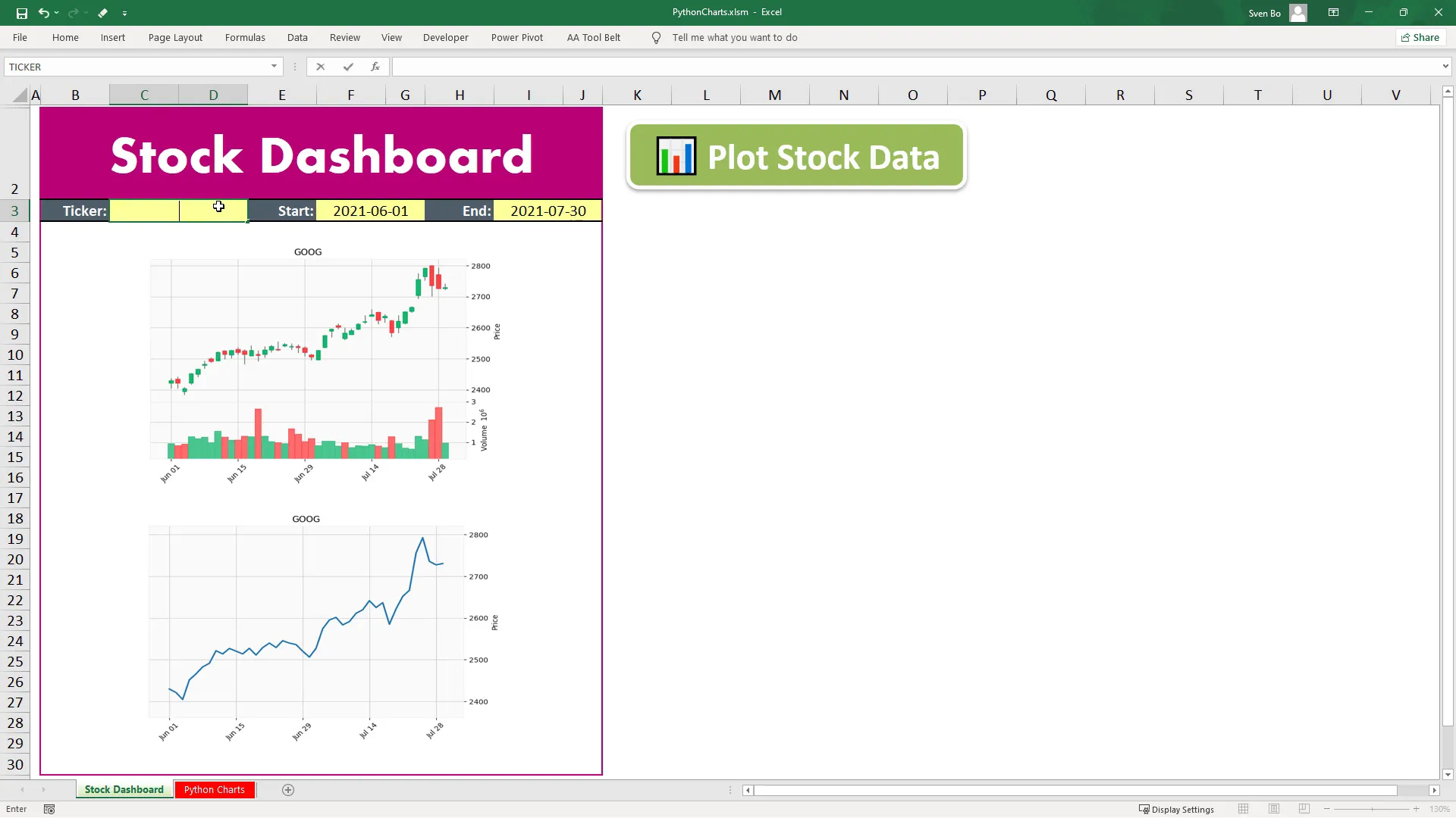
Stock Dashboard Demonstration
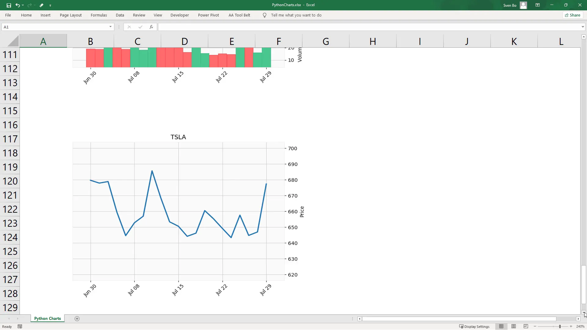
To further illustrate the capabilities of xlwings, I’ve prepared a simple Stock Dashboard. After entering the stock ticker symbol and the desired period, clicking the button will execute a Python script that plots the stock data in a candlestick chart and returns a line chart showing the closing price.
Setting Up Your Environment
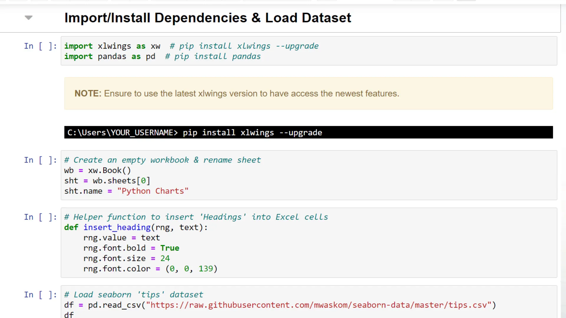
Before we start coding, we need to install the required dependencies. First, ensure you have the latest version of xlwings installed. You can do this by running the following command in your command prompt:
pip install xlwings --upgrade
Additionally, you will need the pandas library. Once you have these set up, create an empty workbook using xlwings. This workbook will be used throughout the tutorial for plotting different charts.
Creating Charts with Python
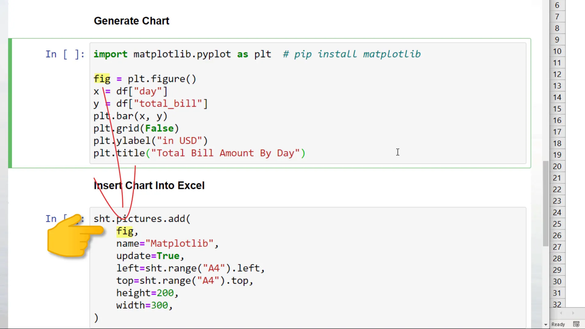
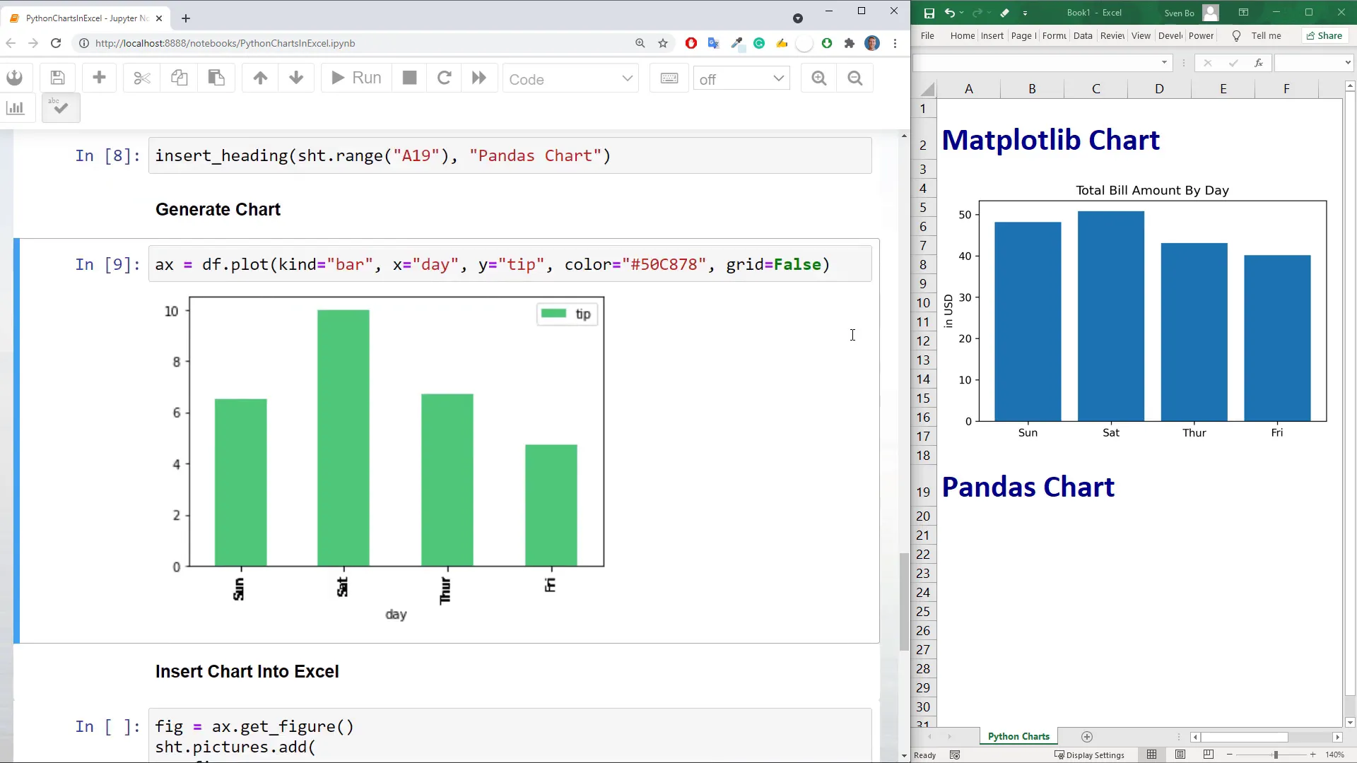
Let’s kick off by creating a matplotlib chart. First, I initialize a matplotlib figure object and store it in a variable called fig. This figure will plot a simple bar chart showing the total bill amount by day.
To insert the chart into Excel, I use the xlwings picture add method. This method requires several arguments:
- Matplotlib figure
- Image name
- Update flag set to true
- Cell location for insertion (e.g., A4)
- Height and width of the image
Using Pandas for Charting
Next, I create a pandas chart using the plot method on our dataframe. The process is similar: I first generate the chart, retrieve the figure object, and then insert it into the Excel sheet.
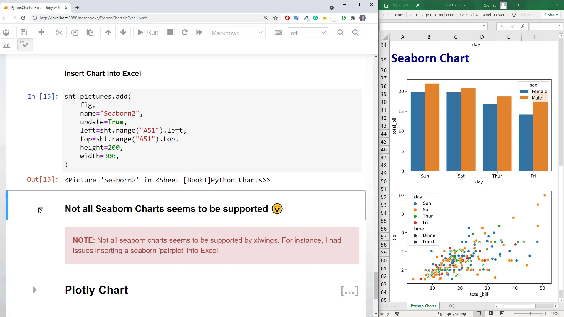
Exploring Seaborn Charts
Seaborn is another powerful library that allows you to create beautiful visualizations with minimal code. However, it’s important to note that not all seaborn charts are supported in xlwings. For example, I encountered issues when trying to insert a seaborn pairplot, which returned a blank chart.
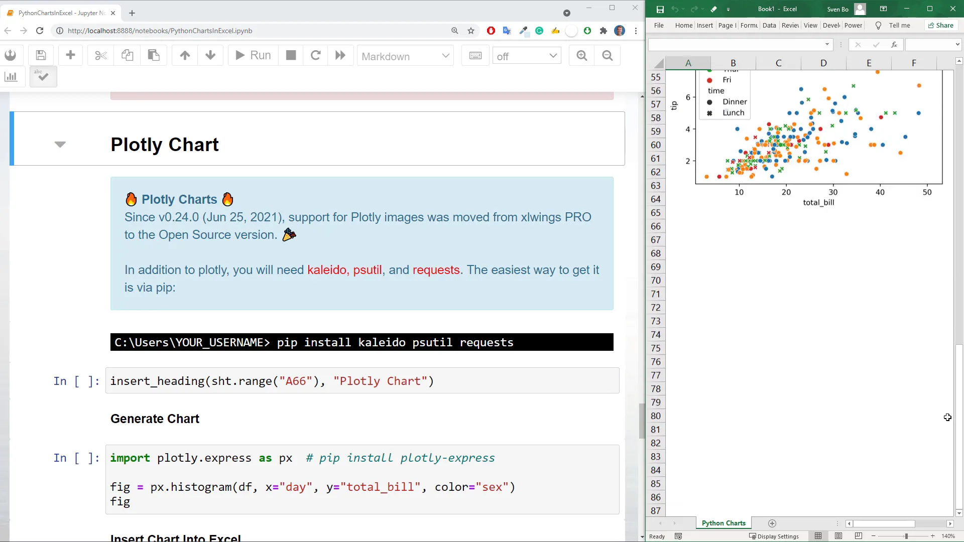
Utilizing Plotly for Interactive Charts
Plotly charts can now be inserted into Excel using the open-source version of xlwings, thanks to an update. To use plotly, you’ll need additional libraries like Kaleido, psutil, and requests. After setting up the heading, I generate a plotly chart and insert it into Excel. Plotly charts may take a bit longer to render compared to other libraries, but they offer advanced capabilities.
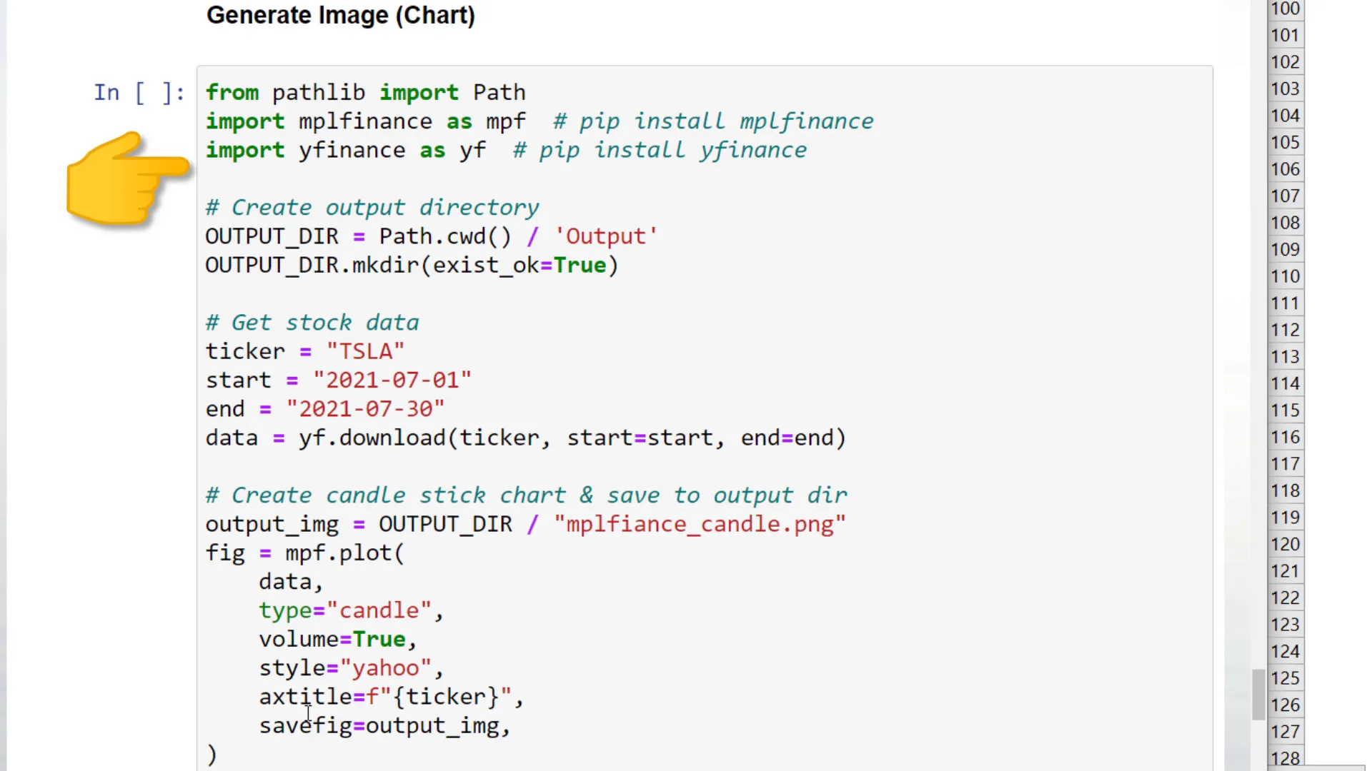
Working with Financial Data
To demonstrate the application of xlwings with financial data, I utilize the mplfinance module to plot stock data. After retrieving Tesla stock prices for July 2021, I create a candlestick chart and insert it into the Excel workbook.
Executing Python Code from Excel
If you’d like to execute Python code directly from Excel, you can initialize a quickstart project by using the command:
xlwings quickstart ProjectName --standalone
This command will create an Excel and Python file that you can work with side by side. From the developer tab in Excel, you can insert a button and assign it to execute a sample macro.
Conclusion
In this post, I covered how to easily insert Python charts into Excel using the xlwings library. From setting up your environment to creating various types of charts, the possibilities are extensive. Thanks for reading!