6 Quick Fixes to Improve Your Plotly Express Charts

Introduction
Hey guys! In this post, I’m excited to share six tips that can enhance your Plotly Express charts. I’ll demonstrate how to transform a standard bar chart into something visually appealing and informative. Let’s dive in!
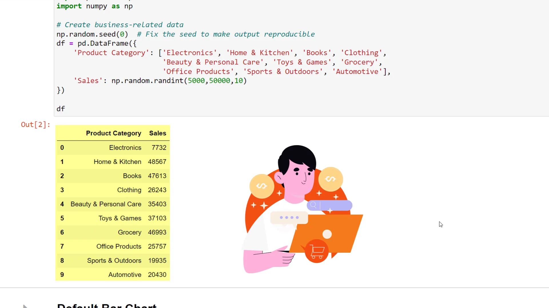
Load the data
Firstly, I’ll import the necessary dependencies and load a dataset created randomly with NumPy. This dataset consists of sales data sorted by product category. Here’s what it looks like with the standard Plotly bar chart:
Default Plotly Charts
The initial chart is functional but lacks excitement. Let’s improve it!
Tip 1
My first piece of advice is to utilize Plotly’s pre-made templates. These designs can be applied to your charts to enhance their appearance. For instance, let’s try the “seaborn” template:
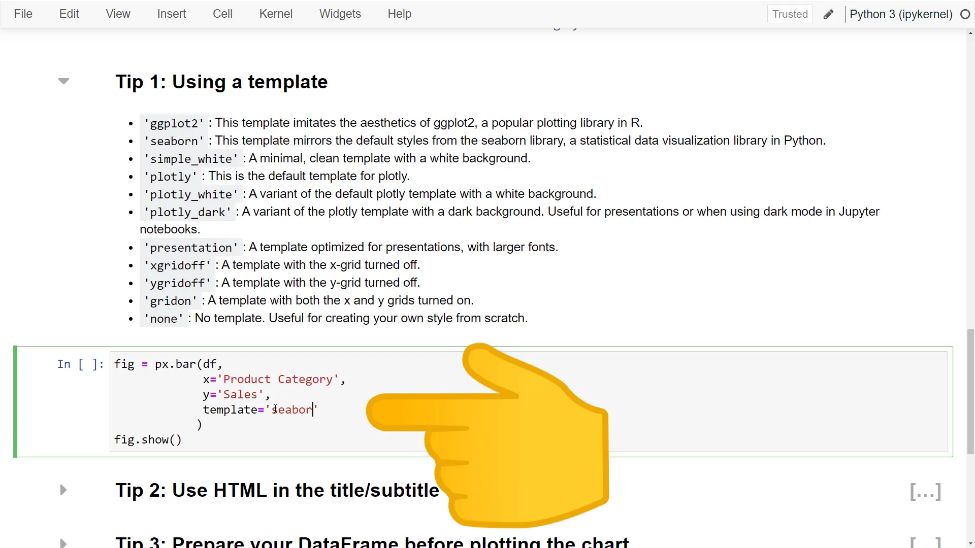
The chart now looks different and more engaging. My personal favorites are the “presentation” and “simple_white” templates. The “presentation” template has larger text, while the “simple_white” template offers a clean look that’s easy to read. For this tutorial, I’ll stick with “simple_white.”
Tip 2
Next, let’s talk about the chart title. Did you know you can use HTML tags in your chart title? For example, to create a bold title with a subtitle, you can format it like this:
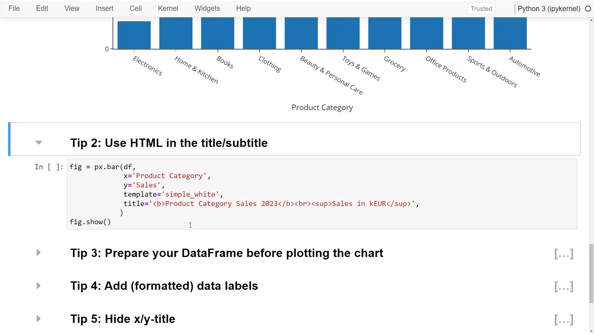
After applying these changes, our chart looks significantly better!
Tip 3
The third tip involves preparing your DataFrame before chart creation. Sorting the sales from highest to lowest can help identify top-selling products more easily. However, if someone asks for exact sales numbers, you might struggle. To address this, you can add data labels using the “text” parameter:
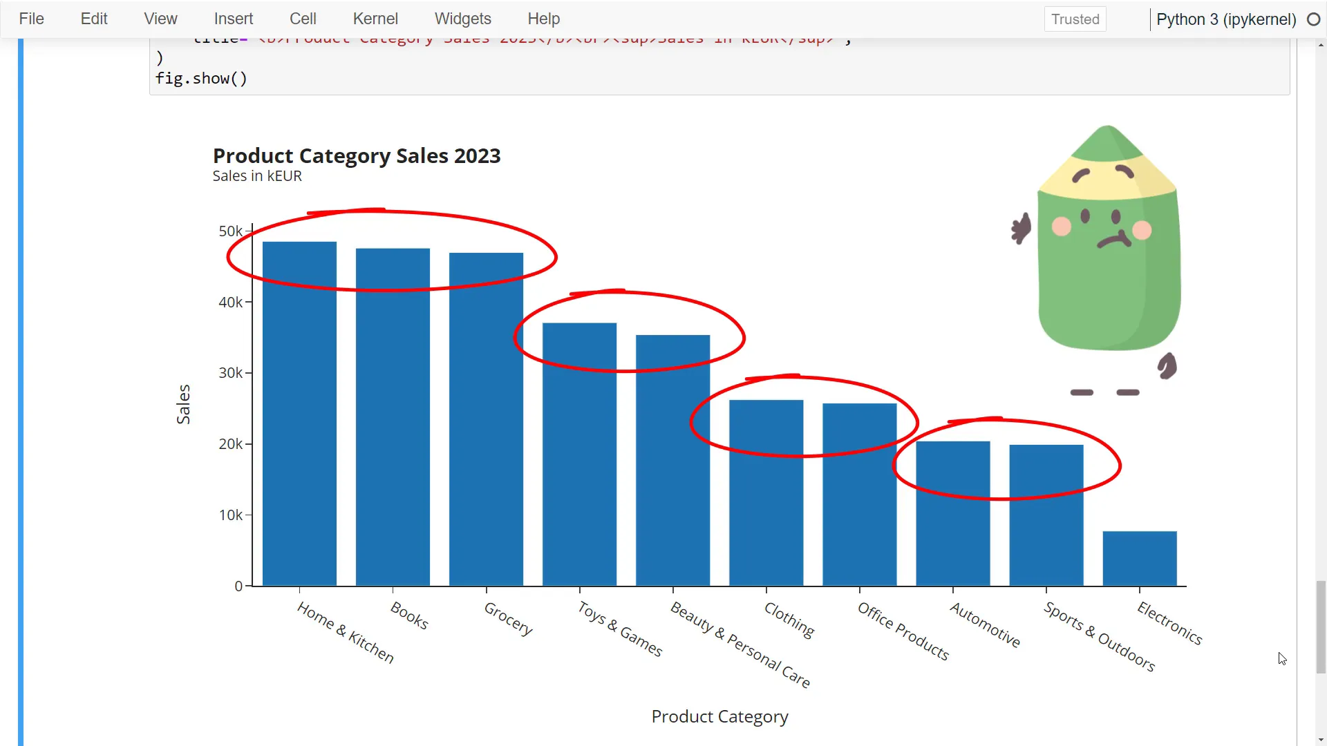
This setup displays the figures in thousands with one decimal point, making the bar chart more informative.
Tip 4
Since we have an appealing title and subtitle, we can remove the x and y-axis titles to create a cleaner look. To do this, simply set the title text to an empty string:
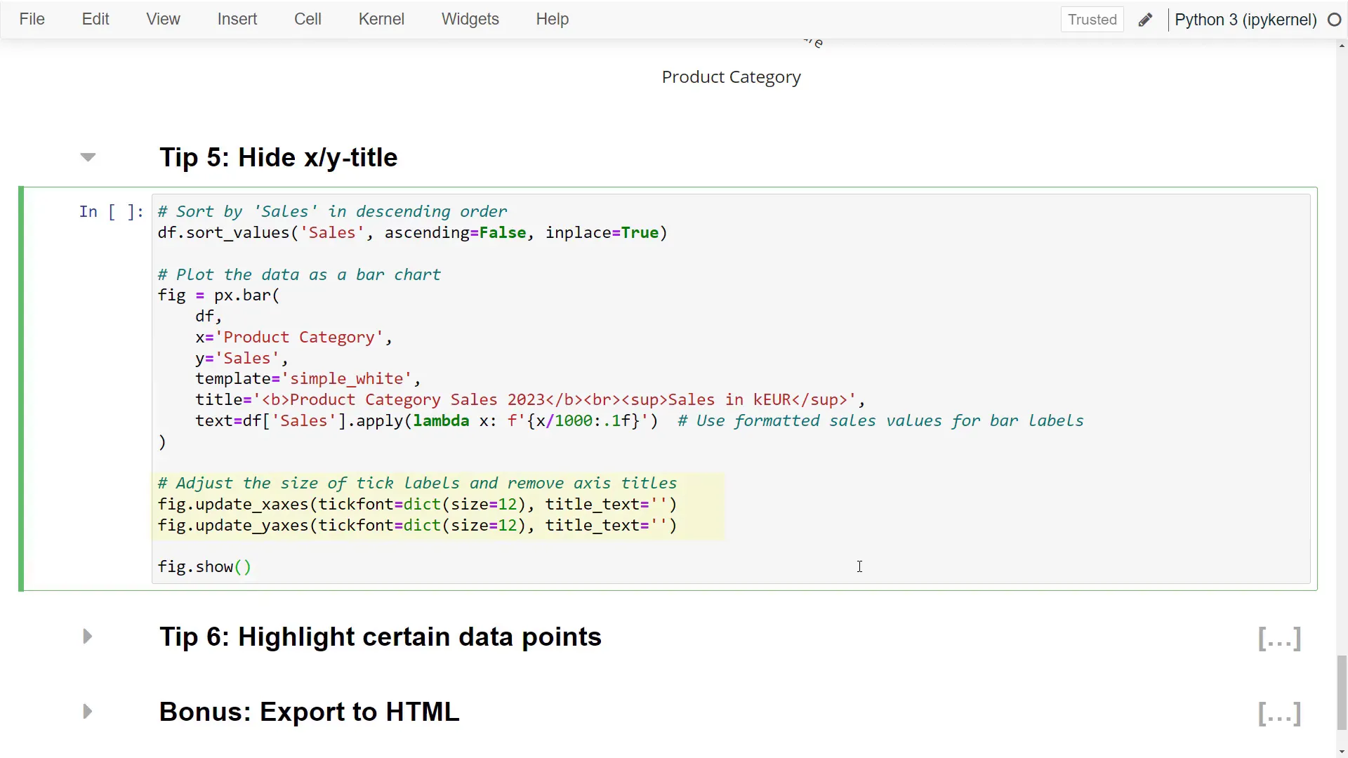
Now the chart appears even more streamlined!
Tip 5
The fifth tip focuses on emphasizing a specific aspect of your chart. For instance, if I’m a business analyst presenting the performance of a new “Clothing” line, I can highlight that category. Although this requires a bit more coding, the effort is worthwhile. I’ll select the “Clothing” category and update the figure to make all other bars grey, with the “Clothing” bar in blue:
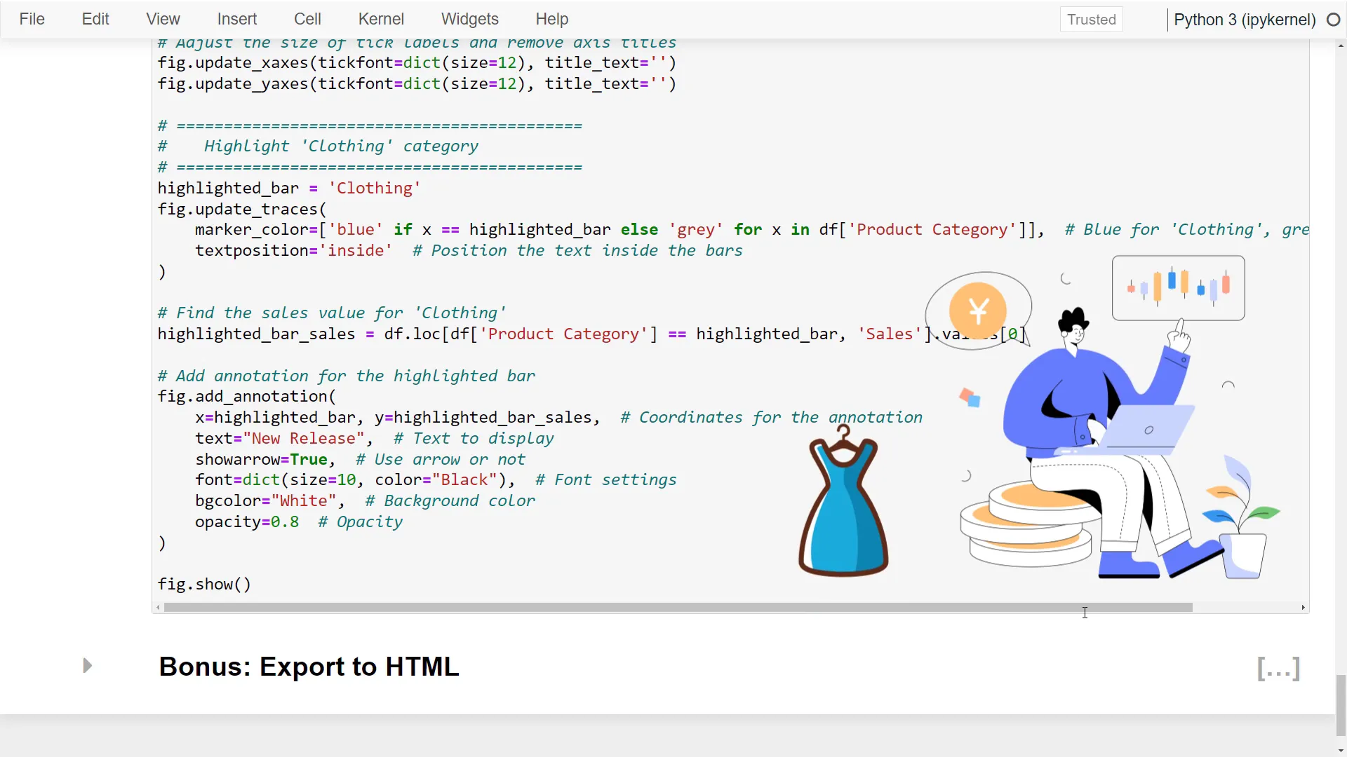
To make this highlight even more effective, I can add a note explaining the color choice. This involves finding the sales value for the “Clothing” category and placing it on the y-axis, adjusting the text and background color accordingly.
Tip 6
For a bonus tip, you can easily save your chart as an HTML file with a single line of code. Simply use the “write_html” function on the figure object and specify the output path:
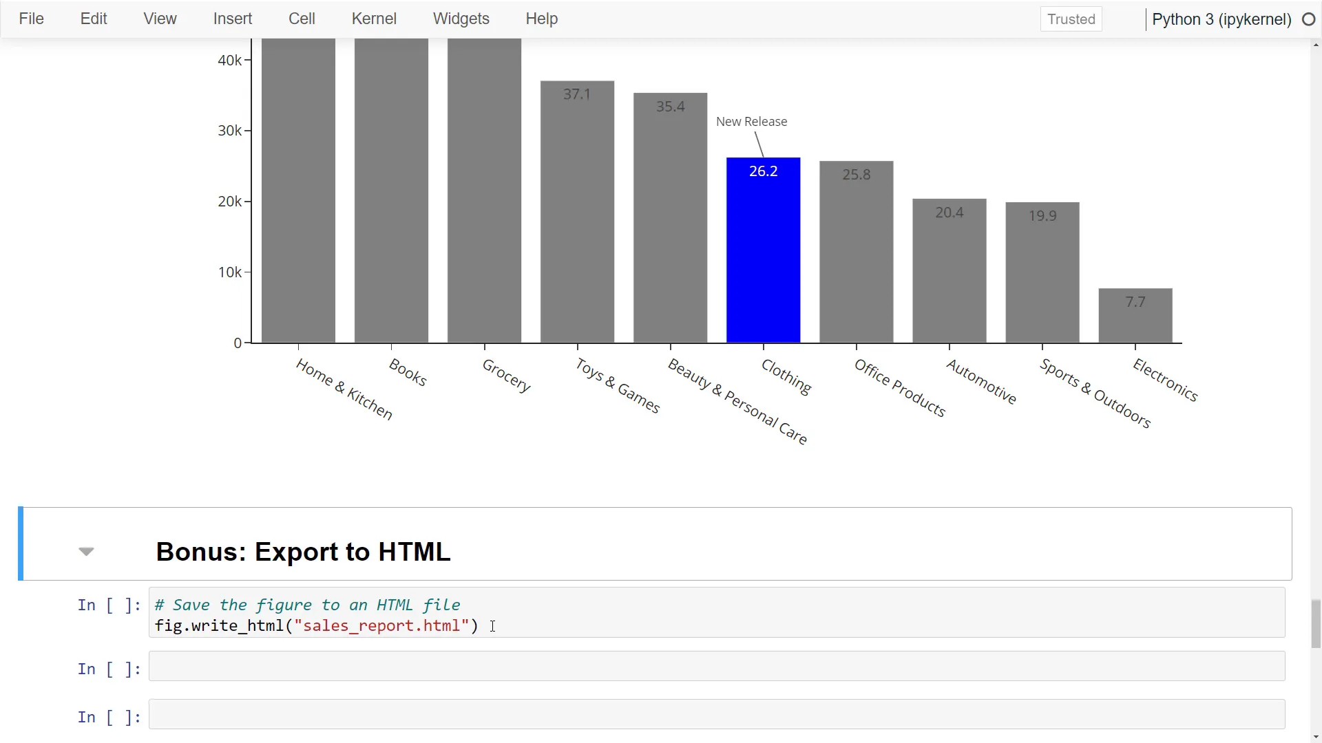
This feature is handy for presentations or sharing with others!
Outro
So, those were my tips for enhancing your Plotly Express charts. I hope you found them useful! Let me know in the comments which tip you liked the most, and feel free to share your own tips as well. Thank you for reading!