Make Your Streamlit Apps Look Amazing with Shadcn
Introduction
One big plus of using Streamlit is how simple it is. Yet, that simplicity comes with a downside—there aren’t many styling options available. All the UI elements, like sliders, date pickers, and select boxes, they all look the same. I was looking around and found a cool package that lets you use Shadcn components in Streamlit. In this post, I’ll show you how to use these components to give your Streamlit apps a fresh, professional look.
Shadcn
So, what is Shadcn? In a nutshell, Shadcn is a collection of beautifully designed, accessible, and customizable React components. These components can be used to build modern web applications with Next.js, mainly used by front-end developers. You can see some examples on the official Shadcn page, and you’ll notice that many elements look quite different from the typical Streamlit style.
Sample Code
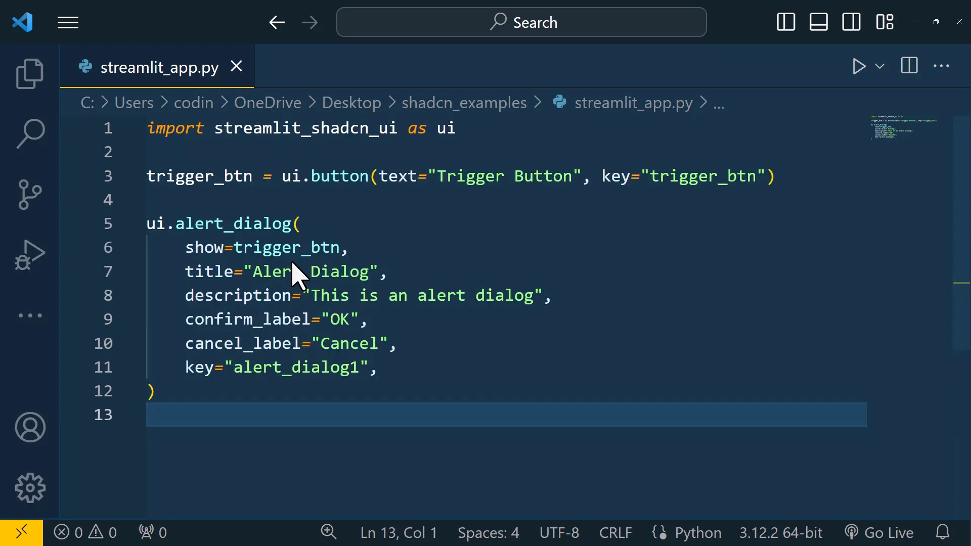
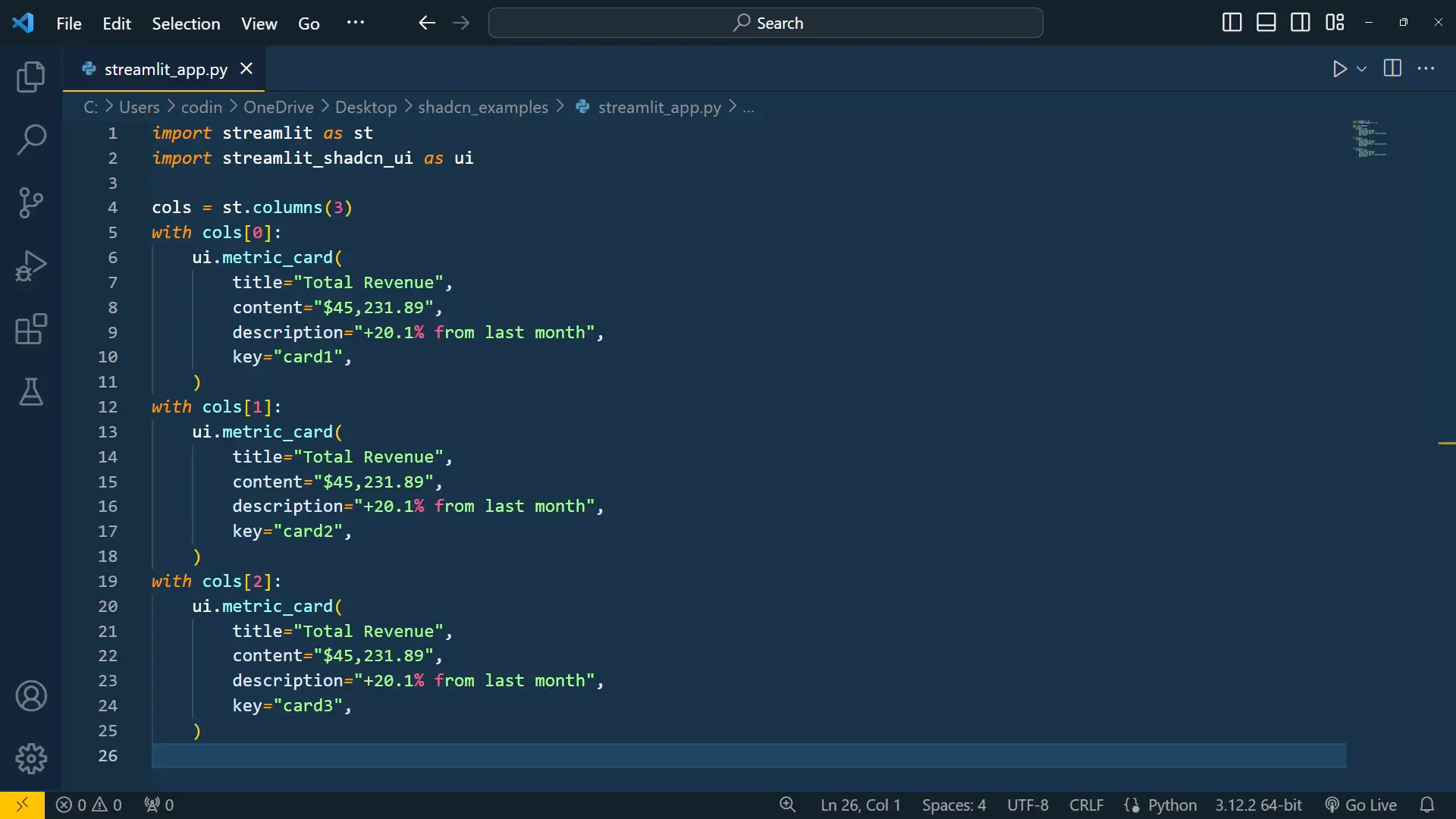
To get started with Shadcn in your Streamlit app, you just need to copy a command and run it in your command prompt or terminal. Once installed, you can begin using the components right away. I’ve prepared an empty Python file where I can paste the sample code.
Code
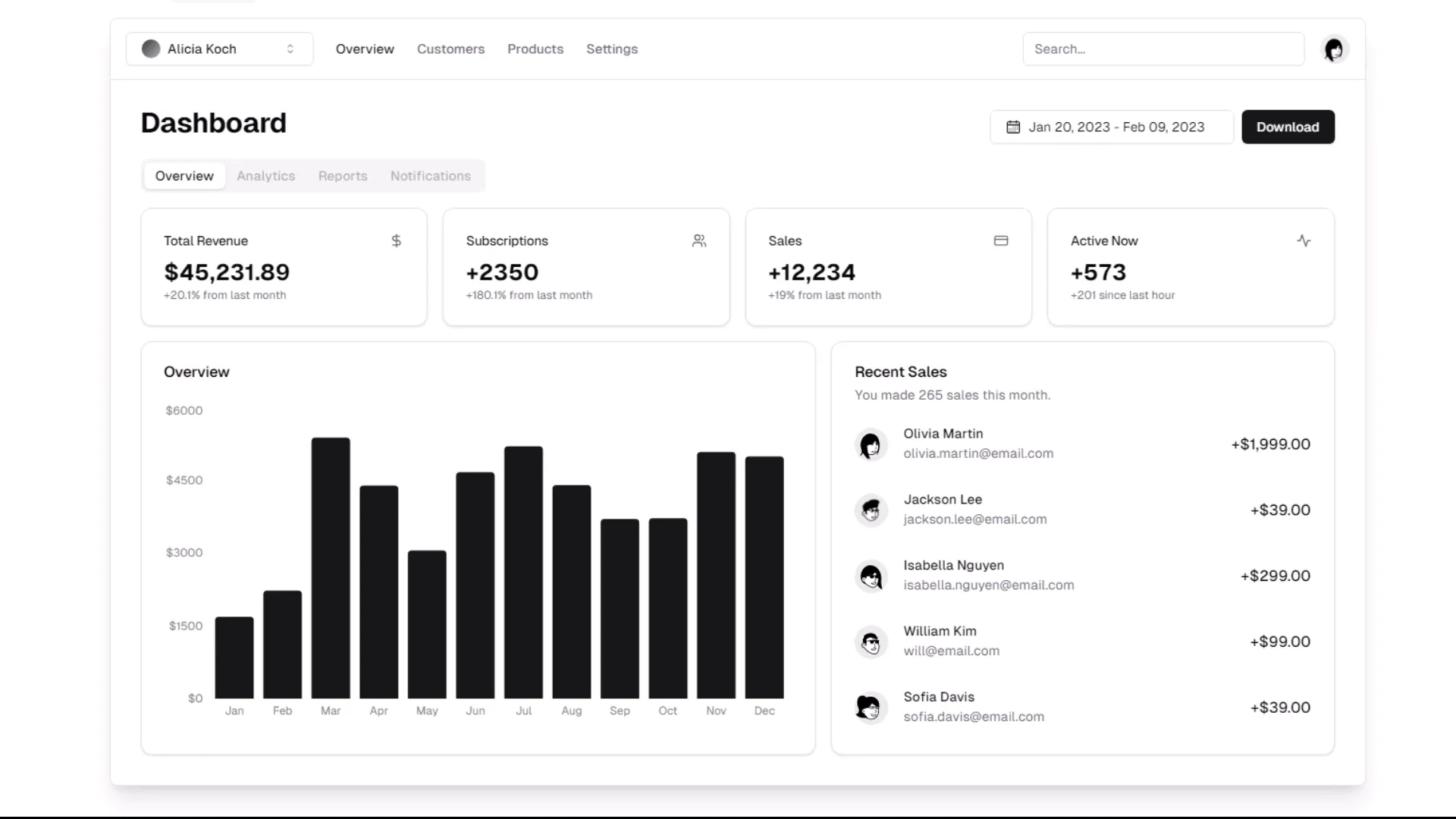
After installing the package, you can create a button that triggers an alert dialog, along with many other elements. For instance, you can see tabs, a beautiful date picker, a data table, a slider, and more. The syntax is straightforward; just import the streamlit_shadcn_ui package, and you can use the various elements within your app.
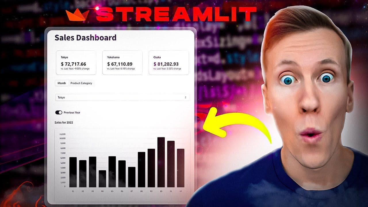
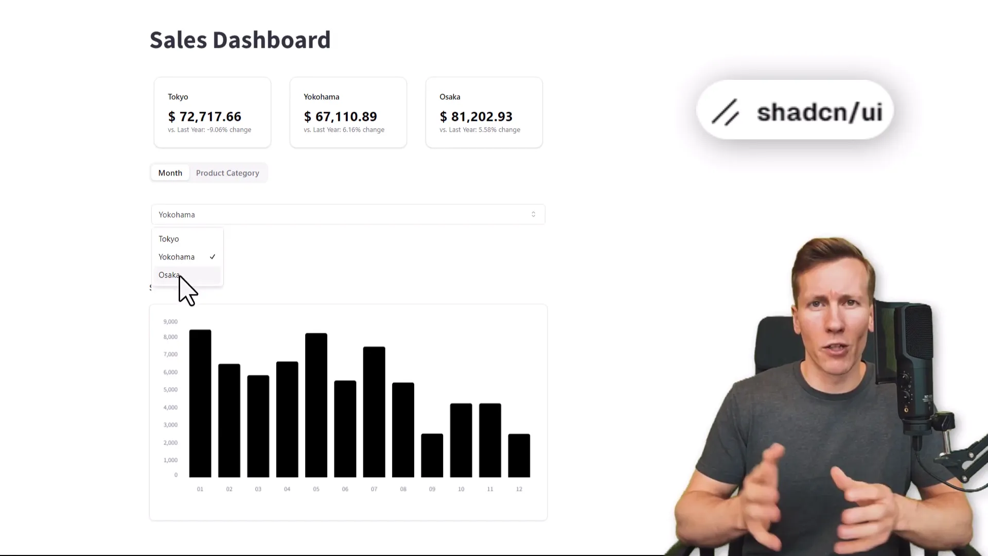
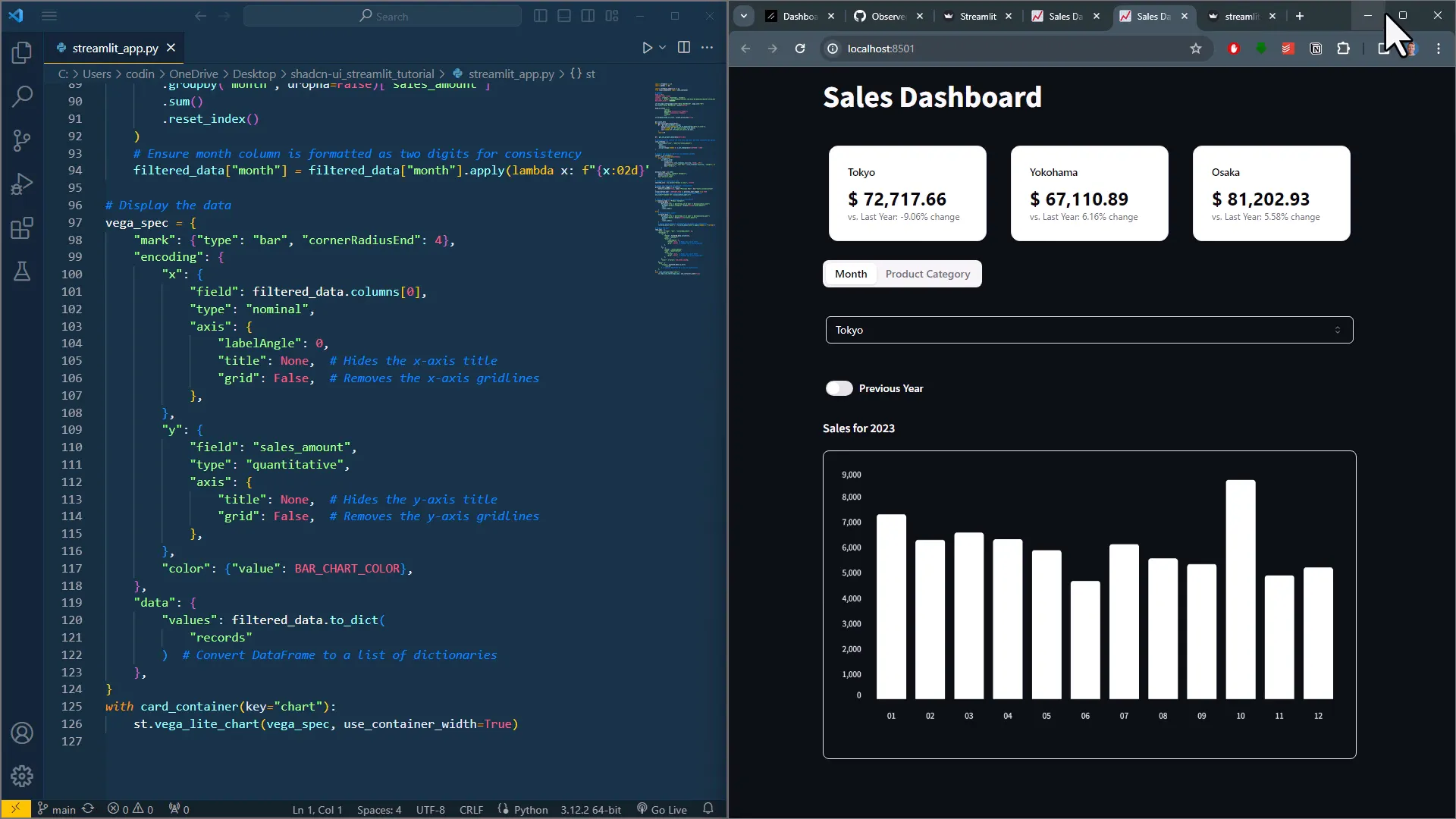
To give you a more real-life example, I created a functional dashboard that displays total sales by city and allows you to compare it to the previous year. The dashboard includes tabs to group sales by month or product category, and you can select the city or switch to the previous year’s sales view.
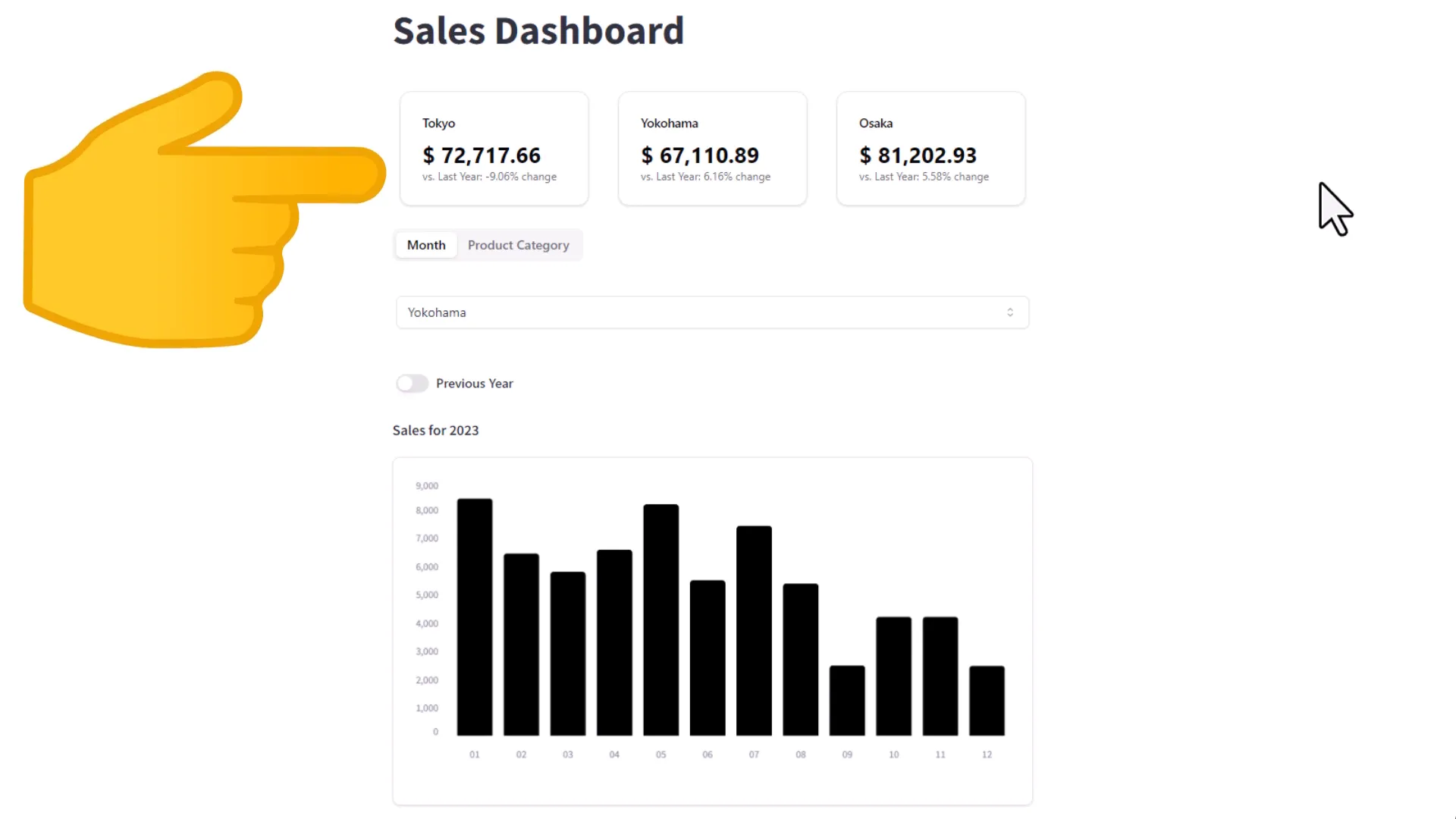
After setting up the configurations, I created a function to read data and added caching for better performance. I also calculated yearly revenue for each city and year. The dashboard employs metric cards to present this data clearly. Below the metrics, the tab element lets users switch between monthly views and sales by product category.
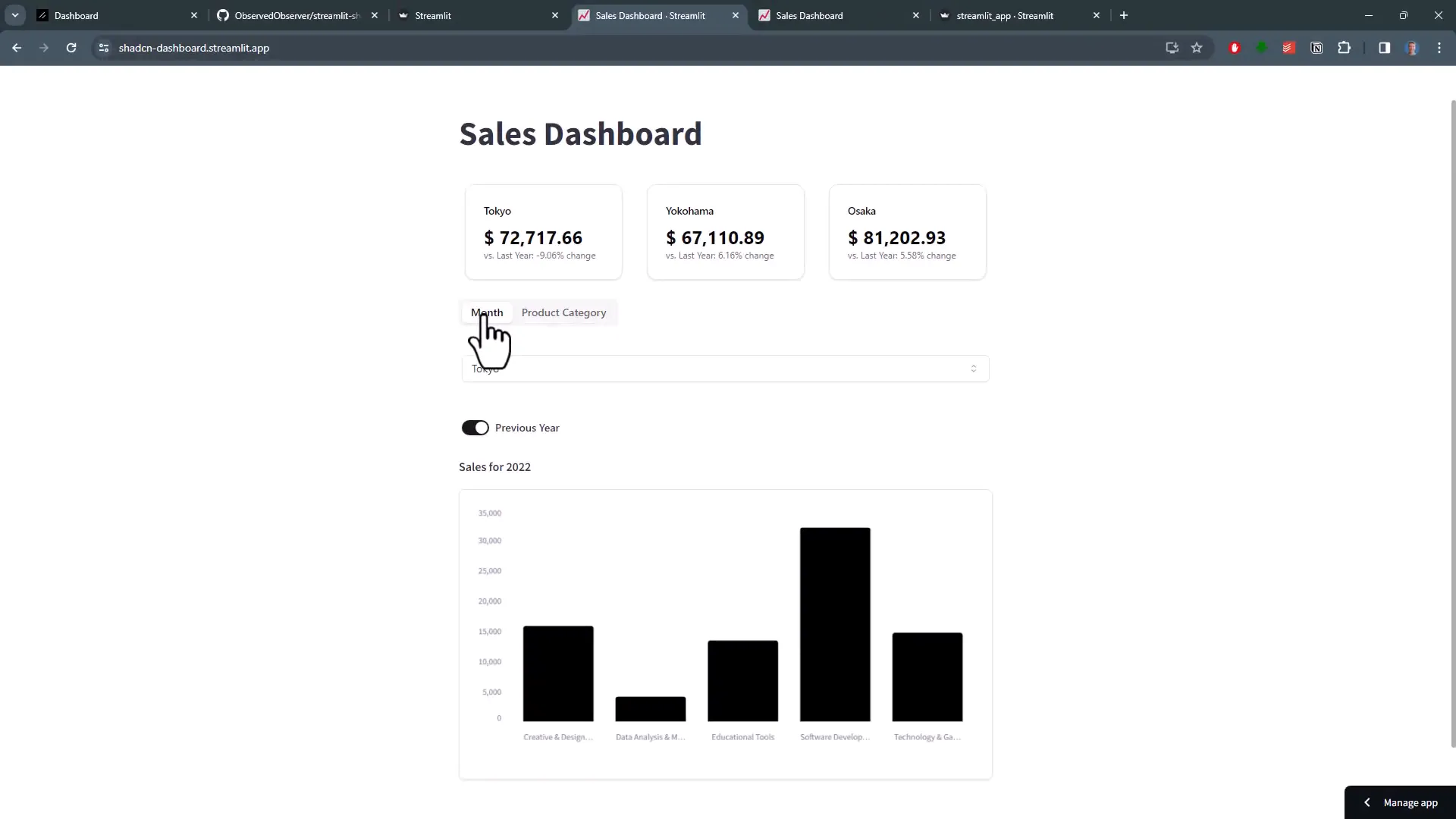
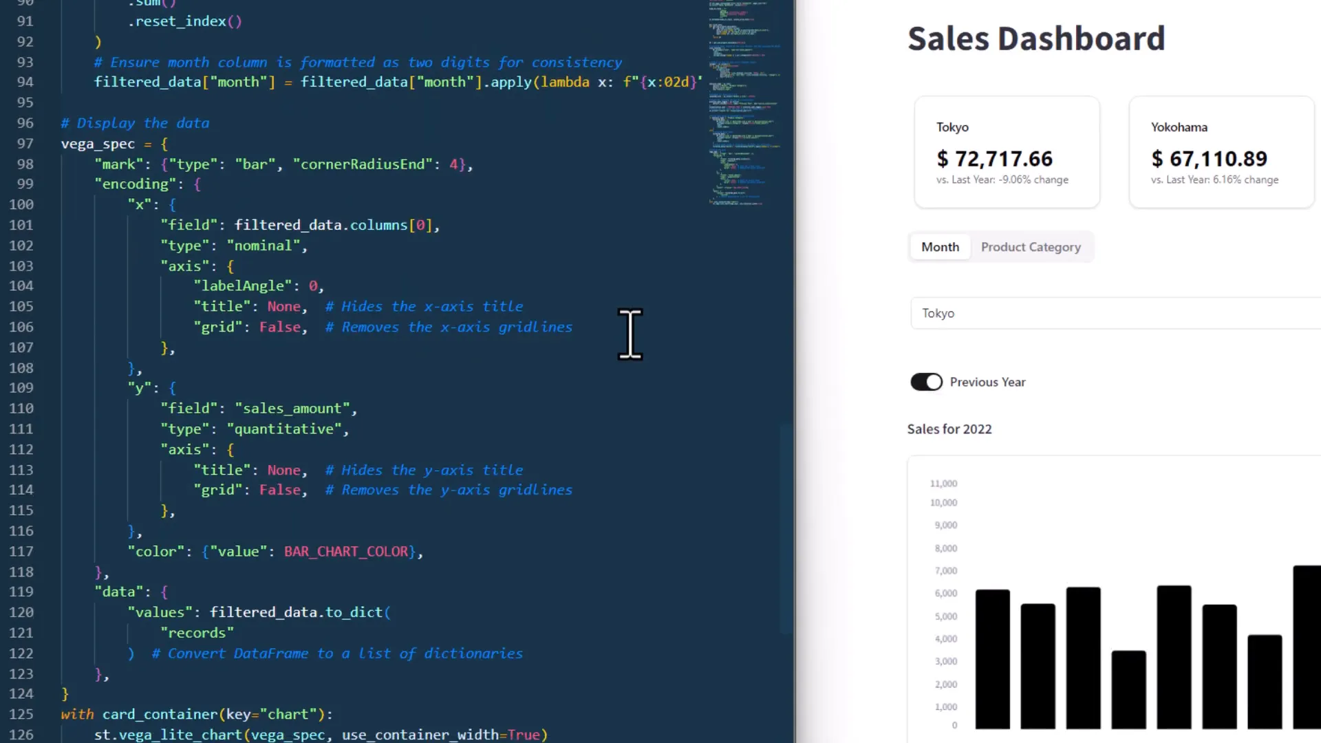
As a result, I filtered the data based on the user selections. While you can use a standard Streamlit bar chart, I opted for a Vega-Lite chart to achieve rounded corners for the bars. This code block defines how the chart looks, and I embedded it in a card container to enhance the overall design.
However, there are some current limitations to the package. Initially, I wanted to create a dashboard in dark mode, but I found that the dark theme isn’t fully supported yet. For example, the toggle is hard to see, and there’s noticeable whitespace around the selection items in the select box. Therefore, it seems to work best with the light theme of Streamlit.
Conclusion
In summary, using Shadcn components can significantly enhance the visual appeal of your Streamlit apps. With its beautifully designed and customizable components, you can create a more engaging user experience. While there are some limitations, especially regarding dark mode support, the overall functionality and aesthetic improvements are worth exploring.