Supercharge Excel With Python 🚀
Introduction
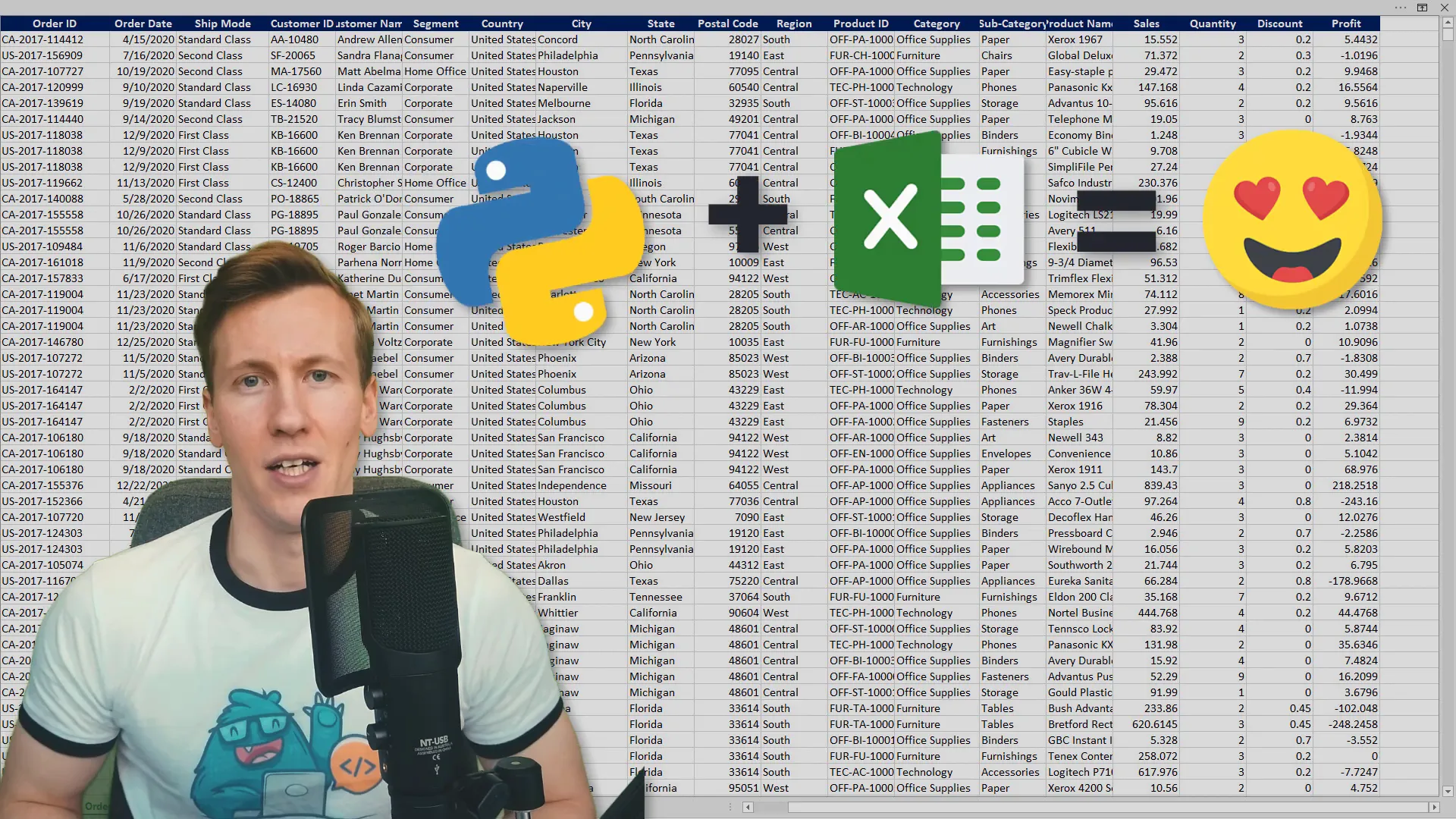
Combining Python and Excel can enhance your data analysis capabilities significantly. In this post, I’ll share how to analyze a dataset and create interactive charts, such as a sales calendar, while also splitting data into separate workbooks.
Getting Started
The purpose of this guide is to inspire you and share my tips and tricks. Keep in mind that your use case might differ, and there’s no one-size-fits-all solution. I have many tutorials on this topic, so I’ll keep the explanations brief and recommend my previous videos for deeper insights.
Reading Data from Excel
To begin, I’ll read data from an Excel file and store it in a Pandas DataFrame. The Pandas library is like Excel on steroids, allowing for powerful data manipulation and analysis. We will plot interactive charts before exporting the results back to Excel.
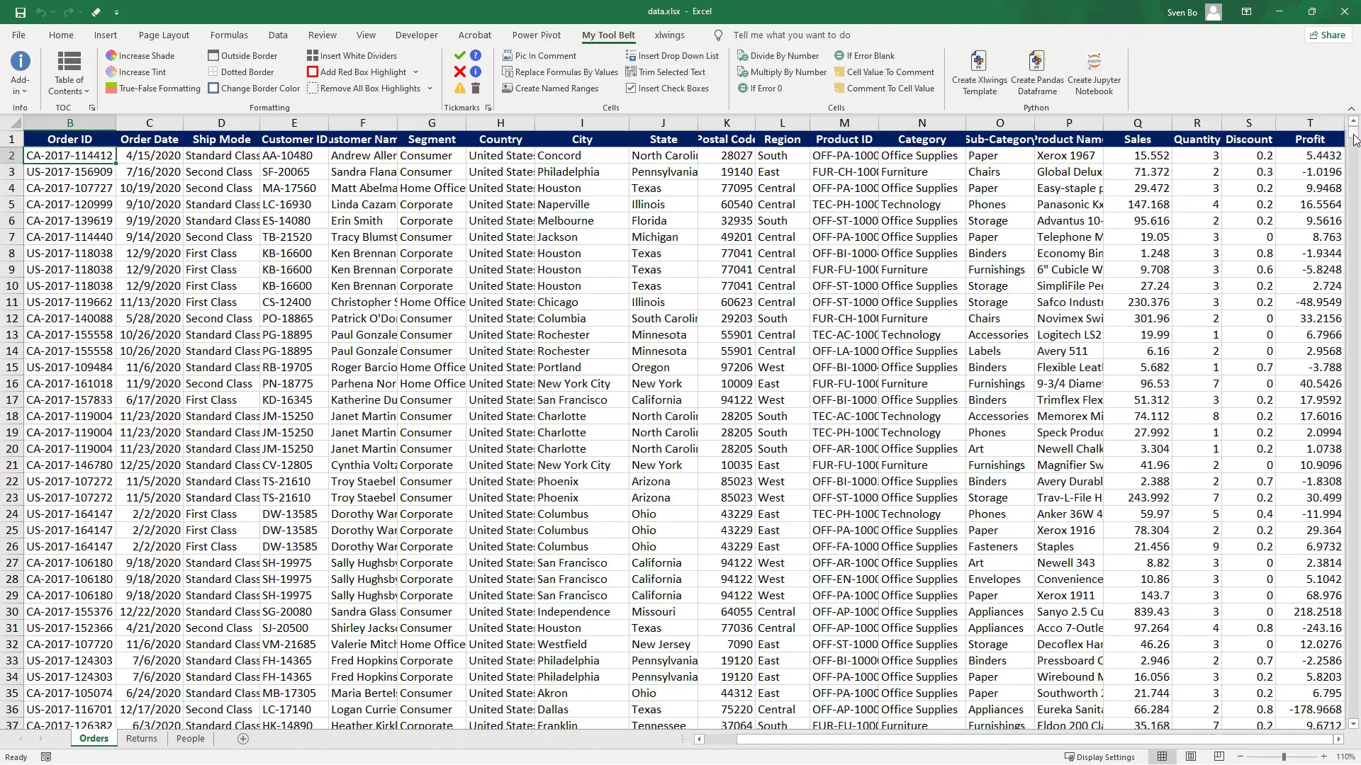
For this tutorial, we’ll focus on the Order Date, subsegment, Sales, and Profit from a fictional store’s transactional data with over 3,300 records. To kick things off, I need to install the required libraries:
- pandas
- openpyxl
- plotly-express
- xlwings
These can be installed via the command line with pip install [library name]. I’ll also upload the notebook to my GitHub page where you can find the necessary requirements in a ‘requirements.txt’ file.
Importing Libraries
Now, let’s import the libraries:
import pandas as pd
import plotly.express as px
import xlwings as xw
from pathlib import Path
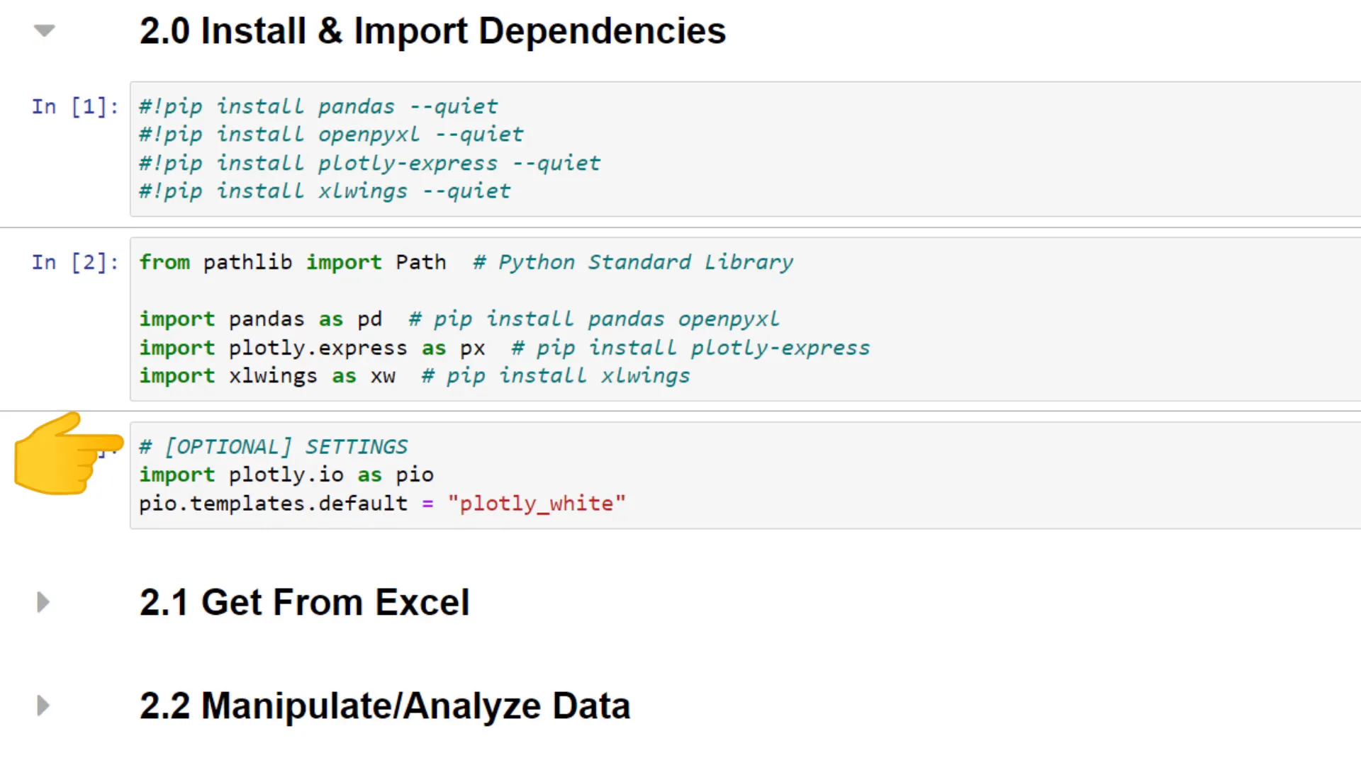
Next, I’ll set a preferred style for plotting with Plotly Express. After importing the dependencies, I will load the data from the Excel file and print out five sample rows to verify the import.
Analyzing the Data
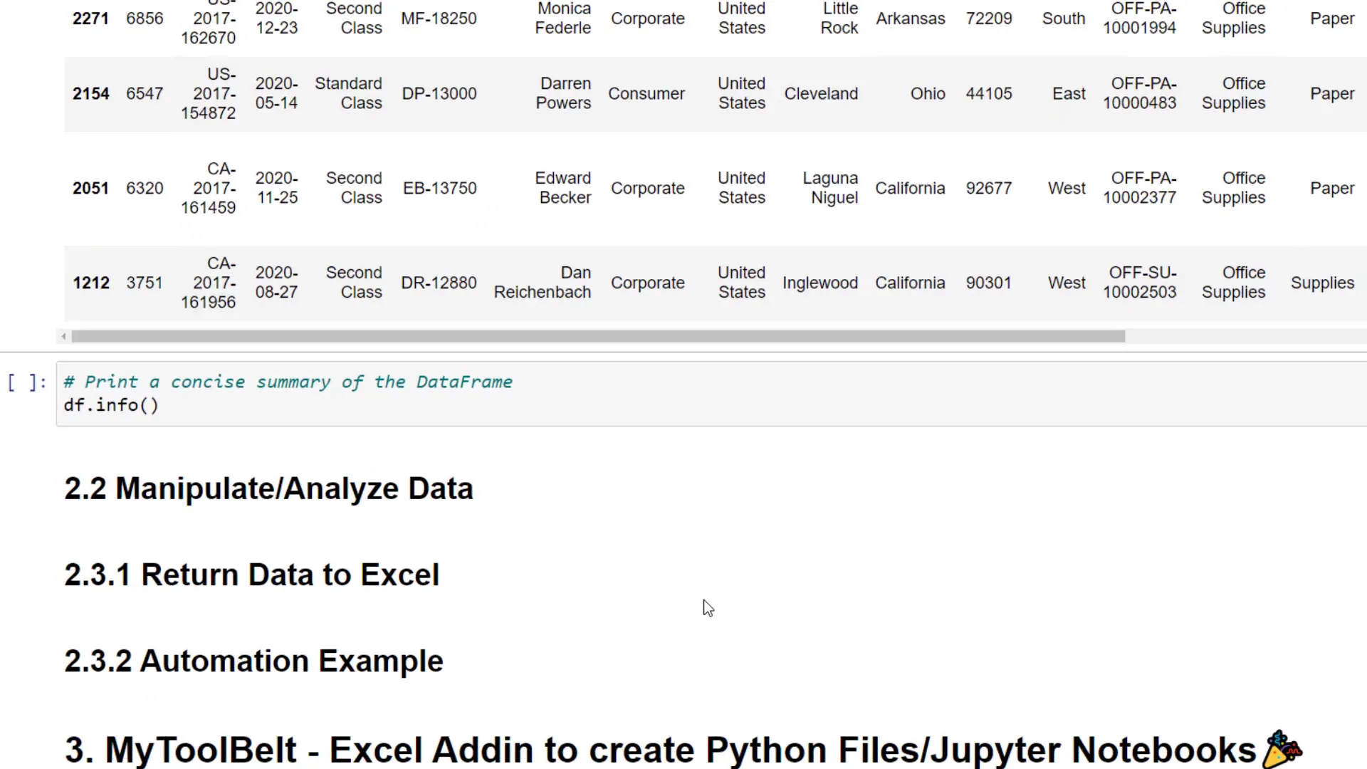
Once the data is in a DataFrame, I typically check for null values and print a concise summary using the info() method. This gives us an overview of each column’s data type, which is helpful for further analysis.
Next, I want to extract a month column from the Order Date and calculate the Profit Margin by dividing the Profit by Sales. This will help us analyze the dataset more effectively.
Grouping and Summarizing Data
Using the groupby operation, I can group the data by sub-category and sum up numerical values. This allows me to check profits for each sub-category. I’ll then create a bar chart using Plotly Express to visualize the data.
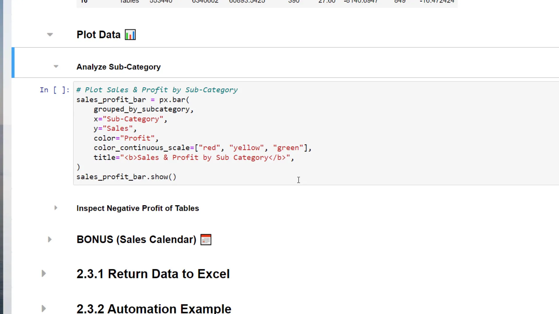
The bar chart will display sub-categories on the x-axis and sales on the y-axis, with colors indicating profit contribution. A low profit will be marked in red, while a higher profit will be green. This visualization helps quickly identify sub-categories with negative profits.
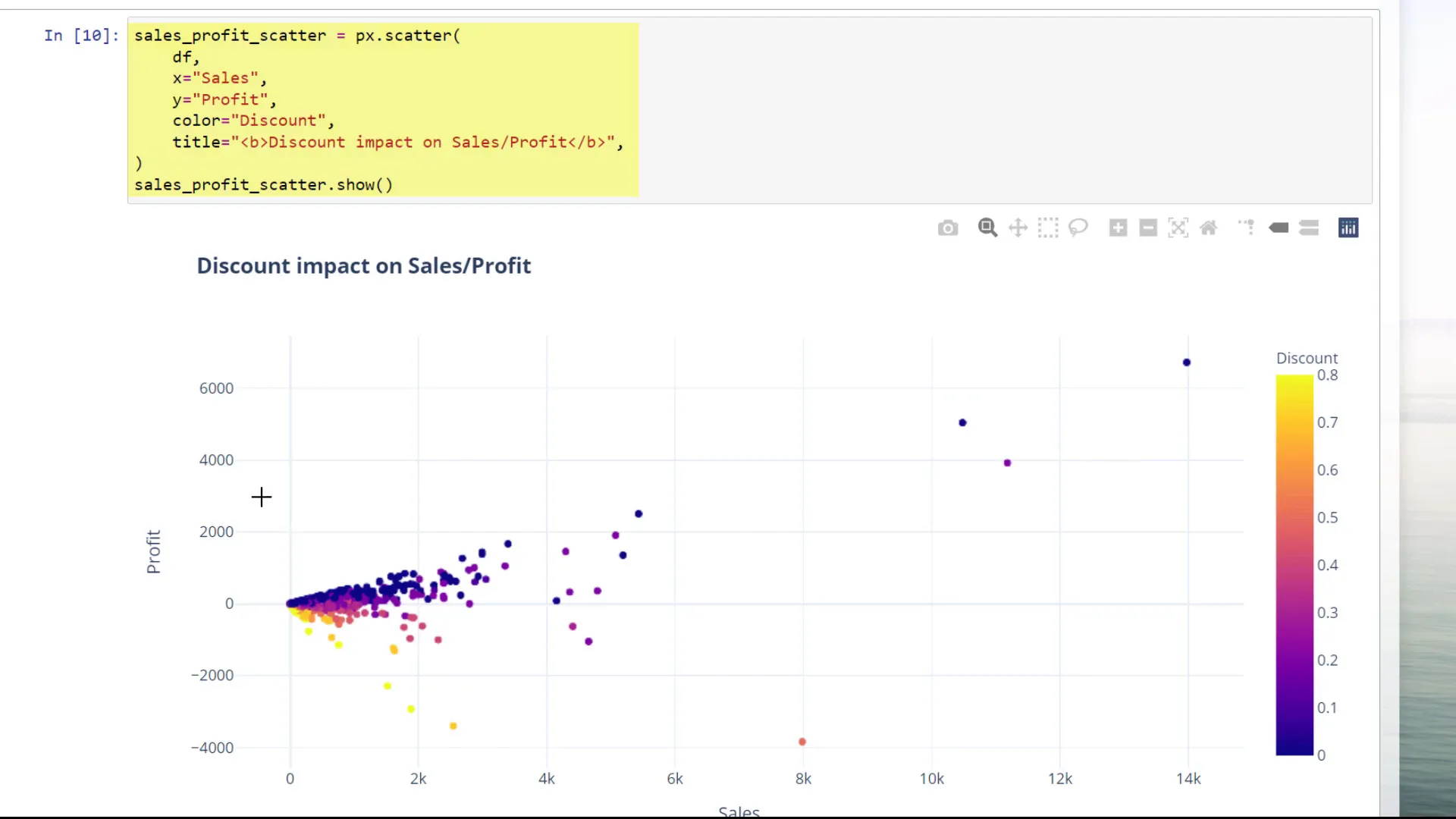
Exploring Relationships
I can also create a scatter plot to explore the relationship between total profit and discounts granted to customers. The interactive nature of the scatter plot allows for easy zooming and examination of data points.
Next, I’ll calculate the average discount by sub-category and show the total profit amount alongside it, plotting this new DataFrame using a bar chart.
Exporting Findings
To keep things organized, I’ll create three folders: one for the analysis, one for charts, and another for automation examples. I’ll export the charts to a standalone HTML file and inject them as images into the original Excel file using the xlwings library.
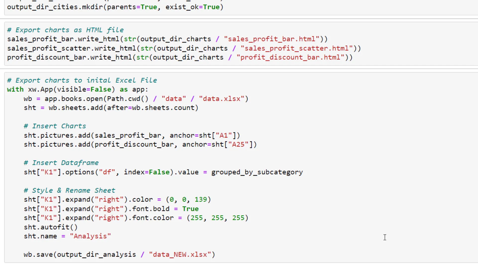
To run xlwings, I’ll initialize the Excel instance, open the workbook, and add a new sheet for the charts. I’ll also insert the grouped DataFrame and style the sheet before saving it.
Automation Example
Finally, I’ll demonstrate a small automation idea. I want to save the data for each city in a separate workbook. Using a simple for loop, I can filter the DataFrame for each city and save it to the output directory, ensuring the file name matches the city name.
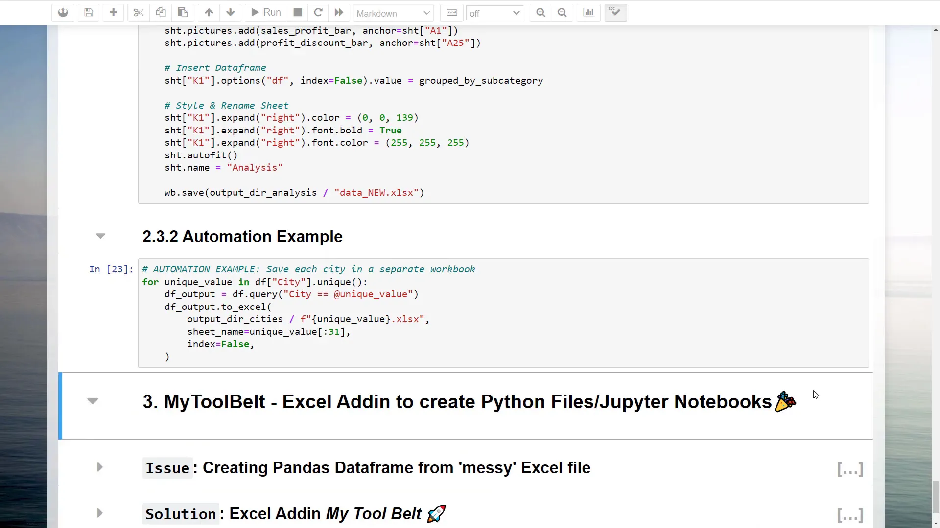
This method ensures I have one workbook for each city, which is useful for further analysis. However, keep in mind that real-world data might not always be clean or tidy.
Conclusion
In this tutorial, I’ve shown how to combine Python and Excel for data analysis and automation. By leveraging libraries like Pandas and Plotly, you can enhance your data manipulation capabilities significantly. Remember, the data you often encounter may require additional cleaning and structuring, which is where tools like my Excel add-in come in handy.
If you’re interested in the add-in, you can find it linked below, and using the coupon code “YOUTUBE20” gives you a 20% discount on the Pro Version.