Turn An Excel Sheet Into An Interactive Dashboard Using Python (Taipy Tutorial)
Introduction
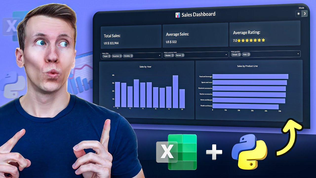
In this tutorial, I will show you how to transform an Excel sheet into an interactive web application using Python. The application will include various filtering options for charts and KPIs, as well as a toggle button to switch between dark and light modes. For this project, I will be using Taipy, a powerful tool for creating production-ready web applications without the need to learn HTML, CSS, or JavaScript.
Turn the Excel Data into a Pandas DataFrame
First, let’s take a look at the Excel data, which contains supermarket sales information for different cities, including customer gender, product details, total sales amount, purchase time, and customer ratings. I will use the MyToolBelt Excel add-in to access this data. Although I created this add-in and some features are exclusive to the paid version, you can still follow along without it.
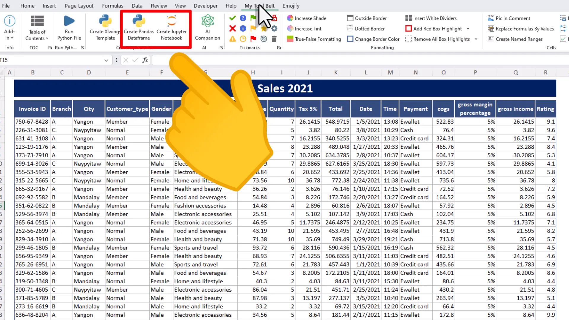
To create a Pandas DataFrame, I will click the “Create Pandas Dataframe” button, select the data range I want to convert, and the add-in will generate a Python file in the workbook’s directory. I will rename this file to main.py and open it in Visual Studio Code.
Install the dependencies (Pandas, Openpyxl, Taipy)
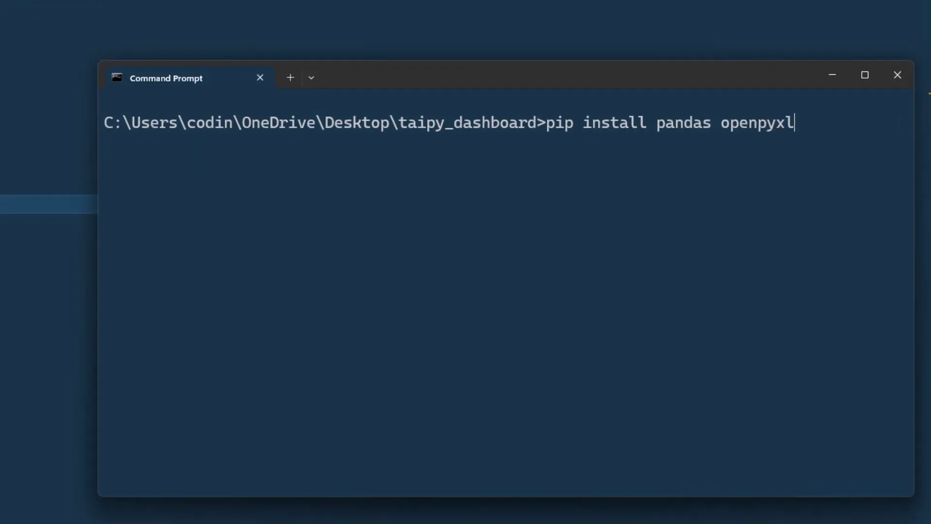
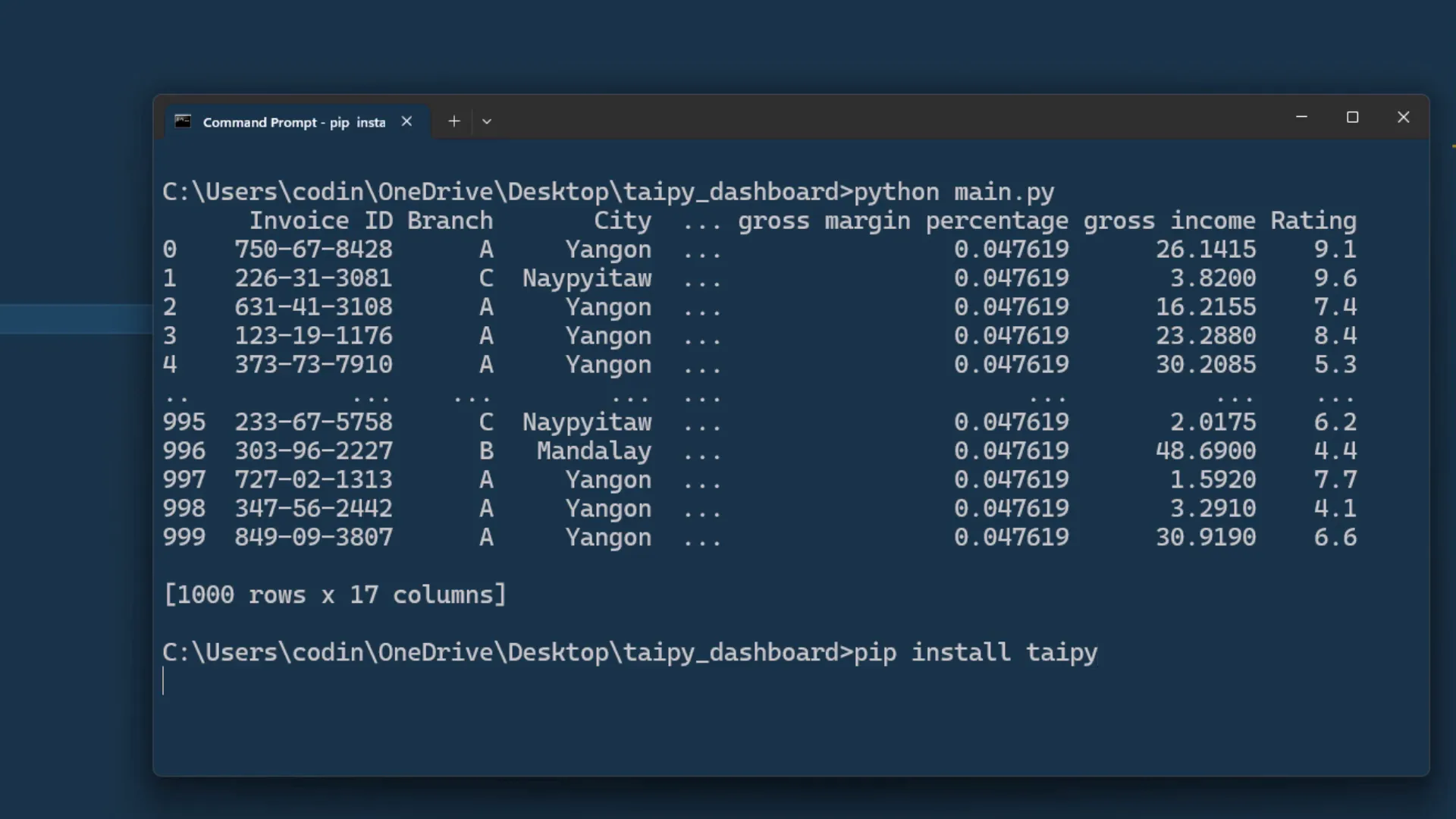
To work with the Excel data, I need to have pandas and openpyxl installed. I can install these packages by running the command pip install pandas openpyxl in the terminal. Once installed, I can execute the Python file to load the spreadsheet data into a Pandas DataFrame.
Creating a very simple app
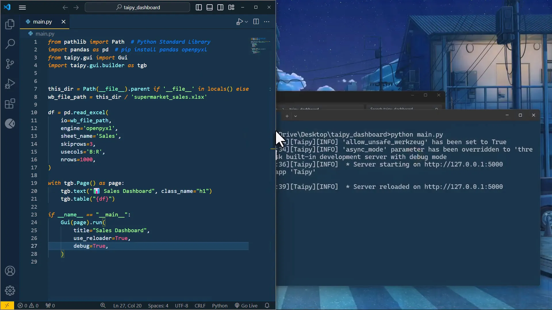
Next, I’ll create the web app using Taipy. To install Taipy, I will run pip install taipy. After installation, I will import the necessary components from Taipy and begin defining the layout of my web page.
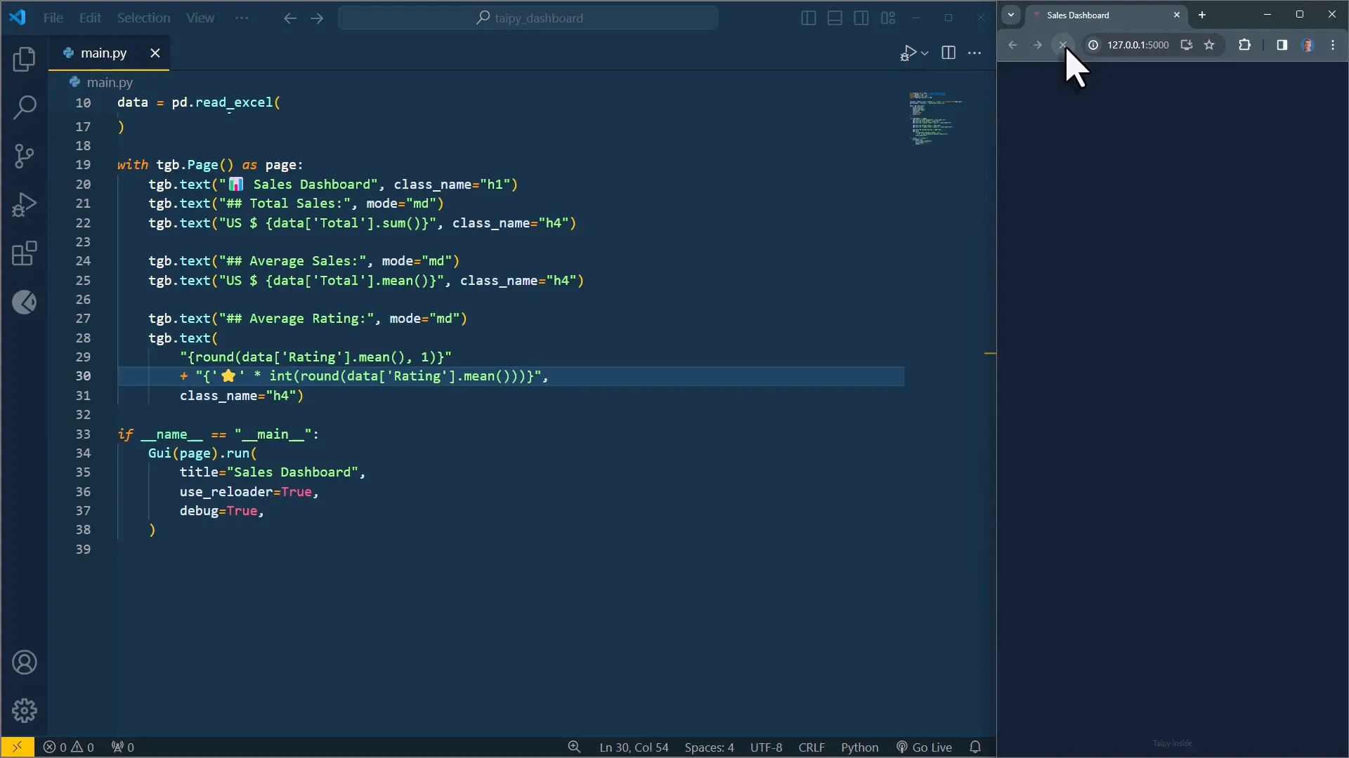
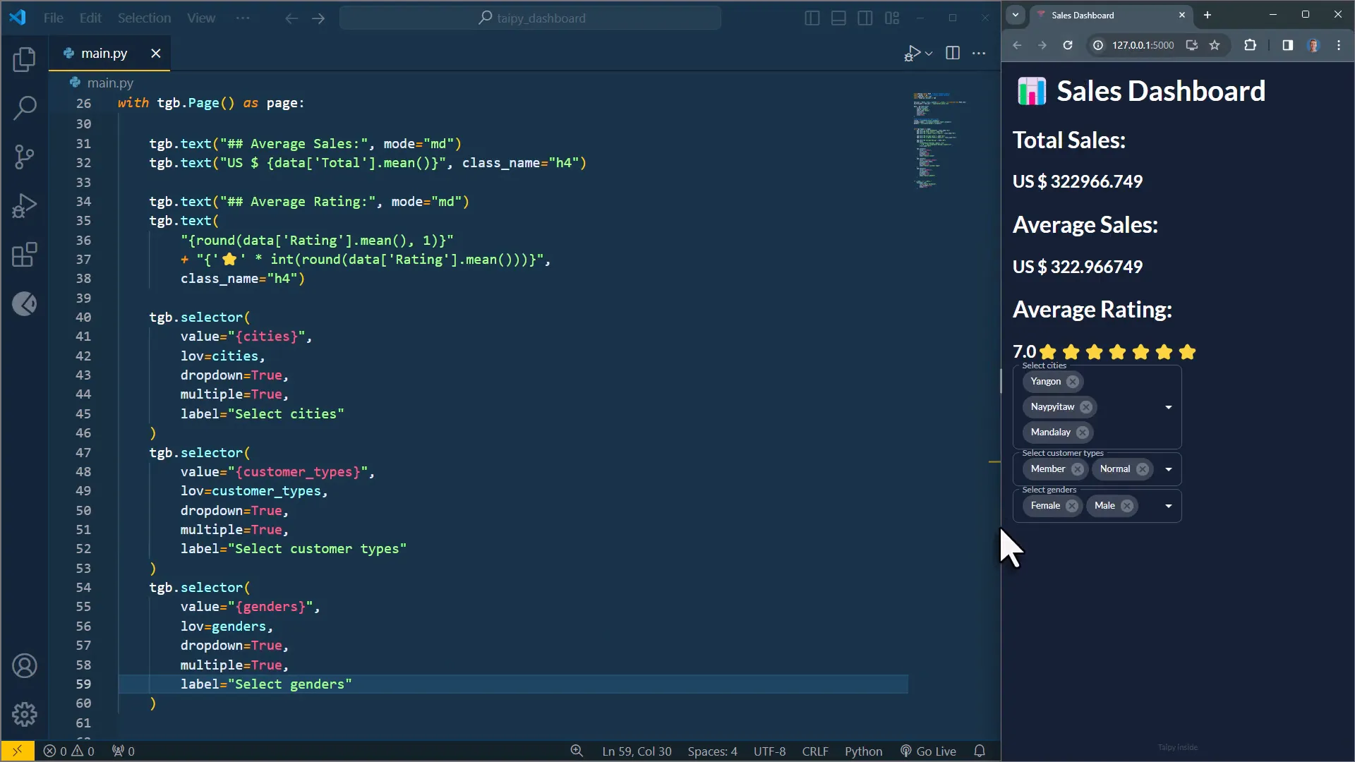
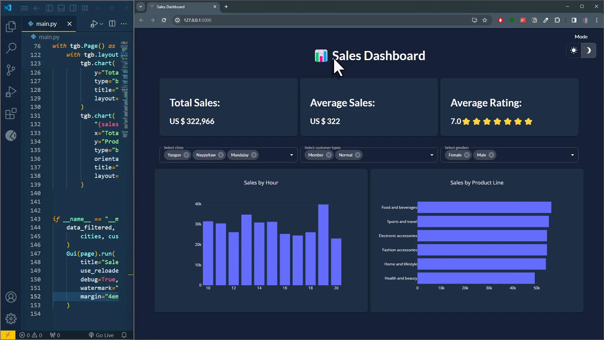
Creating the top KPIs
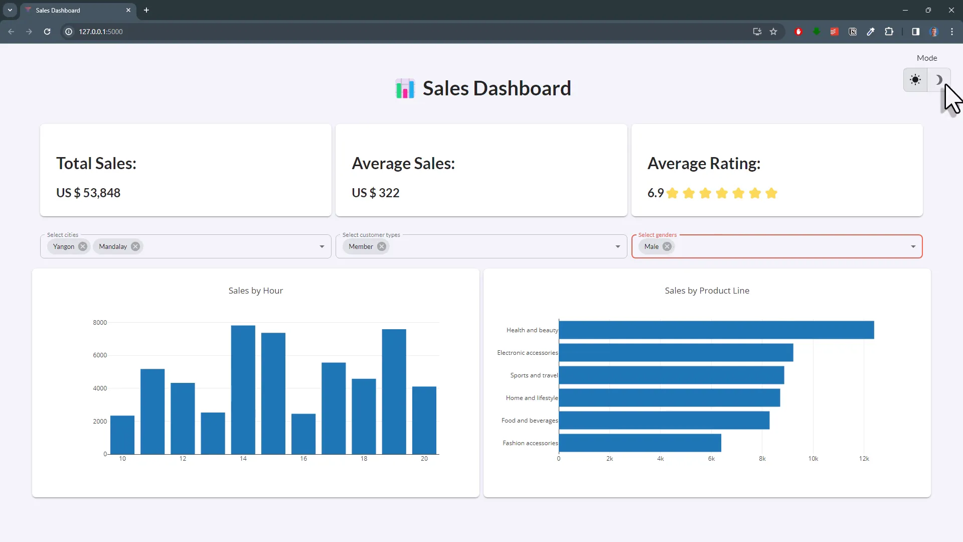
To display the KPIs at the top of the page, I will change the DataFrame name to data and use a text element to insert a subheading. I will also sum up the total sales using Pandas and display it on the web page. Additionally, I will show the average sales and average rating, formatting the rating to include star emojis based on the rating value.
Creating the filter selections
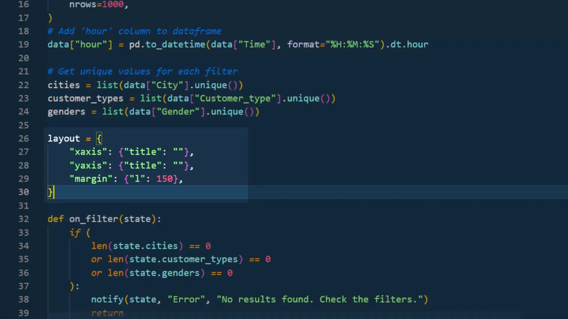
To filter the dataset based on cities, customer types, and genders, I will use drop-down menus. First, I will obtain unique values for these fields using the Pandas unique method. Then, I’ll add the selector elements to the app, ensuring that changes to these selectors only affect the current user’s session.
Customize the layout
To improve the layout, I will arrange the KPIs in a single row and place the filter selections below them. By using the layout element, I can specify the number of columns and their sizes, ensuring a visually appealing arrangement of elements on the page.
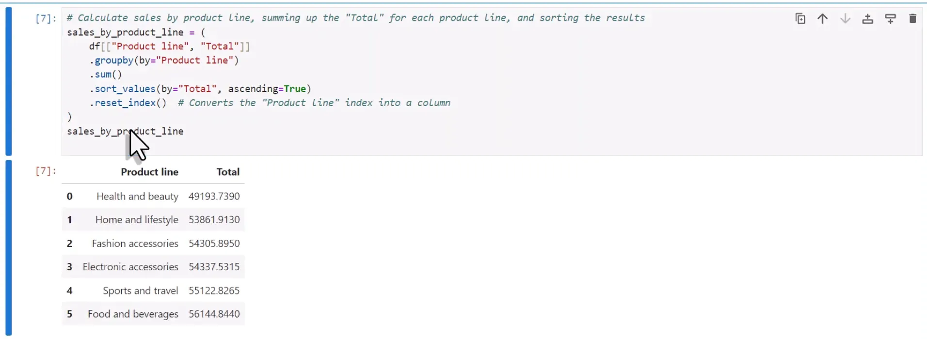
Creating the chart DataFrames with Pandas
Before creating the charts, I will perform calculations in Pandas. I will create a Jupyter notebook to group sales by product line and by hour. I will convert the purchase time to a datetime object to extract the hour information correctly. This will allow me to visualize the data effectively in the charts.
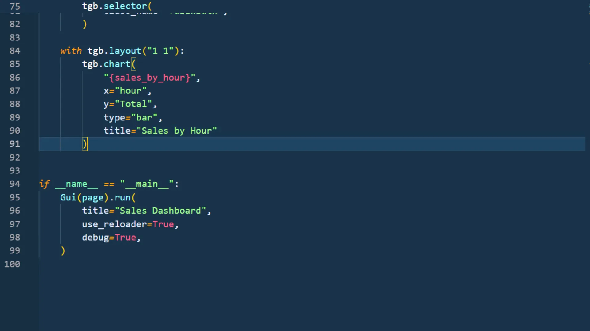
Creating the Charts
Using the Taipy chart element, I will create two charts: one for sales by hour and one for sales by product line. The charts will be configured using Plotly parameters, and I will ensure that they are displayed correctly on the page.
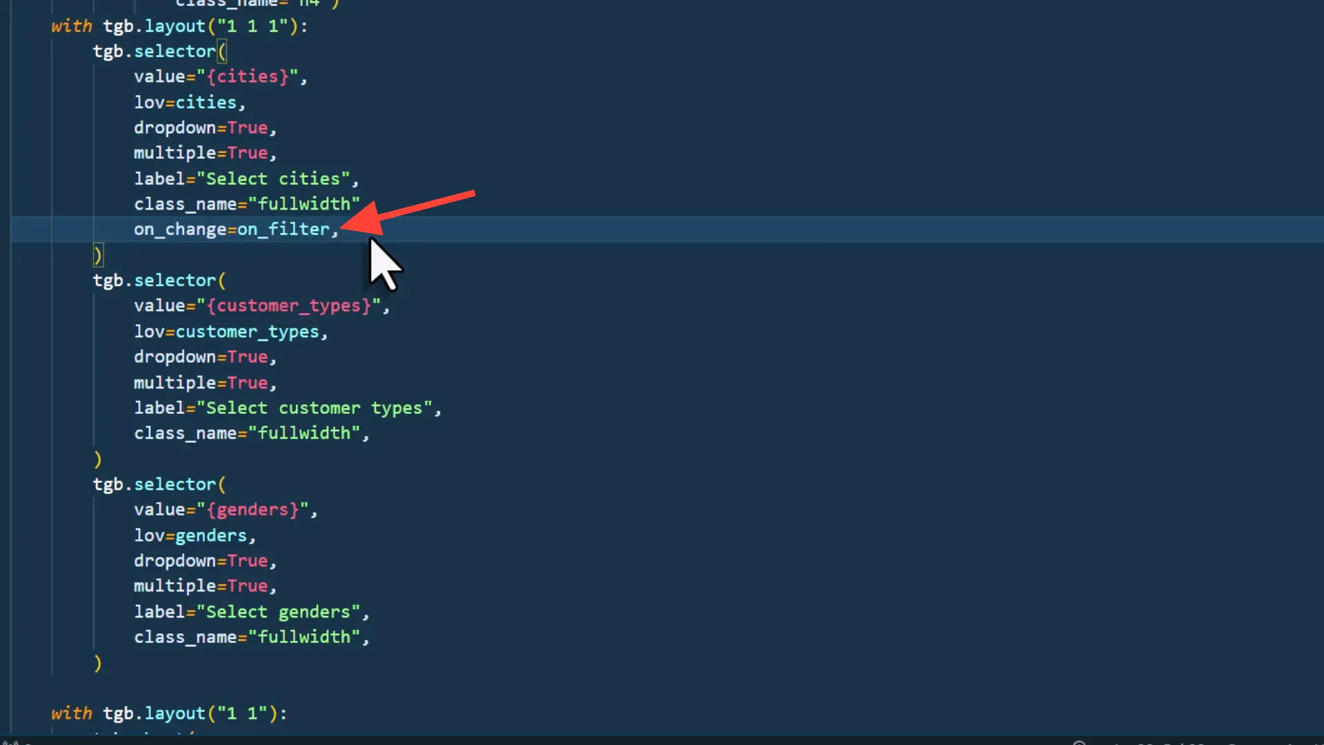
Interactions (Filter the dataset)
To make the dashboard interactive, I will implement filtering functionality. Whenever a user changes a selection in the drop-down menus, the KPIs and charts should update accordingly. I will create an on_filter function to handle this interaction and ensure that it only affects the current user’s state.
Styling the app incl. toggle button
Next, I will focus on styling the app. I will add a toggle button for dark and light modes, and customize the appearance of the charts and KPIs. This includes adjusting margins, adding padding, and removing the default watermark from Taipy.
The final app
After applying all the customizations and ensuring that the app is interactive, I will test it to confirm that everything works as expected. The dashboard should retain the filter selections even after refreshing the page, providing a seamless user experience.
Deployment of the app
In the next steps, I will deploy the app so that it can be accessed over the internet. This will allow users to share the link with others, making the dashboard widely available.
Outro
In this tutorial, I demonstrated how to turn an Excel sheet into an interactive web app using Python and Taipy. We covered everything from accessing the data to creating KPIs, filters, and charts, as well as styling the app. The final step will be deploying the app for public access.