Time-Series Data Manipulation with Pandas
Introduction
In this tutorial, I will show you how to manipulate and work with time-series data using pandas, focusing on analyzing YouTube data.
Load and inspect the data
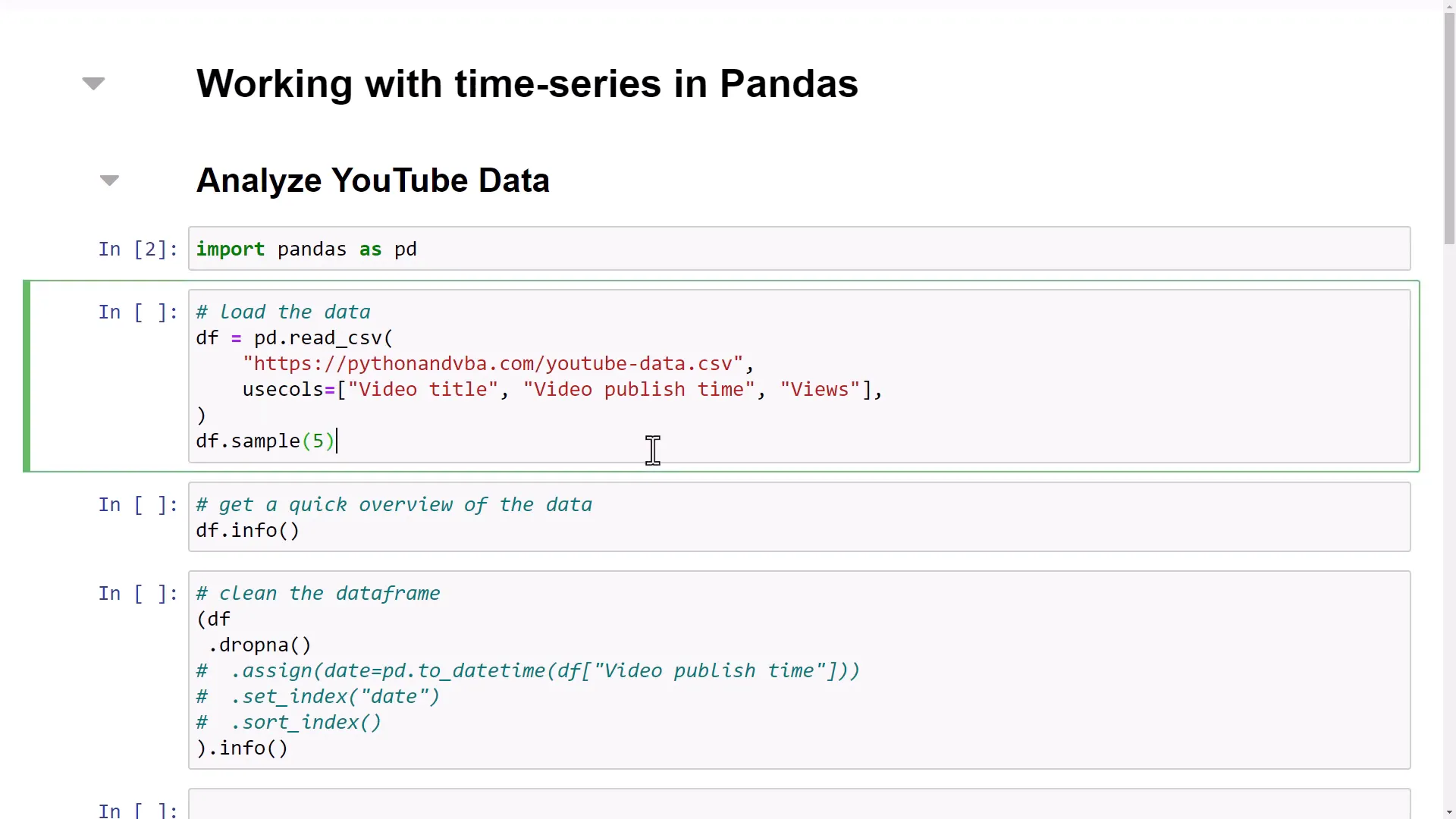
Let’s start by importing pandas and loading the dataset, which contains the video title, video publish time, and total views.
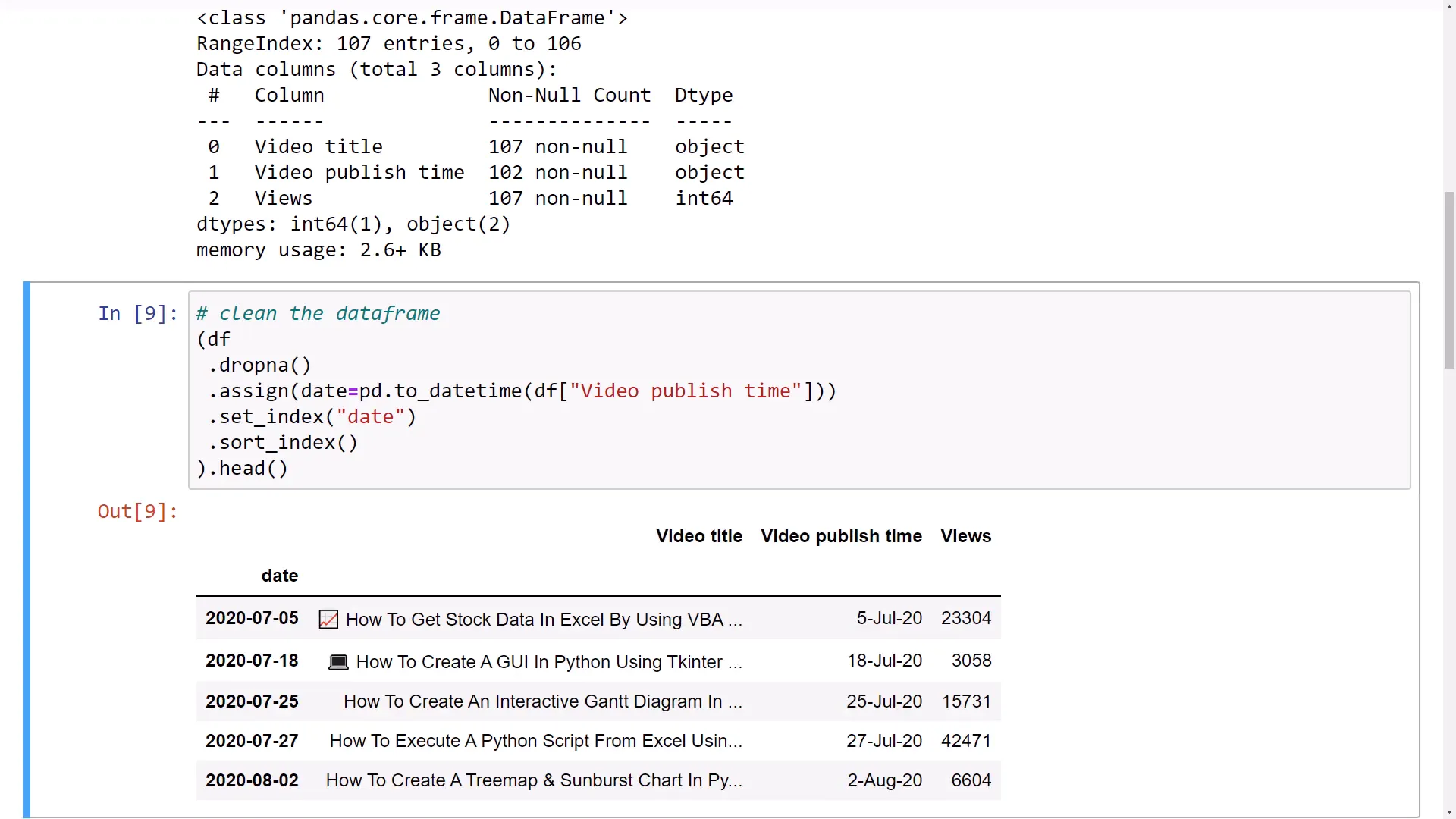
Using the info method, I can quickly overview the data. Here, I notice some missing values in the “Video publish time” column, and the data type for that column is assigned as “object”. This is not useful for our time-series analysis, so I need to convert it into a DateTime object.
Clean the dataframe
Next, I will clean the dataframe by removing empty values. After removing five rows, I will create a new column called “date” and transform the “Video publish time” into a DateTime object.
By taking advantage of pandas’ method chaining, I can keep my code clean and easy to debug. I will also set this new column as the index and sort it for plotting later.
Time-Series manipulation
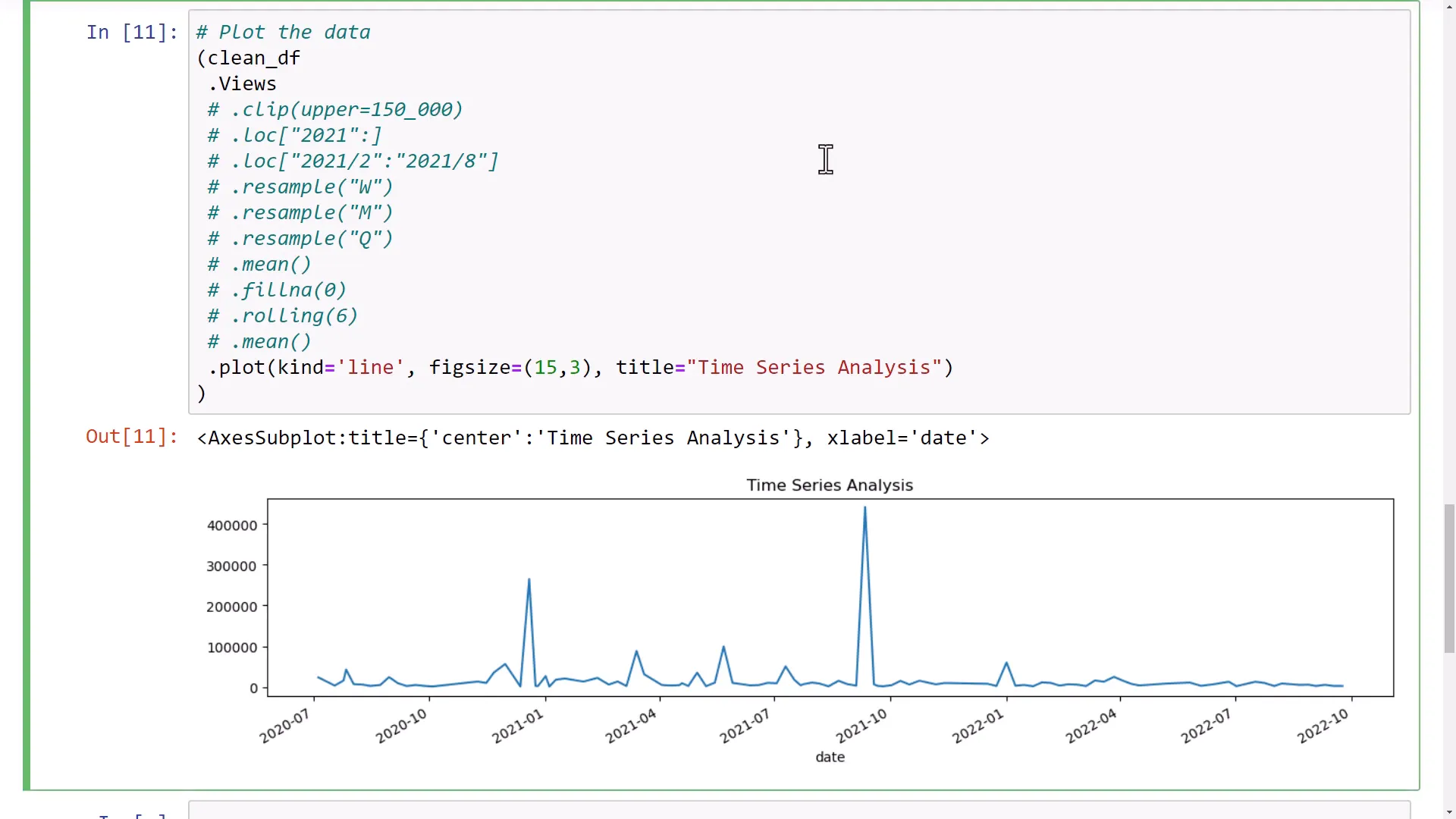
Now that I have a clean dataframe, I can begin manipulating the time series data. First, I will select only the views and visualize them using the pandas plot method, resulting in a line chart.
However, there are two outliers in the dataset that make comparisons challenging. To address this, I will use the clip method to set an upper limit of 150k views, making the pattern of the other videos clearer.
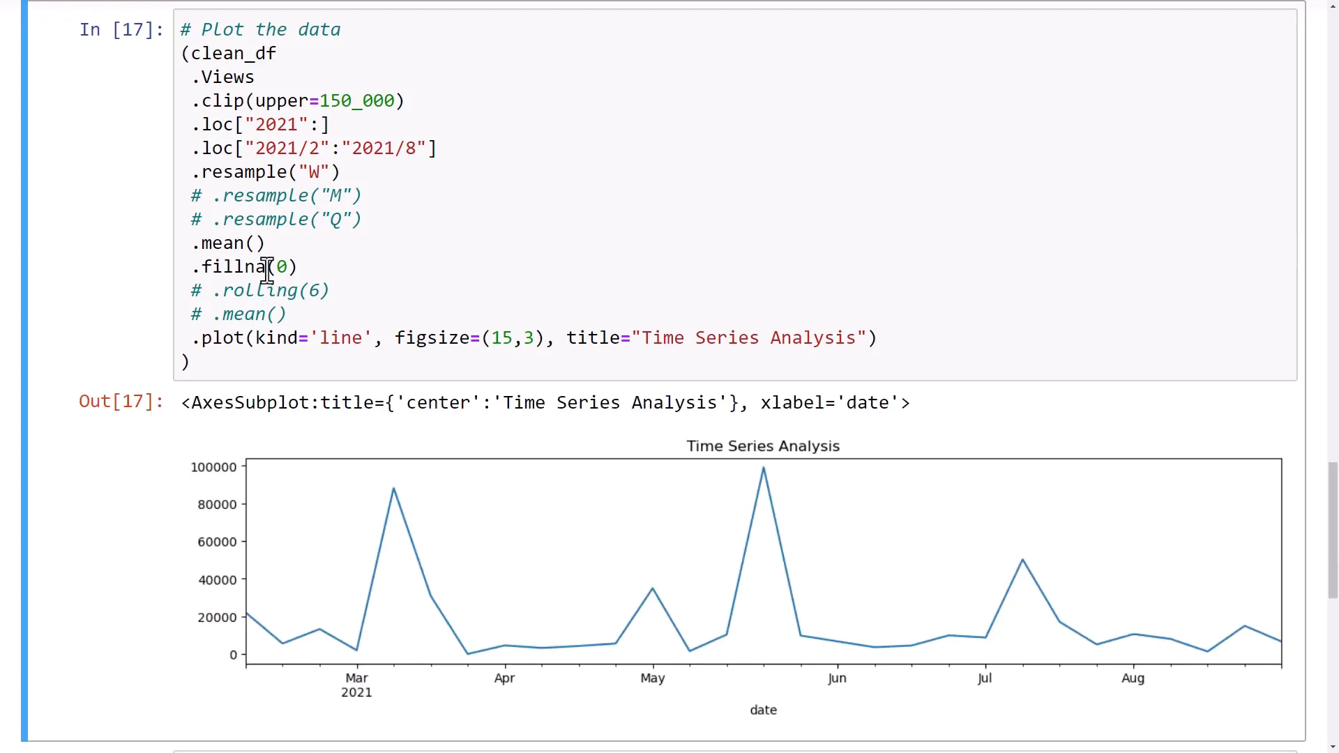
With the DateTime object in place, I can use the loc method to filter data from 2021 onwards. I can also define specific timeframes for more granular analysis.
Next, I will demonstrate the resample method to calculate the mean views by week. If I run this, pandas returns a lazy object, and I can visualize the mean views by week in a chart. I notice a gap between March and April due to no videos being posted, which I can fix by filling missing values with 0.
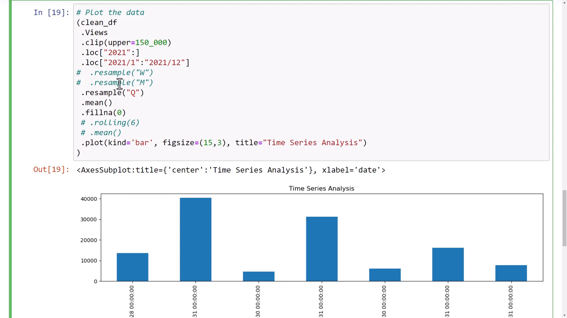
I can also resample the data by month or calculate quarterly means. Each method provides a different insight into the data, and I can switch to bar charts for better visibility.
Calculation of a simple moving average
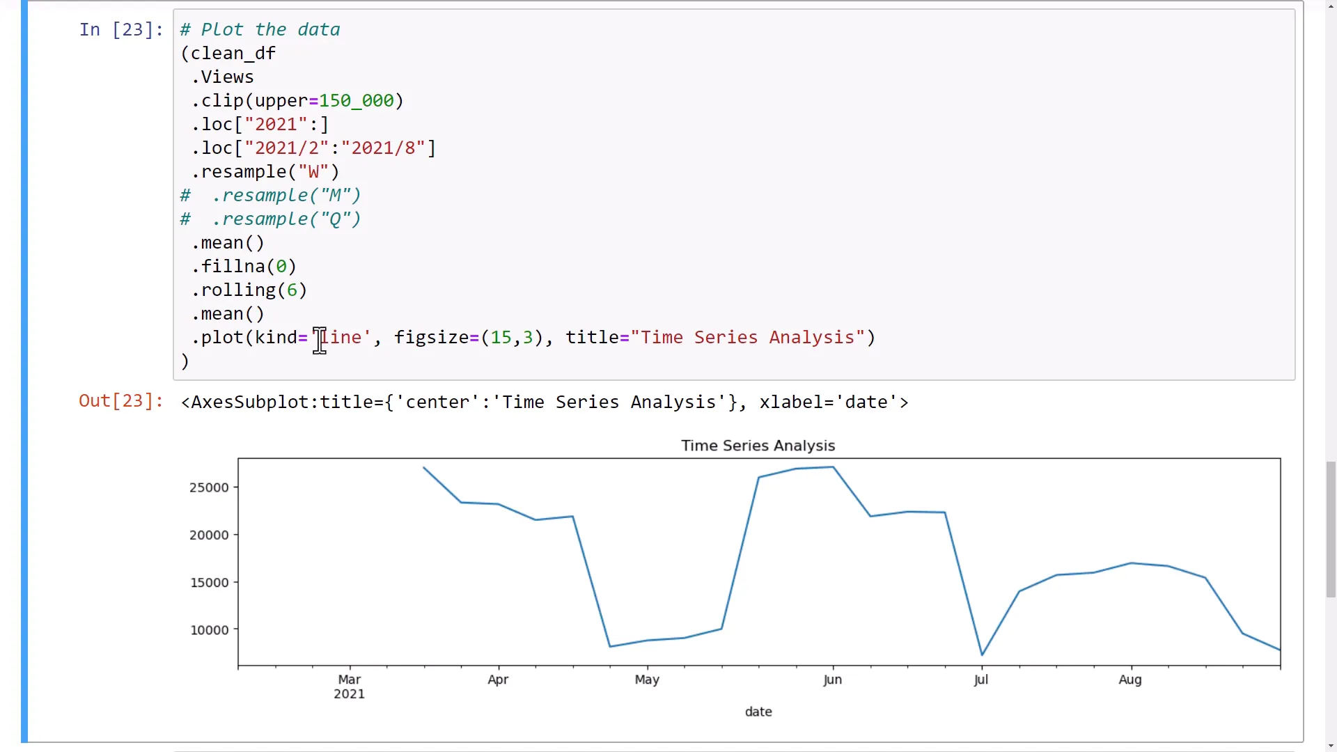
Another powerful technique is calculating a moving average. For instance, I can calculate the moving average for six entries, which results in the first five entries being missing. This calculation shows the average of the first six data points, and I can visualize this in a line chart.
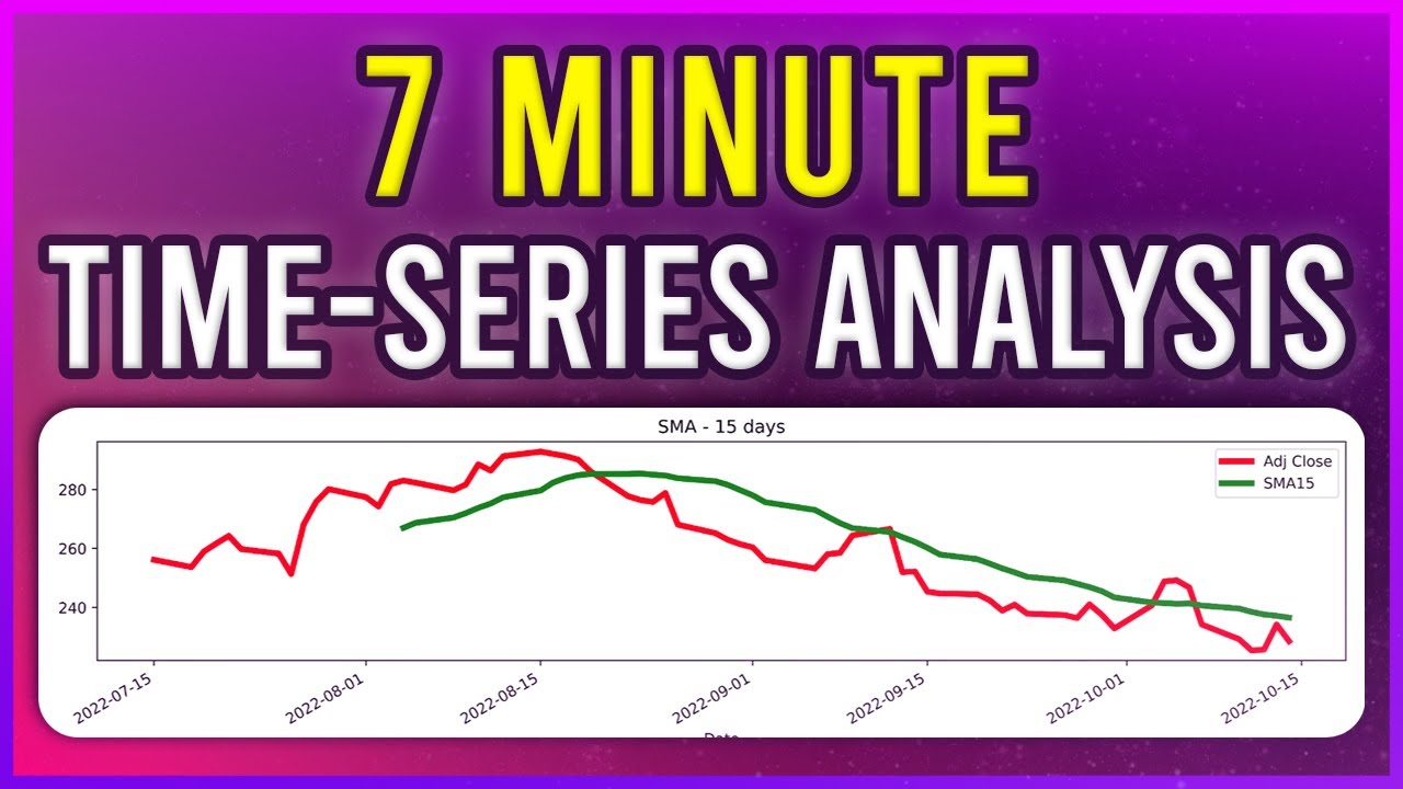
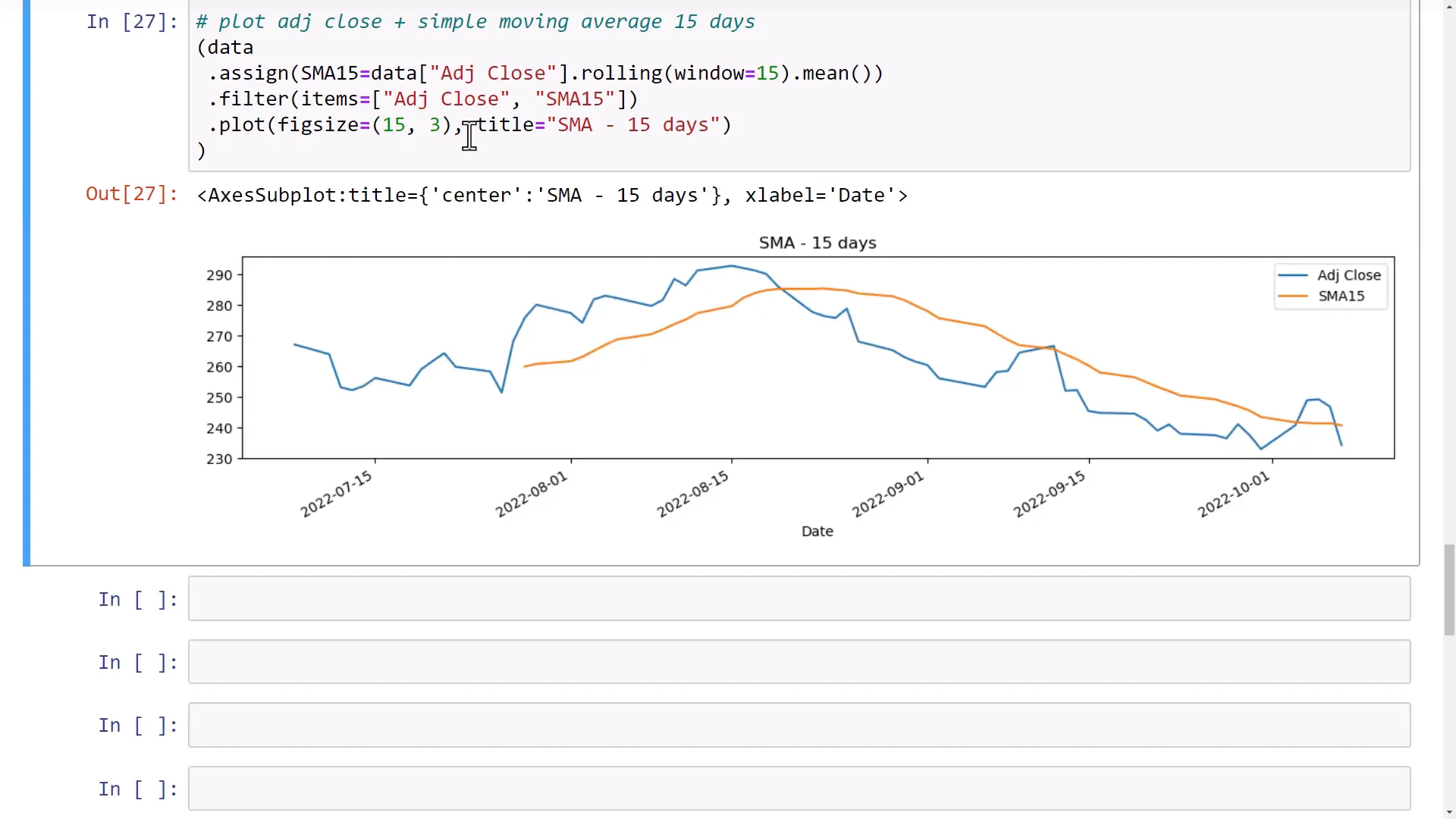
To demonstrate this further, I will import the yfinance package to download stock information for Microsoft over the last three months. I will then add a new column to the dataset for a 15-day rolling average on the adjusted closing price.
Finally, I will plot the adjusted closing price alongside the simple moving average, resulting in two lines on the chart: one for the daily adjusted closing price and another for the 15-day moving average.
Outro
That covers how to manipulate time-series data using pandas. The range of functions available makes it an excellent tool for data analysis, whether you’re working with YouTube data or stock prices.