How To Turn Excel Data Into a Live Dashboard With AI (No Code)
Introduction
You know that feeling when you’re staring at a massive Excel spreadsheet, trying to make sense of rows and columns of numbers, wishing it could just magically transform into a sleek, interactive dashboard? That’s exactly the frustration many of us have faced. You want to share insights quickly, filter data on the fly, maybe even export a neat report—but instead, you’re stuck slogging through PowerPoint slides or wrestling with complicated code.
Well, buckle up, because today I’m going to show you how to turn your plain old Excel data into a live, interactive dashboard in just about five minutes. And the best part? You don’t need to write a single line of code. Thanks to the power of AI and a platform called Hostinger Horizons, what used to take hours or days can now be done with a simple prompt and a click of a button.
So grab your favorite coffee (or tea, no judgment), and let’s dive into how you can bring your Excel Dashboard dreams to life—quickly, cleanly, and without the usual headaches.
The Problem with Traditional Excel Dashboards
Let’s set the scene: You have a spreadsheet with sales data, customer info, timestamps, product lines, and whatnot. You want to create a dashboard that:
- Shows your key performance indicators (KPIs) like total sales and average customer ratings.
- Has dynamic charts so you can see sales per hour or by product line.
- Lets you filter the data by city, customer type, or gender.
- Allows exporting the dashboard as a standalone file you can easily share.
Sounds simple enough, right? But traditionally, building this kind of dashboard meant one of three things:
- Manually formatting data and charts in Excel—which quickly gets messy and hard to maintain.
- Building something in VBA, which is powerful but often a pain to debug and limited in interactivity.
- Writing custom code in Python, JavaScript, or other languages—which requires programming skills and lots of time.
In fact, about four years ago, I built a similar dashboard using Python. It worked great, but it took a lot of effort and time to get right. And I heard from many of you that this approach, while solid, wasn’t accessible for everyone.
So, what if you could skip all that hassle? What if AI could handle all the coding and design for you, and you only needed to tell it what you want? That’s exactly what Hostinger Horizons offers.
Meet Hostinger Horizons: Your No-Code AI Dashboard Builder
Hostinger Horizons is a platform that lets you create web applications by simply writing a clear, high-level prompt. It uses AI to generate the entire app based on your instructions and even lets you deploy and host it with one click. Imagine telling someone you want a sales dashboard, describing your data, and having a fully interactive app ready in minutes—no coding required.
Full transparency: this platform sponsored the walkthrough I’m sharing, but after testing it, I’m genuinely impressed. It’s intuitive, powerful, and surprisingly flexible.
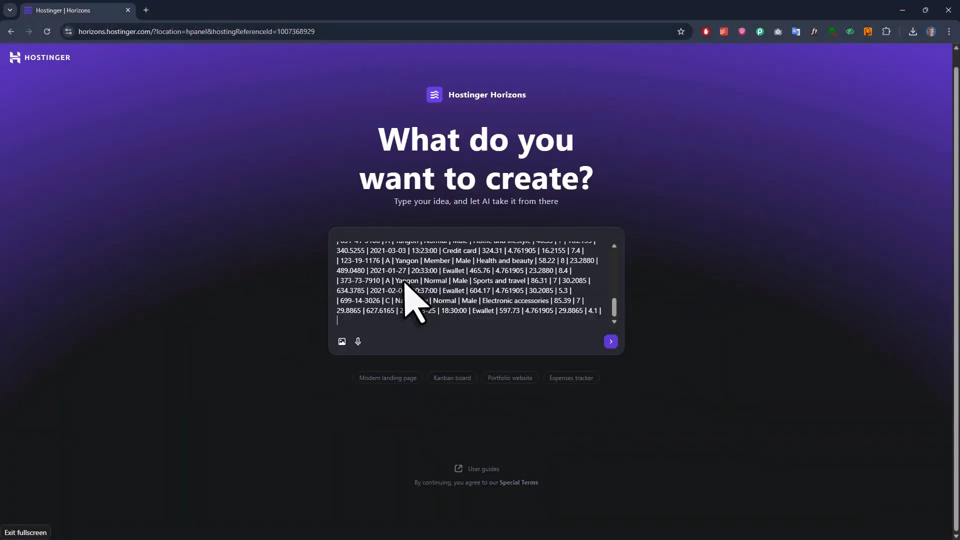
Step 1: Writing Your Dashboard Prompt
Everything starts with your AI prompt. It needs to be clear enough so the AI understands exactly what you want but not so detailed that it gets bogged down. The Hostinger docs recommend keeping it between two to five sentences.
Here’s the prompt I used to create my sales dashboard:
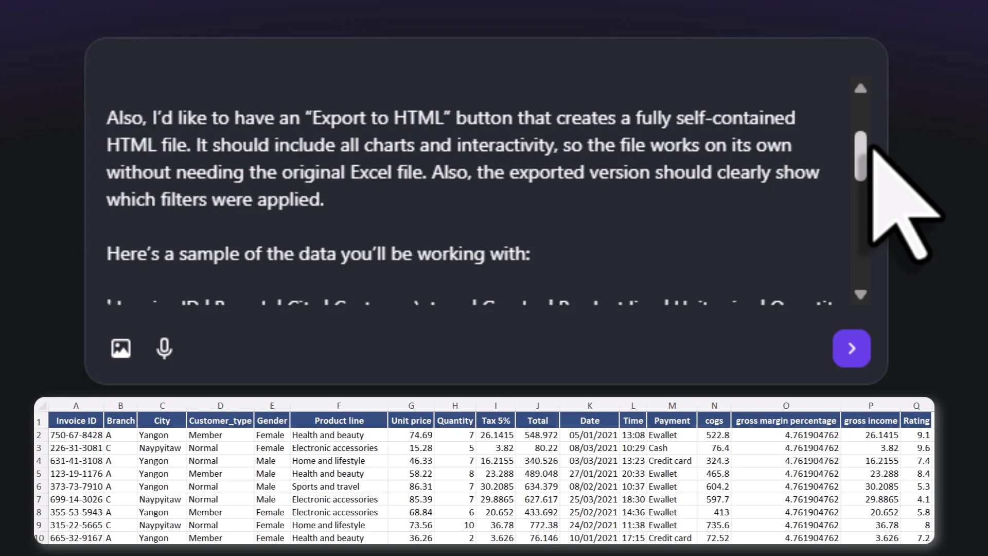
Build a sales dashboard for me using the data from the first sheet of my Excel file. At the top, show key performance indicators, like total sales, average customer rating, and average sales per transaction. Below that, include charts for sales per hour and sales per product line. The dashboard should support dynamic filters for city, customer type, and gender and automatically update when any filter is changed. Also, I would like to have an export to HTML button that creates a fully self-contained HTML file. It should include all the charts and interactivity, so the file works on its own without needing the original Excel file. Also, the exported version should clearly show which filters were applied.
Notice how the prompt breaks down the layout, key features, and export functionality. The AI needs this kind of guidance to deliver exactly what you want.
To help the AI understand your data structure, you also paste in a snippet of your Excel data converted to markdown format. (Side note: I use my own Excel to Markdown converter tool to do this quickly—just drag and drop your Excel file, and it spits out the markdown.)
By combining your prompt and sample data, the AI can tailor the dashboard perfectly to your dataset.
Step 2: Let the AI Build Your Dashboard
Once your prompt is ready, you just hit a button and wait a few minutes. The AI writes the entire web application for you—HTML, JavaScript, CSS, and all the logic for the filters and charts.
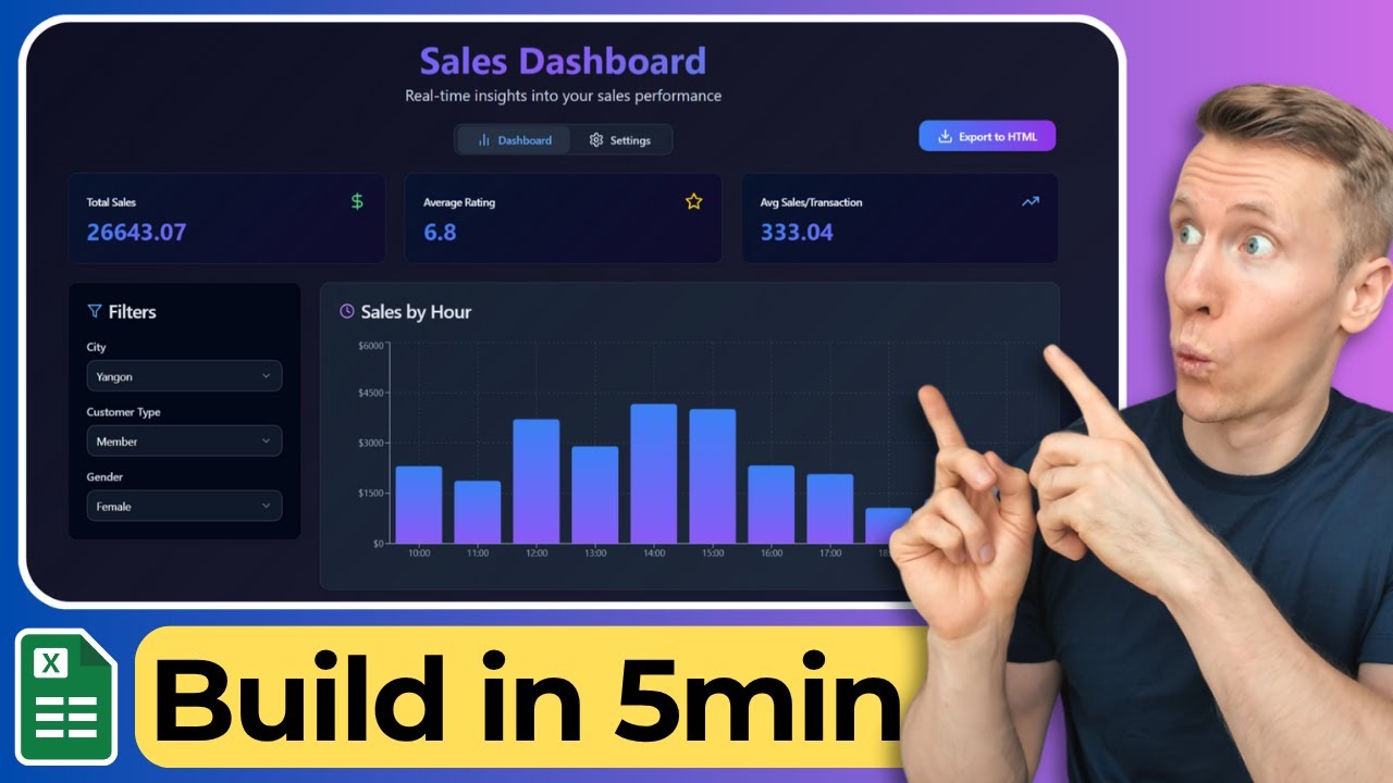
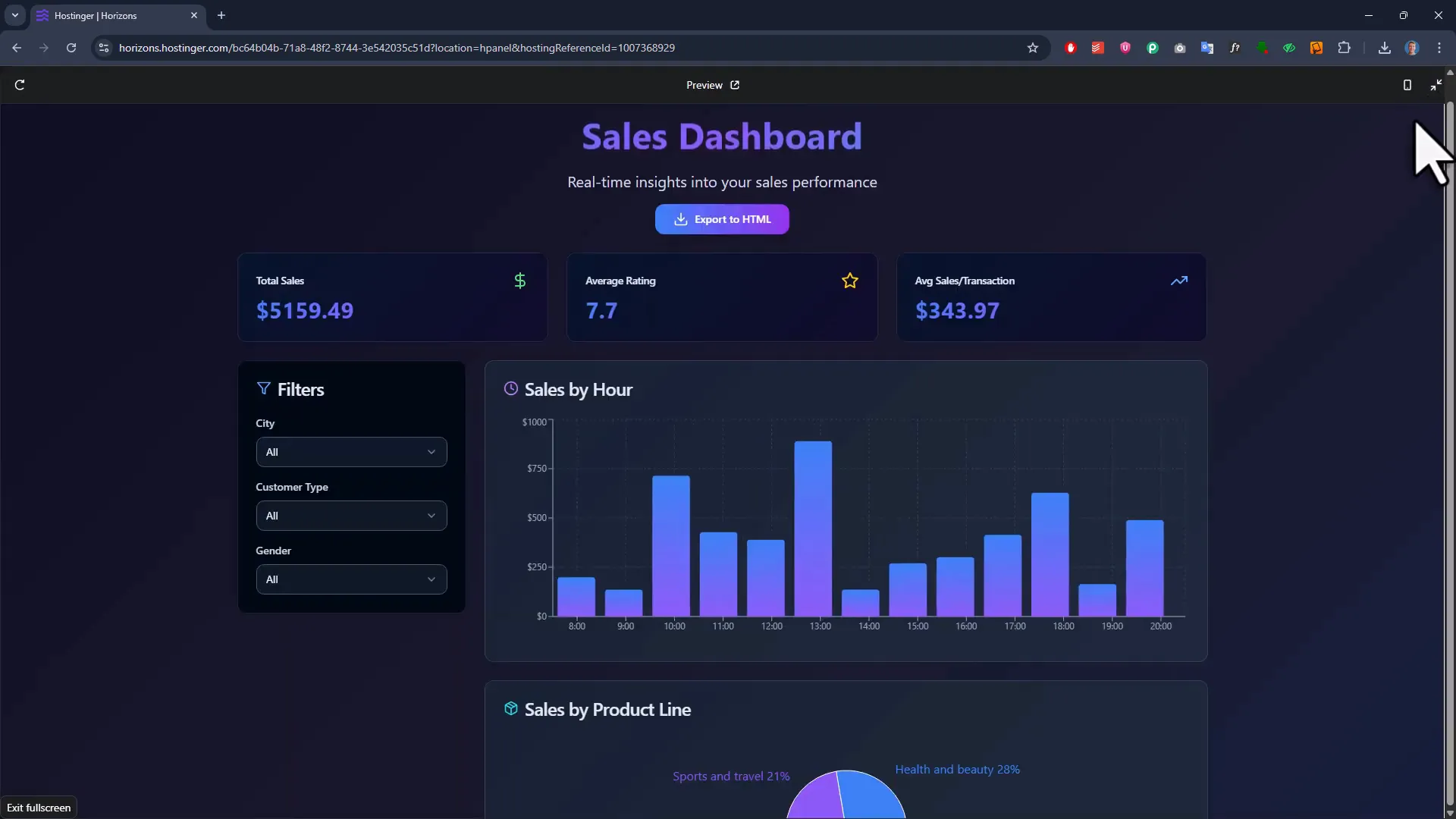
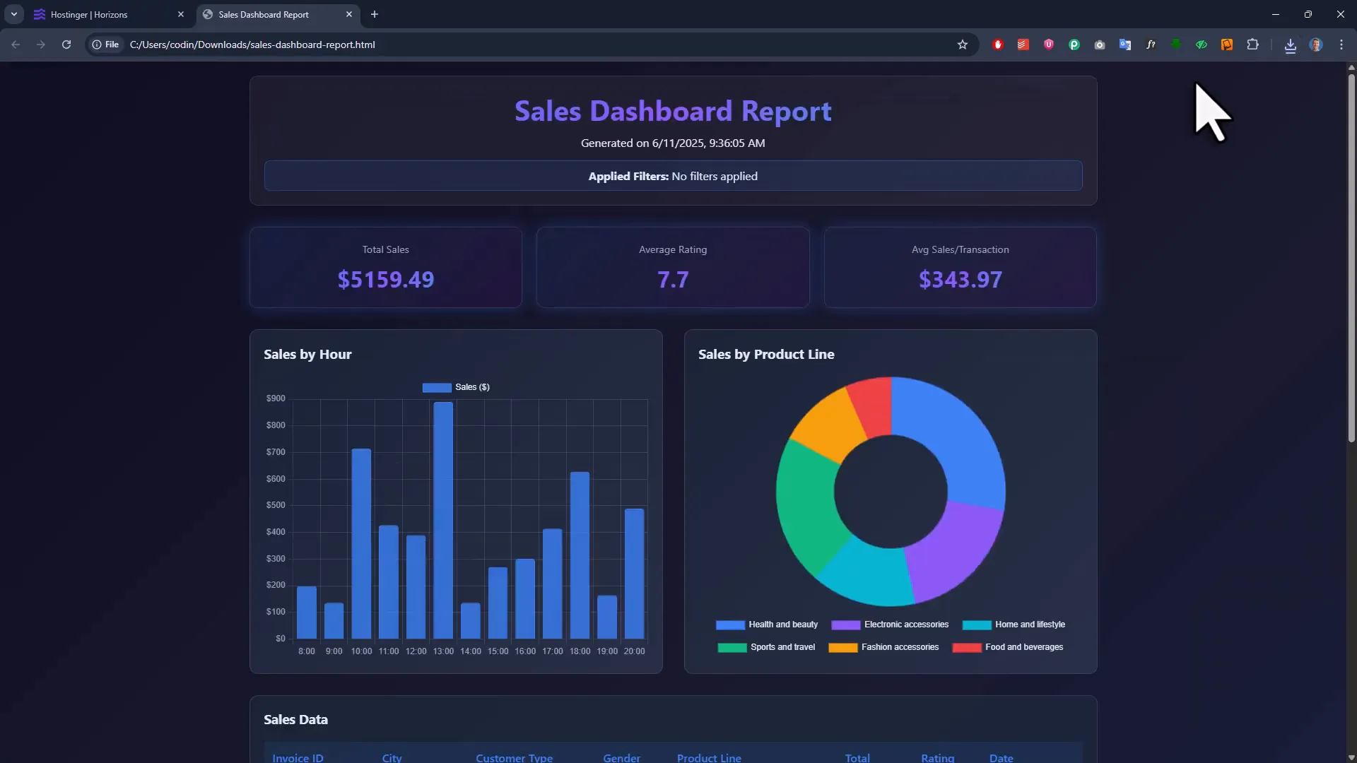
When it’s done, you get a beautiful, functional dashboard with:
- Top KPIs displayed prominently.
- Interactive charts for sales by hour and product line.
- Dynamic filters for city, customer type, and gender that update the dashboard instantly with smooth animations.
- A data summary section below the charts.
Everything is designed to be clean and easy to read. Plus, hovering over charts shows detailed data points, making it even more interactive.
Step 3: Testing Filters and Export Functionality
Of course, a dashboard isn’t much use if the filters don’t work. Luckily, the filters here respond instantly. Change the city or customer type, and the charts and KPIs update smoothly. It feels like a fully polished app.
Next up: the export button. Why is this important? Well, if you’re a data analyst or manager, you don’t always want to share your live dashboard online. Sometimes, you want to send a snapshot of the current view to your team or boss—without building a PowerPoint or sharing raw data.
The export button creates a fully self-contained HTML file that includes all charts, filters, and interactivity. This means you can email the file, and the recipient can open it in a browser and interact with it just like the live dashboard—without needing the original Excel file.
Testing the export, I found:
- The exported report includes the date and time it was generated.
- It clearly shows which filters were active when exporting.
- All data and charts are intact and interactive.
There were a couple of quirks, like a donut chart showing up instead of a pie chart in exports sometimes, and slight design differences. But these are minor and can be tweaked later. Overall, the export functionality is a game-changer for sharing insights quickly.
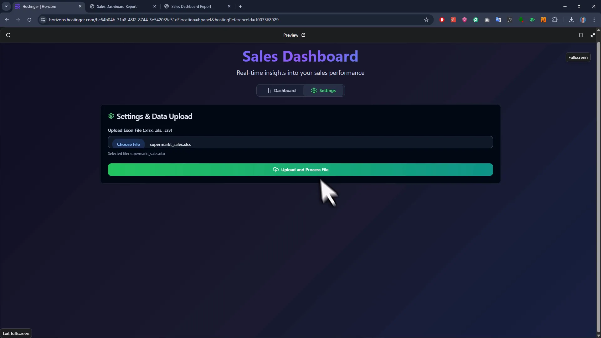
Step 4: Uploading Your Own Excel Data
Now, the dashboard so far was built using sample data. The real magic happens when you upload your own Excel file and have the dashboard update dynamically with your actual data.
To make this happen, I added a prompt instructing the AI to include a settings area with an upload button. This allows me to select any Excel file and have the dashboard refresh with my real data.
Once uploaded, the dashboard updates all KPIs, charts, and filters based on the new dataset. I even compared it side-by-side with the Python dashboard I built years ago, and the numbers matched exactly—proof that the AI-generated dashboard is accurate.
Another cool feature: the dashboard is mobile responsive. Resize your browser, and the filters move neatly to the top for easy access on smaller screens.
Step 5: Customizing and Tweaking Your Dashboard
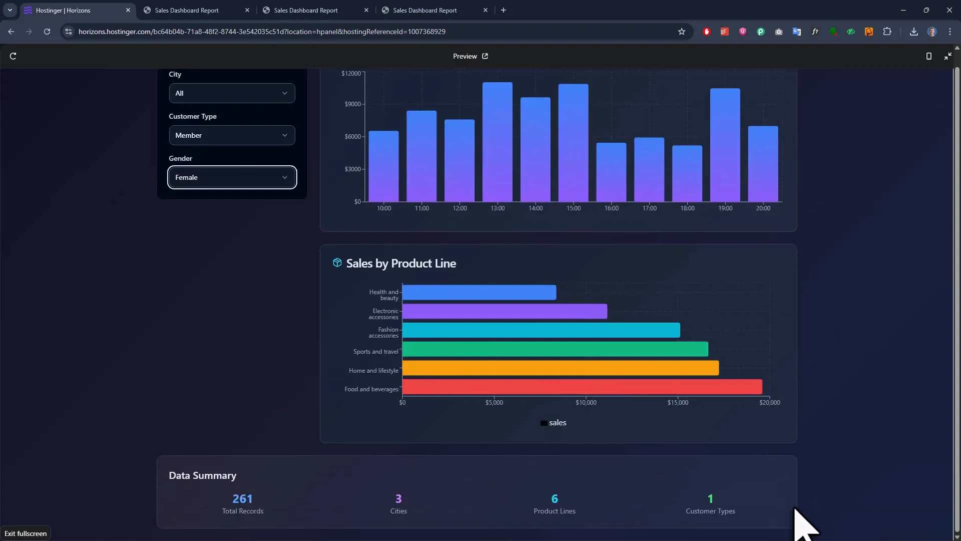
Even though the AI does most of the heavy lifting, you might want to customize your dashboard further:
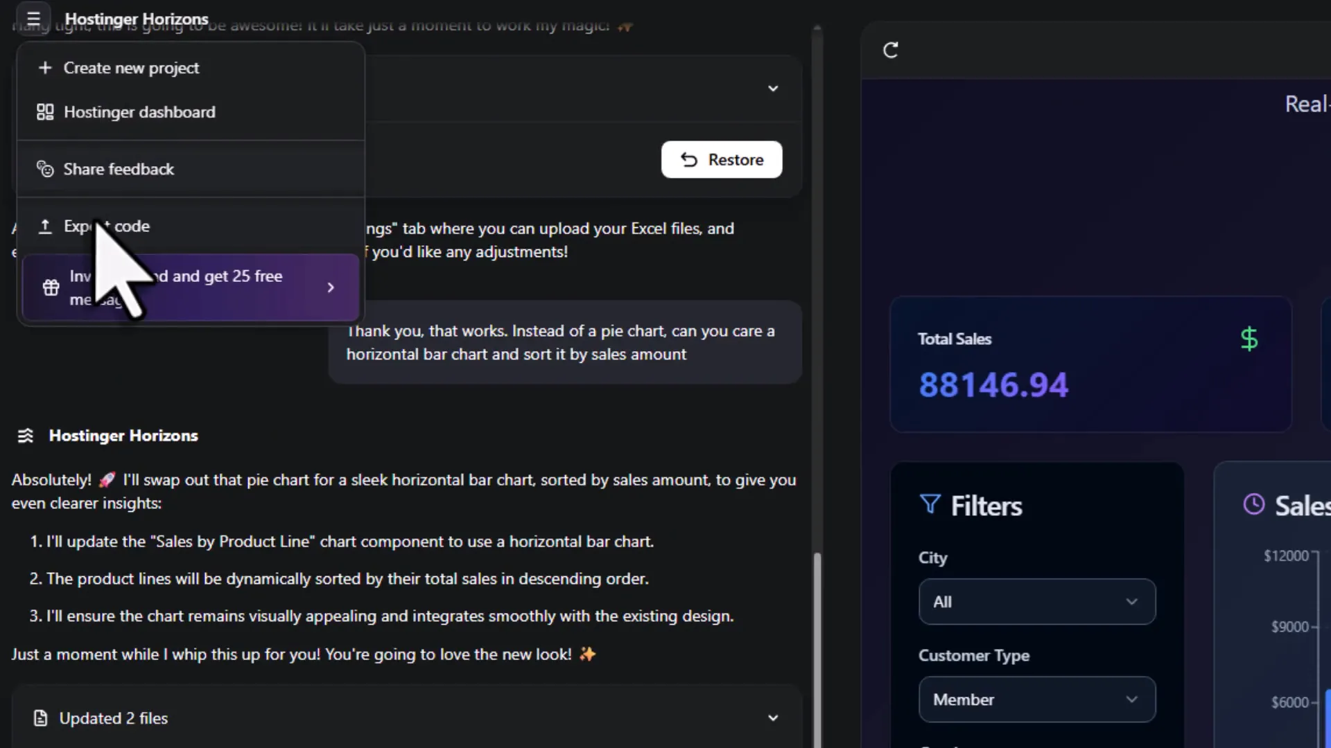
- Change chart types, for example turning pie charts into horizontal bar charts.
- Add buttons to export data back into Excel format.
- Fix minor design issues, like improving number visibility.
Here’s a quick tip: you can ask the AI to make multiple changes at once. But from my experience, it’s better to tackle tweaks one at a time. This way, you avoid accidentally breaking parts of the dashboard that already work well.
For example, I asked the AI just to change the chart type for sales by product, and it handled it perfectly. Uploading my data again showed the updated chart, still fully interactive and filterable.
Step 6: Peek Behind the Curtain — Exporting Your Code
One concern you might have is, “Okay, this is cool, but what’s actually happening behind the scenes?”
Here’s the best part: Hostinger Horizons lets you export all the source code of your app. With a click, you download a zip file containing HTML, JavaScript, CSS, and all necessary files. You can open it in your favorite code editor (hello, VS Code!), explore how it works, or even customize it beyond what the AI can do.
This transparency means you’re never locked into a black box. Whether you want to learn, tweak, or hand off the project to a developer, you have full access.
Step 7: Deploying Your Dashboard Online
Building the dashboard is only half the battle. The other half is making it accessible to your team or stakeholders.
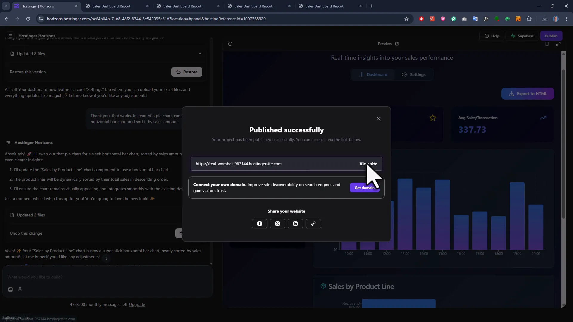
Deploying web apps can be tricky—setting up servers, domains, SSL certificates, and all that technical jazz. But with Hostinger Horizons, deployment is as simple as clicking a “Publish” button. The platform handles everything behind the scenes and gives you a live URL to share instantly.
Want to make it even more professional? You can connect your own custom domain. For example, I registered salesdashboardgenerator.io directly through Hostinger and linked it to my app. After a short wait for domain registration, my dashboard was live on my own branded URL.
This makes it perfect for internal tools, client demos, or even launching your own product.
Bonus Features: Undo, Integrations, and More
Hostinger Horizons packs a few more handy features that make life easier:
- Undo button: Go back to previous versions of your project with ease.
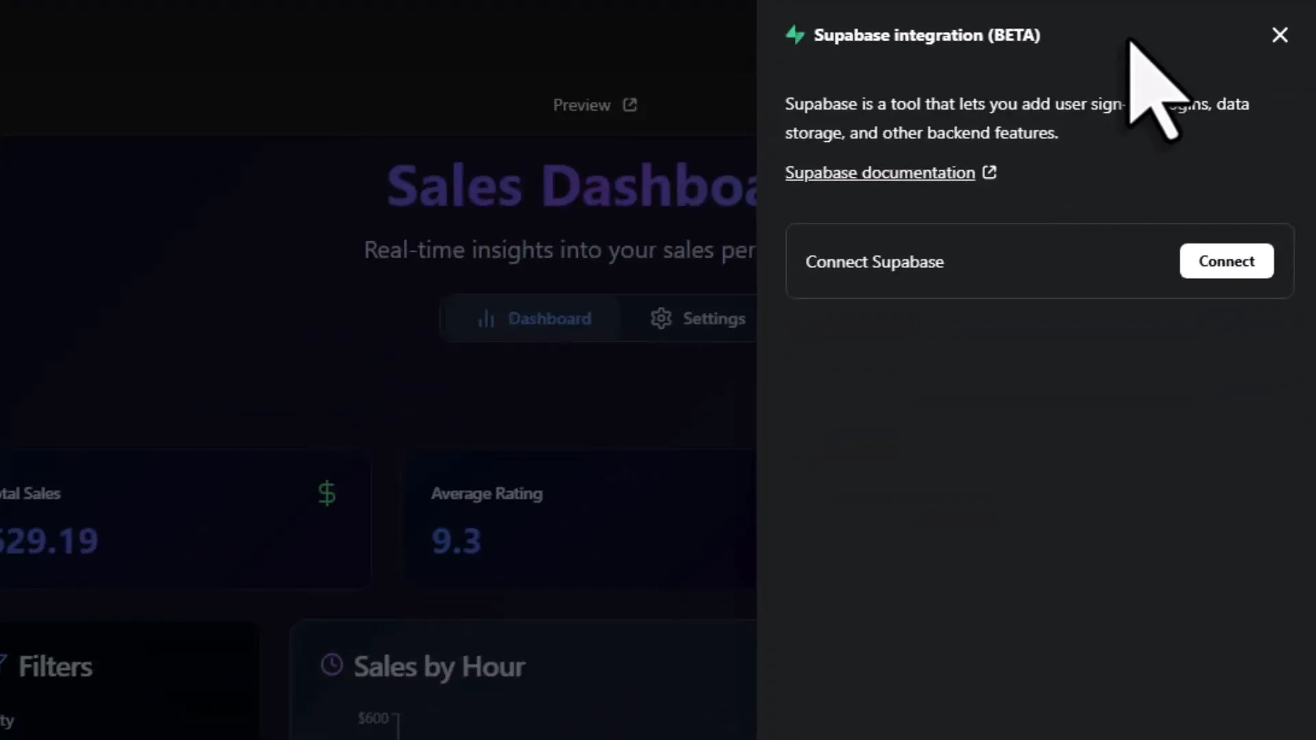
- Integrations: Connect your dashboard to databases like Supabase, add user authentication, or even accept payments via Stripe.
This means you’re not limited to internal tools—you could build a micro SaaS product or minimum viable product (MVP) without writing a single line of code.
And if you ever get stuck, their support team is available to help, so you’re never left hanging.
Wrapping Up: Why This Changes the Game for Excel Dashboards
Looking back, it’s incredible how far we’ve come. What used to be a multi-day coding project can now be done in minutes by simply describing what you want to an AI. The combination of Hostinger Horizons and a smart prompt lets you:
- Turn raw Excel data into an interactive, filterable dashboard.
- Export professional reports as standalone HTML files.
- Upload and update your own data with ease.
- Customize and tweak your app without coding.
- Export the entire source code if you want full control.
- Deploy your app online and connect a custom domain effortlessly.
Plus, the platform’s integrations open doors to even more advanced applications—think user logins, real-time data from databases, or payment processing—all without writing code.
Whether you’re a data analyst, project manager, or entrepreneur, this is a tool that can save you hours, reduce frustration, and help you launch ideas faster than ever.
So here’s my friendly challenge to you: If you’ve been sitting on an idea for a dashboard, internal tool, or mini app, why not give Hostinger Horizons a shot? Use the discount code SVEN to get 10% off your first month and start building today.
Happy building!