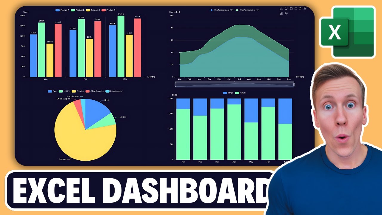
How to Turn Excel Data into Interactive Dashboards (No Coding, No AI)
Introduction
Creating interactive dashboards from Excel data can seem daunting, but it doesn’t have to be. With the right tools, you can turn your boring spreadsheets into visually appealing and interactive dashboards in just a few seconds. In this post, I’ll walk you through how to use Grafly, a new Excel add-in, to achieve this without any coding or AI tools.
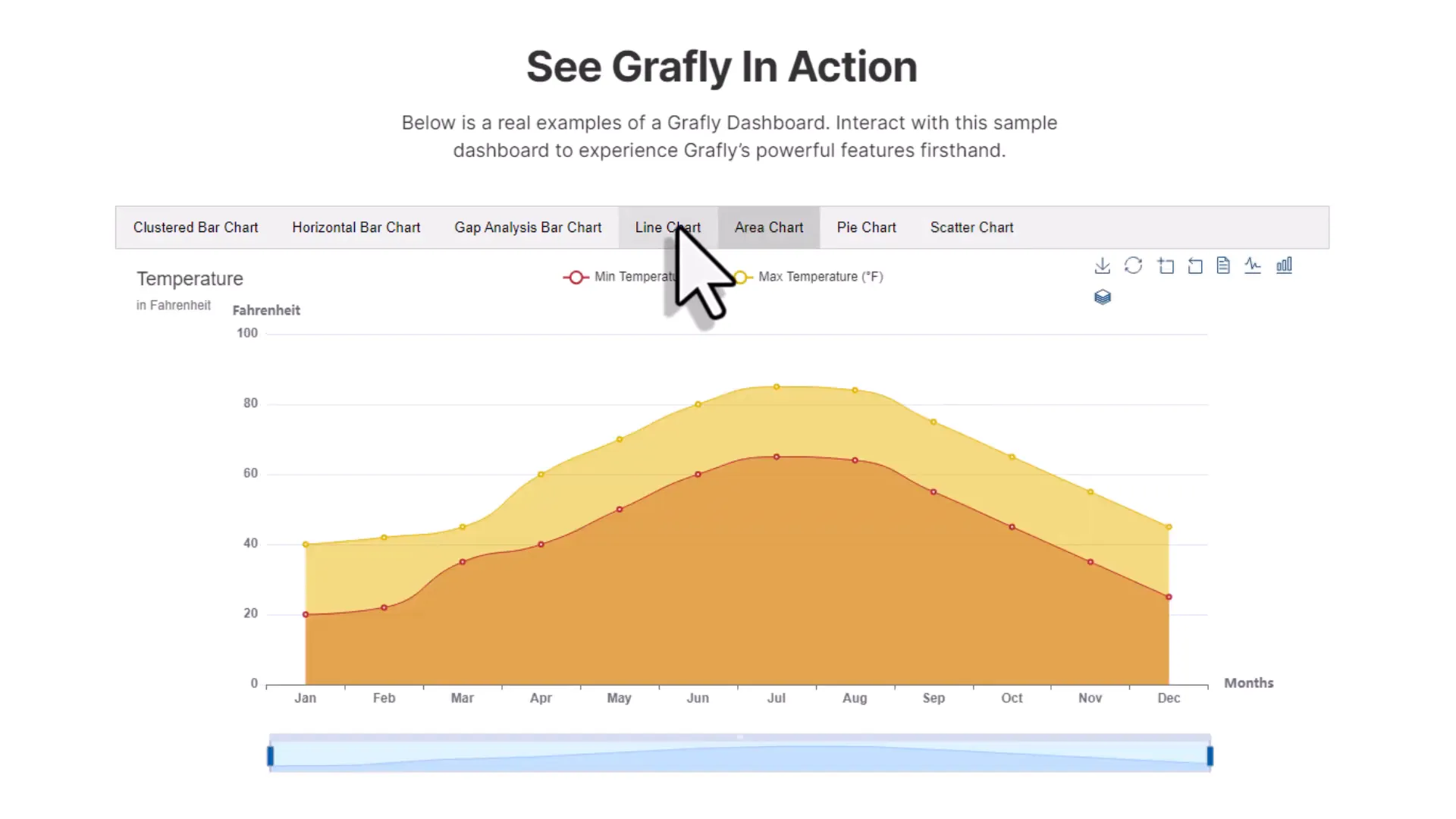
Live Demo of Grafly
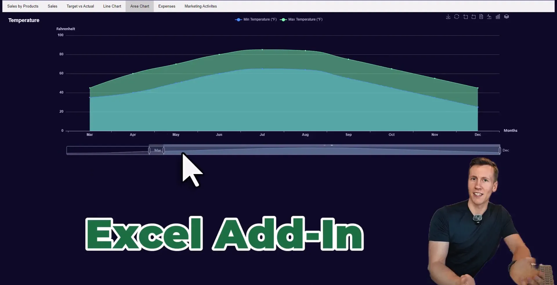
Grafly allows you to select your data, click a button, and generate a fully interactive chart saved as an HTML file on your machine. The charts feature animations, data zoom sliders, and the ability to switch chart types dynamically. Once individual charts are created, you can use the dashboard builder to compile them into a single HTML file, ready to share with colleagues or managers.
Tools for Standard Reports
When it comes to standard reports, depending on your industry, you might need to illustrate the company’s financial situation, track warehouse performance, or monitor costs. In such cases, using BI solutions like Power BI or Tableau makes sense. However, for ad-hoc analysis, simpler tools may suffice.
Tools for Ad-hoc Analysis
Ad-hoc analysis is often needed when stakeholders request specific insights, such as potential savings from reducing travel expenses. For these situations, a well-formatted Excel table or a simple Excel chart might be all that’s needed. Grafly fits perfectly here, allowing you to create interactive visualizations quickly without the overhead of complex software.
The Inspiration Behind Grafly
The journey to create Grafly stemmed from a desire to produce interactive charts from Excel data efficiently. Previously, I used Python for this purpose, but it often felt impractical. This led to the development of the MyToolBelt add-in, which transformed Excel ranges into Python dataframes, but it still required coding for chart creation. Grafly simplifies this process significantly.
How to Create Single Charts
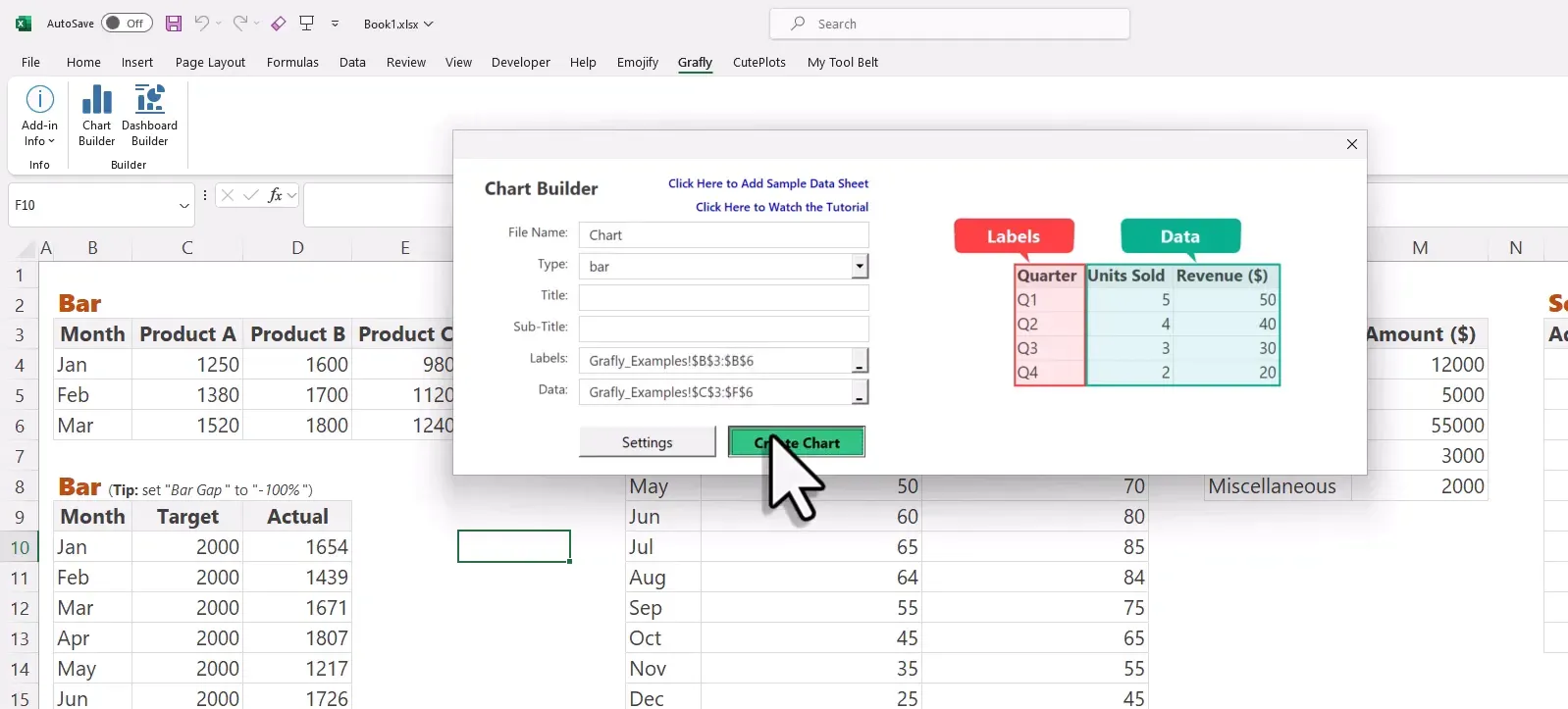
To create a chart with Grafly, you simply select your data, choose the chart type, and click to generate it. This process opens your default browser with the new interactive chart, which is saved as a local HTML file, ensuring that all data is self-contained and accessible offline.
Chart Settings & Features
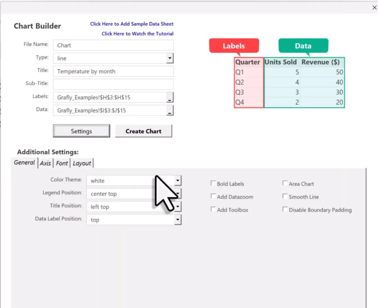
Grafly offers a variety of settings for customizing your charts. You can change themes, adjust legend positions, add data zoom features, and even switch chart types dynamically. This flexibility allows you to tailor your visualizations to meet specific needs.
Additional Demo Charts
Grafly includes demo charts that showcase different types of visualizations, such as horizontal bar charts, pie charts, and scatterplots. You can switch between these charts easily, making it a versatile tool for data presentation.
How to Build Dashboards
Building a dashboard in Grafly is straightforward. Simply open the Dashboard Builder, select the charts you want to include, and customize the layout. You can choose to arrange charts in tabs or on a single page, with options for draggable layouts that allow you to resize and reposition charts as needed.
Benefits of Using Grafly
Grafly is lightweight, with dashboards being just a few kilobytes in size, making them easy to share via email. Moreover, since everything is saved as HTML, you can even host your dashboards online, providing a seamless way to share your insights.
Future Plans and Development
Grafly is actively being developed, with plans to introduce more chart types and features based on user feedback. This ensures that the tool continues to evolve and meet the needs of its users.
How to Get Grafly
If you’re interested in trying out Grafly, you can find it on my website. There’s a one-time payment with a 14-day money-back guarantee, allowing you to test it without risk. For the first 20 users, a special discount coupon is available.
Creating Cartoon Charts with Cuteplots
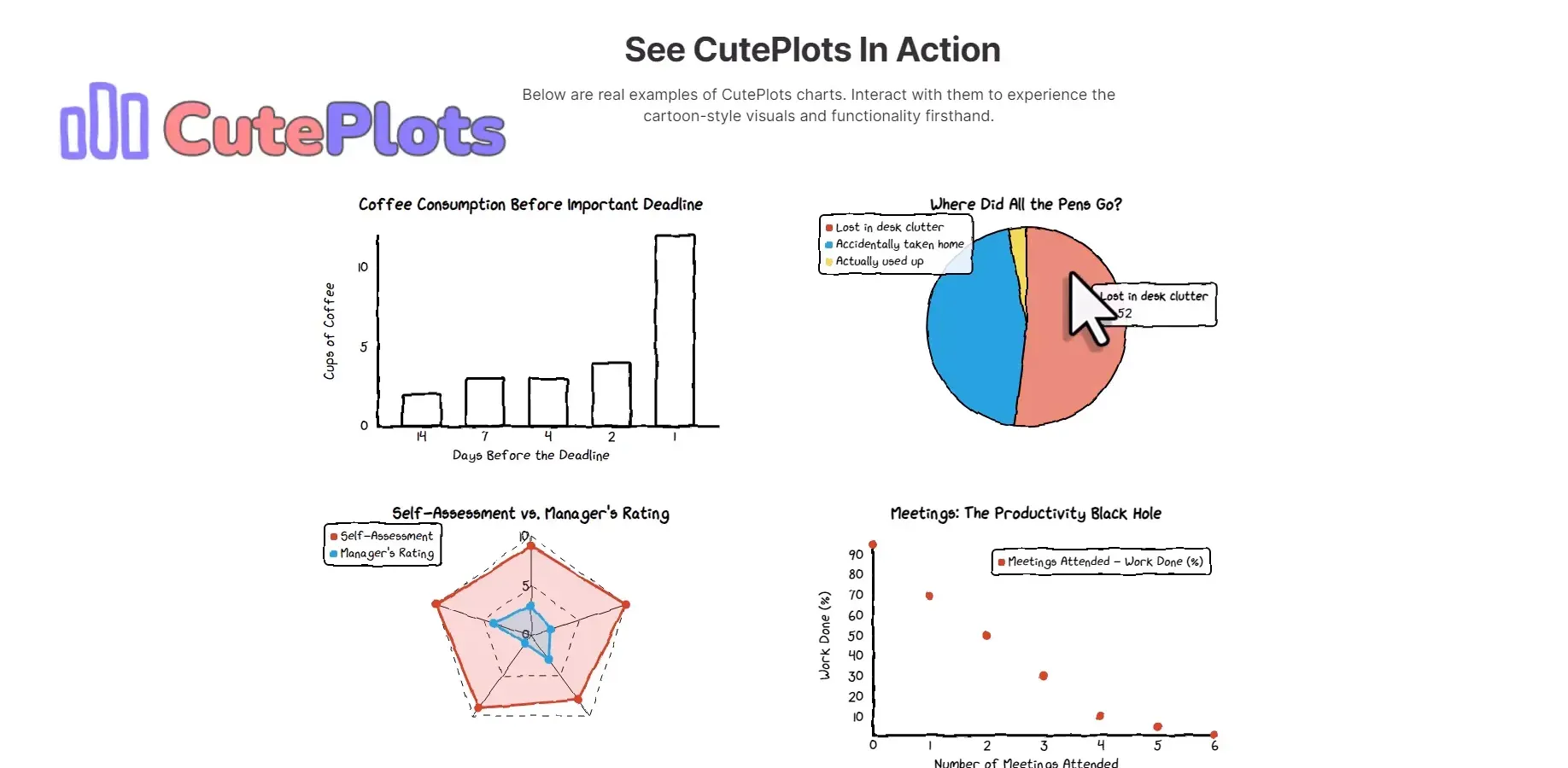
If you’re looking for something more whimsical, check out Cuteplots, which allows you to create interactive cartoon charts. It’s a fun alternative to Grafly for those who want to add a light-hearted touch to their data presentations.
Closing Remarks
Grafly is not meant to replace traditional Excel charts or Power BI reports, but rather to serve as a valuable addition to your toolbox for quick and interactive data visualization. I’m excited to hear your thoughts on Grafly, so please share your feedback in the comments!