
Create Interactive Excel Charts with Python Using xlwings Lite and pyecharts
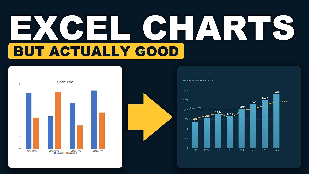
You can turn Excel tables into interactive, shareable HTML charts without installing Python locally by using xlwings Lite, pandas, and pyecharts. Start with a small script, then add hover tooltips, zoom controls, styling, and combine multiple charts into one tabbed dashboard. You can download the sample work + code here: https://pythonandvba.com/yt/interactive-charts
Stop making boring Excel charts
Excel charts are fine for a quick look at the numbers. But when you need to present data, share a report, or help people explore a trend for themselves, plain charts can feel a little limiting.
A better option is to turn the Excel table you already have into an interactive HTML chart. The result can include hover effects, animations, tooltips, zoom controls, downloadable images, and more. It opens in a regular browser, so you can send it around without asking anyone to install a separate BI tool. Nice and simple.
The setup uses three pieces:
- xlwings Lite to run Python directly inside Excel
- pandas to turn an Excel table into a DataFrame
- pyecharts to create interactive charts and dashboards
The useful part is that you do not need Python installed on your computer. xlwings Lite runs inside Excel as a free add-in, which makes this a practical option for Excel users who want more than the standard chart menu.
Install xlwings Lite in Excel
First, install xlwings Lite from the Office add-in store.
- Open the Home tab in Excel.
- Click Add-ins, then choose More Add-ins.
- Search for xlwings Lite.
- Click Add, then Continue.
Once the add-in loads, an editor opens in a task pane on the right. This is where you can write and run Python code within the workbook.
If you want a quick sanity check, choose one of the built-in examples. The Seaborn example creates a new sheet, table, and chart, which confirms that the add-in is ready to go.
If this is your first time mixing Python and Excel, that is completely normal. The workflow becomes much less mysterious once you see it as a familiar sequence: get the table, work with the rows and columns, then create output. If you want a more guided route through that process, my Excel Automation Course teaches Python concepts from an Excel user’s perspective.
Read an Excel table into a pandas DataFrame
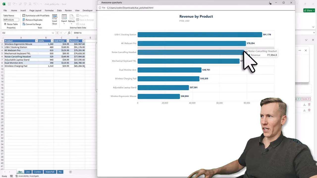
For this example, imagine a worksheet called Bar with an Excel table named tblProducts. It contains a Product column and a Revenue column.
xlwings gives Python access to the workbook, sheet, and table. pandas then converts the table into a DataFrame, which is essentially a flexible Python version of an Excel table.
Here is the minimal bar-chart version:
import pandas as pd
import xlwings as xw
from pyecharts.charts import Bar
from xlwings import script

OUT = "/data"

@script(name="Bar - Minimal")
def bar_minimal(book: xw.Book):
    table = book.sheets["Bar"].tables["tblProducts"]
    df = table.range.options(pd.DataFrame, index=False).value

    chart = Bar()
    chart.add_xaxis(df["Product"].tolist())
    chart.add_yaxis("Revenue", df["Revenue"].tolist())
    chart.render(f"{OUT}/bar_minimal.html")

    print("Done: bar_minimal.html")
The important bit is the book parameter. It refers to the current workbook, so the code can find the Bar sheet and the tblProducts table inside it.
This line converts the Excel table to a DataFrame:
df = table.range.options(pd.DataFrame, index=False).valueSetting index=False means pandas does not add an unnecessary index column. From there, df["Product"] provides the x-axis labels and df["Revenue"] provides the bar values.
Make the Python script a clickable Excel button
The @script decorator is what turns a normal Python function into a runnable item in xlwings Lite. In the example, this line creates a task-pane action called Bar – Minimal:
@script(name="Bar - Minimal")That is handy because you do not have to hunt through code every time you want to rebuild a chart. Open the workbook, click the script name, and the HTML file is generated again.
It also makes the workbook friendlier for colleagues who are comfortable in Excel but do not want to become Python developers by lunchtime.
Install pyecharts from the Requirements tab
pyecharts is a third-party package, so it needs to be listed in the xlwings Lite Requirements tab before you import it in your script.
pandas
pyecharts
After changing the requirements, restart the add-in. That part is easy to miss, so if Python complains that it cannot find pyecharts, check this first.
Python has several excellent charting libraries, including matplotlib, seaborn, and plotly. pyecharts is especially useful here because it creates interactive HTML output, including browser-friendly tooltips, animations, sliders, and toolboxes.
Render the chart as a standalone HTML file
When the script runs, this line saves the chart as an HTML file:
chart.render(f"{OUT}/bar_minimal.html")The /data folder is special in xlwings Lite. Files saved there appear in the add-in’s Files area, where you can download them and open them in a browser.
The first chart will be intentionally basic, but it is already interactive. Hover over a bar and you can inspect its value instead of trying to squint at a tiny data label.
Save charts directly to a local folder
You are not limited to the add-in’s internal file area. If you want each generated chart to go straight into a project folder, create a local folder such as charts, then open xlwings Lite’s Local Folders tab and choose Add Folder.
Once the folder is connected, update the output path in your script. Instead of rendering to /data, render to the local folder path made available by the add-in.
This is useful when you want generated HTML reports to sit beside the workbook, ready to attach to an email, upload, or archive with the rest of the project files.
Turn a minimal chart into a polished one
The minimal chart proves the workflow. The polished version is what you would actually put in front of a client or manager.
For a more professional bar chart, you can:
- Sort products by revenue
- Use horizontal bars so long names remain readable
- Add a title and subtitle
- Apply a consistent corporate color palette
- Show formatted currency labels
- Add cleaner gridlines and spacing
- Use hover tooltips for detailed values
pyecharts lets you control dimensions, colors, axis labels, legends, grid margins, and tooltips in code. Yes, there are quite a few settings, but you do not need to memorize them all. Build from a working example, make one improvement at a time, and use AI when you need help adapting a chart to your own data.
The sample workbook and finished scripts include both minimal and polished versions, so you can start with something that already works.
Five useful interactive chart types for Excel data
The same pattern works beyond a basic bar chart. Read a named Excel table into a DataFrame, create the pyecharts object, add the appropriate columns, then render the result.
Line chart
A line chart is ideal for monthly revenue or another time series. The polished example uses a smooth line, a soft fill underneath it, hover tooltips, and a data zoom slider. The slider matters when you have 24 months or more, because nobody enjoys reading a crowded x-axis.
Combo chart
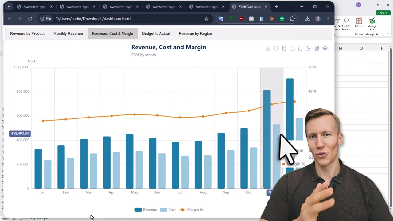
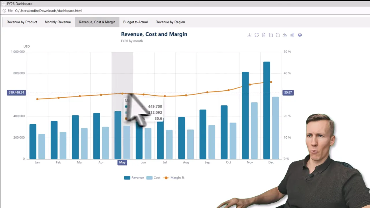
A combo chart combines revenue and cost bars with a margin percentage line on a second y-axis. This gives you amount-based measures and a percentage-based measure in one view without pretending they are the same unit.
The interactive toolbox can let people save the chart as an image, view the underlying data, zoom, reset the chart, or dynamically switch the chart type. That is a lot more useful than a static screenshot pasted into PowerPoint.
Waterfall chart
A waterfall chart is perfect for explaining how a budget became an actual result. It starts with a total, shows positive and negative drivers as floating bars, and ends with the final total.
There is no dedicated waterfall chart object in this example. Instead, it is created by stacking an invisible base bar underneath the visible change bars. It sounds slightly sneaky because it is, but it works well.
Pie or donut chart
A donut chart works nicely for revenue by region. The center cutout keeps the chart visually lighter, while the labels and tooltips show each region’s share of the total.
Use pie charts sparingly, though. They are best when the number of categories is limited and the purpose is clearly to show proportions.
Combine every chart into one interactive dashboard
Once you have several polished charts, pyecharts can combine them into a single HTML dashboard with tabs. One file can include:
- Revenue by Product
- Monthly Revenue
- Revenue, Cost and Margin
- Budget to Actual
- Revenue by Region
The Tab object is used to add each chart to its own tab, then render one final dashboard.html file. This is an easy way to share a complete interactive report without creating a complicated web app.
Each chart keeps its own functionality. The line chart still has its zoom controls, the combo chart still has its toolbox, and hover effects remain available across the dashboard.
Find more chart ideas in the pyecharts gallery
The five examples are only a starting point. The pyecharts gallery is a great place to browse chart types and see the code behind each one.
If you spot a chart you like, use it as a reference for your own workbook. You can copy its page link and ask xlwings Lite’s Wingman AI to help recreate that chart using your Excel data.
Wingman needs to be connected to a large language model such as ChatGPT or Claude first. Once it is connected, you can describe what you need, provide the chart reference, and use the generated code as a starting point. Still check the result, of course. AI is helpful, but it is not a substitute for knowing whether your revenue column somehow became a pie slice.
The practical workflow to reuse
For any new interactive Excel chart, the process is basically the same:
- Keep your source data in a named Excel table.
- Use xlwings to access that table from the current workbook.
- Convert it into a pandas DataFrame.
- Use pyecharts to build the chart type you need.
- Add styling and interactive options where they help.
- Render the output as HTML.
- Download it from xlwings Lite or save it to a connected local folder.
That is the real win here. Your Excel workbook remains the familiar place where the data lives, but your output no longer has to look like a default chart from 2007.
This article uses Python inside Excel to build interactive charts. If you want the underlying skills taught from an Excel user's perspective, the course covers pandas, merging files, dashboards and bulk Word documents.