
Create Hand Drawn Charts in Excel With Python and Cutecharts
Cutecharts renders line, bar and pie charts in a deliberately hand-drawn comic style, which suits a rough draft or an informal deck better than a polished chart does. It reads Excel data through Python and outputs an interactive HTML file.
Install Requirements
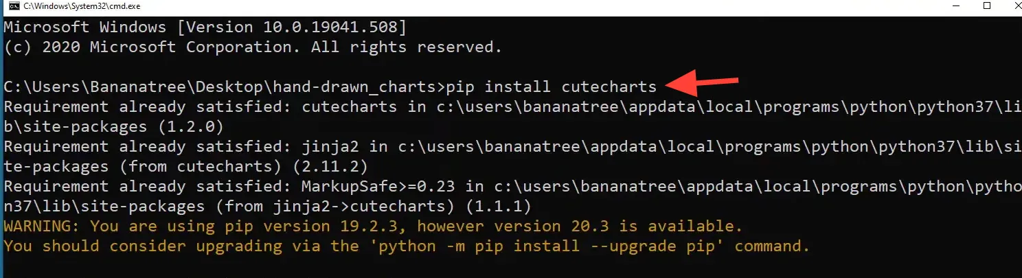
Before diving into chart creation, it’s essential to set up your environment. You will need to install Python and the Cutecharts library. Make sure Python is installed on your machine, and then you can install Cutecharts using pip. This is a straightforward process that can be done via the command line:
Line Chart
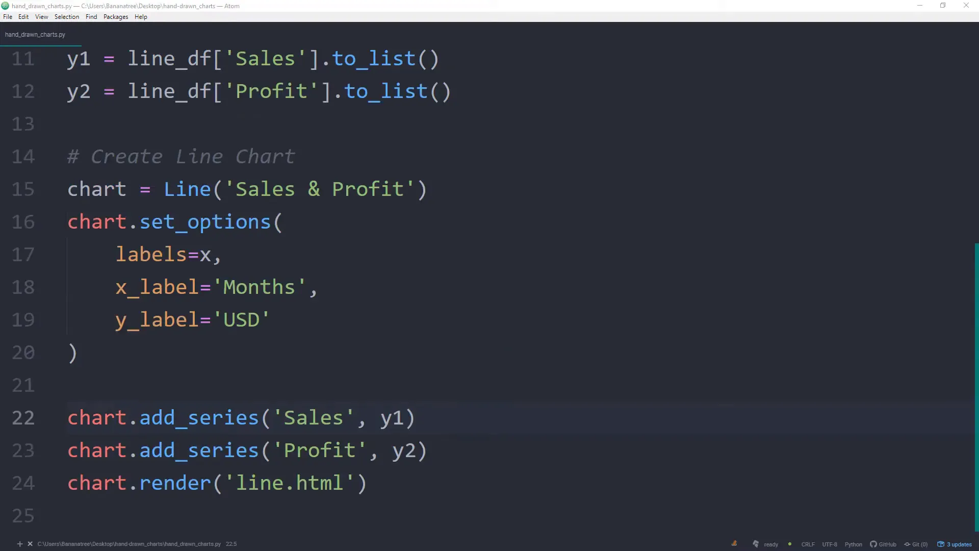
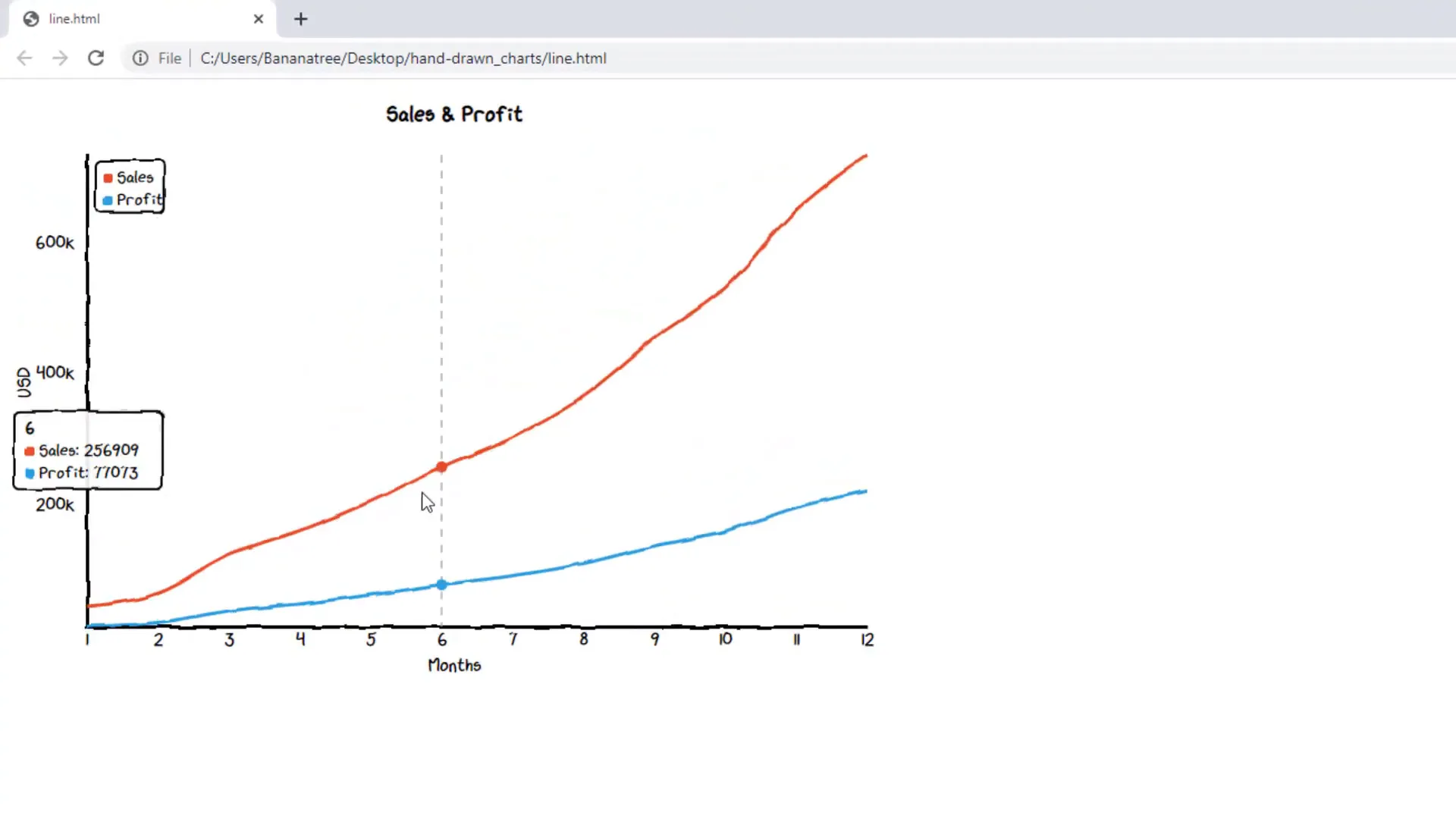
To start with, let’s create a basic line chart. This chart will visualize sales data over time. I will demonstrate how to set up the data in Excel, import it into Python, and use Cutecharts to generate a hand-drawn style line chart. The process involves specifying your chart title, labels, and data series.
Bar Chart
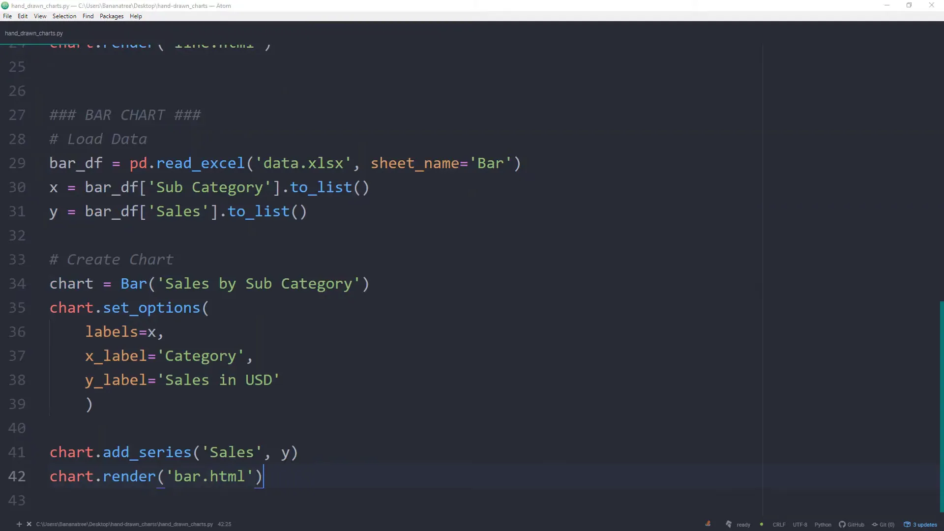
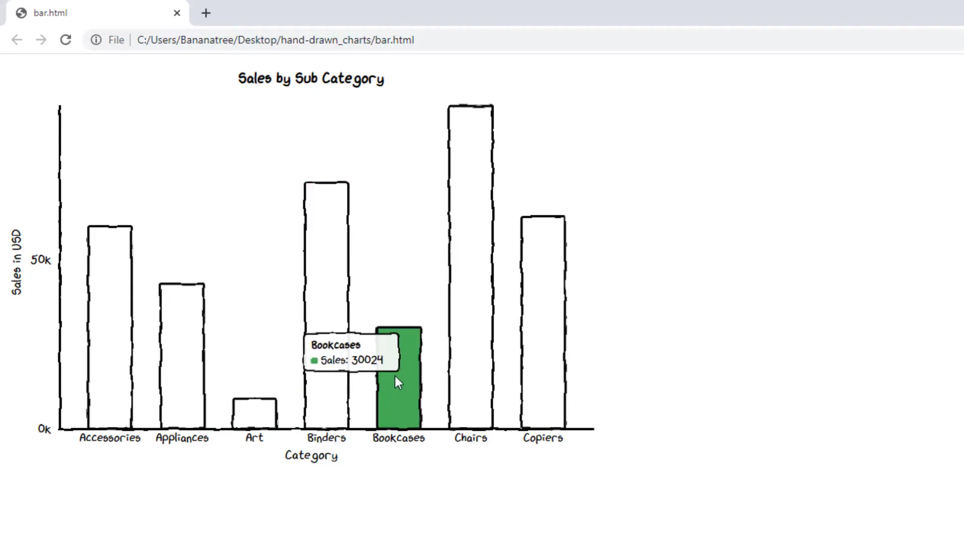
Next, we’ll create a bar chart. This type of chart is perfect for comparing different categories, such as sales across various products. Just like with the line chart, you will set up your data in Excel, specify your labels, and use Cutecharts to render the chart in a hand-drawn style.
Pie / Donut Chart
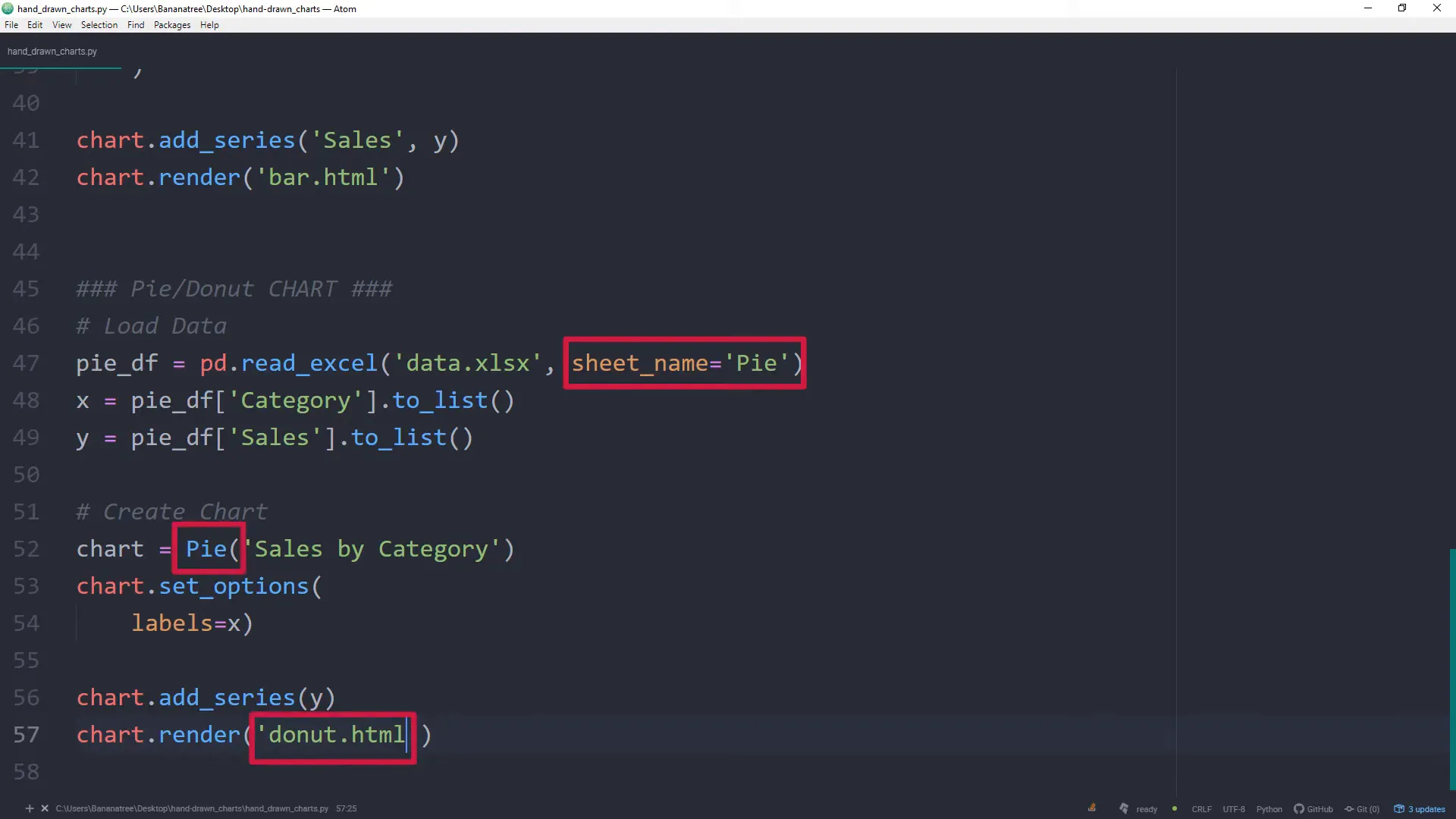
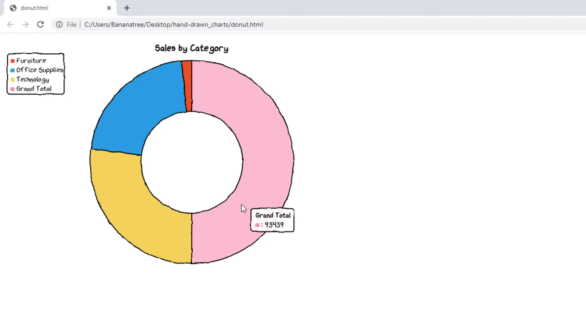
Pie and donut charts can effectively display proportions and percentages. In this section, I will show you how to create a pie or donut chart with Cutecharts. You will learn how to format the chart to highlight specific segments and make it visually appealing.
Cutecharts Github
For those interested in exploring more about Cutecharts, I highly recommend checking out the official Github repository. It contains valuable resources, documentation, and examples that can help you dive deeper into customizing your charts and utilizing various features of the library.
Conclusion
In conclusion, creating hand-drawn charts in Excel with Python using the Cutecharts library is a straightforward and enjoyable process. By following the steps outlined in this post, you can transform your data visualizations into engaging and artistic representations. Whether you’re presenting to colleagues or sharing insights with clients, these unique charts can leave a lasting impression.