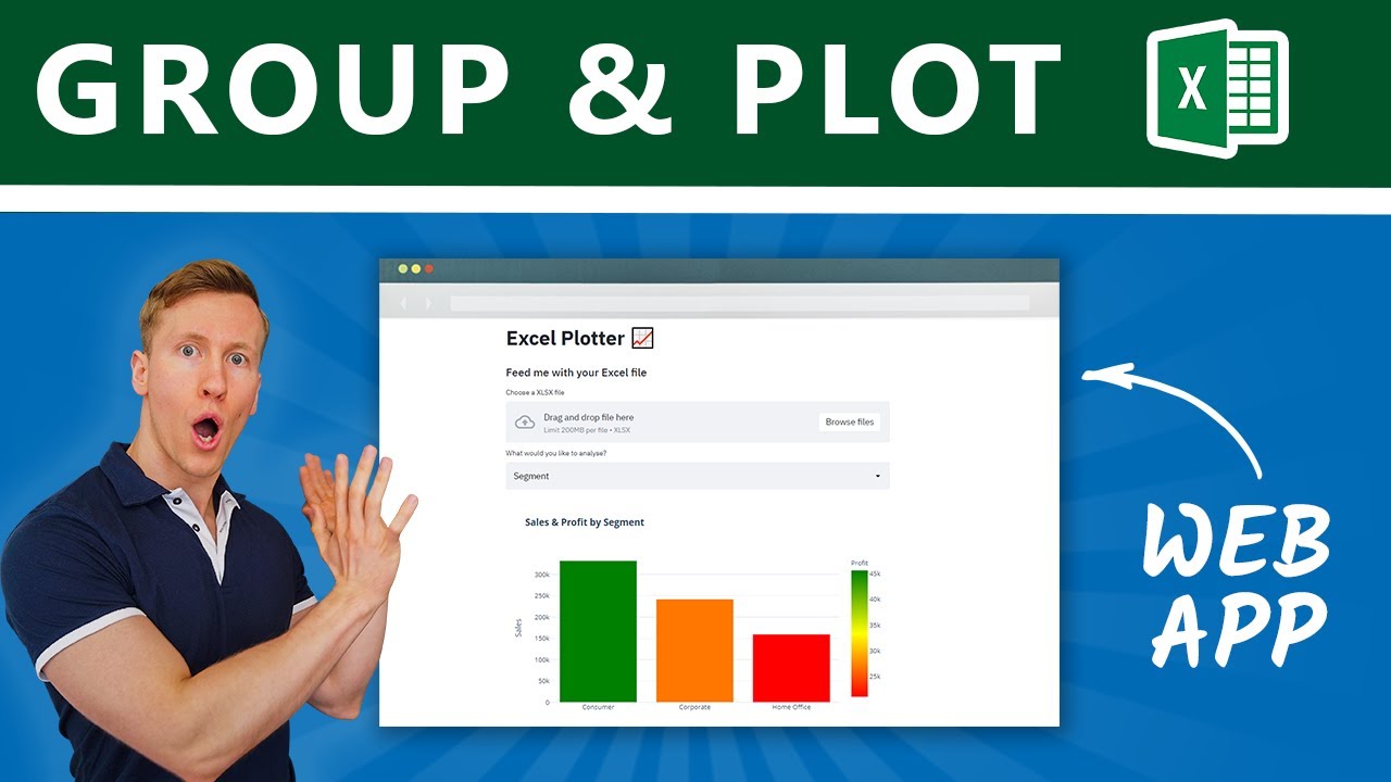
Build a Web App to Group & Plot Excel Files in Python with Streamlit
Introduction
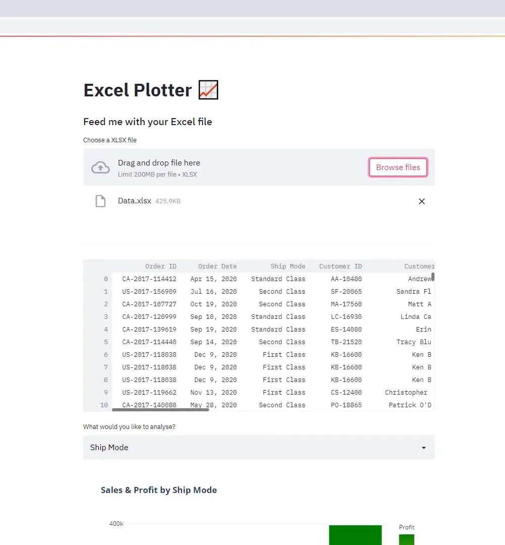
In this blog post, I will walk you through creating a web app that groups and visualizes Excel files using Python. The app allows users to select a column for analysis and download both the transformed Excel file and an interactive chart. We’ll be working with a dataset that contains business transactions by order ID for 2020, including details like Order Date, shipping mode, Product Category, Sales, and Profit amounts.
The web app is built entirely with Streamlit, so no HTML, CSS, or JavaScript is necessary. Let’s get started!
Required Libraries
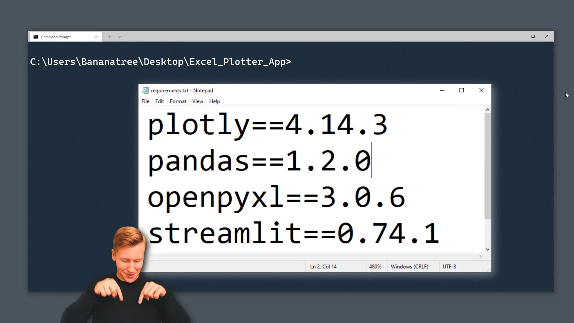
First, I need to install the necessary libraries for this project. I’ll include a requirements text file in the project folder, and you can find the download link in the description box. Here’s what you need to install:
- Streamlit: For building the web app. Use the command
pip install streamlit. - Pandas: For data manipulation. Install it with
pip install pandas. - Openpyxl: Required for working with Excel files. Install it via
pip install openpyxl. - Plotly Express: For data visualization. Install it using
pip install plotly-express.
Web App Setup
Once the libraries are installed, I’ll create a new Python file and import the libraries:
import streamlit as st
import pandas as pd
import plotly.express as px
Next, I will set the title of the web app to “Excel Plotter” using st.set_page_config. I can also add emojis to the title if I want to!
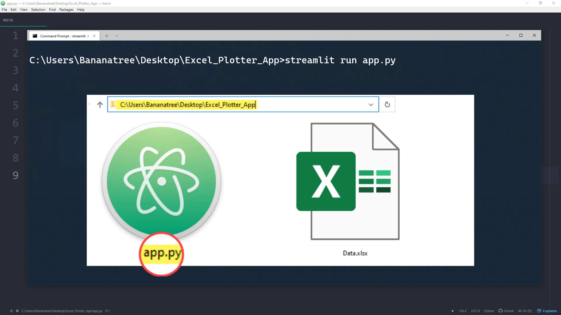
To check that everything is working, I will run the web app with the command:
streamlit run app.pyThis should open the web app in a new browser window displaying the title and subheader.
Upload Excel File
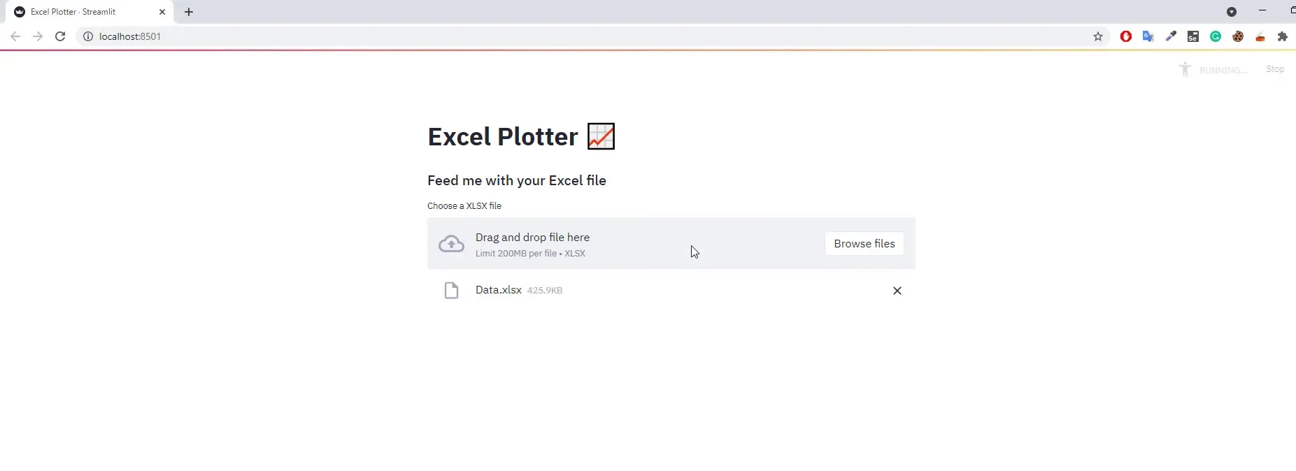
Now, let’s implement the file upload functionality. I will use the st.file_uploader method to allow users to upload Excel files, specifying the accepted file type as ‘xlsx’.
uploaded_file = st.file_uploader("Choose an XLSX file", type='xlsx')After a file is uploaded, I will read its content into a pandas DataFrame using pd.read_excel and display it with st.dataframe.
Group Data
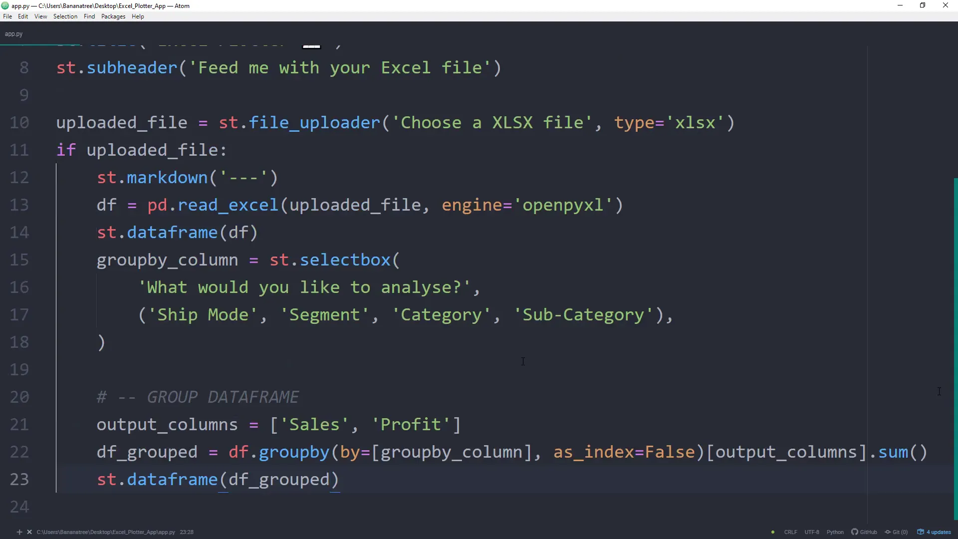
Next, I want to allow users to group and aggregate the data. This will be similar to using a Pivot Table in Excel. Users can select a column to analyze, and I’ll use a selection box to capture this input.
After getting the user input, I’ll create a new DataFrame called df_grouped that contains the data grouped by the selected column, summing the Sales and Profit values.
Plot Data
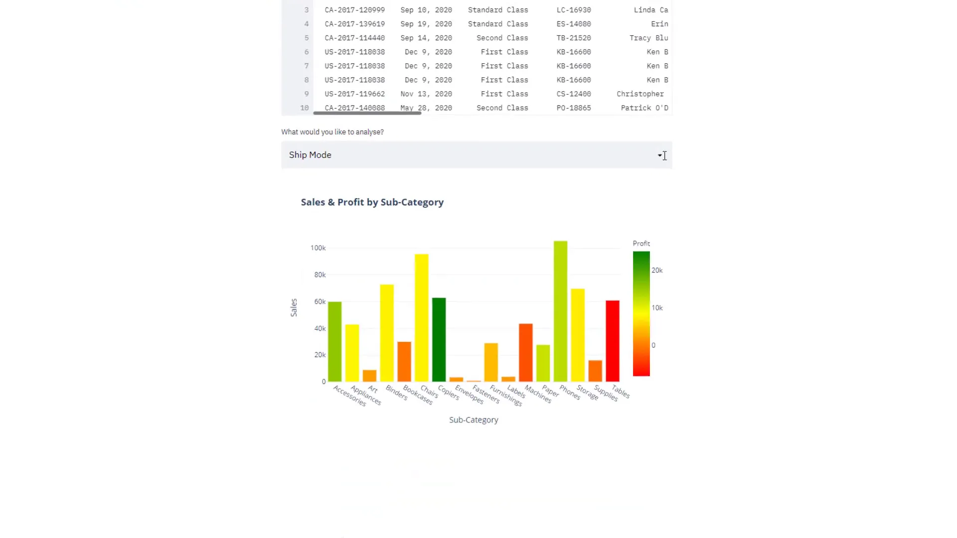
Instead of displaying the grouped DataFrame, I want to visualize it. I’ll use Plotly Express to create a bar chart where the x-axis represents the selected column and the y-axis shows the sales. The profit will determine the color of the bars.
fig = px.bar(df_grouped, x=groupby_column, y='Sales', color='Profit', color_continuous_scale='RdYlGn')Finally, I will display the plot using the st.plotly_chart function. This chart will provide valuable insights into the data, allowing users to interact with it.
Download Data
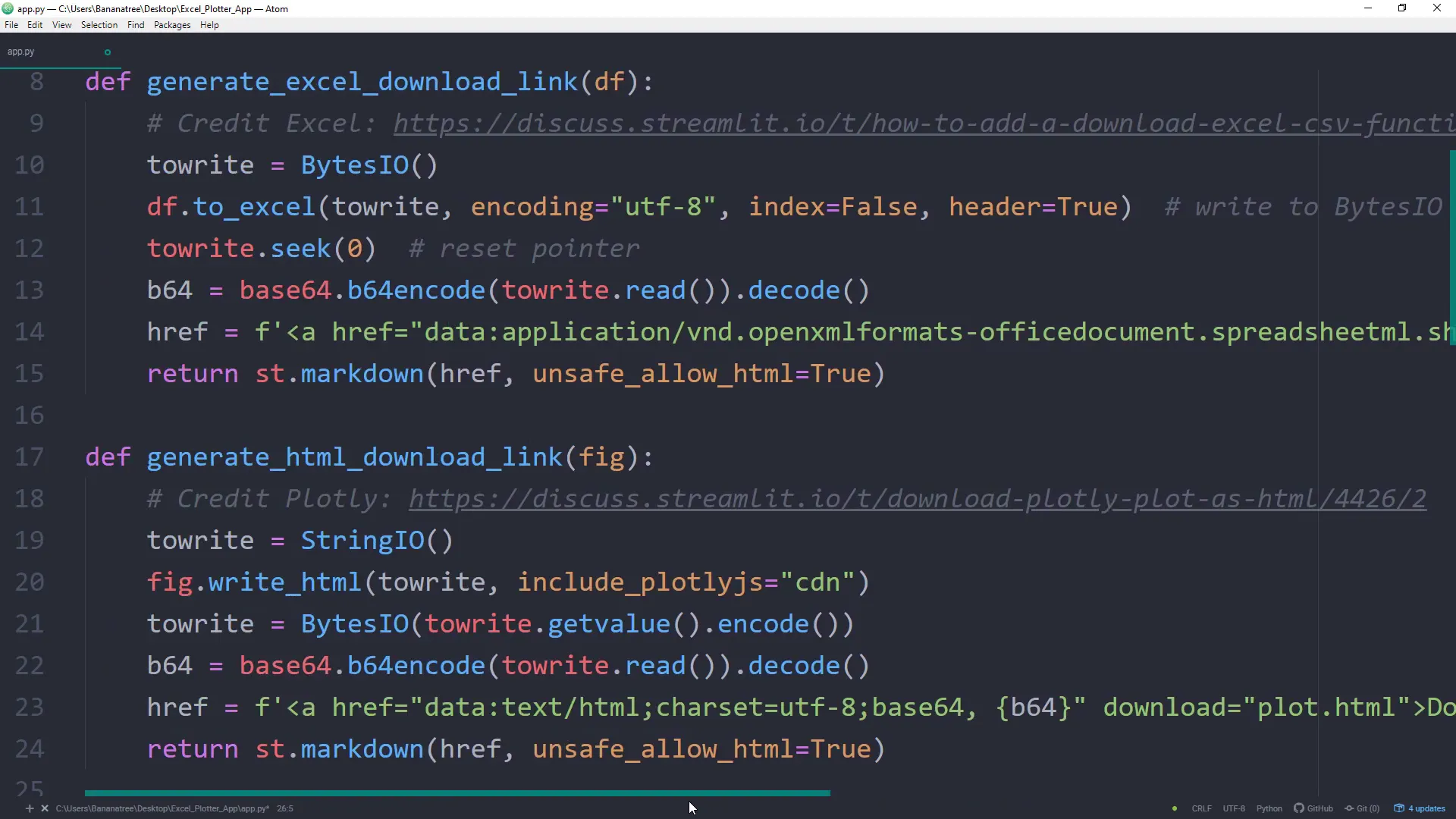
To allow users to download the grouped Excel data and the chart, I will create two download links. Since Streamlit doesn’t have built-in functions for this yet, I’ll leverage some code from the Streamlit discussion forum to generate the download links.
Here’s a brief overview of the download functions:
- Generate an Excel download link that takes a DataFrame as input.
- Create an HTML download function for the Plotly chart.
After implementing these functions, users will have the option to download both the Excel file and the interactive chart at the bottom of the web app.
Conclusion
In this post, I covered how to build a web app using Streamlit to group and visualize Excel files. We went through the setup of required libraries, the implementation of file upload functionality, data grouping, plotting, and providing download options for the results. This app can be deployed for free, making it accessible for anyone interested in quickly analyzing Excel data.