
Automate Excel With Python to Combine Files and Create Charts

Monthly sales workbooks combined into one file, extra calculated columns added, and an interactive chart built from the result. pandas does the merge and the maths, Plotly draws the chart, and the whole run is a single script you can point at next month’s folder.
Before diving into the code, let me clarify that this is a simplified example. In real life, your data could be messier or contain more information. However, I hope this tutorial sparks ideas on how to automate your specific use case.
You might wonder, why not use Power Query or VBA for this task? Both are valid options. VBA is powerful, and Power Query is excellent for handling large amounts of data and preparing it. But the advantage of Python is its flexibility. With Python, you can expand your automation beyond just Excel tasks, such as sending reports via WhatsApp, uploading to the cloud, or creating web applications.
Let’s take a look at the sample files I created. There are three Excel files, each containing sales records for their respective months. For instance, the January file contains sales records from January 1st to January 31st. Our goal is to combine these files into one and create an interactive bar chart to show sales progress by month.
Python Code
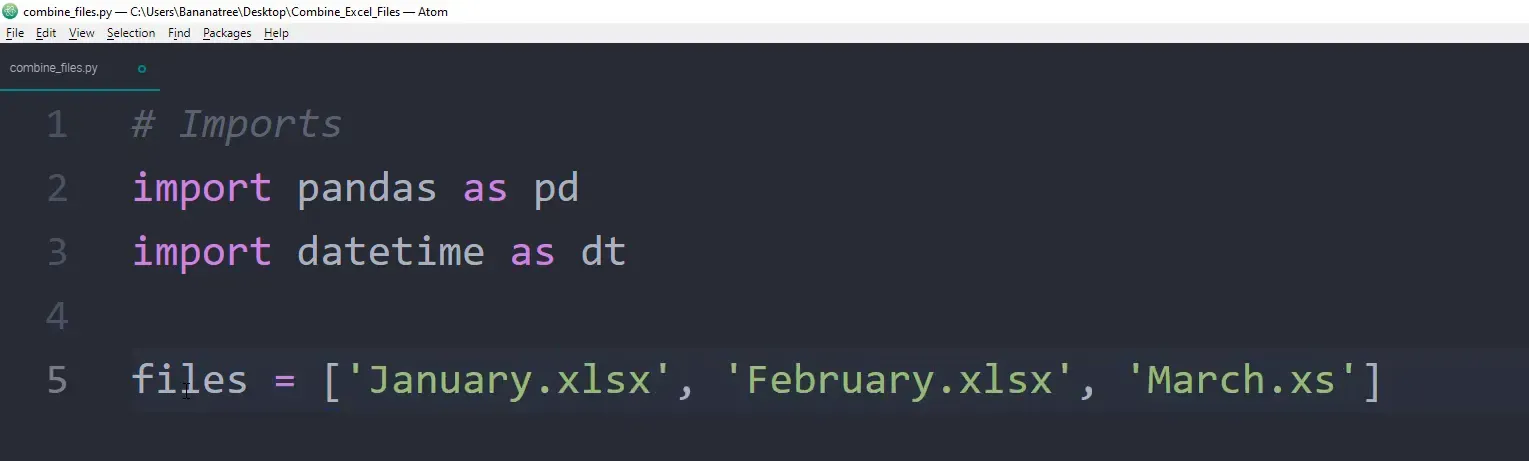
To start, I will create a new Python file called combine_files.py. First, I will import the necessary libraries:
import pandas as pd
import datetime as dt
If you haven’t installed these libraries yet, you can do so via the command prompt:
pip install pandas
pip install datetime
pip install xlrd
Next, I will create a list that holds the names of the Excel files we want to work with. Ensure the names match exactly.
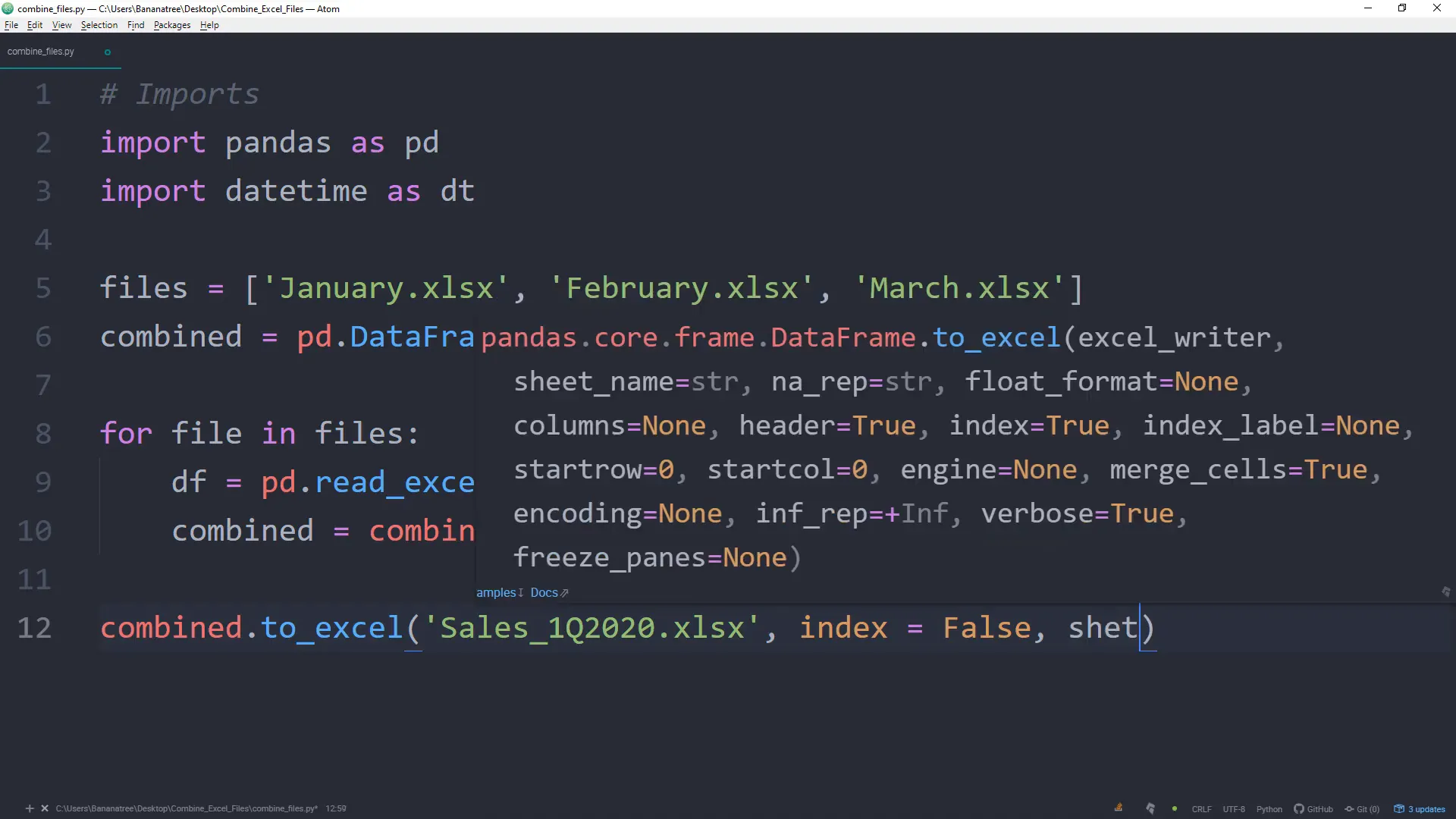
The first challenge is to combine the Excel files into one single file. To do this, I will create an empty DataFrame called combined. A DataFrame represents a table of data with rows and columns, similar to an Excel worksheet.
Next, I will loop over our list of Excel files and append each file to the combined DataFrame. I can read each Excel file into a DataFrame using:
df = pd.read_excel(file)
In the first iteration, file will be replaced by january.xlsx, then february.xlsx, and so on.
After reading the files, I will append them to the combined DataFrame using the append method, setting ignore_index to true to avoid index issues. Once combined, I will export this DataFrame to Excel:
combined.to_excel('first_quarter_2020_sales.xlsx', index=False, sheet_name='Sales')
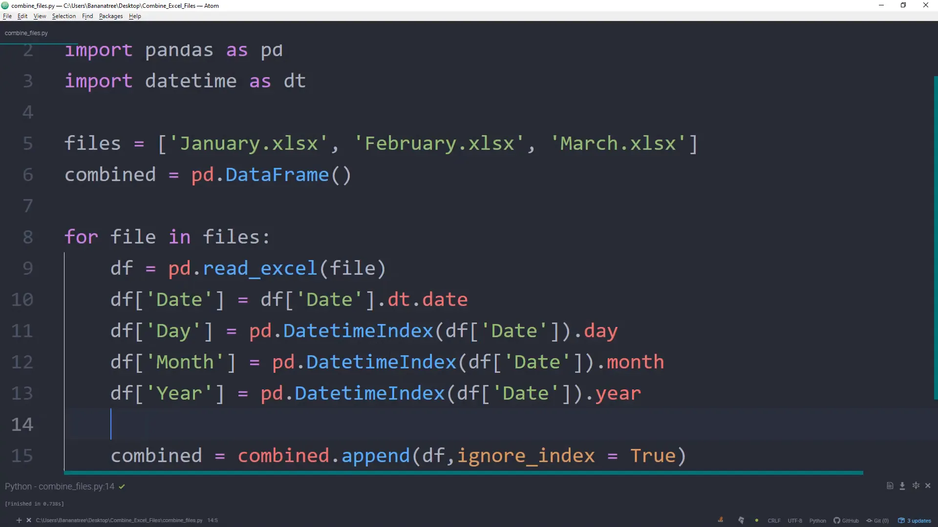
Now we have the sales from January to March in one file. You might notice that the date includes time information. I will adjust the date column to remove the timestamp:
combined['Date'] = combined['Date'].dt.date
Next, I will create separate columns for the year, month, and day for better readability. I will add a column named day to extract the day information:
combined['Day'] = combined['Date'].dt.day
I will also create a month and year column in a similar way:
combined['Month'] = combined['Date'].dt.month
combined['Year'] = combined['Date'].dt.year
To translate month numbers into names, I will use the calendar library:
import calendar
combined['Month Name'] = combined['Month'].apply(lambda x: calendar.month_name[x])
Lastly, I will create a bar chart to visualize the sales progress over the months using the Plotly library:
import plotly.express as px
fig = px.bar(combined, x='Month Name', y='Sales', title='Sales First Quarter 2020')
fig.write_html('sales_first_quarter_2020.html')
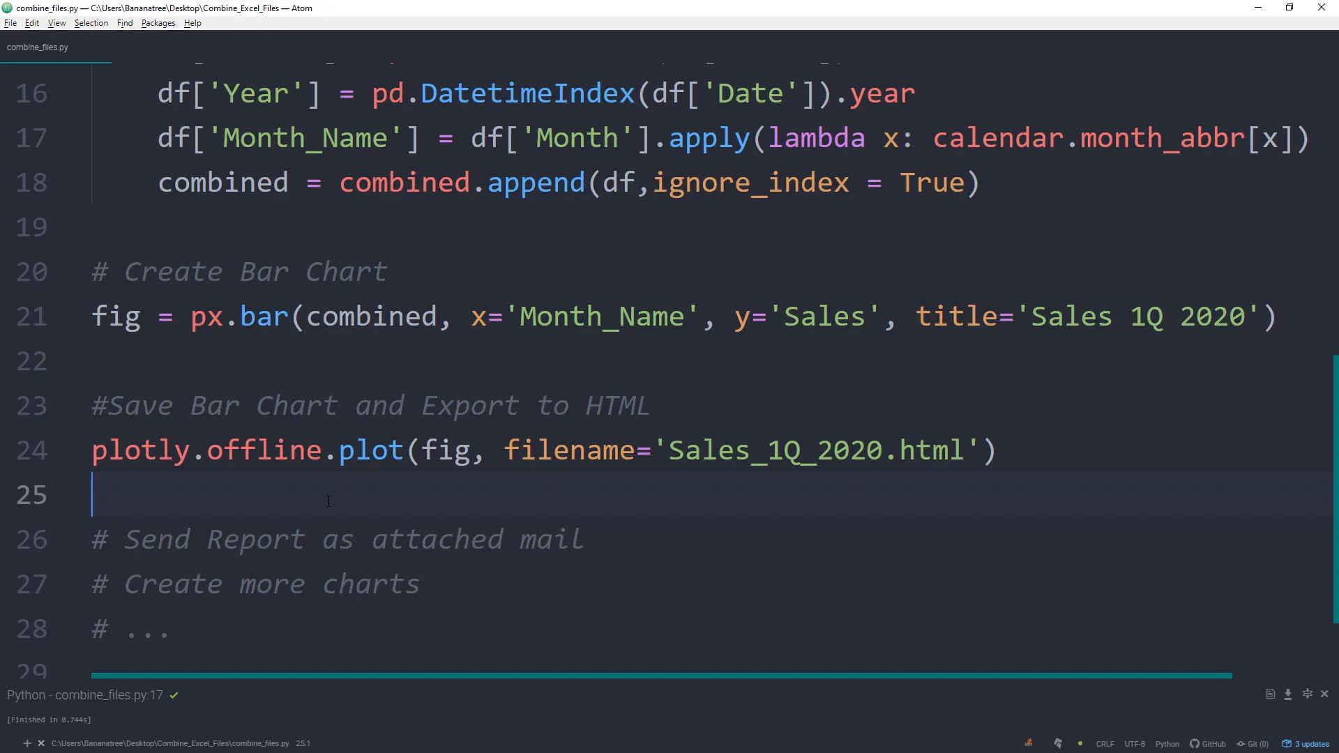
Once the script is executed, the chart will show the sales progress by month and be saved as an HTML file.
Conclusion
That’s it for this tutorial! I hope you found it useful and got inspired for your automation projects. If you have any questions or issues, feel free to leave them in the comments below. I’m happy to help you out. Thank you for reading!