
How To Create A Pie Chart In Python Using Plotly & Excel
![How To Create A Pie Chart In Python Using Plotly & Excel | Tutorial [EASY] 💻](https://pythonandvba.com/wp-content/cache/flying-press/a5e6d9d15babc29133184e2d5521b504.jpg)
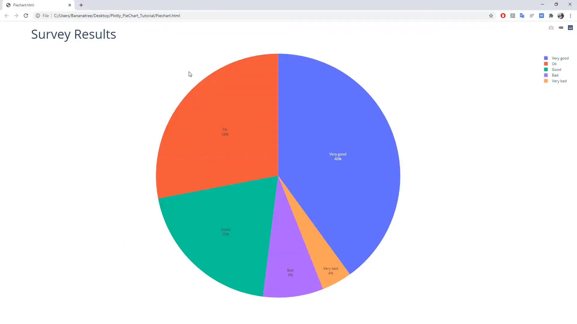
An interactive Plotly pie chart drawn from data held in an Excel file. Categories can be hidden and shown by clicking the legend, hovering gives exact values, and because the source is the spreadsheet, editing the sheet and rerunning updates the chart.
Getting Started
First things first, ensure you have all the required libraries installed. Open your command prompt by pressing Windows + R, typing cmd, and pressing Enter. The names of the libraries can be found in the requirements text file linked in the description box below.
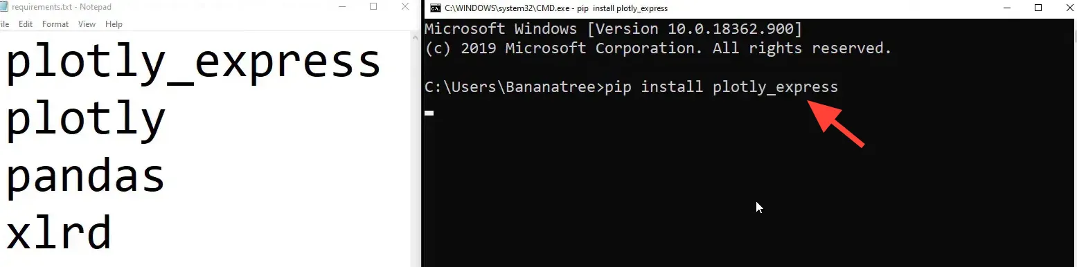
On Windows, type:
pip install plotly_expressand press Enter. Your screen might look a bit different if you have already installed the libraries. Next, install Plotly:
pip install plotlyThen install Pandas and xlrd:
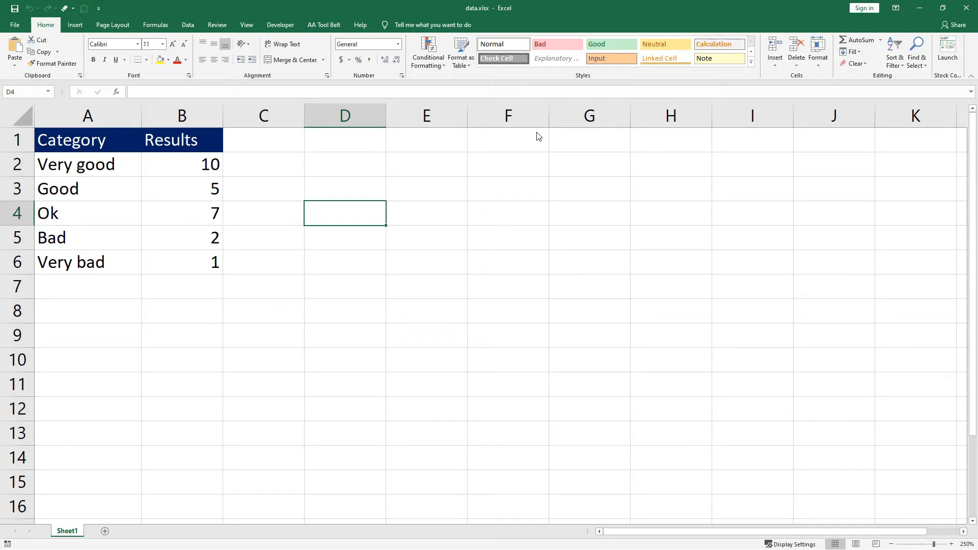
pip install pandaspip install xlrdNow that we have installed the libraries, let’s take a look at the Excel file I have prepared. It contains some survey results. In column A, there are two categories, and next to it, the number of people who voted for each category.
Next, I will create a new Python file and name it pie_chart_python.py. In this file, I will first import the libraries we just installed:
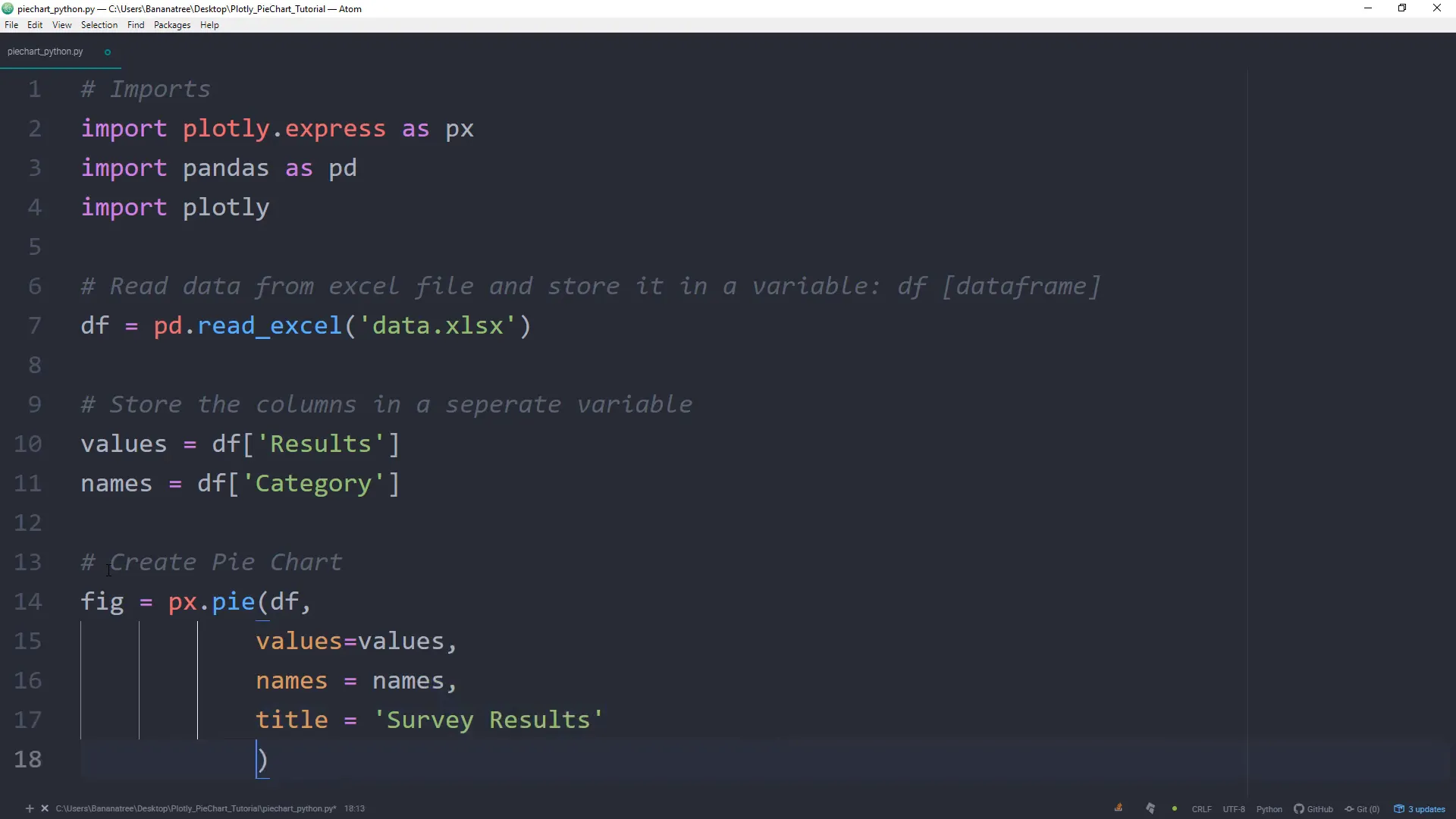
import plotly.express as px
import pandas as pd
import plotly
Next, I will read the data from the Excel file using Pandas and store it in a DataFrame:
df = pd.read_excel('data.xlsx')Keep in mind that this works only if the Excel file is in the same folder as your Python script. If not, specify the exact path to the Excel file.
Now, I will store the values of each column in separate variables. The first variable will be the values:
values = df['Results']And the second variable will be the category names:
names = df['Category']With these two variables, we can create the pie chart:
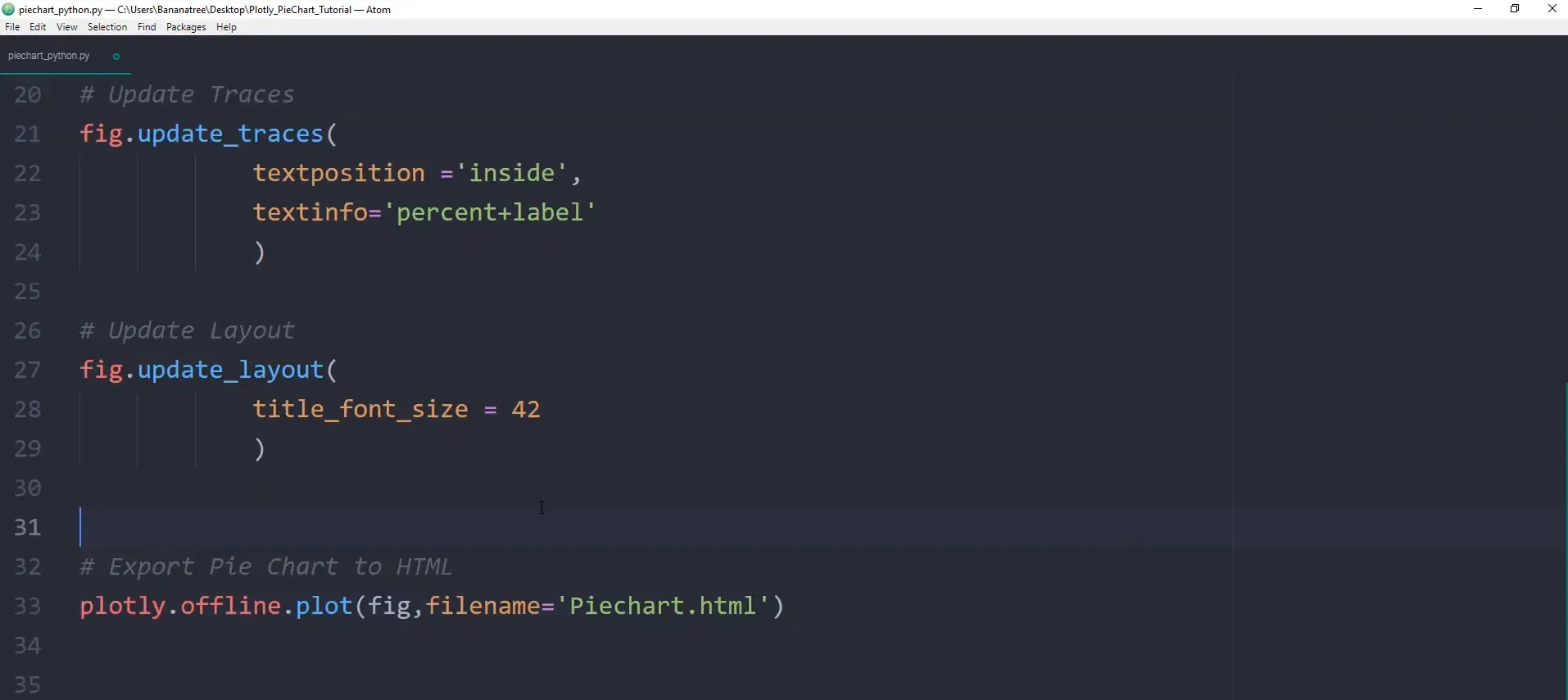
figure = px.pie(df, values=values, names=names, title='Survey Results')Now, I will update the traces to display the label inside the pie chart:
figure.update_traces(textposition='inside', textinfo='percent+label')Lastly, I will update the layout to change the title font size:
figure.update_layout(title_font_size=42)The cool thing about Plotly is that we can save the chart in an HTML file:
plotly.offline.plot(figure, filename='Piechart.html')
Now, let’s save the file and see if it’s working. Open the command prompt again and navigate to the folder where the script is saved. For example:
cd Desktop
cd PieChartTutorial
Once in the folder, run the script:
python pie_chart_python.pyAfter running the script, you should see the interactive pie chart where you can view different percentages and hide or unhide categories.
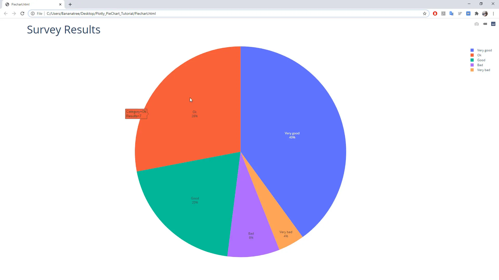
Additionally, you can save the pie chart as an HTML file. If you want to take it a step further, you could execute the Python script using VBA directly from an Excel file by clicking a button. If you’re interested in how this works, I cover executing a Python script from Excel with VBA separately.
Conclusion
I hope you found this tutorial useful. You can create interactive pie charts effortlessly with Plotly and Python. Happy coding!