How To Create An Interactive Gantt Diagram In Python Using Plotly & Excel

Introduction
In this tutorial, I will walk you through the process of creating an interactive Gantt chart using Python and Excel. The beauty of this method is that any changes made to the data in the Excel file will automatically update the Gantt chart when you run the script again.
Setting Up Your Environment
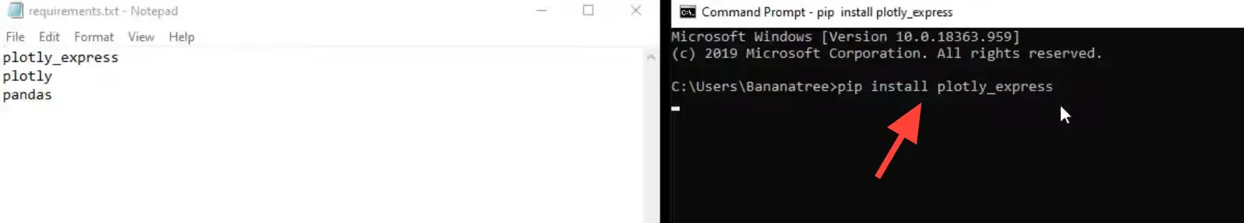
Before diving in, ensure you have the necessary libraries installed on your machine. If you’re using Windows, you can open the command prompt by typing ‘cmd’ in the search bar.
Install the required libraries using pip:
- pandas: for data manipulation
- plotly: for creating the Gantt chart
Reading Data from Excel
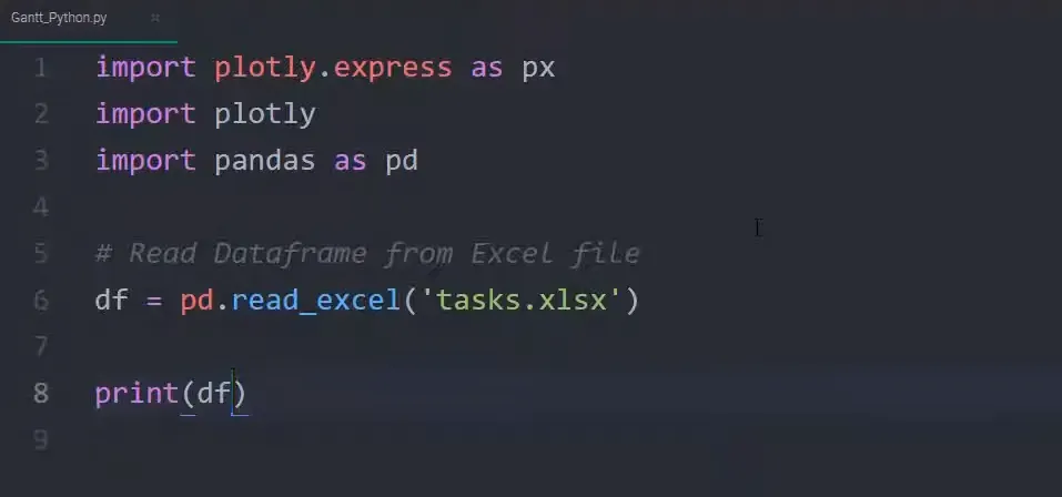
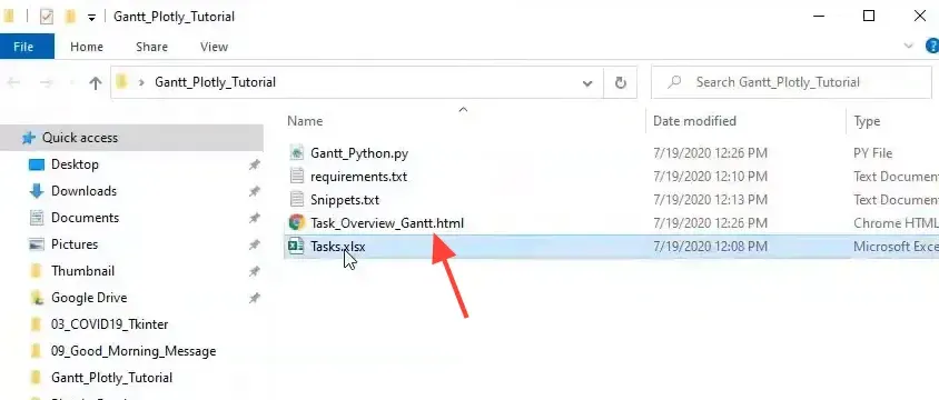
Next, I will show you how to read data from an Excel file. The data structure should include details like project start and finish dates, along with completion percentages.
Here’s how you can read data from an Excel file into a DataFrame:
import pandas as pd
data = pd.read_excel('your_file.xlsx')
Make sure to replace ‘your_file.xlsx’ with the actual path to your Excel file.
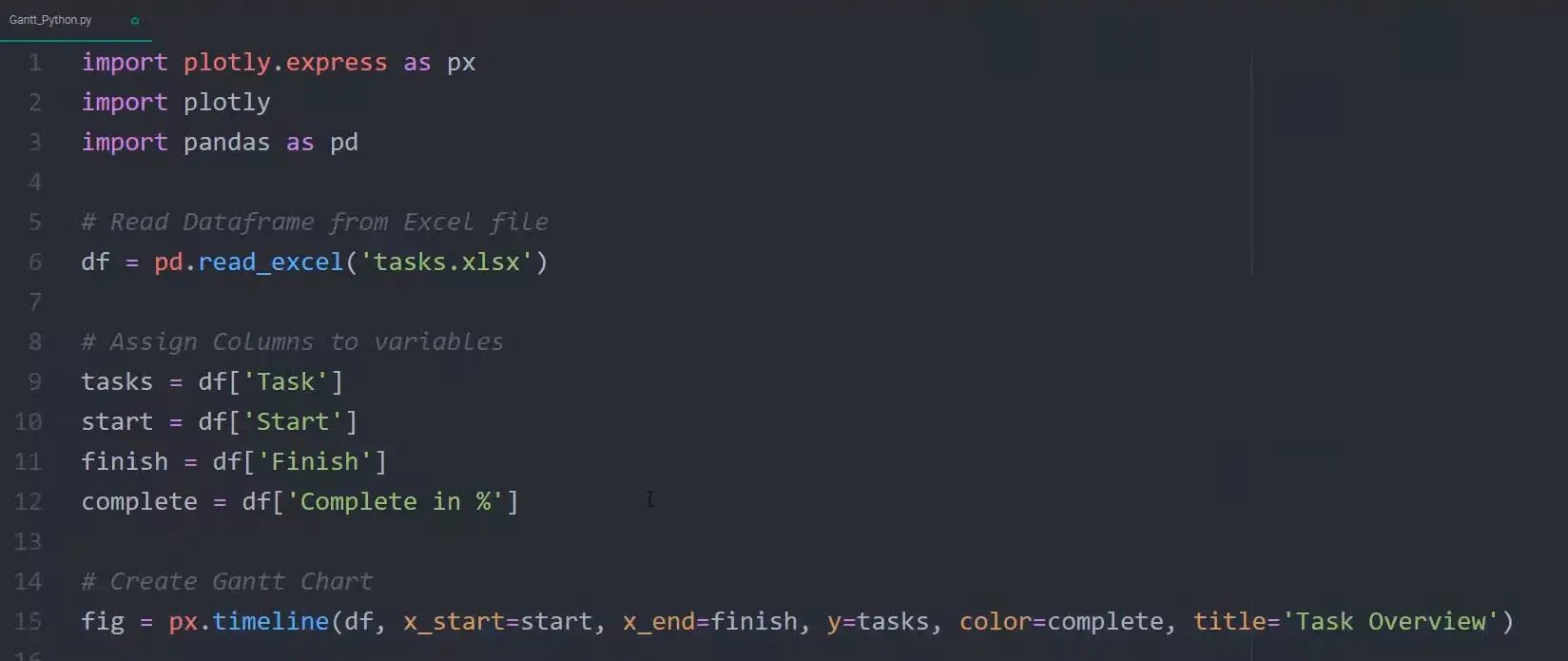
Creating the Gantt Chart
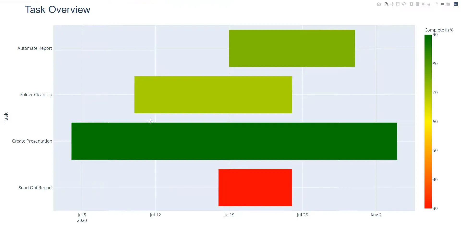
Once I have the data in a DataFrame, I can easily create the Gantt chart. This code creates a timeline where each task is represented with its corresponding start and finish dates, and colors indicate the completion status.
Saving the Chart
After setting everything up, I can save the Gantt chart as an HTML file. This allows for easy sharing and viewing in web browsers.
fig.write_html("gantt_chart.html")
Conclusion
In this post, I covered how to create an interactive Gantt chart using Python and Excel. We discussed setting up the environment, reading data from an Excel file, creating the Gantt chart, adding interactivity, and saving the final output. This method is efficient and allows for real-time updates based on changes in your data.
Source Code
import plotly.express as px
import plotly
import pandas as pd
#import plotly.figure_factory as ff

# Read Dataframe from Excel file
df = pd.read_excel('tasks.xlsx')

# Assign Columns to variables
tasks = df['Task']
start = df['Start']
finish = df['Finish']
complete = df['Complete in %']

# Create Gantt Chart
fig = px.timeline(df, x_start=start, x_end=finish, y=tasks, color=complete, title='Task Overview')

# Upade/Change Layout
fig.update_yaxes(autorange='reversed')
fig.update_layout(
        title_font_size=42,
        font_size=18,
        title_font_family='Arial'
        )

# Interactive Gantt
#fig = ff.create_gantt(df)

# Save Graph and Export to HTML
plotly.offline.plot(fig, filename='Task_Overview_Gantt.html')