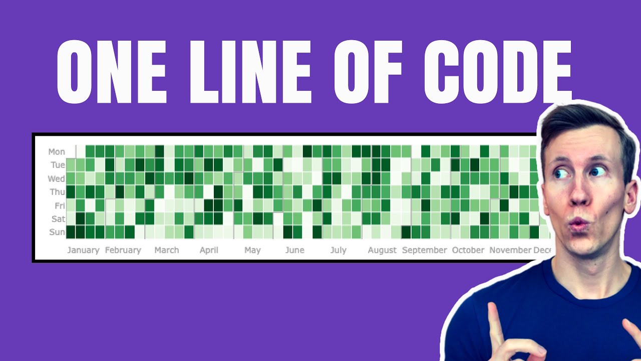
Create Stunning Calendar Heatmaps in Python (with ONE Line of Code!)
Introduction
Creating interactive calendar heatmaps can be a game-changer in visualizing trends over time. In this post, I’ll guide you through the process using the plotly-calplot package, which allows you to create stunning visualizations with just a single line of code. 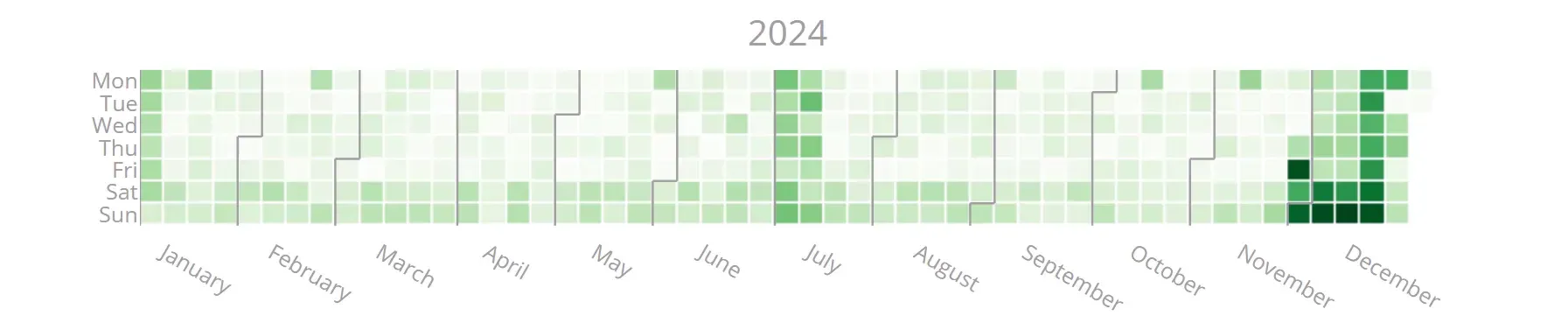
Why Use Calendar Heatmaps?
Calendar heatmaps are particularly useful for representing data that varies over different periods, such as sales data, seasonal patterns, or any other date-related metrics. They provide a quick visual reference that helps in identifying trends or anomalies at a glance.
Getting Started with Plotly-Calplot
To create a calendar heatmap, first, you need to install the plotly-calplot package. You can do this easily using pip:
$ pip install plotly-calplotOnce installed, you can start creating your heatmaps. Here’s a simple example to illustrate how it works:
Creating Your First Heatmap
With the package ready, let’s create a heatmap with just one line of code. You’ll need to prepare your data in a Pandas dataframe with a date column and a value column. Here’s how you can do it:
from plotly_calplot import calplot

# creating the plot
fig = calplot(
    dummy_df,
    x="date",
    y="value"
)
fig.show()
And just like that, you have a beautiful interactive calendar heatmap! 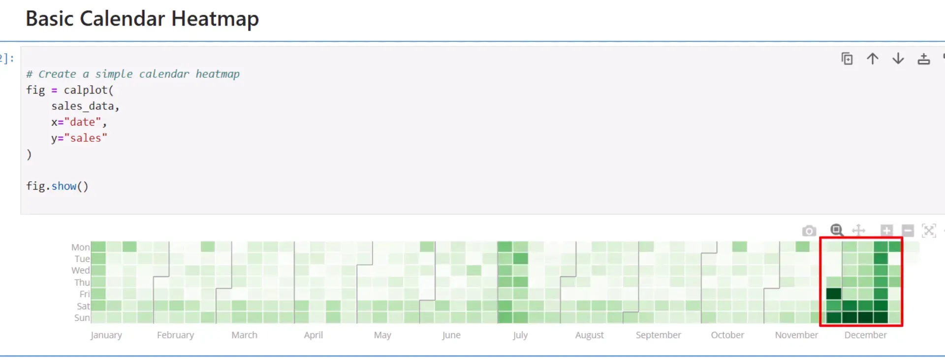
Customizing Your Heatmap
Now that you have your basic heatmap, let’s explore some customization options.
Dark Theme
If you prefer a dark theme, you can easily switch to it by adding a parameter:
fig = calplot(
    dummy_df,
    x="date",
    y="value",
    dark_theme=True
)
fig.show()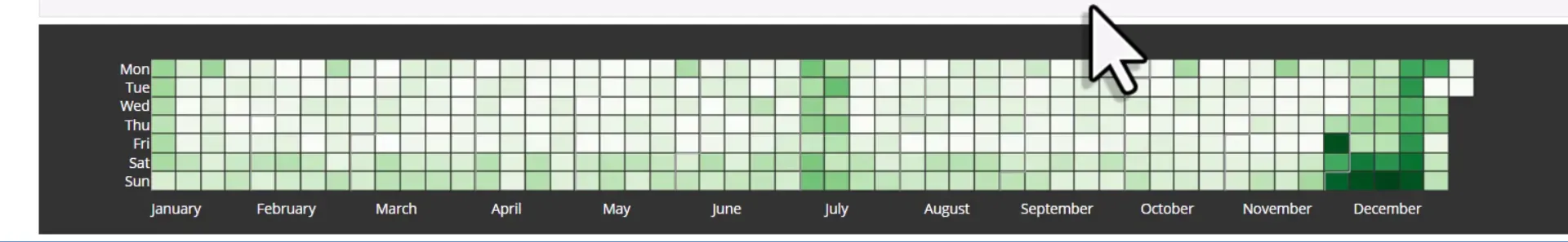
Adjusting Gaps
You can also control the gaps between the squares of your heatmap for a more polished look:
fig = calplot(
    dummy_df,
    x="date",
    y="value",
    gap=0  # No gap
)
fig.show()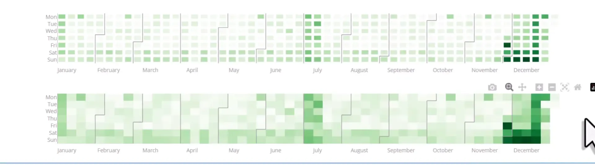
Custom Color Scales
Another important aspect is the color scale. You can choose from standard Plotly color scales or create your own:
fig = calplot(
    dummy_df,
    x="date",
    y="value",
    colorscale="blues"  # Using a standard color scale
)
fig.show()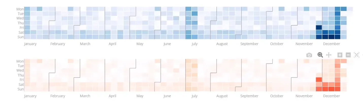
Exploring Additional Options
The plotly-calplot package offers various other options to enhance your heatmaps. For instance, you can add titles for each year or adjust the width of month lines:
fig = calplot(
    dummy_df,
    x="date",
    y="value",
    years_title=True,
    month_lines_width=3
)
fig.show()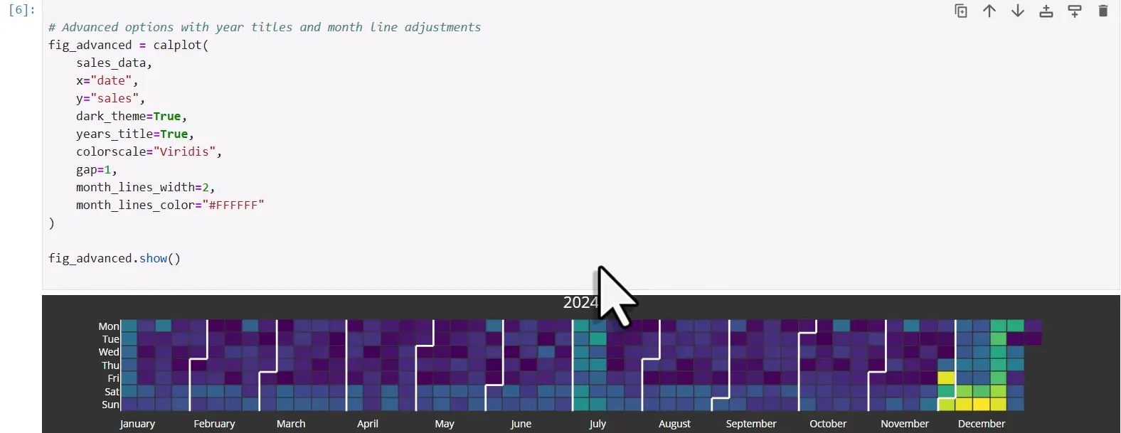
Conclusion
In this post, I covered how to create interactive calendar heatmaps using the plotly-calplot package. From installation to customization, you now have the tools to visualize your date-related metrics effectively. Calendar heatmaps are not just visually appealing; they also provide valuable insights into your data. Thanks for reading.