Solve Real-World Data Science Tasks in Python | Data Analysis with Pandas & Plotly (Full Tutorial)

Introduction
In this tutorial, I am excited to tackle a real-world data science problem using Python, specifically with the Pandas and Plotly libraries. Imagine working as a data analyst at Coding Is Fun Corporation, where the CEO requests an analysis of the commercial data for the year. This is our task: to transform data into actionable insights.
(Setup) Virtual Environment
Before diving into the analysis, I will create a virtual environment. This step is optional but recommended, as it helps isolate different versions and libraries of Python for each project. If you’re using conda, you can create a virtual environment by typing:
conda create -n data_analysis python=3.8
Activate the environment with:
conda activate data_analysis
Once activated, you’ll notice the environment name in the terminal. This virtual environment will help ensure that the packages I use are compatible with my code.
(Setup) Installing Libraries
Next, I will install the necessary libraries. In the requirements.txt file, you’ll find the libraries needed for this project. Install them by running:
pip install -r requirements.txt
This might take some time, so be patient while the dependencies are being installed.
(Settings) Project Files Overview
Now, I will launch Jupyter Notebook in the project folder. Inside the data folder, you will find the Excel workbook that we will analyze. The output folder is currently empty, and it will eventually store our manipulated datasets and generated charts.
(Settings) Importing Libraries
Let’s go ahead and import the libraries installed earlier:
import pandas as pd
import plotly.express as px
from pandas_profiling import ProfileReport
from autoviz import AutoViz
These libraries will facilitate our data analysis and visualization tasks.
(Settings) Setting Plotly Template
Before plotting, I will set a template for our visualizations. I prefer the Plotly white theme:
template_style = 'plotly_white'
(Settings) Load DataFrame
Next, I will load the Excel data into a DataFrame:
df = pd.read_excel('data/data.xlsx')
Let’s print the first five rows to understand the data structure:
df.head()
(Explore Dataset) Traditionally
Before utilizing automated tools for exploratory data analysis, I will manually check some basic information about the DataFrame using:
df.info()
This gives us insights into the total number of entries, column names, data types, and null values.
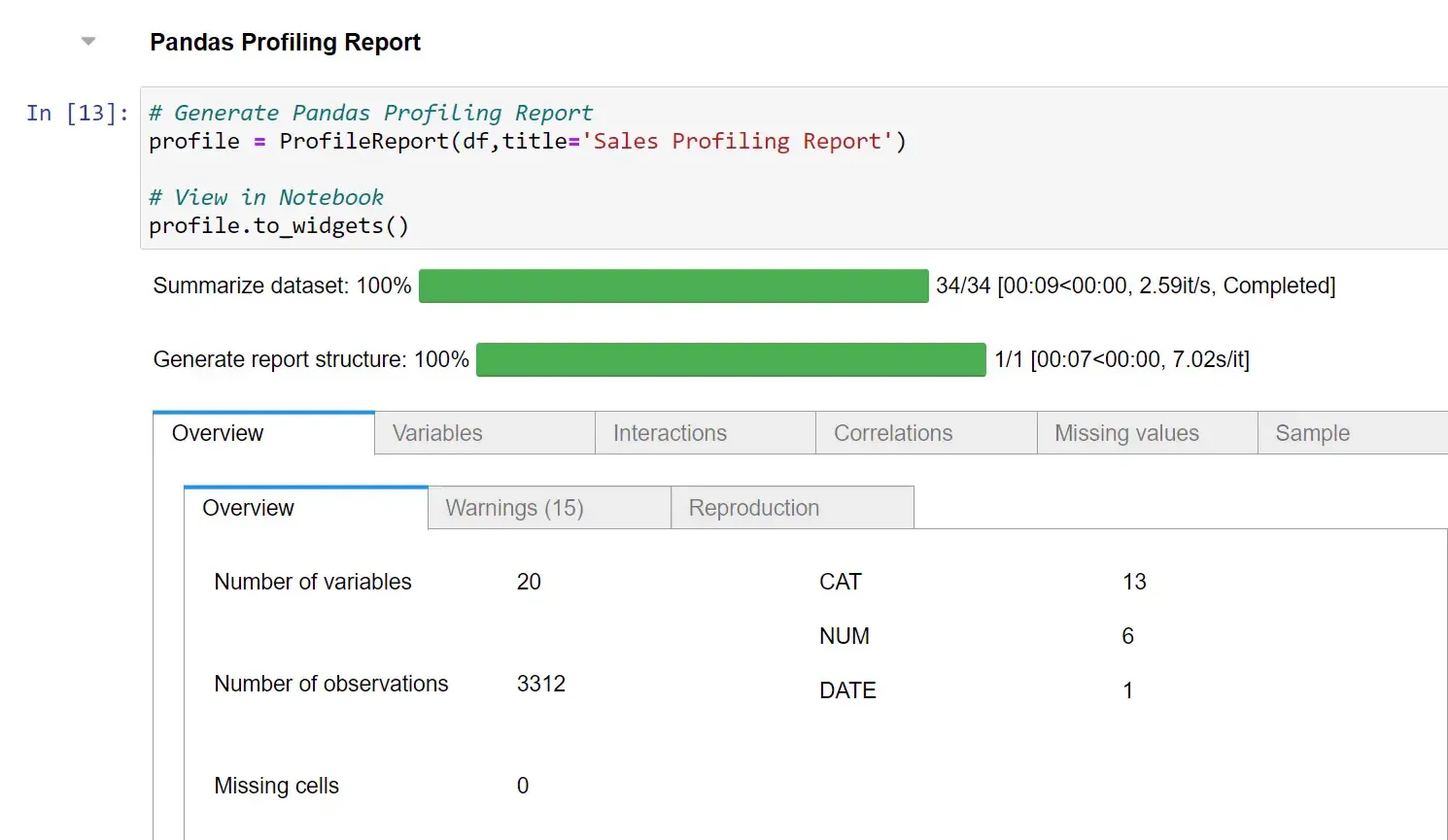
(Explore Dataset) Pandas Profiling Report
To streamline our analysis, we will generate a Pandas Profiling Report:
profile = ProfileReport(df)
profile.to_widgets()
This report provides valuable insights into each column, including distinct values and descriptive statistics.
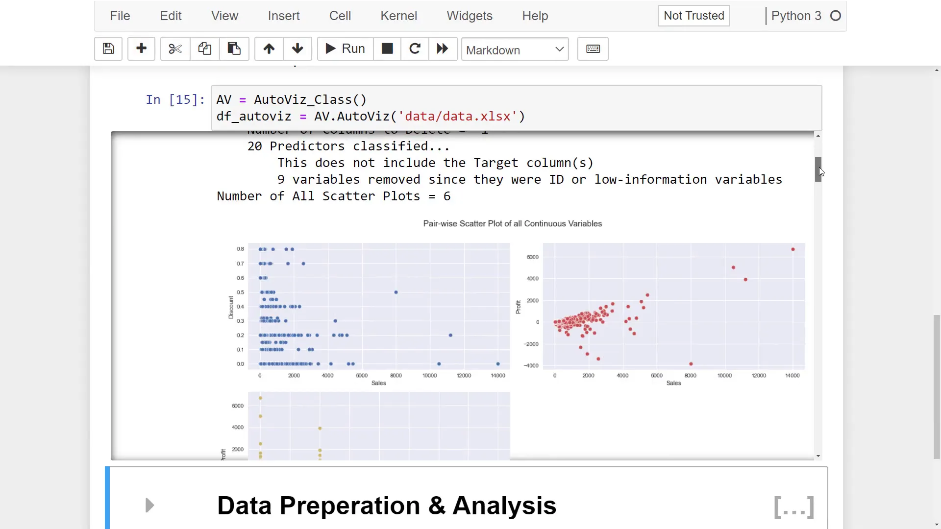
(Explore Dataset) AutoViz Report
autoviz = AutoViz()
autoviz.auto_visualize('data/data.xlsx')
(Data Prep & Analysis) Various Pandas Functions
In this section, we will enhance our Pandas skills by answering specific questions, such as determining the highest sales in 2020:
highest_sales = df['Sales'].max()
The average discount for chairs can be found by filtering the DataFrame:
average_discount = df[df['Subcategory'] == 'Chairs']['Discount'].mean()
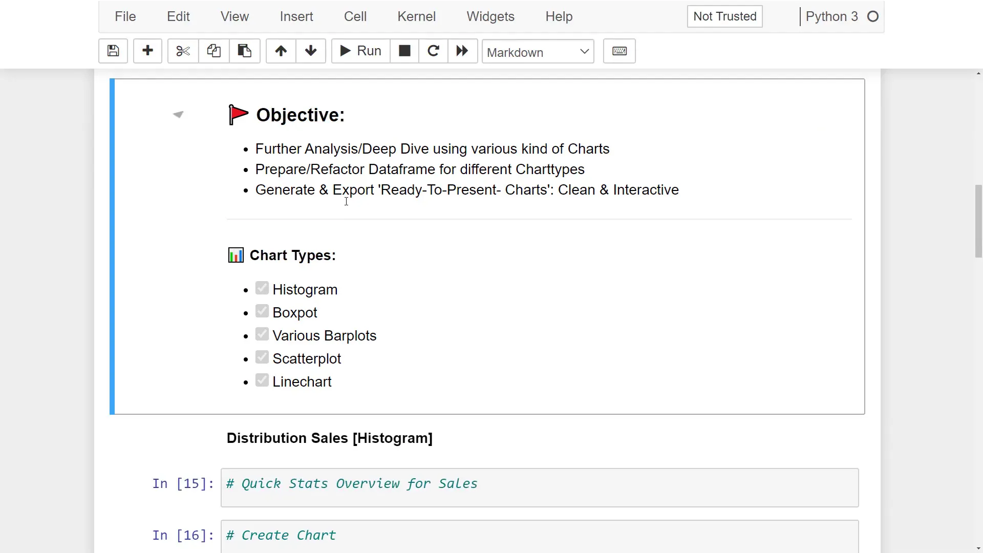
(Deep Dive & Visualization) Overview
Now, let’s move on to the visualization part. We will create various charts to present our findings effectively.
(Deep Dive & Visualization) Histogram
Creating a histogram to visualize the sales distribution is straightforward:
fig = px.histogram(df, x='Sales', template=template_style)
fig.show()
(Deep Dive & Visualization) Box Plot
Next, I will create a box plot to compare distributions:
fig = px.box(df, y='Sales', template=template_style)
fig.show()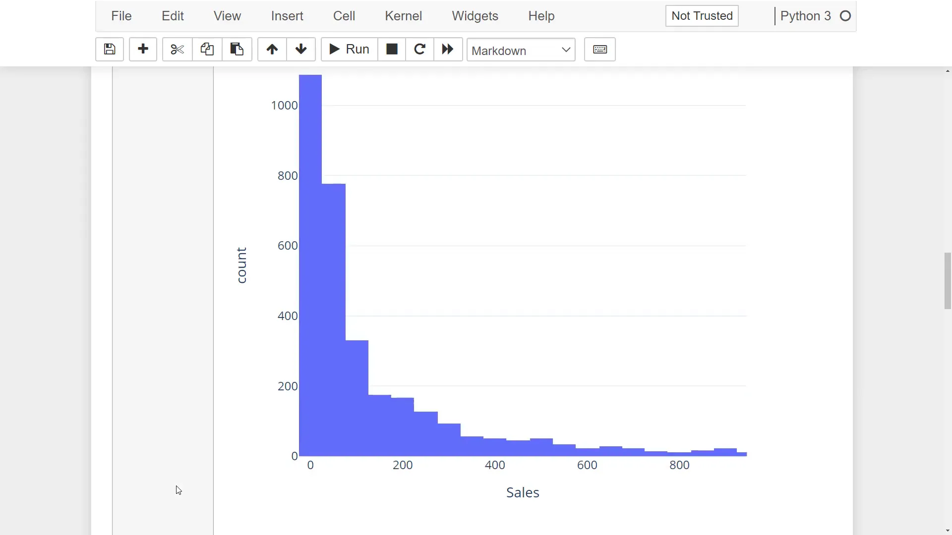
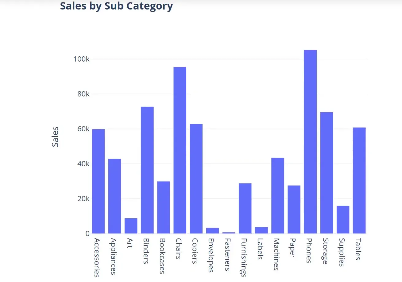
(Deep Dive & Visualization) Various Bar Plots
To compare sales across subcategories, I will create a bar chart:
sales_by_subcategory = df.groupby('Subcategory')['Sales'].sum().reset_index()
fig = px.bar(sales_by_subcategory, x='Subcategory', y='Sales', template=template_style)
fig.show()
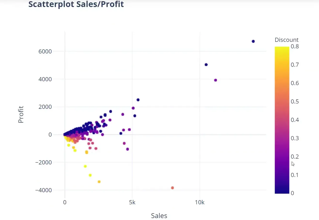
(Deep Dive & Visualization) Various Scatter Plot
To analyze the relationship between sales, profit, and discount, I will create a scatter plot:
fig = px.scatter(df, x='Sales', y='Profit', color='Discount', template=template_style)
fig.show()
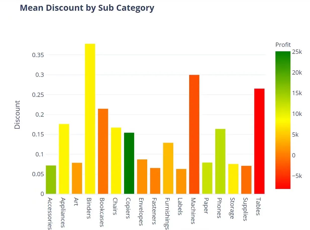
(Deep Dive & Visualization) Discount Analysis
Next, I will analyze the average discount by subcategory:
average_discount = df.groupby('Subcategory')['Discount'].mean().reset_index()
fig = px.bar(average_discount, x='Subcategory', y='Discount', template=template_style)
fig.show()
(Deep Dive & Visualization) Line Chart
Finally, I will create a line chart to visualize the sales and profit trends over time:
df['Cumulative Sales'] = df['Sales'].cumsum()
df['Cumulative Profit'] = df['Profit'].cumsum()
fig = px.line(df, x='Order Date', y=['Cumulative Sales', 'Cumulative Profit'], template=template_style)
fig.show()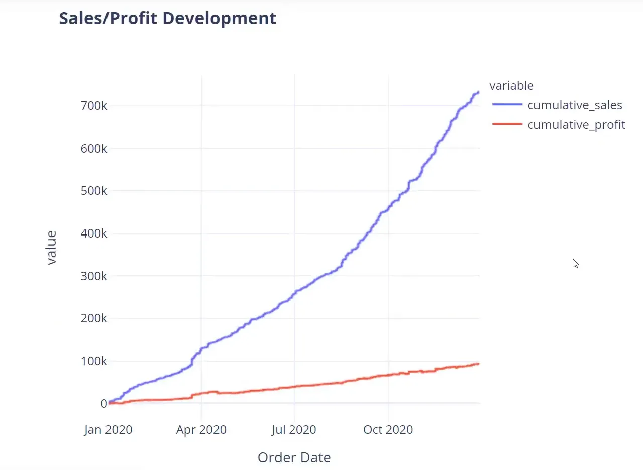
Final Words
In this tutorial, we have covered the essential steps for data analysis using Python, focusing on data preparation, exploration, and visualization. We utilized various libraries to streamline our process and create insightful visualizations.
Thank you for following along!