FINALLY! Style Your Streamlit App with Custom CSS 🎨
Introduction to Custom Styling
Getting Started with the Latest Version
First things first, ensure you have the latest version of Streamlit installed. You can do this by running:
pip install streamlit --upgradeOnce that’s set, I’ll guide you through a demo application that shows off the new styling capabilities.
Understanding the Demo Application
In my demo, you’ll see three main files: the Streamlit application, the Python script, and the CSS file located in an assets folder. The CSS file is crucial as it allows you to define styles that can be applied to various elements in your app. 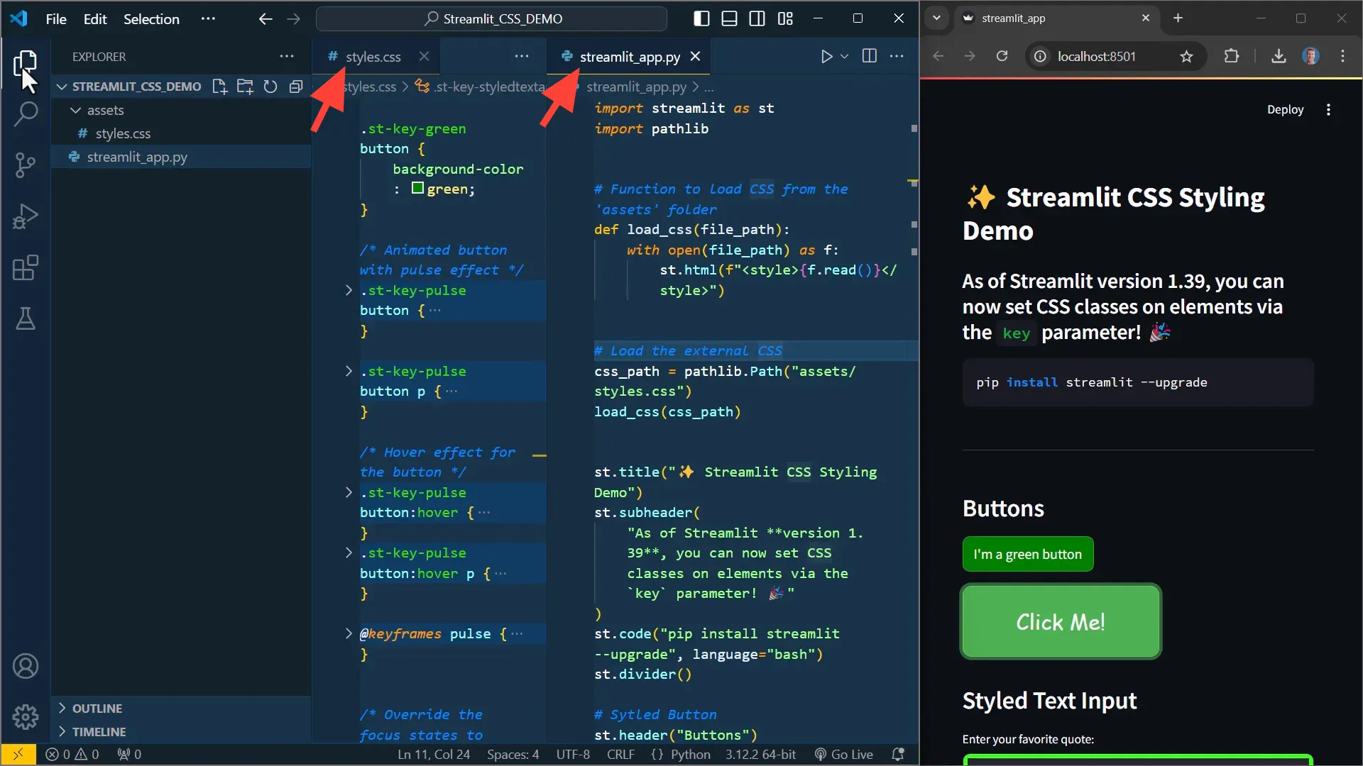
Applying CSS to Your Streamlit App
To apply the CSS file, I define a function that reads the CSS content and wraps it in a Streamlit HTML element. This function is called at the top of the script to ensure styles are applied early. 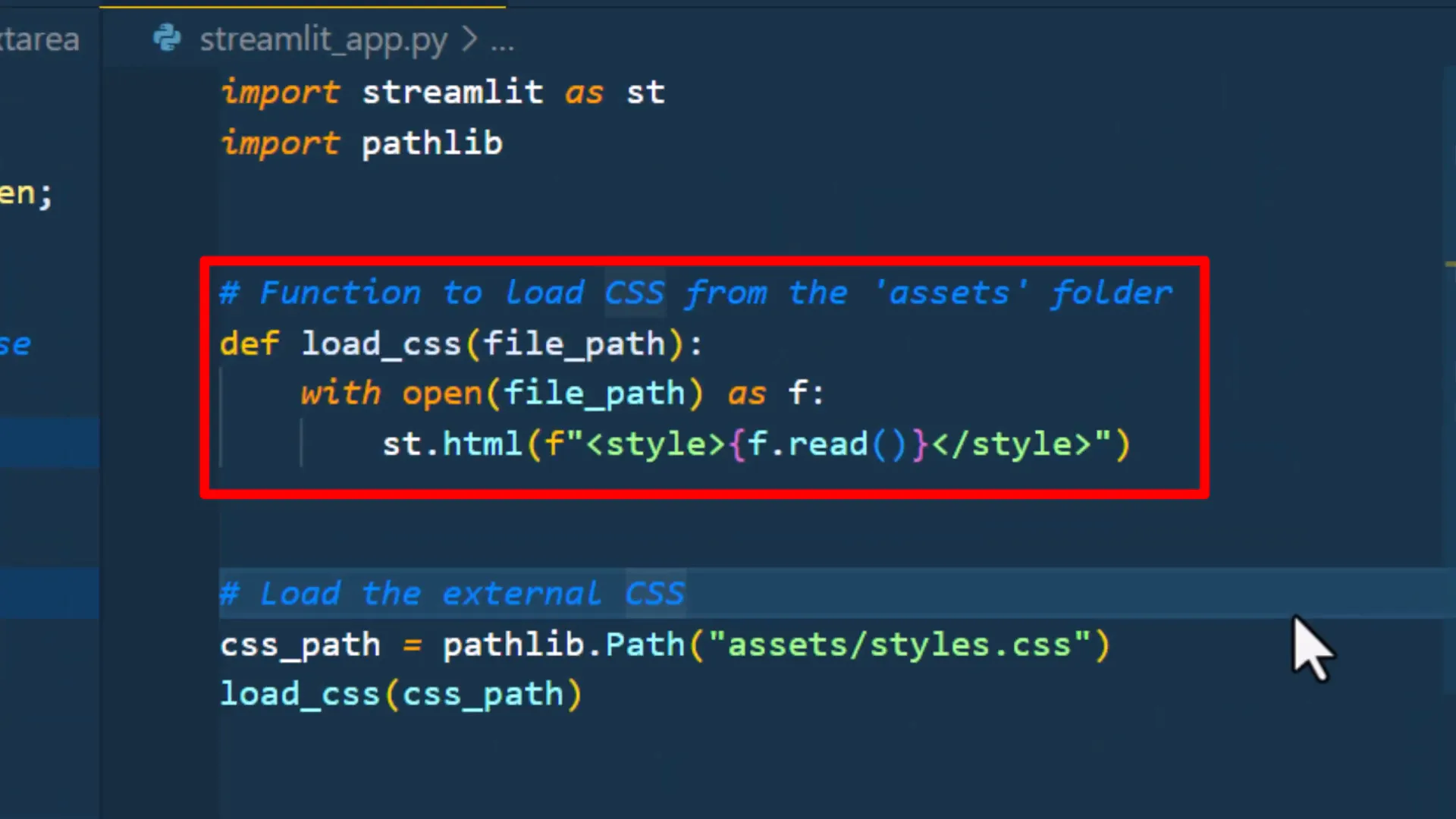
Styling Buttons with Custom Classes
One of the exciting features is how keys assigned to buttons are transformed into class names. For example, a button with the key “green” will have the class st-key-green. This allows you to target and style it in your CSS file. 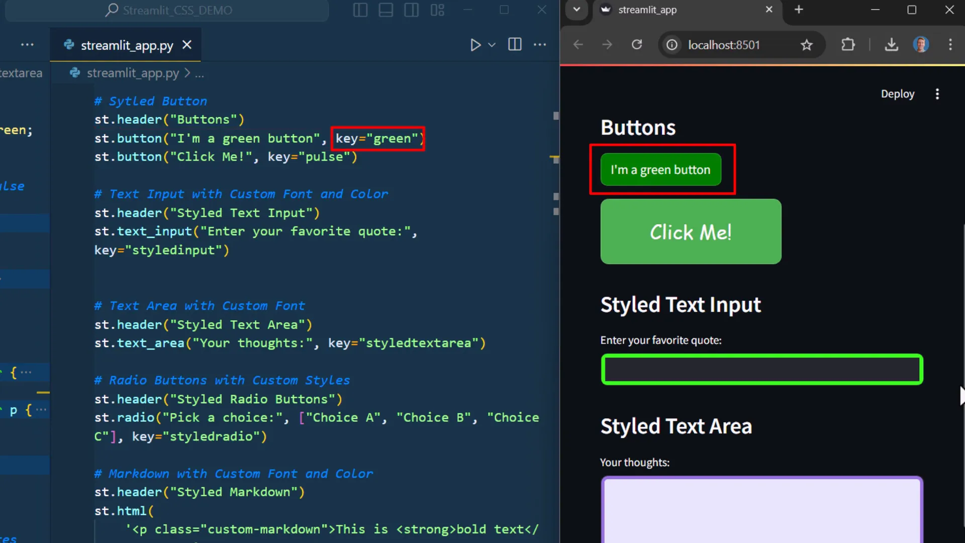 Here’s how I added a red button:
st.button("Red Button", key="red")Reloading the application now shows both the green and red buttons styled as per the CSS rules you define.
Advanced CSS Features
You can also apply animations to buttons. For instance, I created an animated button by defining a CSS animation property and targeting the button’s class. 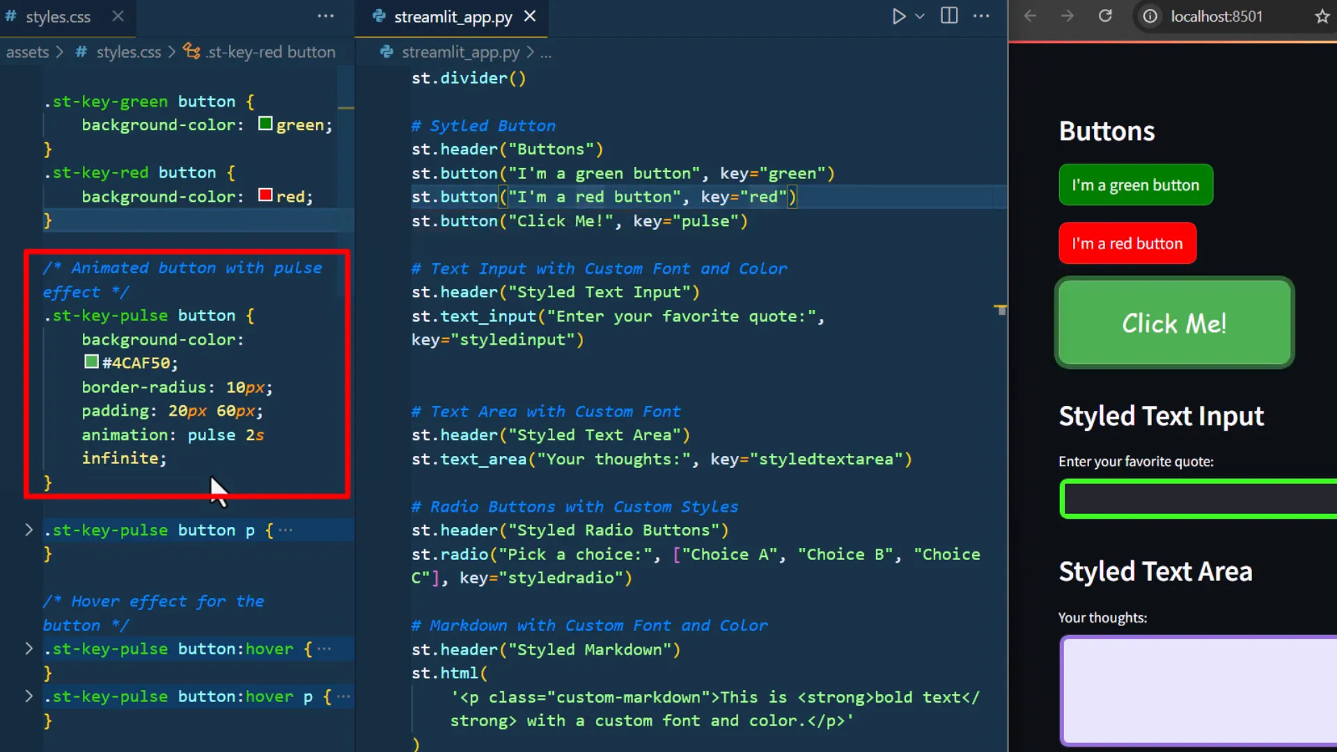
Using Developer Tools to Inspect Elements
If you encounter issues, use the browser’s developer tools to inspect elements. In Chrome, right-click and select “Inspect”. You can hover over elements to see their applied styles. This is especially useful for understanding how to target specific elements effectively. 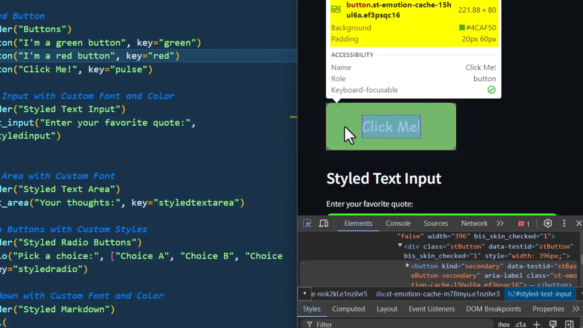
Creating Hover Effects
Adding hover effects is straightforward. You specify the :hover pseudo-class in your CSS. For example:
.st-key-green:hover { background-color: darkgreen; }This changes the button’s background color when hovered over, enhancing user interaction.
Handling Focus States
By default, Streamlit applies its styling when a button is focused. You can override this using the :focus pseudo-class in your CSS. This ensures your custom styles remain intact even after the button is clicked. 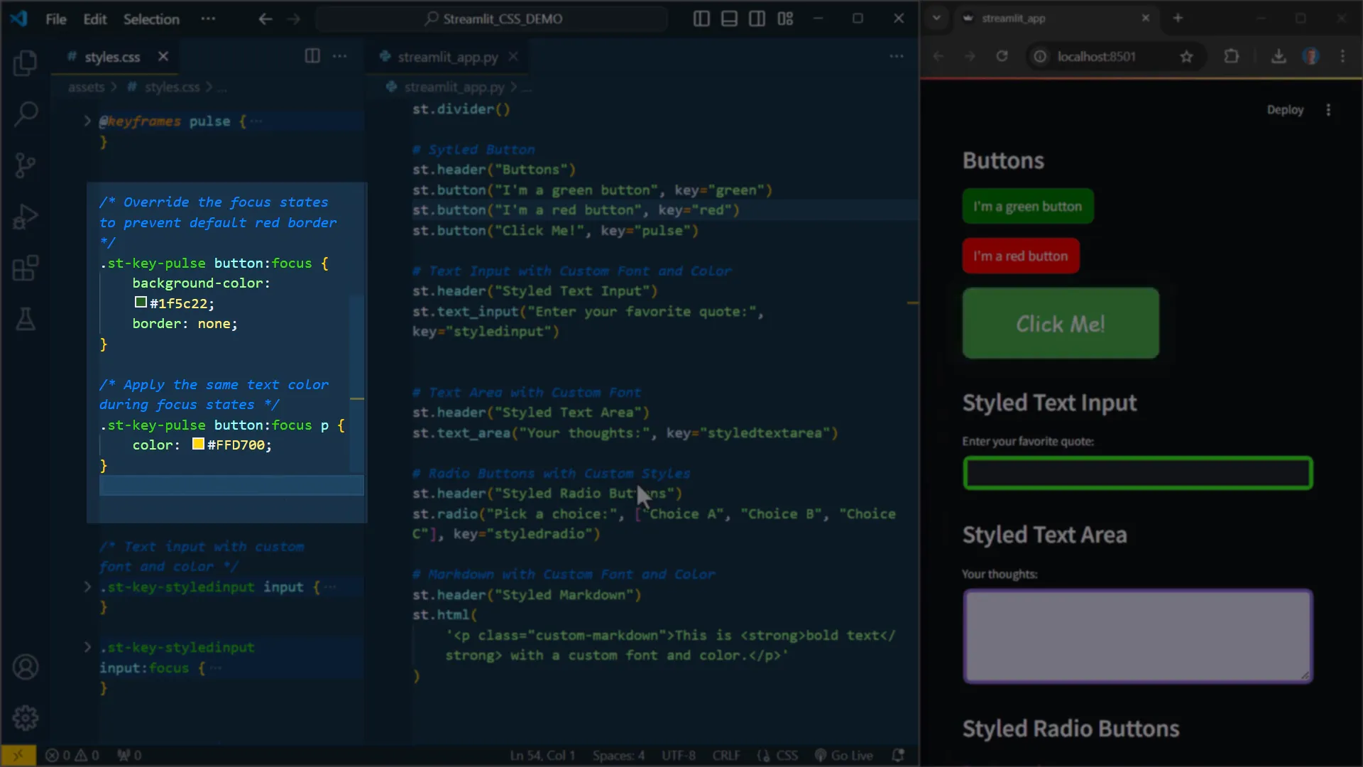
Styling Input Elements 📝
Next, I added a text input box with a key named “styledinput”. In my CSS, I altered its border style and set it to none when focused, giving it a clean look. 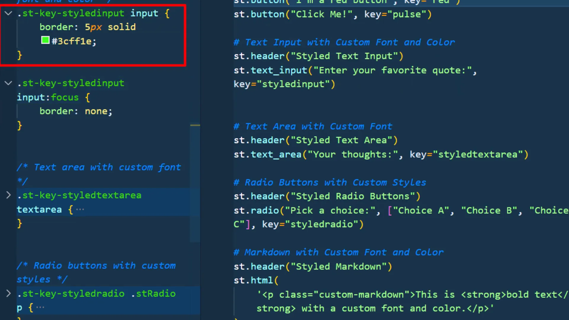
Customizing Text Areas and Radio Buttons
Just like buttons and input boxes, you can style text areas and radio buttons. For the radio button, you need to target the paragraph inside the st.radio element to change its font family and color. 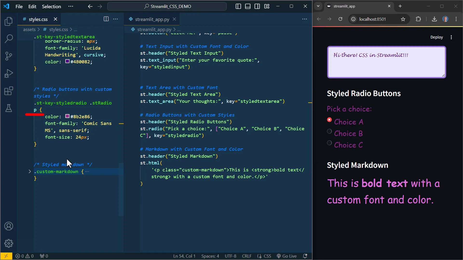
Incorporating HTML Elements
Streamlit allows for HTML integration using the HTML element. You can define your HTML and style it with CSS, which can be useful for adding additional formatting options. 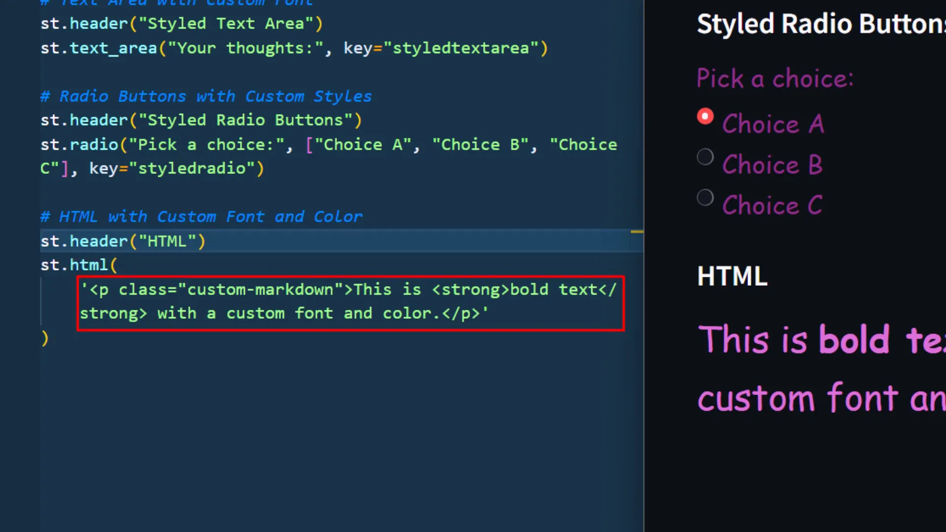
Conclusion and Final Thoughts
In this post, I covered how to style various elements in your Streamlit app using custom CSS. With the new features available, you can easily enhance the look and feel of your applications. If you have any questions or want to share your experiences, feel free to reach out!
Further Links

