Turn An Excel Sheet Into An Interactive Dashboard Using Python (Streamlit)
Introduction
In this tutorial, I will demonstrate how to convert a simple Excel sheet into an interactive dashboard using Python, specifically with the Pandas, Plotly, and Streamlit libraries. The beauty of Streamlit is that it allows you to create web applications directly in Python without needing to know HTML, CSS, or JavaScript.
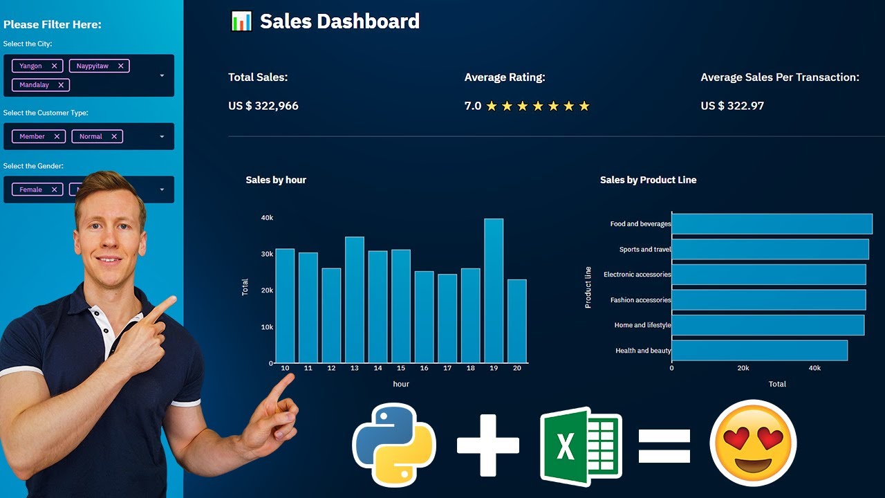
The dashboard will feature various options for users to filter the dataset, with KPIs at the top and charts below that update accordingly.
Exploring the dataset
Let’s take a quick look at our dataset. It contains supermarket sales data from three different locations, including whether the customer was a member, their gender, different product lines, total sales (including taxes), purchase time, and customer satisfaction ratings. These columns will be visualized in our dashboard.
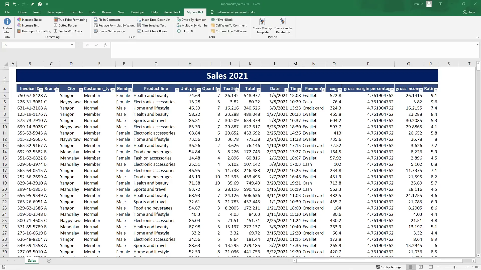
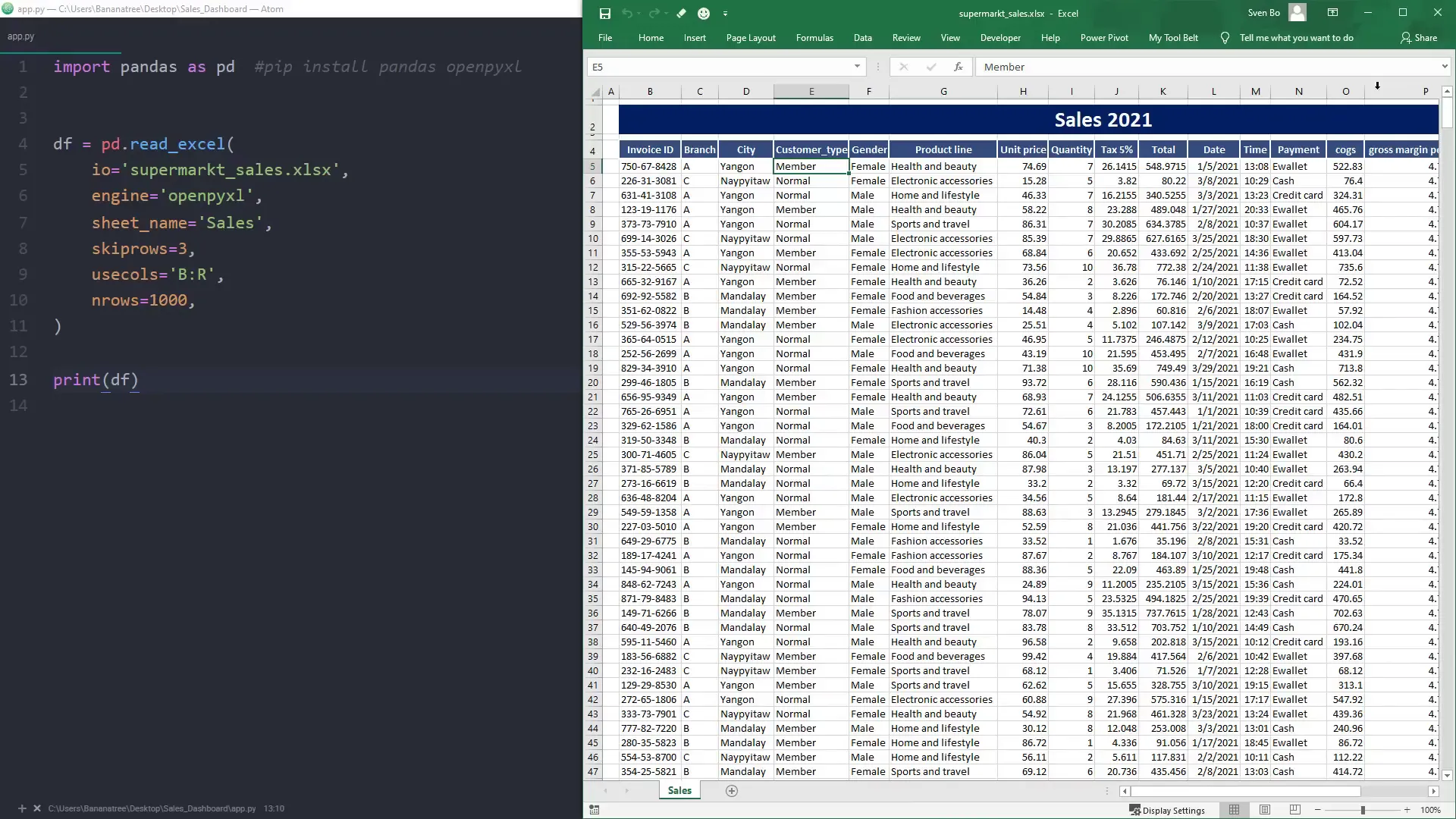
Convert Excel Data into a Pandas Dataframe
To work with the data in Python, I will transform the Excel data into a Pandas DataFrame. An easy way to do this is by using an add-in called ‘My Tool Belt.’ While this add-in is convenient, you can also read Excel data directly using Pandas.
To read in the Excel data, ensure you have the necessary libraries installed by running the following commands:
- Pandas:
pip install pandas - OpenPyXL:
pip install openpyxl
Install Dependency’s
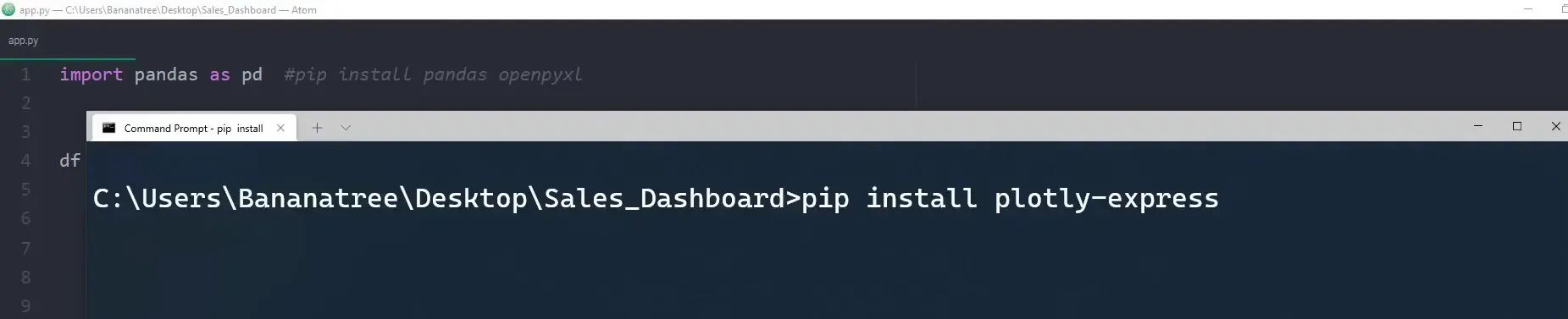
Along with Pandas and OpenPyXL, you will also need Streamlit and Plotly Express. Install them using the commands:
- Streamlit:
pip install streamlit - Plotly Express:
pip install plotly-express
Getting started with Streamlit
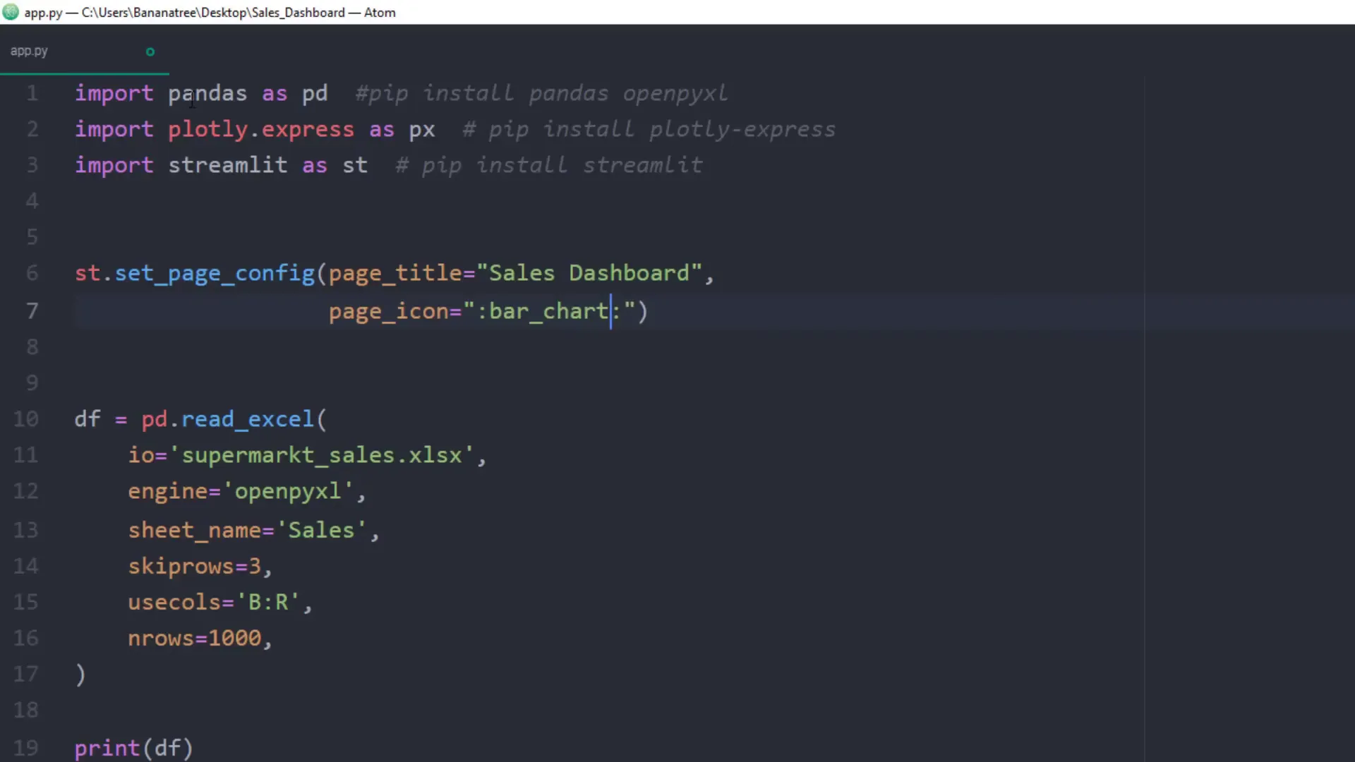
After installing the libraries, I will import them and set up some basic configurations for our web app using st.set_page_config. This includes specifying the title and favicon for our app.
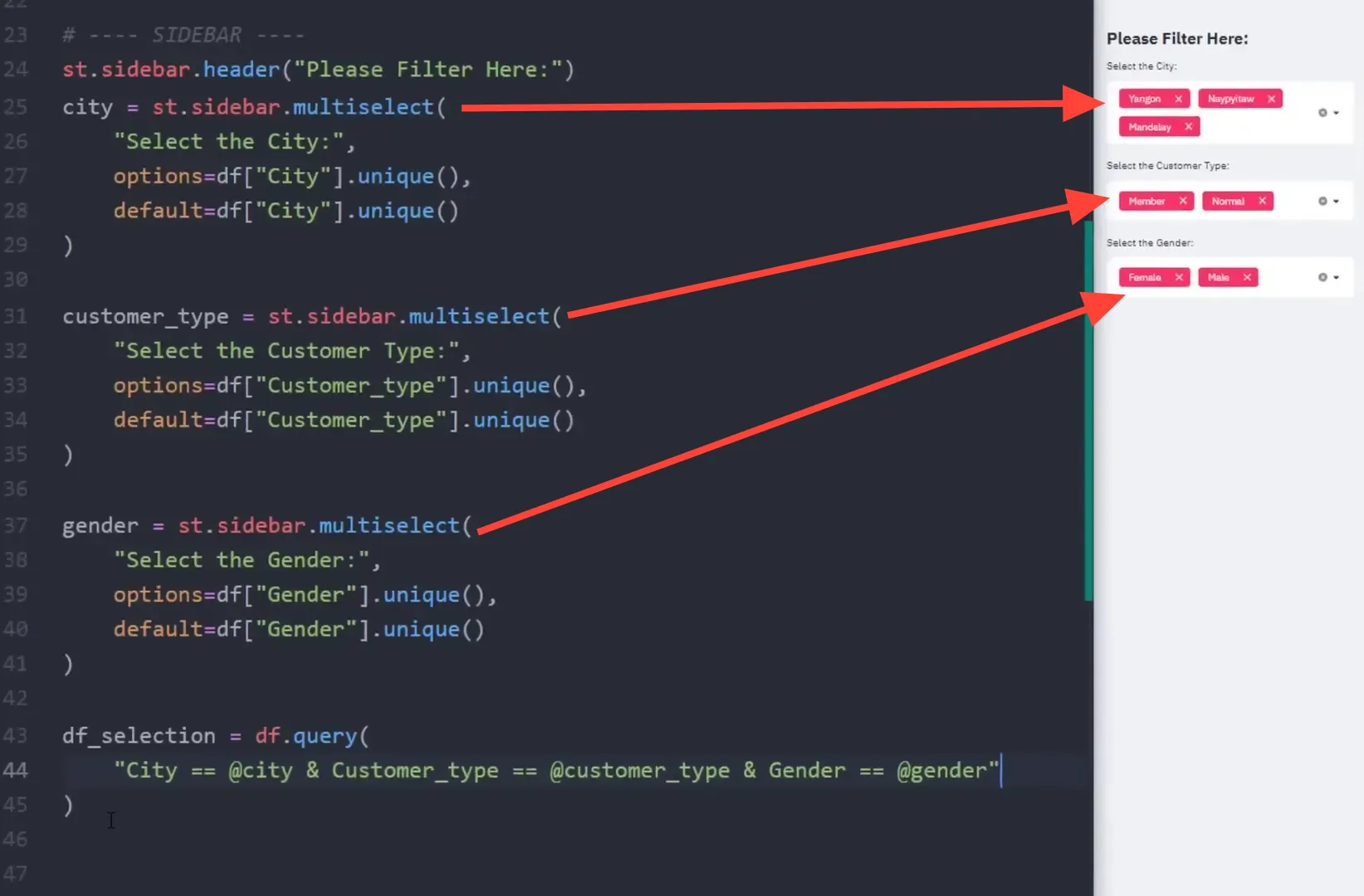
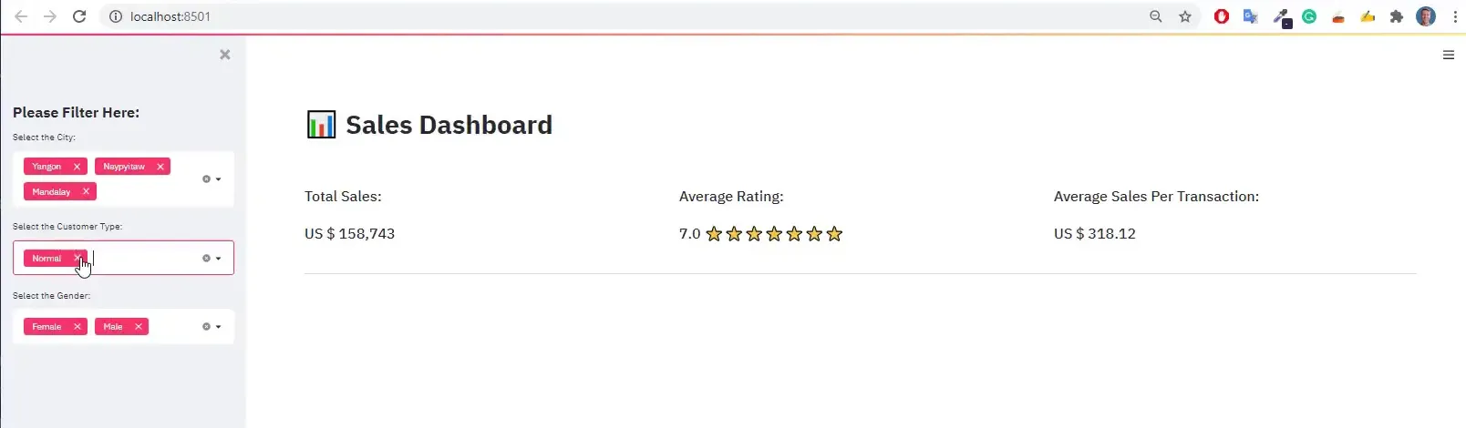
Building the Sidebar (Filter Selection)
The sidebar will allow users to filter the dataset based on different criteria such as cities, customer types, and gender. I will use the Streamlit multiselect component for these filters.
For example, I will label the city filter as “Select the city” and provide options based on the unique values in the Excel column ‘city’. I will also set a default value to display all city names initially.
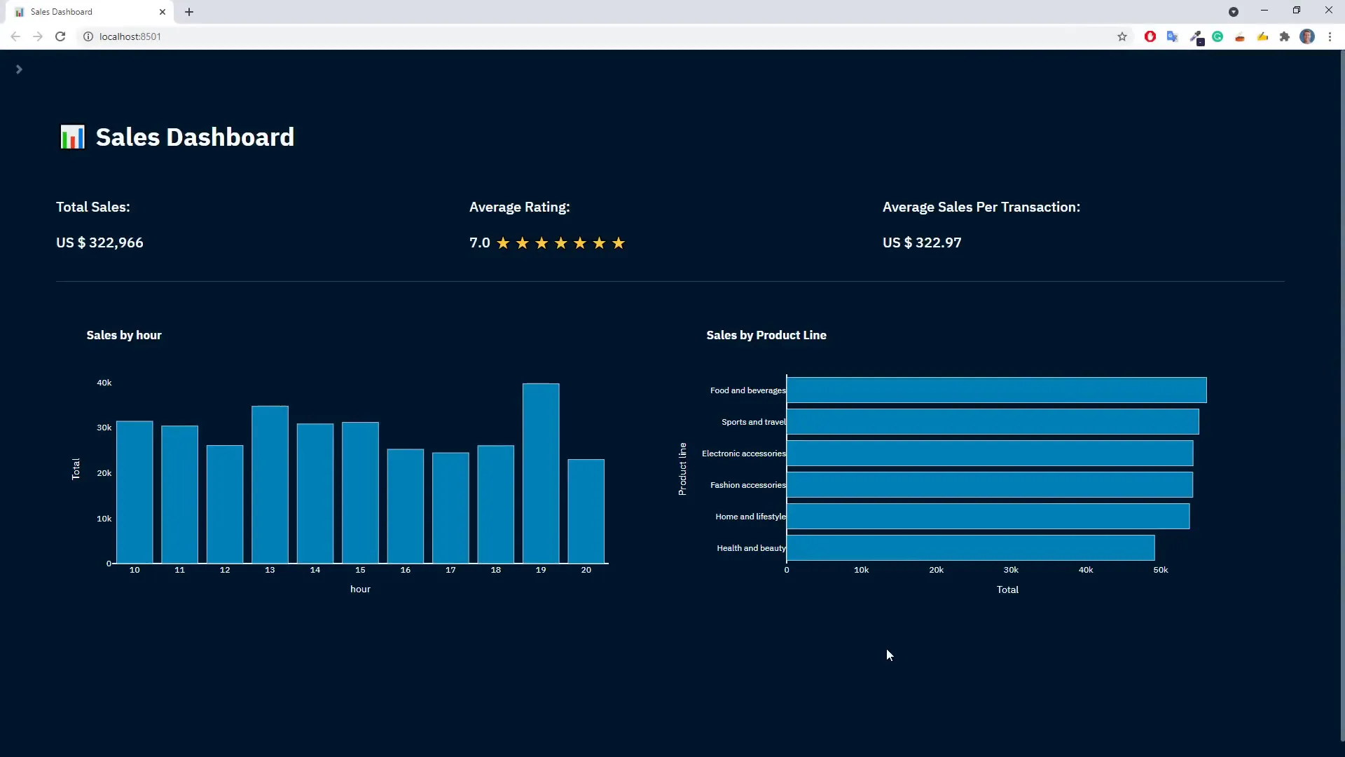
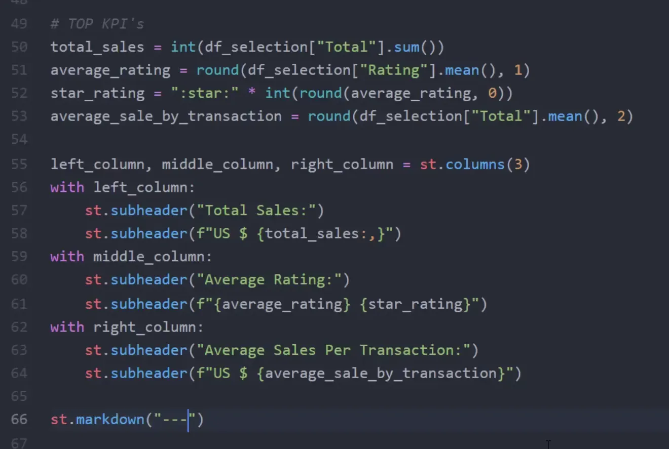
Building the KPI Section
Next, I will create a section for displaying key performance indicators (KPIs) such as total sales, average rating, and average sales per transaction. These KPIs will be displayed in separate columns for clarity.
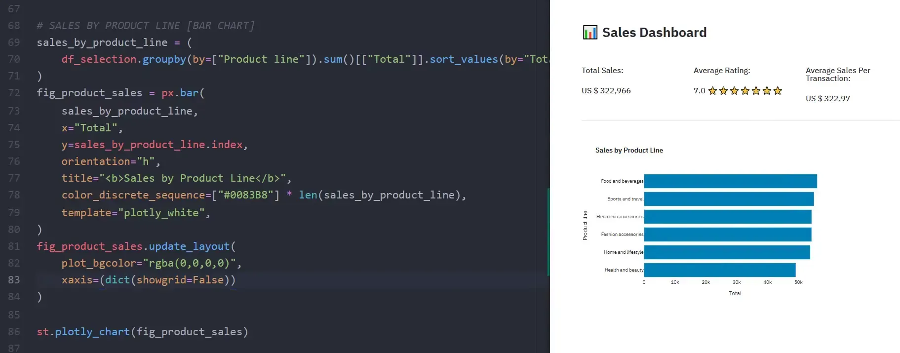
Building the Visualizations (Bar Charts)
Now, I will include two bar charts in the web app. The first chart will show sales by product line. I will use the Pandas groupby method to aggregate sales data, followed by Plotly Express to create the bar chart.
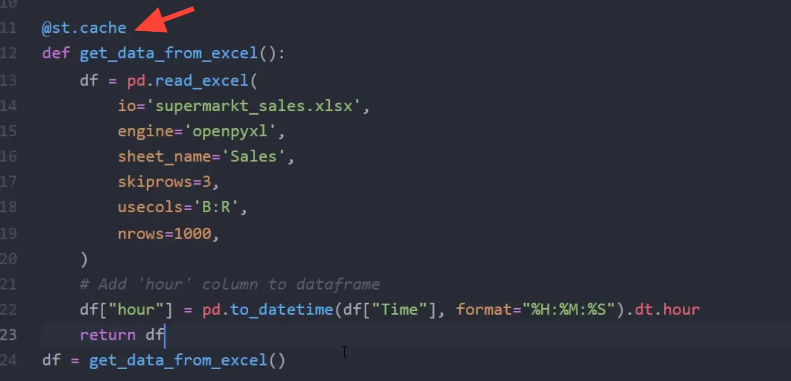
A brief digression: Enhance App Performance
To improve the performance of the app, I will cache the DataFrame. This means that every time the filters are changed, the entire script won’t rerun to load the DataFrame again. Instead, the cached version will be used, speeding up the filtering process.
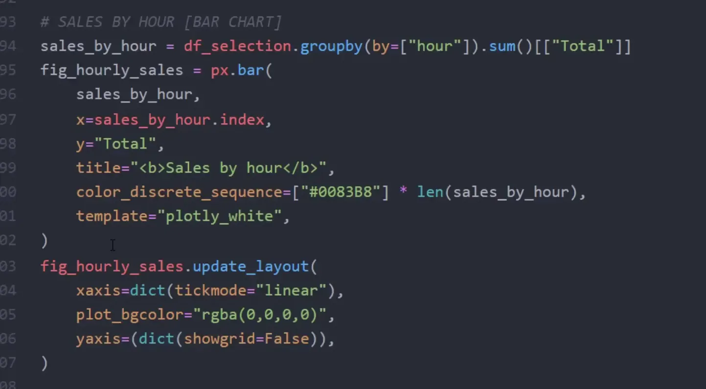
Continue Building the Visualizations
The second chart will plot sales by hour. Before plotting, I need to convert the ‘time’ column to a DateTime object to extract the hour information. After creating the chart, I will make minor tweaks to improve its appearance.
Styling the Web App
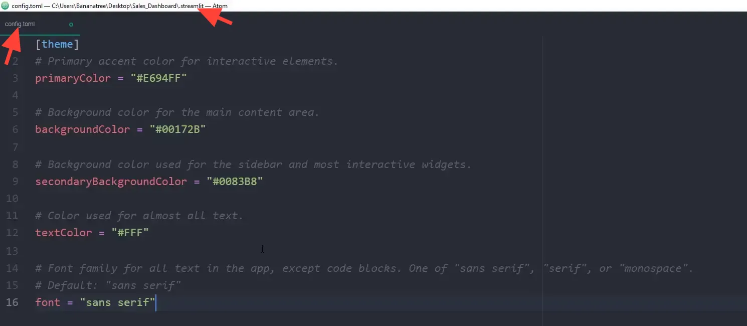
Finally, I will apply some styling to the app. This includes removing the hamburger menu icon, the footer note, and changing the overall theme to enhance the user experience. Custom CSS will be injected to hide elements that are not needed.
Wrap-Up
In this tutorial, I demonstrated how to convert an Excel sheet into an interactive dashboard using Python with Streamlit, Pandas, and Plotly. You can now deploy your web app to the internet for free and customize it further to suit your needs.