Turn Your Excel Data Into An Interactive Dashboard Using Python | Pyecharts Tutorial
Introduction
In this post, I will guide you through the process of transforming an Excel spreadsheet into a standalone HTML dashboard using the Pyecharts library. This dashboard will feature various interactive charts, including sales and profit amounts by sub-category, as well as a sales calendar heatmap. Let’s dive into the steps required to create this engaging data visualization.
Create Pandas DataFrame
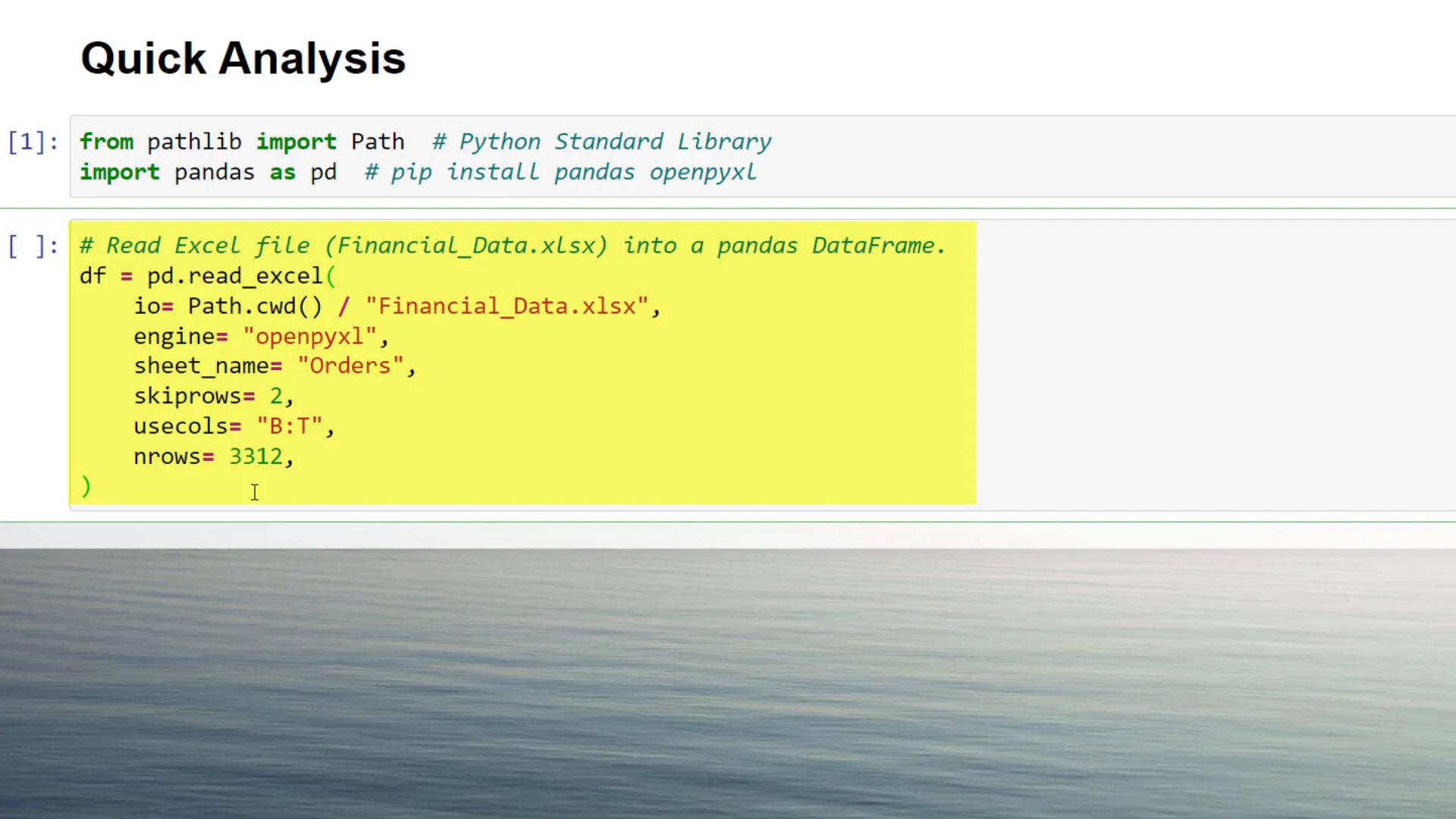
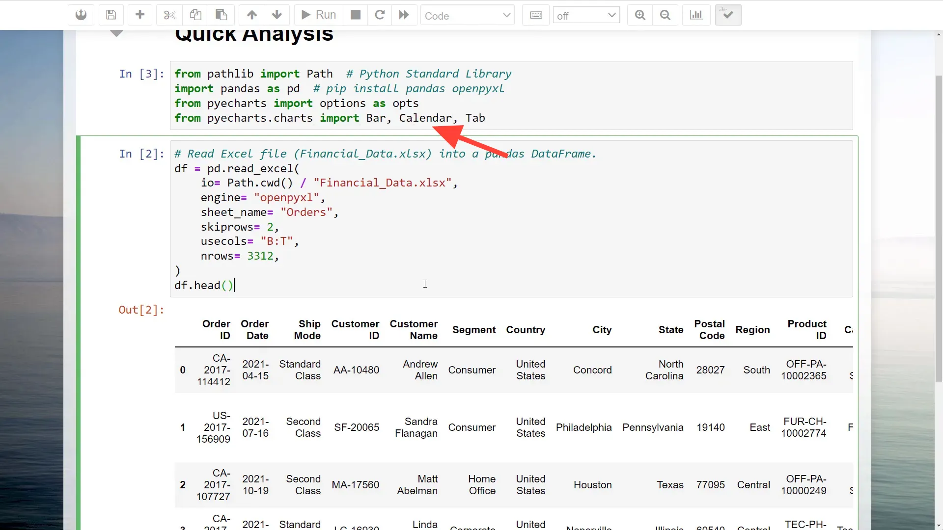
First, I need to load the Excel data into a pandas DataFrame. While I will be using the Excel add-in ‘MyToolBelt’ to simplify this process, it’s not a requirement. You can also load the data manually. If you’re following along without the add-in, simply use the pd.read_excel function to read your Excel file by specifying the file path, sheet name, and other parameters.
Install Pyecharts
Next, I will install the Pyecharts library. Open your command prompt or terminal and type pip install pyecharts. After installation, I will import the necessary classes from Pyecharts, including options for customization and chart types like Bar, Calendar, and Tab.
Data Preparation
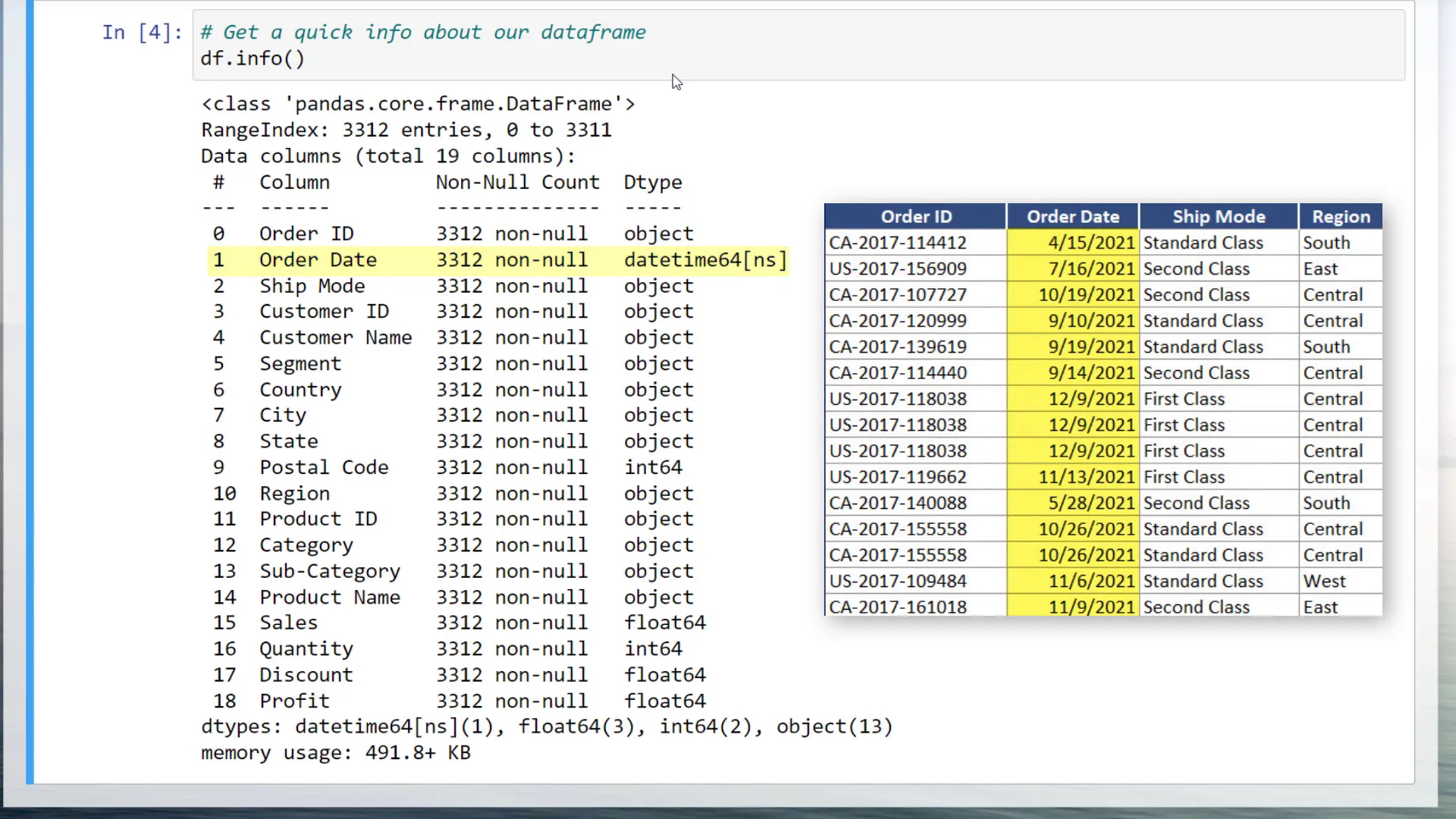
Before proceeding with the visualization, I want to analyze the DataFrame using the info method to check for null values and understand data types. For example, the order dates are stored as DateTime objects. To plot sales and profit by month, I will create a new column in the DataFrame to extract the month from the order date. Then, I will group the data by month and sum the sales and profit amounts.
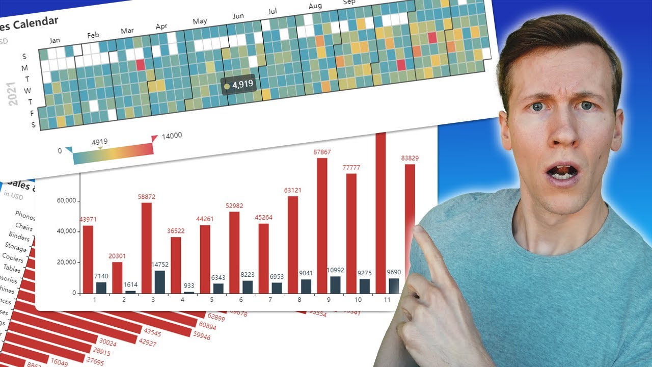
Plot Sales and Profit by Months
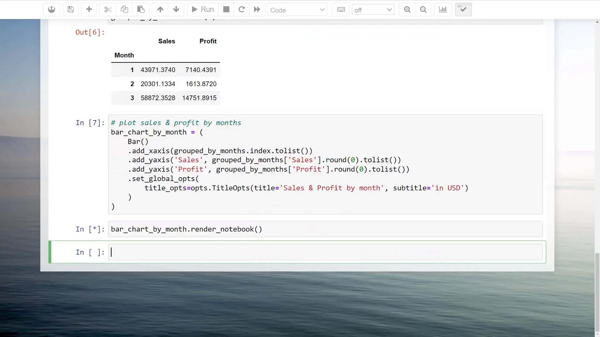
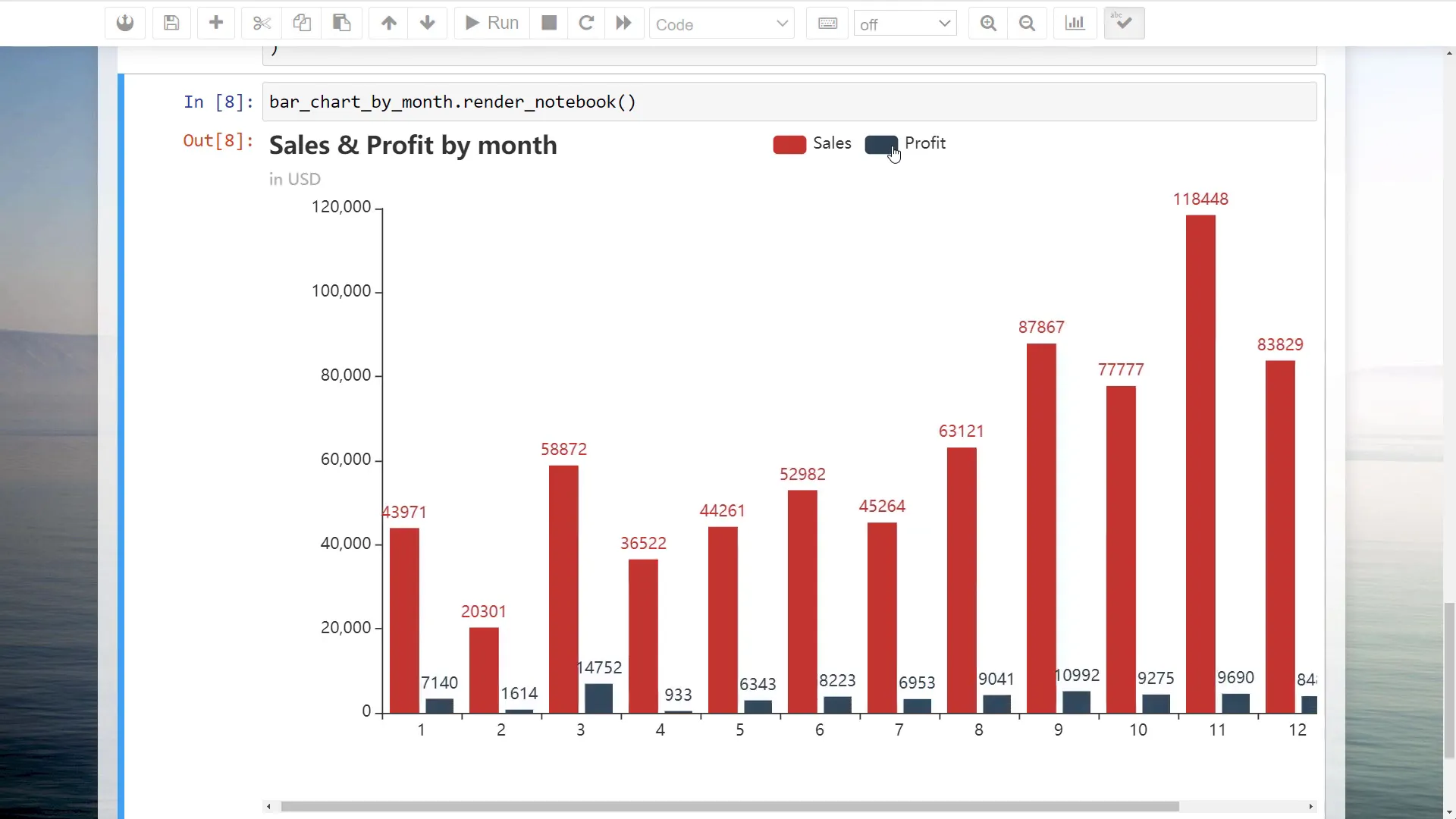
Now, let’s create a bar chart to visualize sales and profit amounts by month. I will initialize a Bar chart object and add the months to the x-axis, while the sales and profit amounts will populate the y-axis. I will convert the pandas series to lists to meet the input requirements of Pyecharts. Additionally, titles and subtitles can be added for clarity.
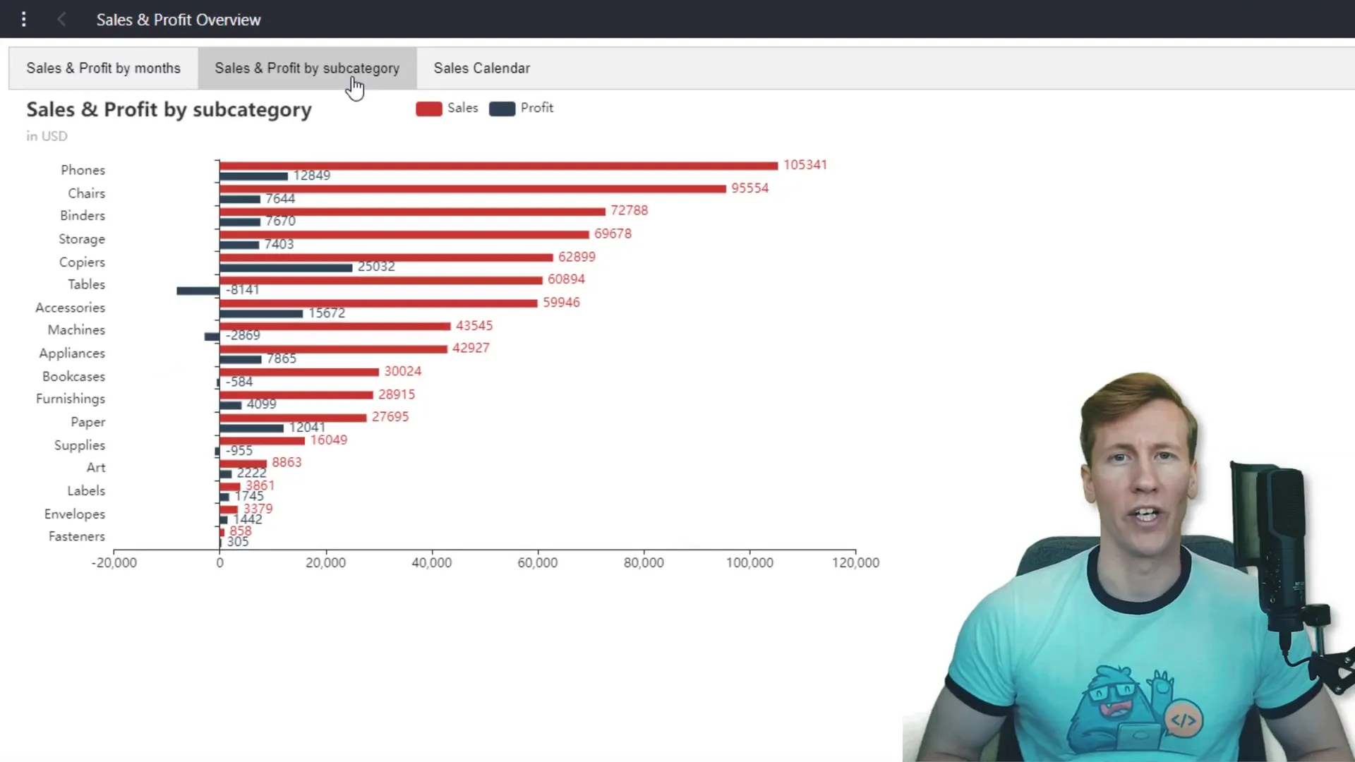
Plot Sales and Profit by Subcategory
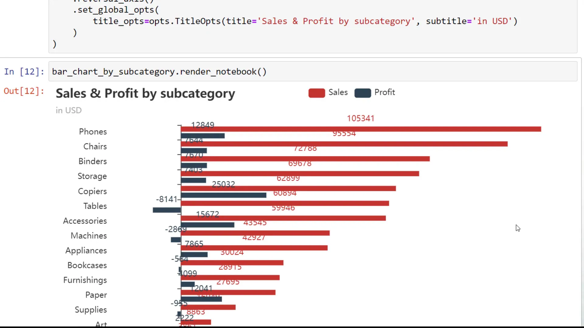
Next, I’ll create another bar chart to visualize the sales and profit by sub-category. This involves creating a new DataFrame that groups the data by sub-category and sorts it by sales. I will also customize the chart to display horizontal bars for better readability, positioning the labels to the right for a clearer view.
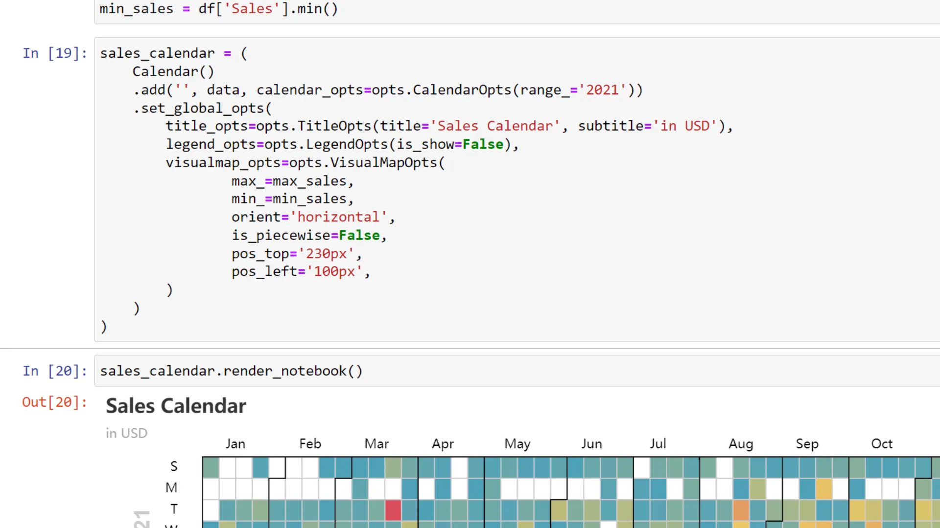
Plot Sales Calendar Heatmap
For a more detailed analysis, I’ll plot the sales amount for each day in a calendar heatmap. To prepare the data, I will group the sales by order date and round the results. This data will be structured into a nested list format, which is required for the Calendar chart in Pyecharts. After setting the year and customizing the visual options, I will render the calendar heatmap.
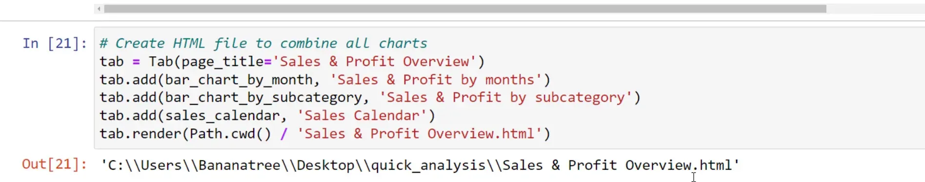
Export Dashboard
Finally, to share the insights from our dashboard, I will export all the charts into a single HTML file using the Tab object. This allows for easy navigation between the different charts within the same document. After specifying the output file path, I will render the tab object, resulting in a compact HTML file that can easily be shared via email.
Summary
In this tutorial, I covered how to create an interactive dashboard using Pyecharts by transforming Excel data into visual insights. We explored various chart types, including bar charts for sales and profit by month and sub-category, and a calendar heatmap for daily sales. The final step was combining these visualizations into a single HTML file for easy sharing. I hope you found this guide helpful and informative!