SQL + Python: Master Data Analysis and Create PDF Reports

Introduction
Today, I’m excited to show you how to boost your data analysis using the powerful combination of SQL and Python. In this tutorial, I’ll take a practical approach and guide you step-by-step on creating a database from scratch using SQLite and Python. We’ll then dive into the nitty-gritty of data analysis using SQL and Pandas. I’ll also show you how to create impressive charts, and on top of it, we’ll generate a professional PDF sales report.
Explaining Database Tables
As we will be working with SQL in this tutorial, I will first need to set up a database. I’ll be using SQLite, which is a lightweight and self-contained database that stores data in a single file. Python also natively supports SQLite, so we don’t need to install any third-party packages.
For our example, let’s say you are the owner of an online store that sells various products to customers. To keep track of the sales made by your customers and gain insights that can help you make better business decisions, you could set up a database with three tables: sales, products, and customers.
The sales table would contain information about each sale, such as the date of the sale, the customer who made the purchase, the product that was purchased, the quantity of the product, the unit price, and the total price. The columns customer_id and product_id refer to the tables customers and products. They are called foreign keys.
The products table contains information about each product that the business sells, such as the product ID, product name, and the unit cost of each item. The product_id column is the primary key for this table and is used as a foreign key in the sales table.
The customers’ table contains information about each customer who has purchased from the business, including the customer ID, first name, last name, email address, and phone number. The customer_id column is the primary key for this table and is also used as a foreign key in the sales table.
Creating Database with Python
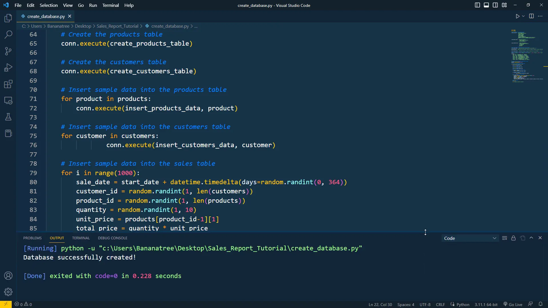
To create the database, I have made the following Python file. Firstly, I will import the required libraries: SQLite3, random, and datetime. Next, I have defined the SQL commands for creating the tables. To create a table, you simply need to provide a name, followed by the columns and their respective datatypes. After that, I defined SQL commands to insert sample data into the tables, which also required creating example data for the products and customers.
With all the preparation in place, I can now execute the SQL statements. To do this, I will connect to the database using a context manager. If the database doesn’t exist, it will be created. Once we are connected, I will create the tables and insert the sample data. Finally, I will commit the changes.
And that’s all there is to it! As I can see in the output terminal, the database has been created successfully.
Inspecting Database
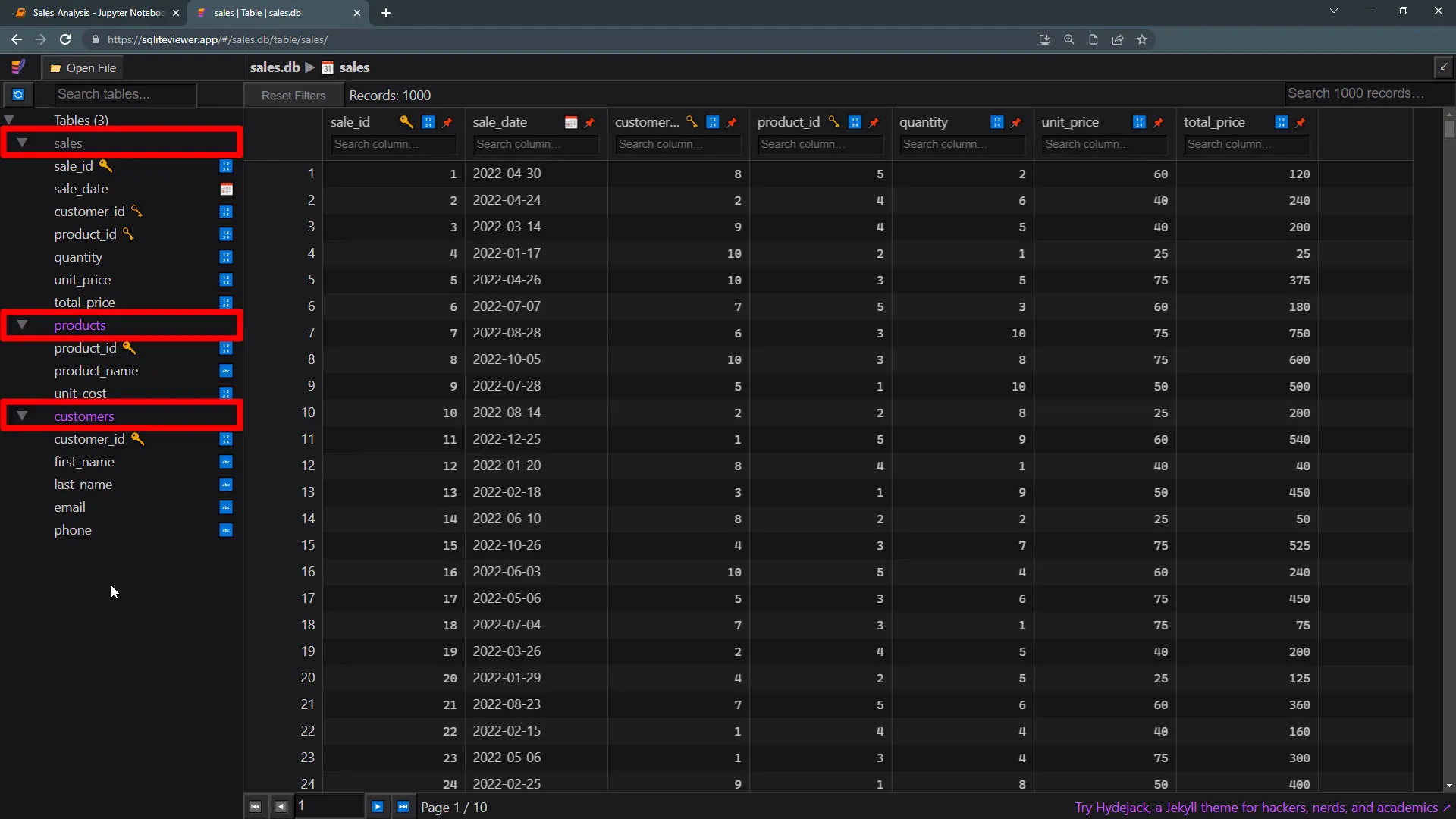
Now, to view the contents of the database file, I will be using an SQLite viewer. Here we can see the sales, products, and customers tables. If we look at the sales table, we can see some sample data, with a total of 1000 records in the table. The product table displays the product ID, name, and unit cost. All customer-related information is stored in the customers’ table.
Installing & Importing Dependencies
To analyze the data, I have created a Jupyter Notebook. As a first step, let’s install and import the dependencies. We will use pandas to analyze the data, plotly express to create charts, Kaleido to export charts as images, and fpdf to generate the final PDF sales report. If you do not have these packages installed, you can remove the comments and run the first cell. In my case, I have already installed the packages, so I can directly import them.
Additionally, I will also import datetime, pathlib, and SQLite.
Define Paths and Charts
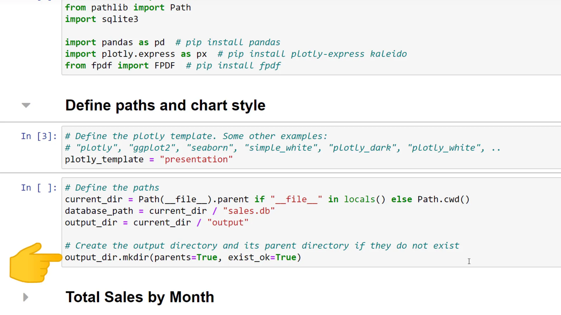
With that in place, let’s define the file and folder paths and the chart style. Plotly has some pre-built chart styles. For a clean and professional chart design, I will choose the “presentation” template. However, feel free to check out the other styles as well.
Next, I will define the file path to our database. The database file is located in the current directory of this Jupyter notebook, so that is why I’m first defining the path to the current directory. Later, when we are creating the charts and the final PDF report, I want to store them in an output folder. With pathlib, we can make the output folder if it doesn’t already exist.
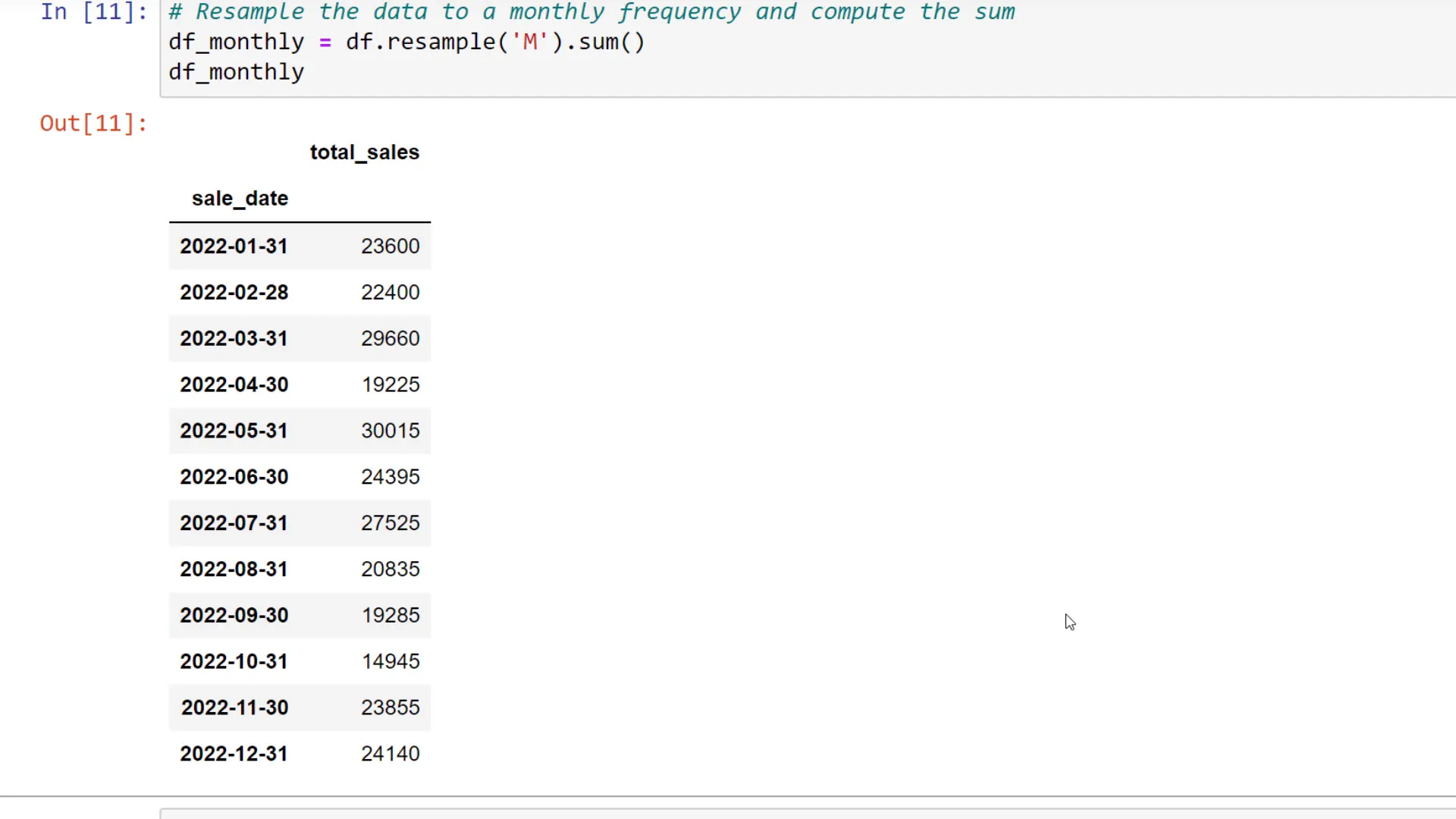
Total Sales by Month
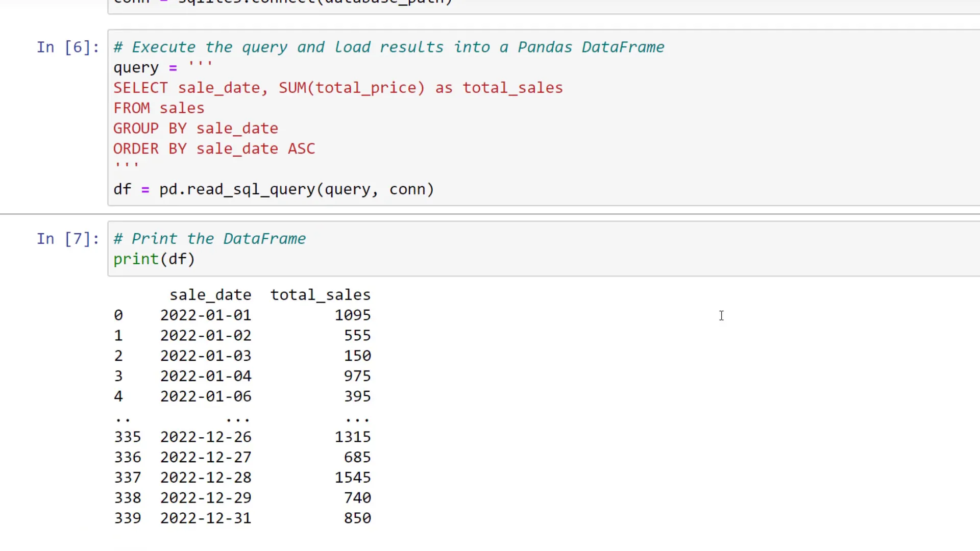
To kick things off, let us start calculating the total sales by month. For this, we first need to connect to our database. All we need to do is to pass the database file path into the connect method from SQLite. Once connected, we can write the SQL query to extract the relevant data. I will not explain each SQL query in full detail, but in a nutshell, I am just selecting the sales date and total sales from the sales table and grouping and ordering them by the date.
To load the results of this query into a pandas dataframe, we can use “pd.read_sql_query” and pass in the query and our connection. Let’s now print out the dataframe to see what we’ve got.
Now that we’ve converted the column, let’s set the “sales date” as the index. By doing so, we can now take full advantage of the frequency conversion of Pandas. In our example, we’ll compute the monthly total sales using the resample method.
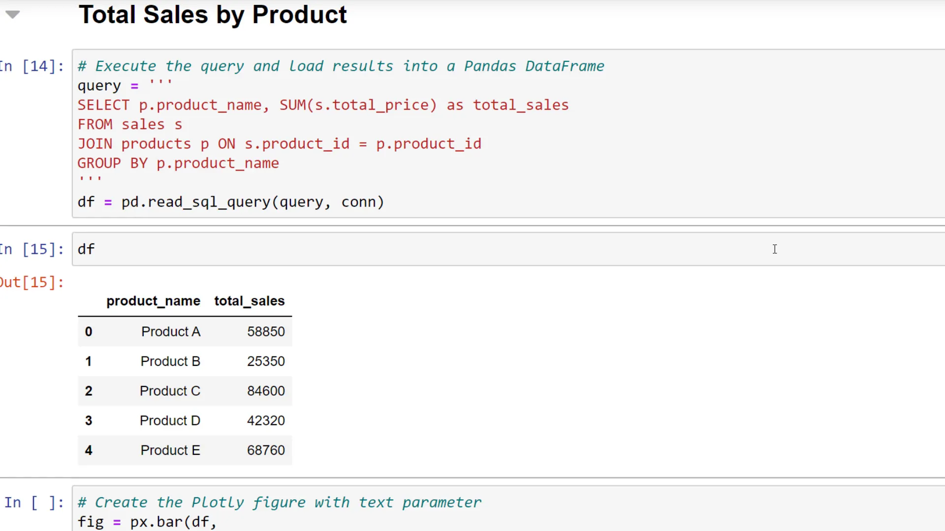
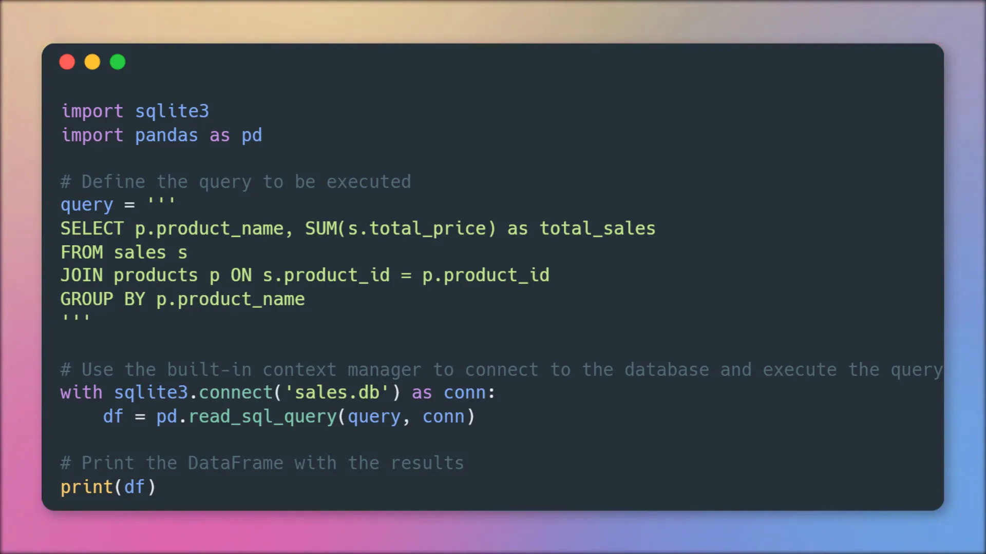
Total Sales by Product
This time I want to sum up the total sales by product. For this, I have written a SQL query, where I am joining the product table on the sales table. And as before, to bring it into a pandas dataframe, I am using “pd.read_sql_query”. Let me print out the dataframe to validate the result.
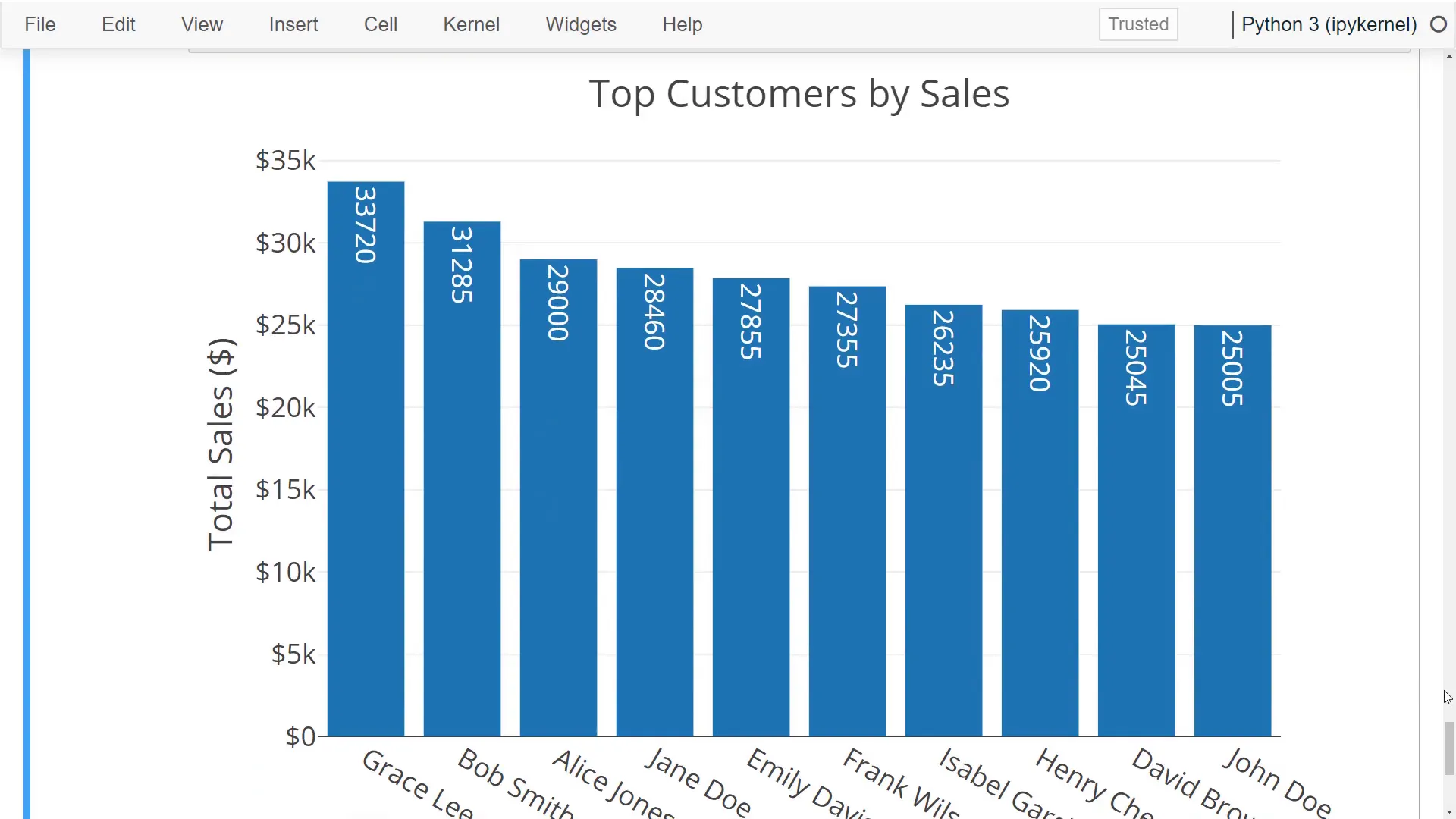
Top Customers by Sales
For the final analysis, I will create a chart to display the top 10 customers by sales. In my SQL query, you will notice that I am combining the first and last names of the customer table using the pipe symbols. I limit the result after ordering the sales. To visualize the data, I will once again use a bar chart.
Create PDF Report
Now that we have gained valuable insights from our data and stored each chart as an image, I thought it would be cool to create a PDF report. For this task, I will be using the “fpdf” package. Let me guide you through the code. First, I define the font color for the text. Next, I iterate over the output directory to obtain a list of all PNG files. Once I have this list, I initialize the FPDF object. This object allows us to easily construct our PDF page.
I start by adding a new page and setting up the font. Following this, I construct the title using today’s date, set the text color, and add this title to the top of the page using a cell. After that, I iterate over each chart filename and add those images to the PDF page. Once this is completed, I save the PDF file in our output directory.

SQL vs Pandas
This whole process was just a simple example, but it showcases how you can leverage the power of SQL and Python to accelerate your workflows. As I mentioned previously, you can also do most of the data wrangling directly in SQL. For instance, if you want to categorize customers based on their sales, you can use a case statement to group the result by customers after merging the sales and customer tables.
Close Database Connection
Lastly, make sure to close the connection to your database to free up resources and prevent potential issues. If you’re not working in a Jupyter Notebook, I suggest using a context manager to close the connection automatically.
Outro
Ok, guys, and that is all for today. I hope you found this tutorial helpful. Thanks for watching!