How To Create An Animated Bar Chart (Bar Race) In Python Using Plotly & Excel
![How To Create An Animated Bar Chart (Bar Race) In Python Using Plotly & Excel | Tutorial [EASY] 💻](https://pythonandvba.com/wp-content/cache/flying-press/f869fdc4d3120325990b6aa343e5e32c.jpg)
Introduction
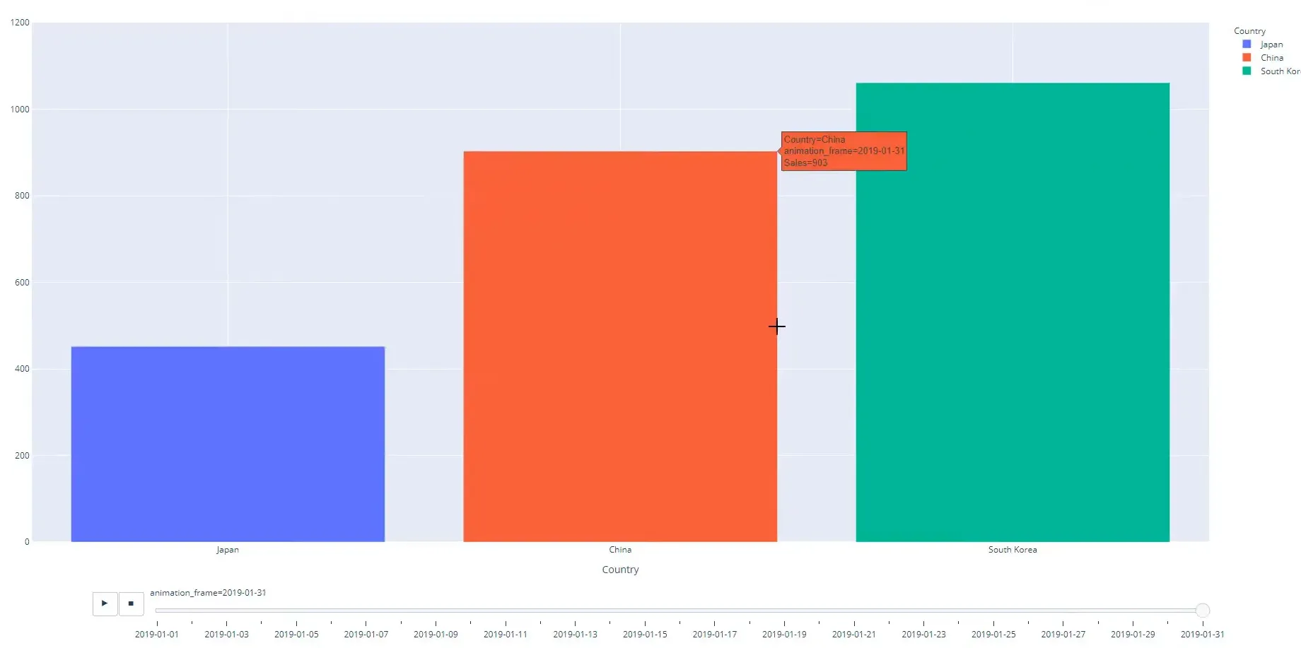
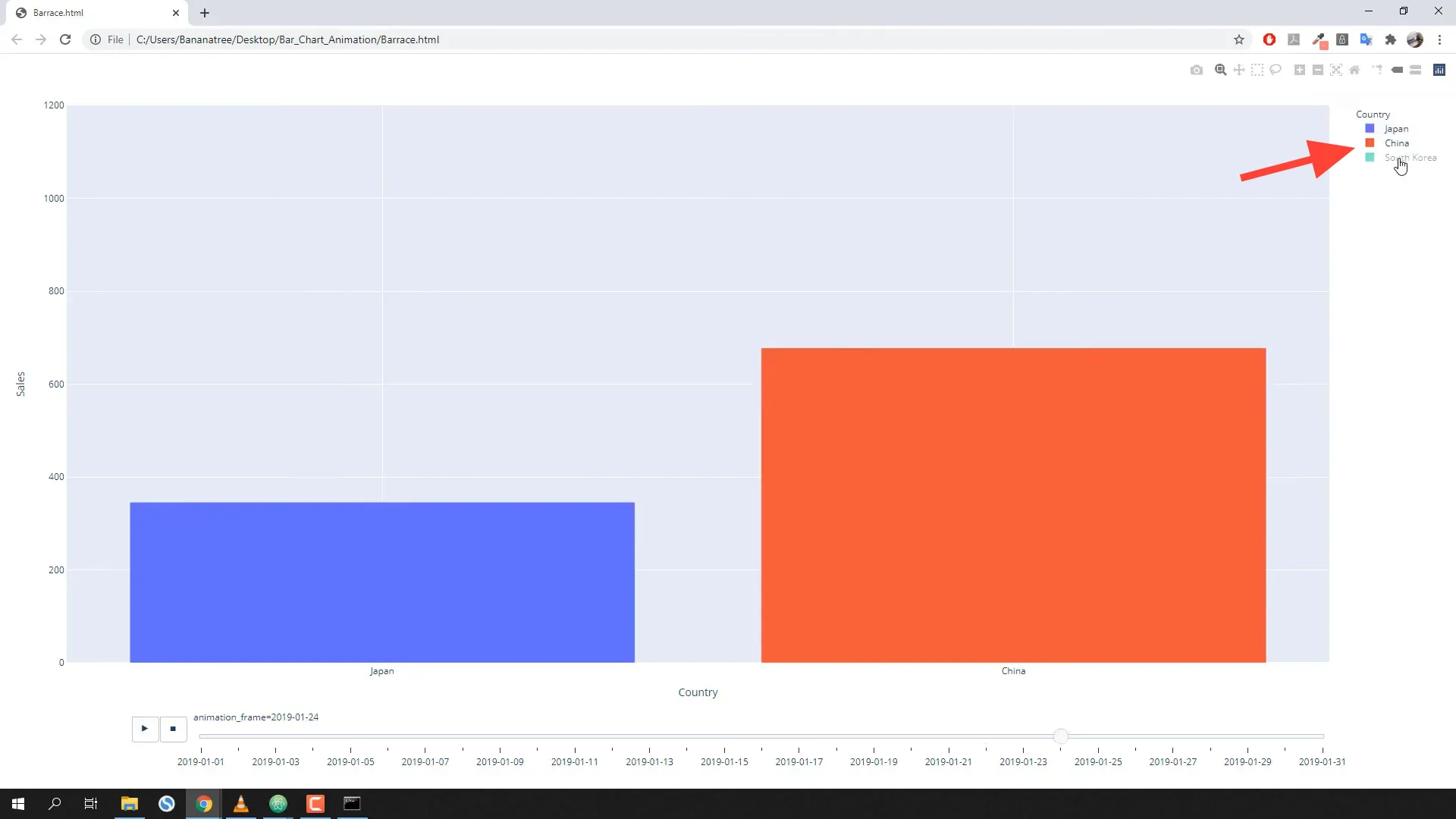
In this tutorial, I will guide you through creating animated bar charts, also known as bar races, using Python and Plotly. This animation will visually represent the daily development of sales by country, and viewers can interact with the chart by clicking on the legend.
Setting Up the Project
Before diving into the coding part, ensure you have your data structured correctly. The data should include sales records for different countries over a specific time frame.

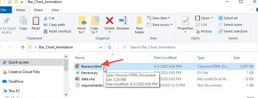
In this case, the data is stored in an Excel file, and I will show you how to read it using Pandas. Here’s how you can set up your environment:
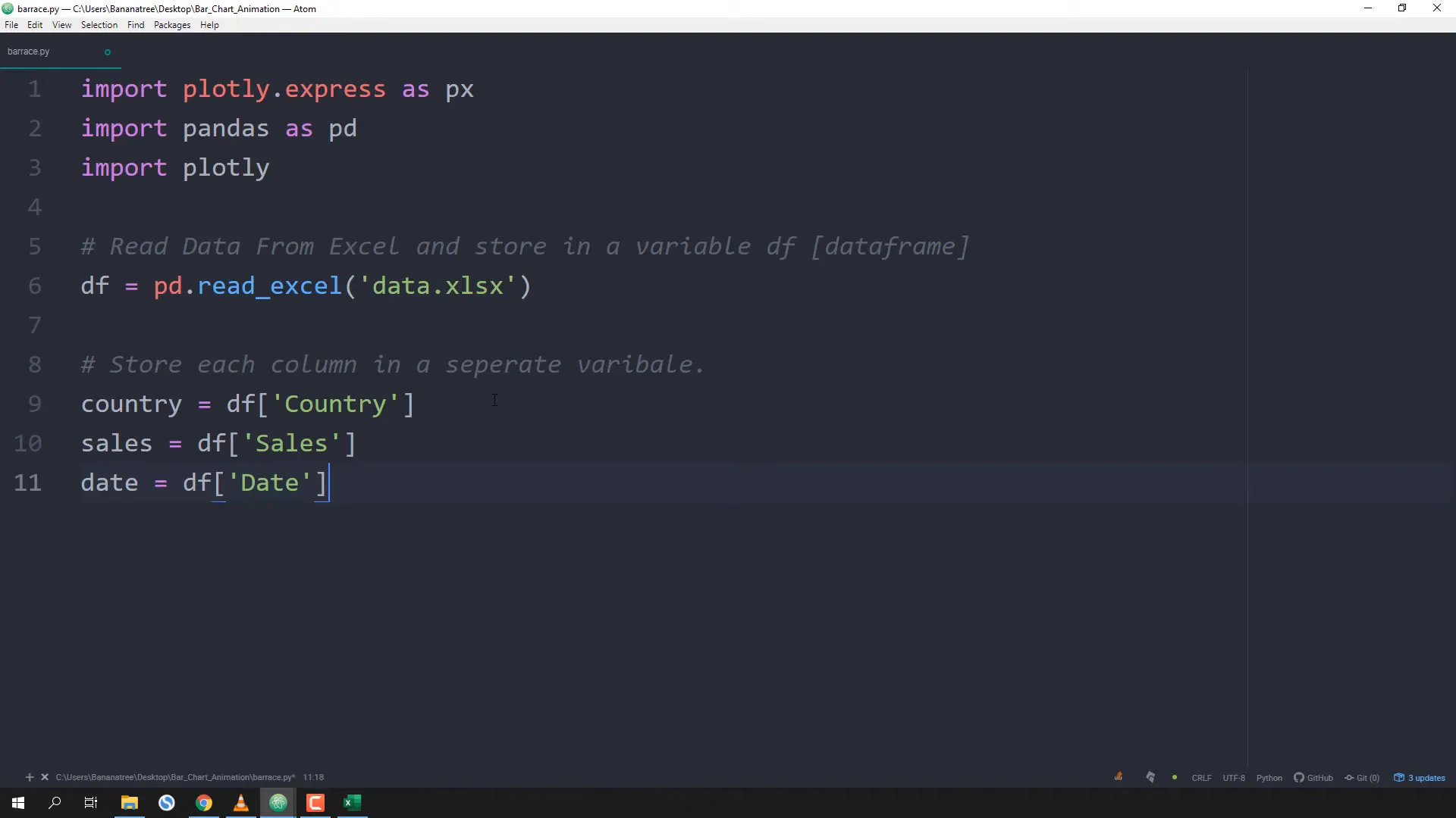
- Import the necessary libraries:
import plotly.express as px
import pandas as pd- Load your Excel file into a DataFrame:
df = pd.read_excel("data.xlsx", usecols="A:C")- Clean your data by dropping any null values:
df.dropna(inplace=True)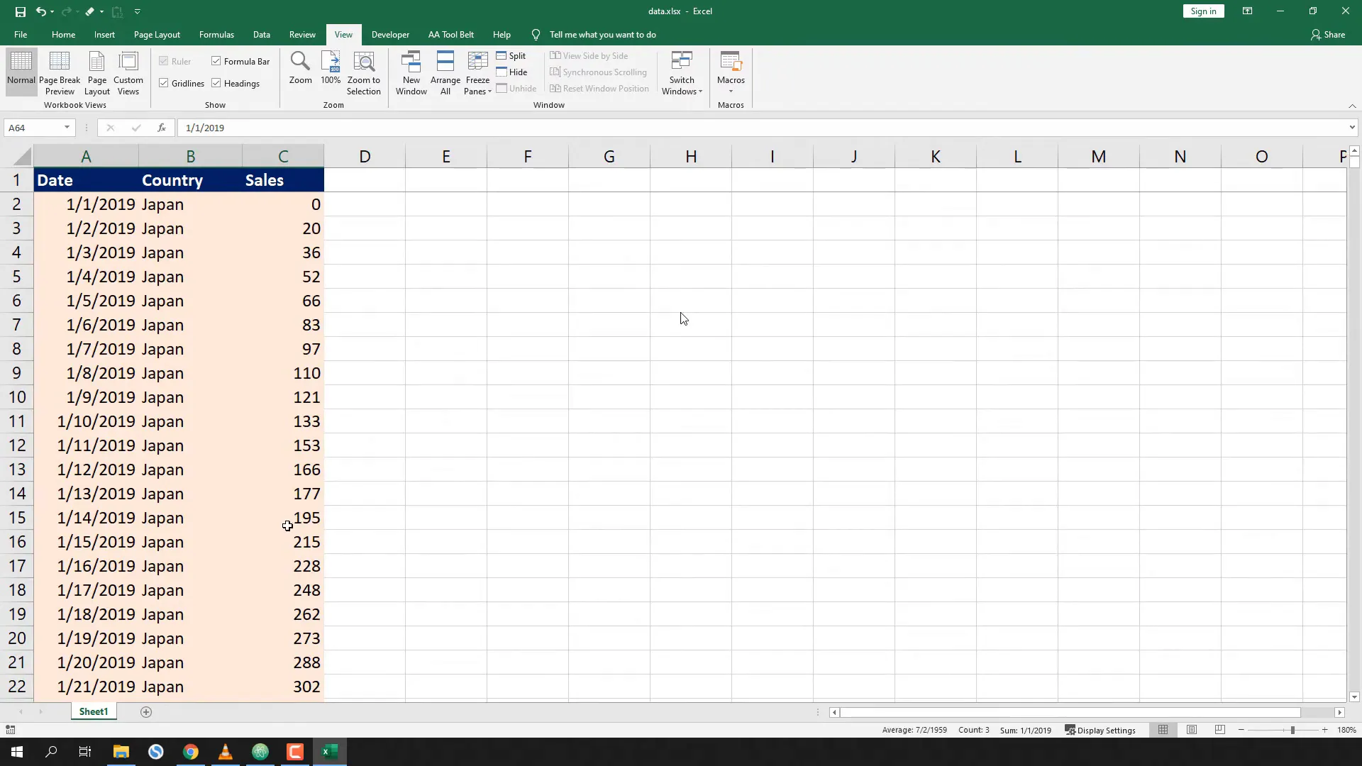
Preparing the Data
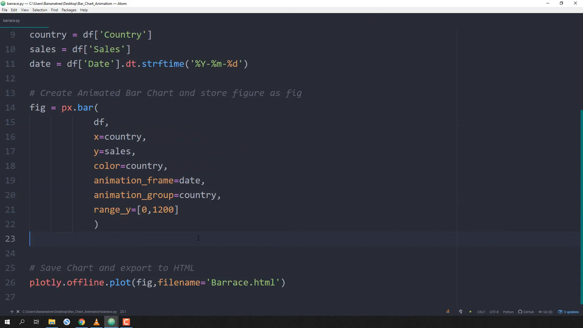
Next, you need to ensure that the date column is formatted correctly. This is crucial for the animation to work properly:
df['Date'] = df['Date'].dt.strftime("%Y-%m-%d")This converts the date to a string format that Plotly can use for the animation frames.
Creating the Animated Bar Chart
Now that the data is ready, let’s create the animated bar chart:
fig = px.bar(
    df,
    x='Country',
    y='Sales',
    color='Country',
    animation_frame='Date',
    range_y=[0, df['Sales'].max() * 1.1],
)
In this code snippet:
- x: The column representing the countries.
- y: The column representing sales figures.
- color: Allows you to color the bars based on the country.
- animation_frame: This will create the animation based on the date.
- range_y: Sets the y-axis range to ensure all bars fit nicely.
Displaying the Chart
Finally, you can display the chart and export it as an HTML file:
fig.show()
fig.write_html("animated_bar_chart.html")
This will allow you to share your animated chart with others, even if they don’t have Python installed!
Interactivity with the Legend
One of the cool features of this bar chart is interactivity. Users can click on the legend to toggle the visibility of specific countries.
Conclusion
In this tutorial, I demonstrated how to create an animated bar chart using Plotly in Python. You learned how to prepare your data, create the chart, and make it interactive. This is a powerful way to visualize sales data and trends over time. Feel free to experiment with your own datasets!