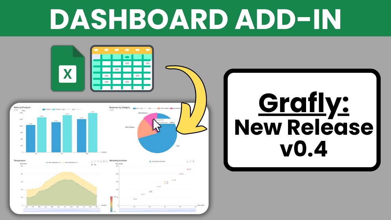
Transform Excel Data Into Interactive Dashboards (With Grafly v0.4)
Introduction
In the realm of data visualization, the ability to create interactive dashboards can significantly enhance how we interpret and present data. Grafly, an Excel add-in, simplifies this process by allowing users to transform their data into visually appealing dashboards. This blog post delves into the latest version of Grafly, focusing on its new features, including gauge and radar charts, and how to effectively deploy these dashboards.
Gauge Chart
The gauge chart is a powerful tool for visualizing metrics within specific ranges. Upon selecting the gauge chart option, a settings window appears where I can customize various aspects. For demonstration purposes, I start with the default settings, showcasing a simple gauge chart divided into five color-coded zones.

Customization options include adding titles and subtitles. For instance, if I want to illustrate the marketing department’s budget utilization, I can set a description beneath the actual value, which represents the amount spent. Additionally, I can add a suffix, such as a percentage, to clarify the data further.
Next, I can adjust the number of zones. By default, there are five, but I can configure this to three zones: green, yellow, and red. The ranges are set so that spending between 0% and 60% falls into the green zone, 60% to 80% into the yellow zone, and 80% to 100% into the red zone.

Re-generating the chart shows the updates, complete with the title, subtitle, actual number, description, and a pointer indicating the current zone. If I prefer a single zone display, I can adjust the settings accordingly, setting the actual value to 85% and changing the color scheme to light grey. This is particularly useful for showing project progress.

Radar Chart
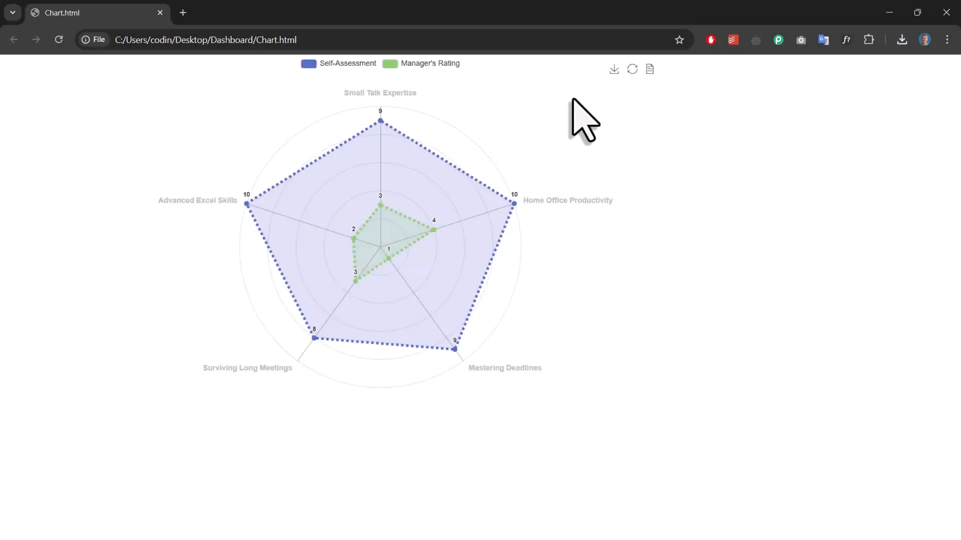
Next up is the radar chart, an excellent choice for comparing multiple variables. To create a radar chart, I clear the title and subtitle fields and select the radar chart option. I then input some sample data, choosing labels for the axes and the corresponding data points.

As with the gauge chart, I can customize the radar chart by adjusting the theme and adding a toolbox for added functionality, such as downloading the chart as an image for presentations.

Additional customization options include changing the area opacity, line width, and style, allowing for a tailored visual representation that suits my needs.
Create a Dashboard
Once the charts are ready, the next step is to create a dashboard. By opening the dashboard builder, I can select the settings files created for each chart. Each tab can be renamed to reflect its content, such as “Multi-Zone Example” and “Single Zone Example”. With just a click, I can compile my dashboard, showcasing both the gauge and radar charts.

This dashboard is saved as an HTML file, making it easy to share with colleagues or stakeholders. The deployment process is straightforward, allowing for a seamless transition from Excel to an interactive web dashboard.
Deployment of a Dashboard
To deploy the dashboard online, I simply create a new folder and copy the HTML file into it, renaming it to index.html. Using a platform like Netlify, I can upload the folder and make the dashboard live in just a few clicks. This provides an accessible way for others to view and interact with the dashboard without needing Excel.

Changelog & Feature Request
The latest release of Grafly includes several enhancements and bug fixes, which can be found in the release notes. Feedback and feature requests are encouraged, allowing users to suggest improvements or new features for future updates. Submitting ideas on the feedback board is a great way to influence the development of Grafly.
Outro
With the introduction of gauge and radar charts, Grafly enhances the capability of Excel users to create visually engaging dashboards. This blog has outlined the steps to utilize these new features effectively and deploy dashboards online. Whether for internal reporting or stakeholder presentations, Grafly provides a robust solution for data visualization.