
Turn Your Excel Data into an Interactive Dashboard (Python + AI)
An Interactive Excel Dashboard can be created from a normal Excel table with xlwings Lite, pandas, Plotly, and AI generated Python code. The finished result is a shareable HTML file with filters, KPI cards, charts, hover details, and a data table, without installing Python locally.
Build an Interactive Excel Dashboard From Your Excel Data
A plain Excel table is useful, but it is not exactly the nicest thing to hand to a manager or colleague. An interactive Excel Dashboard gives that same data a much better home: filters at the top, KPI cards for the important numbers, charts for the patterns, and a detailed table when somebody inevitably asks, “Can I see the rows behind that?”
The nice part here is that Python runs directly inside Excel through the xlwings Lite add-in. There is no local Python installation to wrestle with, no terminal setup, and no need to become a Plotly expert before getting started.
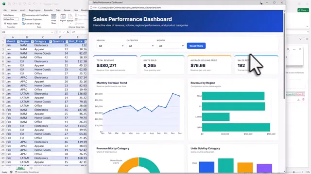
The approach combines Excel, Python, and AI. Excel remains the place where your source data lives, Python handles the data and dashboard generation, and Wingman helps write the code. It is a very practical combination, especially if you want results first and deeper Python knowledge later.
Install xlwings Lite in Excel
Start with your source data formatted as an Excel table. In this example, the table is named SalesData and lives on a worksheet called Data.
To install xlwings Lite, go to Home, choose Add-ins, then select More Add-ins. Search the Office Add-in Store for xlwings Lite, click Add, and continue through the prompt.
The add-in opens as a pane within Excel. It can take a few seconds to load, so do not panic if it looks like it is thinking about life for a moment.
Once open, xlwings Lite gives you a code editor and output pane directly in Excel. You can write and run Python without installing Python on the computer. The add-in also includes sample code, including a Seaborn example that creates a sheet, sample data, and a plot. Running it is a quick sanity check that everything is working.
If you want a closer look at how Python can live inside a workbook, I have also covered running Python in Excel with xlwings Lite, including the add-in’s practical limitations and package support.
Set Up the Python Packages
Clear the sample code and begin with the imports needed for this interactive Excel Dashboard:
import xlwings as xw
from xlwings import script
import pandas as pd
We use:
- xlwings to communicate with the current workbook.
- script to expose a Python function as a clickable Excel button.
- pandas to turn the Excel table into a DataFrame.
- Plotly to generate the interactive HTML dashboard.
Pandas and Plotly are third-party packages, so open the Requirements tab in xlwings Lite and make sure both are listed. When you change the requirements file, restart the add-in from its menu so the new packages are available.
Read the Excel Table Into a DataFrame
The first job is simply to access the active workbook, locate the table, and convert its range into a pandas DataFrame. The current workbook must be passed into the function, because that is how the code can work with the file open in Excel.
def read_sales_data(book):
    sheet = book.sheets["Data"]
    table = sheet.tables["SalesData"]
    df = table.range.options(pd.DataFrame, index=False, header=True).value
    print(df)
The actual dashboard code will build on this DataFrame. Before doing that, it is worth printing the data to the output pane and checking that the expected columns and records are there. A dashboard can look very polished while showing the wrong data, which is not the kind of polish anybody needs.
Turn the Function Into a Button
Add the @script decorator above the function to make it available as a button in xlwings Lite. You can optionally give the button a friendly name as well.
@script
def read_sales_data(book):
    sheet = book.sheets["Data"]
    table = sheet.tables["SalesData"]
    df = table.range.options(pd.DataFrame, index=False, header=True).value
    print(df)
Clicking the new button executes the script and displays the Excel table as a pandas DataFrame in the output pane. That is the basic bridge from Excel data to Python automation.
Use Wingman to Generate the Dashboard Code
Now for the time-saving bit. xlwings Lite includes an AI assistant called Wingman. Unlike a subscription-based assistant, you choose the AI provider and model yourself, then pay that provider only when you use it.
Open the xlwings Lite menu, go to Settings, then use the Local tab to configure Wingman. The setup has two main parts:
- Choose a provider, such as OpenAI.
- Add an API key and at least one model ID.
You can create an OpenAI account, add billing credit, generate an API key, and paste it into the provider settings. For choosing a model, use the current OpenAI model list and copy the model ID into xlwings Lite.
There is one important privacy detail: Wingman cannot access workbook data directly. It only sees your code and whatever you enter into its chat box. That is a good default, but it also means the AI needs a useful description of the DataFrame before it can write relevant dashboard code.
Describe Your Data for AI
A helper function called describe_for_ai can create a structured explanation of the DataFrame, including its columns, data types, and sample values. Give that output to Wingman so it understands the shape of the dataset.
If your data is sensitive, set the helper function’s sample option to False. That keeps sample records out of the description while still supplying useful structural information. It is a small setting, but a sensible one.
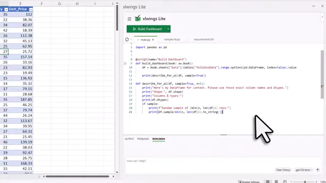
With the data description inserted, use a direct prompt such as:
Use Plotly and save the dashboard as an HTML file to the data folder.
Ensure everything is nicely formatted and only create the HTML file.
Do not change the workbook.
Choose your configured model and send the prompt. Wingman writes the generated Python code into the editor. Depending on the model, prompt, and data, the first version may need a correction. If it throws an error, send the error back to Wingman and ask it to fix the code. That feedback loop is normal, not a failure.
Run and Validate Your Interactive Excel Dashboard
Run the generated script. When successful, it creates an HTML file in the data folder. Open or download that file and you have a standalone Interactive Excel Dashboard, complete with filters, KPI cards, charts, and a data table.
The generated HTML file in this example is around 5 MB. That makes it practical to send to a colleague or manager, provided you have checked the data and the interactions first.
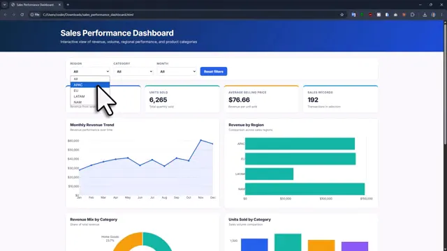
Test the dashboard properly before sharing it:
- Change the region filter and confirm that charts, KPI cards, and the table update.
- Drill down further by category.
- Hover over charts to check the displayed values and tooltips.
- Compare the filtered dashboard numbers with the underlying Excel data.
The dashboard code stays inside the workbook. When your Excel data changes, run the automation again and it will create a fresh Interactive Excel Dashboard. That is a lot nicer than rebuilding charts by hand every reporting cycle.
For the sample workbook, helper function, finished code, and the prompts used for this project, you can download the sales dashboard demo files.
Share the Workbook Without Exposing the Code
Once the automation works, you can make the workbook friendlier for colleagues with App Mode. First, add a useful docstring to the function explaining what it does. Then open Settings and turn on App Mode.
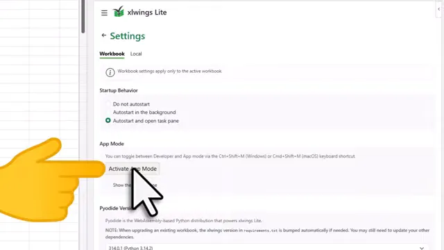
App Mode hides the code and leaves a simple description plus a green button. Save the workbook and share it. Colleagues only need the xlwings Lite add-in installed on their machine to run the automation.
This turns a technical workbook into something much closer to a small internal app. The code is still there, but it is no longer the first thing somebody sees.
Go Beyond Dashboards
An Interactive Excel Dashboard is just one useful output. The same Excel and Python setup can also create Word documents, PDF reports, PowerPoint slides, or data cleaning and consolidation workflows.
AI can absolutely speed up the build, but take the time to understand and validate what it creates. If the generated code currently feels like a black box, that is okay. Ask Wingman to explain each part, change one thing at a time, and use the output to learn as you go.
Excel Automation Course
If you want to build things like this dashboard without leaning on AI for every line, the course walks through Python for Excel, from merging files to interactive dashboards and bulk Word documents. No coding background needed.
