
Grafly lets you create your own custom color theme for charts. You can set
your preferred colors for background, text, borders, and chart elements.
1. Define your theme #
In the Custom Theme section under Grafly > Settings, enter your preferred colors. You can use either:
- Web color names like
red,green,yellow - Or hex codes like
#FF0000,#00FF00
For the Chart Color(s) field:
- If you enter one color, all chart elements (bars, lines, etc.) will use that color
- If you enter multiple colors, separate them with commas (like
red,#FFFF00,green) - If there are more elements than colors, the colors will repeat from the beginning
Example:
| Custom Theme setting | Example value |
|---|---|
| Background Color | #000000 |
| Title Color | #FFFFFF |
| Subtitle Color | #CCCCCC |
| Font Color | #FFFFFF |
| Border Color | #666666 |
| Chart Color(s) | red,#FFFF00,green |
2. How it looks #
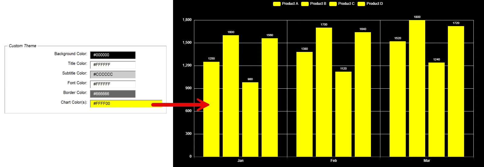
- One chart color used for everything:
- Multiple chart colors cycling through:
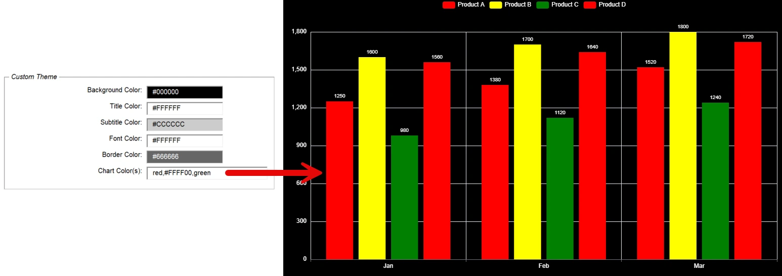
In the second example, three colors are defined but there are four products, so the last one uses the first color again (red).
3. Apply the theme #
When creating your chart, open Additional Settings, go to the General tab, and set Color Theme to custom:
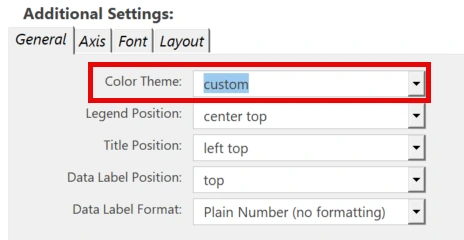
Your custom colors will now be used in the chart.
Tip for creating a dashboard #
When creating a dashboard, you can also use your custom background color. Just select custom from the Background Color dropdown:
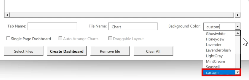
This will apply the background color you defined in your custom theme.