
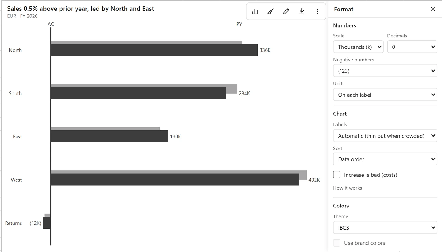
Point at the chart and click Format (the brush) in its toolbar. The Format panel opens next to the chart, and every change shows in the chart at once and is saved with the workbook. The panel only lists the settings that apply to the chart type. The same settings are on the Style tab of the chart editor.
Numbers #
- Scale: Automatic, None, Thousands, Millions or Billions. The unit is added once to the subtitle, so the labels stay short.
- Decimals and Percent decimals.
- Negative numbers: -123, a real minus sign, or (123).
- Units: in the subtitle, or on each label.
Chart #
- Labels and Show value axis.
- Sort: data order, largest first or smallest first.
- Increase is bad (costs): for cost lines, a rise shows red and a fall green.
- Cut total bars (bridges) and Show difference arrows (bridges, scenario columns and integrated variance).
Colors #
Turn on Use brand colors and pick your Main color: Deltaline makes the other shades from it. Brand colors apply to column, bar, line, pie, Mekko, Sankey and cluster-stack charts. Series tagged as actual, prior year, plan or forecast keep the IBCS notation, so a variance chart always reads the same way.
In a small frame the panel covers the chart; close it to see the result. Make the frame wider (560 px or more) to see the panel and the chart side by side.