
Every page has a design you can change at any time. All of these settings are free on every plan.
Where to change them #
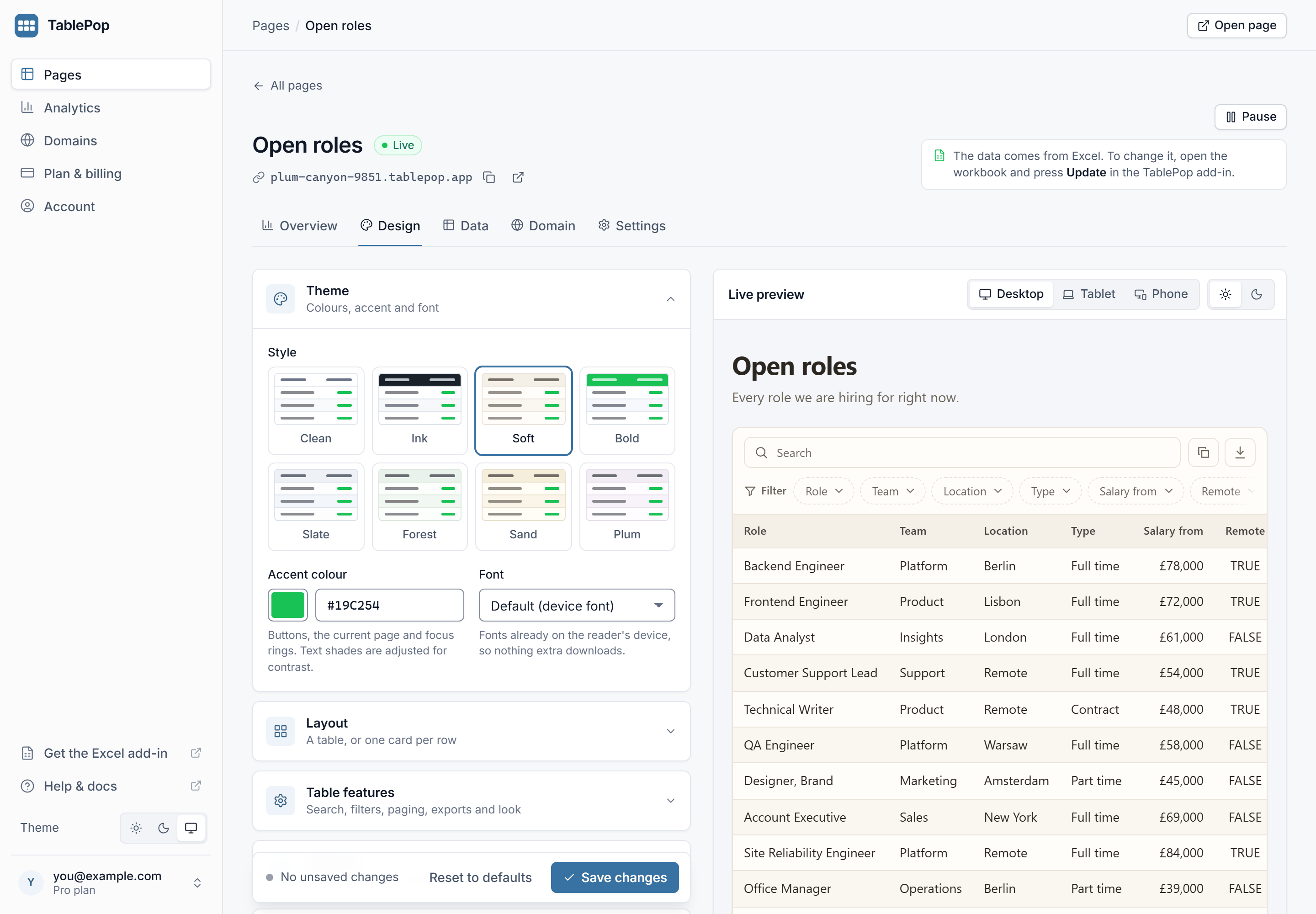
In the dashboard at my.tablepop.app: open a page and go to the Design tab. The settings are on the left, grouped into Theme, Layout, Table features, Columns and Page and embed. The Live preview on the right shows your changes as you make them, on a desktop, tablet or phone width and in light or dark.
Press Save changes when you are happy. The live page follows about a minute later. Reset to defaults puts the table features, column options and page options back to their defaults and removes the logo and footer; the theme, the layout and your data stay.
In the Excel pane: the Look card holds the theme, accent, font and layout. Below it, Table features, Page and embed and Columns open up the other options. They are sent when you publish, or when you update from the main view. When the pane is connected to a page, it shows that page’s own settings.
The title, description and page address live in the Settings tab of the dashboard, under Page details, and in the pane’s Page card.
Theme #
Style sets the overall look. There are eight presets: Clean (the default), Ink, Soft, Bold, Slate, Forest, Sand and Plum.
Accent colour is used for buttons, the current page number and highlights. Any colour works, pale ones included: TablePop adjusts text shades so the page stays readable in light and dark mode.
Font offers fonts that are already on the reader’s device, so nothing extra downloads:
- Default (device font): whatever the reader’s device uses, so it looks native everywhere.
- Serif: suits reports and text-heavy tables.
- Mono: lines up digits neatly, good for codes and IDs.
- Rounded: friendly and soft.
- Humanist: clean and editorial.
- Condensed: fits wide tables into less room.
Layout #
Table is the classic spreadsheet look. Cards shows one card per row, headed by the first text column, with a picture when the page has an image column. See Cards layout and image columns.
Table features #
These decide what readers can do with the table.
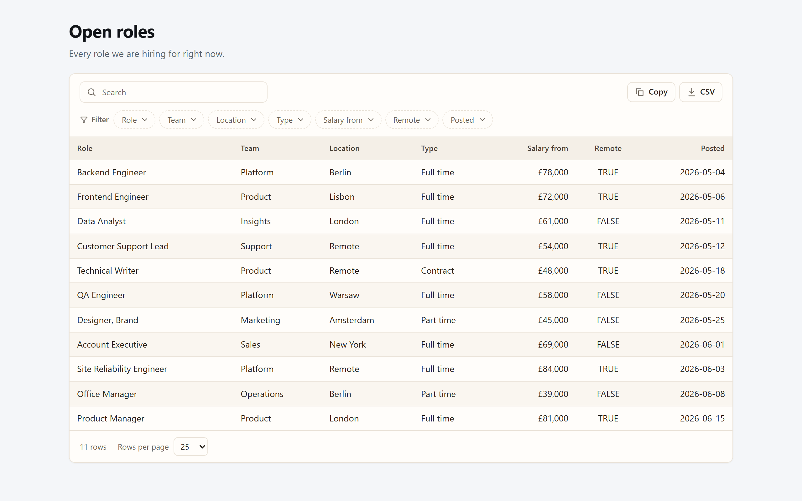
Reader tools
- Search box: one box that searches every visible column. On by default.
- Column filters: a filter per column; numbers and dates get a from and to range.
- Rows-per-page menu: readers pick 10, 25, 50, 100 or all rows.
- Row count: a line such as “Showing 1 to 25 of 57 rows”.
- Columns menu: readers can hide and show columns themselves.
- Highlight matches: marks what the search found in each cell.
- Clickable links: a cell that holds only a web or email address becomes a link.
Rows and export buttons
- Rows per page: 25 by default. Use 0 to put every row on one page, or anything from 10 to 500.
- Buttons: Copy, CSV, Excel, JSON and Print / PDF. Copy and CSV are on by default. Every export takes the columns and rows the reader currently sees, after searching and filtering.
Print / PDF is also how readers get a PDF: it opens the browser’s print dialog, where they can choose to save as PDF. The printout gets the page title and the date, the header row repeats on every sheet, and tables with more than six columns print sideways. There is no separate PDF export.
Look
- Density: Compact, Normal or Roomy.
- Lines: rules between rows, a full grid, or none.
- Striped rows, Row hover and Wrap long text. With wrapping off, long text stays on one line and shows the rest on hover.
Scrolling and small screens
- On small screens: Scroll sideways, or Stack rows, which turns each row into label and value pairs on a phone.
- Freeze columns: keeps the first one, two or three columns in view while the table scrolls sideways.
- Table height: leave it blank for automatic, or set a height so the table scrolls inside a box with a header that stays put.
- Keep the view in the link: search, sort, page and filters go into the address, so a link someone shares opens the same view.
Columns #
For each column you can Hide it, set a Width in pixels, and add a Total at the bottom (sum, average, minimum and maximum for number columns, count for any column). Sort rows by and Direction set the order readers see first; they can still sort by clicking any header.
Hiding a column changes the layout only. The data behind the page still contains it. Leave a column out of the range you publish from Excel if it must not be public.
Page and embed #
These shape the page around the table.
Colour and size
- Colour scheme: Auto follows each reader’s device setting. Light or Dark forces one.
- Light/dark switch: gives readers a button to flip between the two.
- Page width: Narrow, Normal, Wide or Full.
- Frame: Card draws the table on a card. Plain drops the border, shadow and fill, which is best for embedding into your own site.
- Title alignment: left or centred.
- Show the title, Show the description, and the “Updated” line, which tells readers when the data was last published, for example 3 hours ago.
Page background
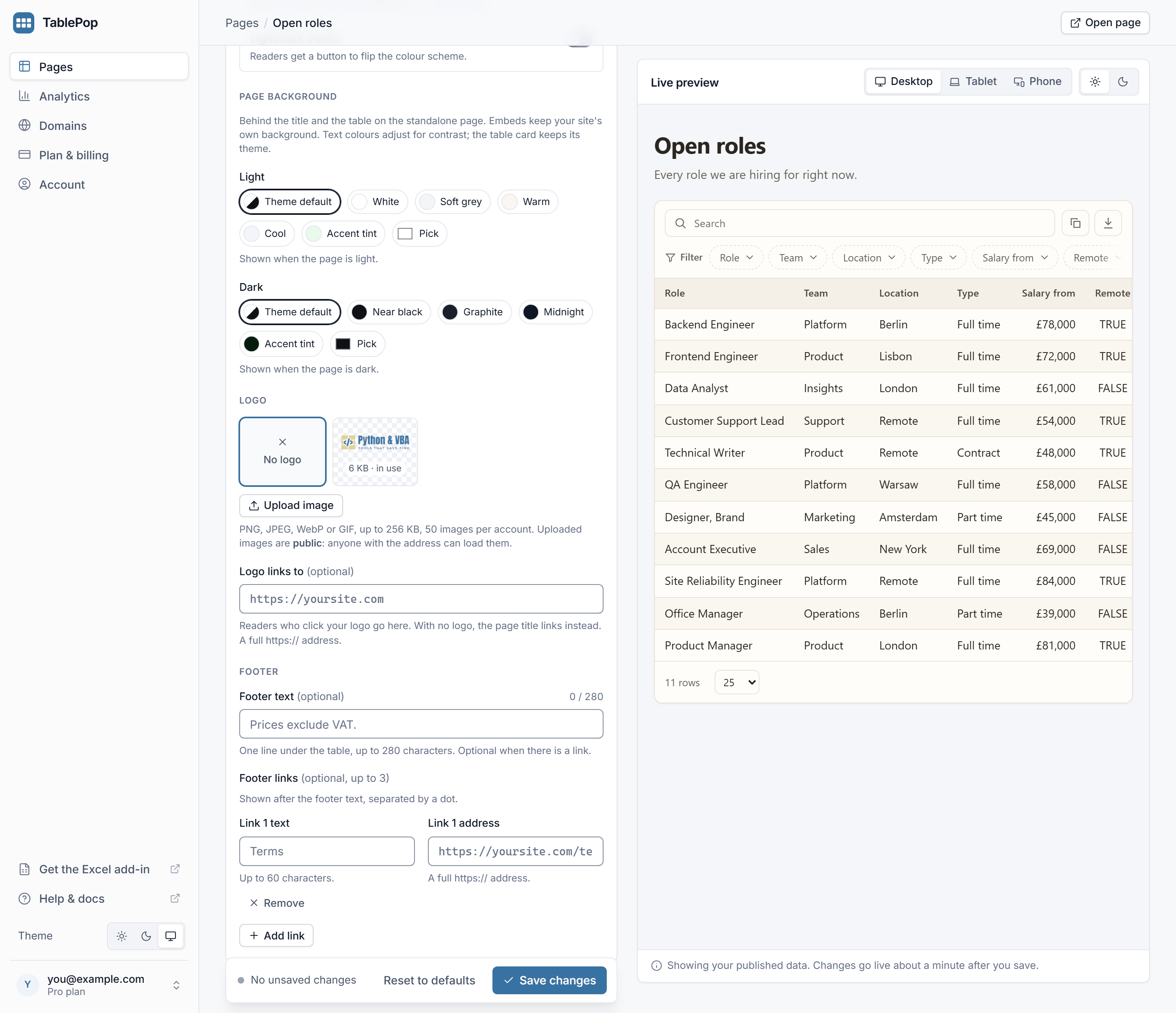
Pick a colour for the area behind the title and the table, separately for Light and Dark. Choose Theme default, one of the swatches (such as White, Soft grey, Warm, Cool, Near black, Graphite, Midnight, or a tint of your accent), or Pick any colour. Text on the background adjusts for contrast. It applies to the page on its own address only; embeds keep your site’s background.
Header: logo and title
- Logo: press Upload image to add a PNG, JPEG, WebP or GIF up to 256 KB. It appears above the title. Uploaded images are public, like the page itself. Dark-mode readers see the logo on a light plate so it stays visible.
- Logo links to: a full https:// address, for example your website. Readers who click the logo go there. With no logo, the page title links there instead.
Logos are uploaded in the dashboard. The pane’s Page and embed section has a link that takes you there.
Footer
- Footer text: one line under the table, up to 280 characters, such as “Prices exclude VAT.”
- Footer links: up to three links, each with its own text and a full https:// address, shown after the footer text and separated by a dot. Press Add link for another one.
The pane has room for the footer text and one link. Add the second and third in the dashboard.
Title, description and address #
In the page’s Settings tab, Page details holds:
- Title: the heading readers see, the browser tab text, and what link previews show.
- Description (optional): one line under the title.
- Address: the first part of the page’s address. On Free it is assigned for you, like
indigo-pantry-4043. On Starter and Pro you can choose it, for exampleq4-price-list.tablepop.app: lowercase letters, digits and single hyphens, up to 40 characters, and not already taken.
Press Save details. The live page updates within about a minute.
A new address retires the old one. Anyone holding the old link, and any embed that uses it, stops working. Pick the address before you share the page widely, or update your links and embed codes after a change.
To put a page on a domain you own, see Custom domains.
The badge #
Pages on the Free plan carry a small “Made with TablePop” line under the table. It is not a setting. Starter and Pro remove it from every page in the account, with nothing to republish.